Anything Photoshop or Photography

Latest

USING THE ART HISTORY BRUSH ON AN AI IMAGE

Old Fishing Boat at Spanish Cay in the Bahamas

I can’t seem to stop trying out AI. Not doing all the fancy stuff, but for some reason I have to use up those Adobe AI credits I haven’t used at the end of the month and that’s when I try things out. The original image (see below) is one of an old fishing boat that was basically abandoned at Spanish Cay in the Outer Banks of the Abacos Islands in the Bahamas. It seemed to be begging for something interesting to happen to it! All that was done at this point was to do some Lightroom editing – no masking but just basic adjustments to improve the contrast and color a little.

Original image of boat from Spanish Cay in the Bahamas

Ran this image through Photoshop AI using Gemini 3.1 (Nano Banana 2) with the prompt “Create an abstract effect with the great color and lines of this old boat and place in water” which ate up 10 credits (Ouch!). Though I have to admit I kind of like the result it made. So I decided to fix this image up and give it a little more pizzaz! The water looked interesting but the trees had to be redone. After some consideration, the Art History Brush was used to create most of the effects in both the top and last image. Different brushes and colors, but the same process.

Image of Boat at Spanish Cay altered by Geminni-3

Where to Download Art History Brushes

In recent PS versions, to download the PS Art History brushes go to the Brushes Panel – in the top right pop-out menu, and append the Converted Legacy Tool Presets which are all the old PS Tool Preset brushes will be appended. There is a folder with just the Art History brushes (can just delete all the others). There are several that work very nice and all can be adjusted as shown below. Probably the best brushes I have recently come across are from a Photo2Paint YouTube short video called Photoshop Art History Brushes – Art Painting. Underneath in info is a link to a short video and a download link for the free brushes – (or click on the following link to just go to the course directly called How to Work with My Art History Brushes which has a download link below the video screen). This video describes all the brushes and how to use them. BTW, the site has many different ways and courses to learn how to paint your images for a fee.

Since you are going to want to adjust these and any other Art History brushes, here is what you need to know. Most info is from Julieanne Kost, the Adobe Evangelist, in her YouTube The Art History Brush in Photoshop from 2015 (the Art History Brush has not changed at all since then and it still works in CS6) for all kinds of tips.

Definition of Various Settings

  • Mode – can change the brush to different ones in Options Bar or change any Layer to different blend modes in Layers Panel.
  • Opacity – can try different strengths for nice effects (also useful with Layers Panel).
  • Styles – the tightness or looseness determines how closely the brush will follow the original line. Julieanne does not use Curly and feels Dab gives a filtered look – the others give painterly effects. Using one of the Tight styles works a little better because it keeps the brushstrokes closer together.
  • Area – how far or much is covered with each paint stroke. A larger area creates more with more abstract strokes. A smaller area uses fewer strokes. Large brushes tend to have more area than smaller brushes. For example, set to 100 px, it looks at an area up to 100 pixels from where you are painting. Best effects are usually at 40 px or less.
  • Tolerance – controls how much the brush respects the original edges of your image. A lower tolerance restricts strokes tightly to the original outlines. If set higher, it will only look in big areas of change. A high tolerance limits strokes to areas that differ from the color in the Snapshot.
  • Brush Settings – change them if you do not like the how the brush works – could use a different Brush Tip in the Brush Tip Shape section, or add or change a texture to a more interesting one from the Texture (same as a pattern) drop-down menu. Be sure to Save the brush as a preset if you like it (press the plus key at bottom of the section).

Steps for Creating an Image

  1. First select the Art History Brush (in a group with the History Brush)- uses shortcut key Y.
  2. Create a snapshot in the History Panel – don’t use the icon at the bottom of the panel if going to create different effects to add to your painting. For more than one in the pop-out menu, select New Snapshot and in the Dialog Box, change From in drop-down to Merged Layers per the great PS Guru Jack Davis (see * at bottom of blog as to why, but basically it allows different snapshots to be created and used for painting). You do not have to do a lot of Snapshots – the one on top used just one with no changes in the Snapshot. To be safe, I did use the Merged Layers Snapshot so if later a different effect might be nice.
  3. Click only on the left box to select Snapshot to use, not on the text or you might lose all your painting history. The Art History Brush icon moves from the top icon Snapshot down to the new one.
  4. Add a New Layer in the Layers Panel for painting – can label it. I usually list the brush and Snapshot used here, and create New Layers for each time the brush is changed. Choose one of the Art History Brushes you have, and look at the Option Bar – it contains different options from other brushes.. Julieanne says the default settings are not that good so try changing settings in these fields.
  5. It has been suggested that you use a large brush as an underpainting, then use a medium brush to bring back some detail, and a small brush to bring back fine detail, preferably on different layers.

Helpful Tips

All kinds of things can be done – can even do just part of the image to get just a bit of effect. This is so easy! A few tips from my oldie but goodie standby PS book called The Photoshop Wow! Book by Linnea Dayton and Cristen Gillespie – extremely creative people, along with some of my own tips are listed below:

  • There are at least three ways to operate the tool: Click each time you want to apply a series of strokes; Hold down the mouse button (or stylus) and watch the strokes pile up; and Drag the brush to set down several sets of strokes.
  • In general use Tight strokes (set in the Styles field in Options Bar (see Styles above).
  • It is helpful to “anchor” your strokes by clicking the cursor in the area of color or contrast that has a clear edge so the strokes will follow the detail to be emphasized.
  • Each time the settings are change in the Options Bar, do a quick stroke to see if you like the results. If not undo and change settings.
  • My tip is that if small detail is going over edges that have a different effect on them, change the Options Bar to settings like an Area of 5 px and a higher Tolerance like 30% – and try changing the Opacity also to keep from getting bad edges on the other layers
  • If you really messed up some strokes, you will find the Eraser does not work. Must turn off all the other layers and go into the layer with the mistake where you can now erase it.
  • I had to do some clean up after painting and found a useful trick with the Photo2Paint brushes. There are some really nice textures in the brushes so I downloaded a couple in the Brush Settings Texture section (press the little plus icon to the right of the texture swatch and Invert box – puts it at the bottom of the Pattern Panel – by clicking on the little arrow to the right of the current texture it opens the Pattern Panel where new texture can be selected. Then your regular brush strokes will blend in better with the painting strokes to some extent.

Image of an old fishing boat in Spanish Cay, the Bahamas, using AI and the Art History Brush

For my AI image the Art History Brush was used following the listed steps. Top image used just the one Snapshot. For the above image four different Snapshots were used to get this result (a Color & Vibrance Adjustment Layer created – and then the Snapshot of the results was created, same with a Burn Layer, a Dodge Layer, and a Clarity & Dehaze Adjustment Layer). By switching the Art History Brush icon between Snapshots at top of History Panel, different parts could painted in the image – therefore four different effects have been added to this image. This is also why the Snapshot Merged Layers was used. A Color Lookup Adjustment Layer set to 31%, the Camera Raw Filter and a Gradient Map using a Purple to Green Linear Gradient set to Soft Light Blend Mode at 50% Layer Opacity. Figure the images turned out very different, even if the AI prompt had requested some kind of painterly effect. And this was a lot more fun than letting AI do it all! Hope this gives a few of you creatives some new things to try out! Enjoy your Summer!…..Digital Lady Syd

*Why use a Merger Snapshot instead of a regular one? Often when painting PS puts up a “No corresponding layer” – you want to do something in the past and there is not corresponding layer to work on in the present. To avoid this, click the upper right pop-out menu and select New Snapshot… and a dialog box opens. In the From drop-down menu, select Merged Layers. Now PS does not care about what is currently visible, it makes a Snapshot of it – can use it to paint from no matter if layers were added or deleted, or possibly an added filter or Dodge and Burn Layers. Jack Davis many years ago did a Painting Class in Photoshop for Creative Live where he showed how to use the Art History brush – best info I have seen.

Digital Lady Syd Related Blogs:
Creating an Art History Action in Photoshop

How to Use the Art History Brush – It Really Is Pretty Nice!

Butterflies Posing in Abstract

MORE AI COMPARISON

AI images with a royalty flair.

Doing another AI comparison using the same prompt and a template just for the fun of it. It turned out kind of nice. Several of the same programs used in my Trying Out Different AI Programs blog from a couple months ago were selected, but this time created portraits. Note my older blog has more info on accessing and create inthese AI programs.

This idea came from a free download at Deal Jumbo called Collage Photo Frame Free Template (by mristudio) which showed baby images. See the basic template below – it is a PSD file with many layers. It was a little difficult to utilize, but does offer a lot of extras that were not selected for the above image.

Template used in image at top

The same prompt “Create a portrait of a woman from the 16th century France” was entered for all AI apps. The difference between this image and the ones created in my previous blog is that some corrections were made using the Clone Stamp so that the individual images would fit properly into the round template frame openings and the square frame. It was a bit of a problem. The round frames were changed from just white – used layer styles to get the gold effect on them (Bevel & Emboss, Stroke, Inner Glow, and Gradient Overlay). The top photo used a Pencil drawn frame I had created a long time ago with a Bevel & Emboss, Satin, and Gradient Overlay styles added for the gold effect. The trick was to find the right texture in the Bevel & Emboss Texture section. Drop Shadows were added to all frames.

Four different AI programs were used in this image. The top one, and my favorite result, was created using Google Flow and Nano Banana 2. Since it was not created in Photoshop, no credits were used, but they will probably start charging for this soon. The middle image used Grok 4 (which was introduced for free for X-users at the beginning of July) and did a pretty good job. Felt this lady looked quite a bit younger than the Flow image. The ChatGPT portrait on the right looks much older and more regal. The younger looking maiden on the left was created using Firefly 3 – selected the best version of the three. This image was way too photorealistic. It was given a painterly more vintage look by applying an oldie-but-goodie filter – Exposure Software’s (the old Alien Skin) Snap Art 4 using the Impasto Detailed preset and masking the face for more clarity. One thing that had to be done to each of the images was to apply a Grain Adjustment Layer which adds some normal looking texture. AI effects tend to smooth out everything in its created images.

Generative Expand was done to accommodate an area for text at the bottom of the template. The font used was the classic movie poster font Trajan Color – Jeanne of Montague – my middle name of Jane (or Jeanne in French) and my Grandmother’s maiden name Montague, shortened to Tague when the family moved to the US a long time ago. The Montague’s did originally come from Normandy in the 1000″s but eventually ended up mainly in Britain. Even so, the ancestry info above is not factual. The texture is from 2 Lil’ Owls called Autumn Whimsy 8, from a retired texture set of hers.

I am finding AI useful for creative endeavors, but not so much for my photography. Still love the Remove Tool and Generative Extend for the Background command, but overall do not use AI that much. This was a fun project and I would not have done it at all if not for the template from Deal Jumbo. Have a good week – very hot here!…..Digital Lady Syd

250 YEARS – HAPPY BIRTHDAY USA!

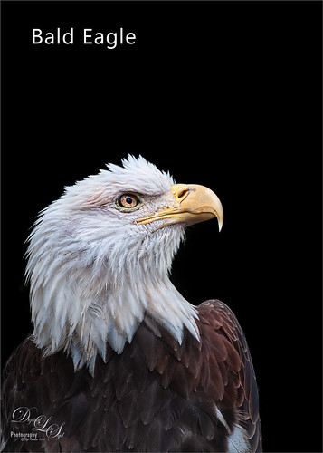
Image of a Bald Eagle

I love photographing and everything about the National Bird, the beautiful American Bald Eagle. Just reposting a few of my images from over the years and a couple update or new ones. for this wonderful celebration! (For older blogs on some of the image – top one, third one, and forth one, click on images to open in Flickr where link is located.)

My drawn image of a Bald Eagle

Drew the above image following the wonderful Aaron Blaise’s Birds of Prey course.

Image of a Bald Eagle standing on the ground.

Both the above and below Eagle images with a Corel Painter background. They reside at the Jacksonville Zoo.

Image of an Eagle sitting on a large branch.

If you really enjoy watching the Bald Eagles, there are some wonderful Web Cams showing the birds from when they are born until they fledge (take off on their own flying). Check out this site which has several nest cams for following them. Best time to watch is in the early part of the year, but the site has several highlight videos to watch if the birds are not currently available. Below is a composite I created trying to show the babies – not the best but it does show how dark the eaglets are when small.

Baby Eaglets

In the meantime, it is a great time to be an American in the USA – if you are lucky like myself, it is a real privilege to live here. Happy 250th Birthday – go enjoy the Fireworks and have fun on the Fourth of July!

TRYING OUT DIFFERENT AI PROGRAMS

Image of the Yellow-Billed Stork done with Adobe Firefly AI

Wanted to compare some different AI program results – not all of them of course – but a few using the same image and prompt. No real changes were done tonally after the AI was applied. Borders were added in some cases, but I believe you can see the differences easily.

In all cases the JPG image below (see my Tidbits Blog called Big Bird for info on its post processing) of a Yellow-Billed Stork (the scientific classification is Mycteria Ibis shown on some of the AI images) taken at the Jacksonville Zoo was used. I thought the image would look good with an Audubon effect so this very basic prompt was used except where noted: Create a nature illustrative effect similar to Audubon painting.

Original Image of the Yellow-Billed Stork

Below are two examples of John J. Audubon’s drawing plates (the Great Blue Heron and the Wood Stork or Wood Ibis) from his book Birds of America (can download all book plates from this site). They represent what my results look like to some extent.

ADOBE FIREFLY (done in Photoshop 2026)

The very top blog image was done in Firefly using PS – it took me a lot longer to create than all the others. I won’t go into all of the details on this. Generative Fill using Firefly Model Fill and Expand Model (and it uses only one Adobe credit with three choices each time it is run) was selected with the prompt “Create a nature illustrative effect similar to Audubon painting.” PS would not let me use this prompt that referred specifically to Audubon. The prompt was changed to “Create a nature illustrative effect” using my original image as a reference. This required it to be run 3 times to get a somewhat similar bird and background. Then lots of clean up. It ended up with a really nice overall feel of an Audubon plate.

LEONARDO AI (via DeeVid)

The Yellow-Billed Stork image created using Leonardo AI

Thought this stork image turned out rather nice. There was a limit of how many iterations you can use for free, but I was able to get a few. The site called DeeVid AI-Leonardo AI Image Generator is pretty easy to use. For this image, it was set to Google’s Model (Gemini 3.1) Nano Banana 2, which Photoshop will let you use (and only one choice is given) for 10 of your credits. (And it better be good unless you have a lot of credits.) I think that is why this one looks pretty nice. Only adjustment made was to the text to fit with my info.

GROK AI

Yellow-Billed Stork created from image and taken into Grok AI

This image created in Grok turned out very different. Used the same Audubon prompt but Grok’s AI engine has the Aurora Model, not like the ones PS or the many other programs appear to be using. Very simple to create – if you use X, just scroll down on the left to Grok and drag your image into the field and add the prompt such as the Audubon prompt.

GOOGLE LABS FLOW AI

Image of a Yellow-Billed Stork with Google Labs Flow AI applied.

This AI program, which requires a Google log-in, can be found at Flow and is using the Banana 2 Model. It was easy to follow and it actually created a similar effect as the left side Great Blue Heron Audubon plate. Had to create a border and add my info is all.

CHAT GPT

3 image Tych showing different results using ChatGPT AI of a Yellow-Billed Stork.

The above were all created using the Chat GPT AI free users program which uses it own GPT Image 2 Model. Just drag image into the Ask Anything field and type in your prompt. The results were interesting as the top one used the standard Audubon prompt like the others. Chat GPT was the only program that gave me suggestions on how to make the image better by improving on my initial prompt. The middle image used a more detailed prompt: Transform this photo into a vintage natural-history illustration in the style of an Audubon bird plate, with delicate watercolor textures, botanical details, aged paper background, and realistic engraving-style shading. The bottom image prompt had what Chat GPT called a strong template: Using the attached image, create a detailed 19th-century natural history illustration inspired by Audubon paintings. Preserve the subject anatomy and colors while adding watercolor textures, fine ink linework, botanical surroundings, and an antique paper background. The differences were subtle between the bottom two, but it did give a more Audubon-authentic effect to the image.

So far these are the only AI programs I have explored. Midjourney will not let you even have a trial without paying the monthly fee, which is as much as my Photoshop subscription. But overall the other examples gave a pretty nice representation of what is out there I think. There is a program called Comfy UI which allows you to create your own AI interface, but it has a large learning curve – there are You Tube videos available on it for those who want to create their own AI program.

BTW, this blog idea came from a recent Kelby One class called The AI Mindset by the great photographer Rick Sammon – it is not a “how-to tutorial” but more on how to create effective prompts using various AI software. Creating short videos using just one image is also included in the class, but this is a whole other blog for me!

Hope you get a chance to try some of these programs on your images. It is really not too hard. And if you get a weird result, go back and try again. AI seems to like to present very different results when repeated. Until the next blog…..Digital Lady Syd

ADDING A PATTERN TO AN IMAGE

Image of guitar player with Chinese New Year graphics

Above is one of my favorite free images from ISO Republic that I use to try out everything Photoshop. In my E-mail there were some free Chinese New Year textures linked, so I decided it would be fun to see what I could do with the celebration of the Chinese New Year where 2026 is the Year of the Horse. A couple of patterns were added. The reason to use a pattern is there are more things that can be manipulated in the Pattern Fill Dialog Box than with a regular texture (as shown in the background of this image).

To start, the first step was to select the whole guitar player from the his background by creating a duplicate layer (CTRL+J) and then using Select Subject (go to Select -> Subject or press the Select Subject button on the Contextual Task Bar (if Bar not showing up in your Photoshop, can quickly open it by right clicking outside the image and choose the top menu item) and then add a layer mask. If anything looks bad, just use a hard edged brush in the layer mask to clean up problem areas. On another duplicate Background layer only the guitar body was selected – I had a little trouble with this until the Magic (or Tragic to some people) Wand Tool was tried with Contiguous checked in the Options Bar – it worked with just two clicks (hold Shift to add second area)! A layer mask was added showing the two parts of the Guitar Body in white.

Creating a Pattern:

Both the background and the guitar used textures from a DealJumbo set called 6 Free Patterns – Chinese New Year. PS will not open anything except a .PAT file as a pattern, even though lots of people call a texture file a pattern, technically it is not. For the Guitar Body, one of the Chinese New Year JPG files was turned into a pattern files. In PS load the texture file to be converted to a pattern (it can be either a JPG or PNG file). Next open the Patterns Panel (if you do not see it, go to Windows -> Patterns and it pops out as seen below). At the bottom of the panel click the (+) sign icon (middle one) to make the texture file into a pattern – just name it how you want. An alternate way to do this is to go to the Edit -> Define Pattern and name it. The pattern will appear at the bottom of your Pattern Panel list. I made all 6 Chinese New Year texture files into pattern files and put them into a Group (bottom right icon). CTRL+click patterns to choose the ones for the group – then drag them into the Group. It is a really easy way to turn any of your JPGs or PNGs into patterns which can then be easily manipulated in your images. Below is an example of what happens once the (+) sign is pressed.

Visual of the Pattern Panel in Photoshop

Using the Pattern Panel:

For the Guitar Body, the Pattern Panel was opened and a pattern in the list is chosen (in this case it was it was the Chinese New Year Pattern 02). Note: The Pattern Fill Adjustment Layer is automatically clipped above the layer that is highlighted in the Layers Panel by default. If no layer mask is preset in the layer below, it is still clipped but fills the whole image like a texture.

To open the Pattern Fill Dialog Box which has some pattern options in it, click on the Pattern thumbnail in the Layers Panel. It shows another thumbnail for changing out the pattern, the Angle, and the Scale percent. In the image below you can see the actual pattern was changed in the Pattern Fill Dialog. To position the pattern to fit your area, just drag the pattern in the “image” – only works when the Dialog Box is open. For the top image the Pattern Fill Dialog was set to an Angle of 41.08 degrees and a Scale of 20%. The layer was set to Hard Light blend mode at 51% opacity.

Image of Pattern Fill Dialog Box in Photoshop

Some Tips: In the example right above, an AI image I created was made into a pattern and placed on the Guitar Body. It was set to an Angle of 45 degrees and Scale of 75%. Sometime a pattern will appear very small when the same settings are used – this is dependent upon the resolution of the pattern file when it was created. Just up the Scale if needed. Another place to change the pattern is at the top of the Patterns Panel where little tiny pattern icons are shown. They indicate the patterns you had previously tried in the current session – to go back to one, just drag it onto the image. The Pattern Fill Dialog settings are sticky and will remain so until you change them.

Adding a Pattern in a Layer Style: Another option for adding a pattern to your image is to highlight the Layer with the layer mask and double click the layer (not thumbnail) to open up the large Layer Style dialog. Check Pattern Overlay to open up its dialog. In drop down, select the pattern to add to your image. Below is an example of how this looks.

Screenshot of the Layer Style Pattern Overlay example.

Note if a Pattern Fill Adjustment Layer had been created and clipped to the image and then you change to a different pattern in the Layer Style Pattern Overlay, you will no longer be able to see the original pattern in the Pattern Fill Adjustment Layer when the Layer Style Dialog is closed. For the cool Guitar Body above, check out DealJumbo’s Free Pirate Patterns (#140 was used below) which are really JPG textures. DealJumbo has a lots of free different “patterns” that can be turned into PS PAT files as shown in this blog, so check them out. The cool thing about applying a pattern in the Layer Styles Dialog is that there are all kinds of special effects that can added to it to make some really interesting results!

For the original top image, the final Guitar Body was created by adding a clipped (to clip, press the first icon at bottom of adjustment layer) yellow to orange Gradient Map on top of the pattern layer set to Soft Light blend mode at 28% opacity, and a clipped Selective Color Adjustment Layer set to Neutrals with Black set to +23. Also the Chinese New Year pattern 1 was place in the center black area of the guitar and set to a tiny Scale of just 5% and an Angle of 45.68. A Hue/Saturation Adjustment Layer was clipped above it to make it a darkish blue color.

Finishing Up:

THE BACK GROUND TEXTURE: The Background texture used Chinese New Year 4 as a JPG and was inserted under the duplicate layer with the guitar player selected. The color of the original image was changed by clipping to the Background Layer (double click to unlock to do this) a Solid Fill Color Adjustment Layer of dark brown to remove the overall dark blue. Then the Chinese Texture layer was set to Linear Burn blending mode with Fill set to 55%. The Layer Style was opened and the Blend If Current Layer’s white tab was split and set to 160/217 – to open up the light color in the texture a little bit.

COLOR OF CLOTHES: This was not as hard as it seems. Used the Quick Selection Brush to select his jacket for one layer, his shirt for another, and his pants for the last. Any selection tool could be used for this. Each layer was set to the Color blend mode and with Kyle T. Webster’s Oily Goodness from his Summer 2023 pack, the selections were painted in with colors in the brown and black tones instead of the blues. To access Kyle’s extra brushes, go to the Brushes Panel (Windows -> Brushes) and in the top right hamburger pop out, select Get More Brushes – should be logged in if using PS so scroll way down to the Summer 2023 Brushes and download. There are gobs of brushes to try in all these sets so have some fun trying them out!

FOG, FLARES, HORSES & FONTS: Then a fog layer using one from Resource Boy 200 Free Fog Textures (used #200) was added to darken the bottom and top and add light in the middle – set to Overlay blend mode at 36%. A Flare (Kyle Nelson’s Flare 15 – can’t seem to locate it but there are a lot of flares available) was added to darken the hand just a small amount – set to Multiply blend mode at 33% opacity. Last step was creating a rough drawing of the horse using a textured erodible brush that comes with Photoshop and a couple reference photos. The text is Avene font with an Outer Glow Layer Style.

Lots went into this image but it was fun to trying different things. Enjoyed drawing the horse especially! Have a good week!….Digital Lady Syd

DIGITAL LADY SYD REFERENCE BLOGS

How to Use a Pattern Fill Adjustment Layer

SHARPENING WITH SURFACE BLUR

Image of a Dove Christmas Tree ornament.

Happy New Year to everyone! Hope it is starting off great! This little dove ornament above is enjoying one of her last days of freedom before December comes again. (BTW, got this pretty little ornament at Walmart for $1.85 (could not find link) this year and the Red Berries also.) Had some fun playing with the lighting on this one. Christmas Tree lights always give such nice effects.

Most of the time using the new AI Lightroom/ACR Denoise slider and, in my case, with an older version of Topaz’s Sharpen AI (that still works incredibly well) is all that is needed if a sharper image is needed. In the case above the image was taken close in using a 170 mm lens at F5.6 with ISO 400. Everything was in sharp focus except for the two red berried that were in front of the bird. I did add a preset on this image, which I do not do very often, FD Painting 1 from Frank Doorhof’s LR set at KelbyOne, and did the standard things in LR such as add a Profile (one of my camera profiles), turned on Remove Chromatic Aberration and Enable Profile Corrections, and turned off Sharpening before running Denoise in the Detail Panel. A mask was created using the Brush to try to sharpen the berries with several sliders but it did not work really great. I mention this since to show it is not always a lost cause if taken into PS.

In PS Topaz Sharpen AI was used to sharpen up the overall image as it had a slight motion blur on it (when using this plugin, do not use Sharpening in LR or ACR). A layer was added to try and paint in some sharpness to the berries which did not work out. This is where Surface Blur was used.

Surface Blur Technique: Learned from watching the Photoshop Virtual Summit 7 in November in a presentation by Daniel Gregory – his presentations are always loaded down with great info! It uses a blurring technique to make things sharper. The following are Daniel’s steps for doing this:

  1. Duplicate your image.
  2. Go to Filter -> Blur -> Surface Blur. As a general rule of thumb, set the Radius within 10% of your Megapixel Size of your camera and Threshold between 10 to 15%. For example he used 50 for the Radius and 40 for his Threshold.
  3. Next invert the Surface Blur layer by clicking on its thumbnail and press CTRL+I. This is the trick for converting this filter into a Sharpening Tool.
  4. Set this layer to Vivid Light blend mode in the Layers Panel. This results in a solarized look on the layer.
  5. Create a stamped layer on top (CTRL+ALT+SHIFT+E) and turn off the eyeball to the Vivid Light layer.
  6. Change top stamped layer to Overlay blend mode. If Soft Light blend mode is used, it can add a little more punch into the highlights.
  7. Adjust the Layer opacity down – usually around 50% good. In my case it was left at 100%.
  8. Can also use a Mask on it or duplicate the layer if needed.

What happened with my dove image is that the sparkles became very sharp and more sparkly on its body which looked great, but the berries really did not pop as hoped.

Sharpen Tool: So as a last resort, I turned to a very old PS tool – the Sharpen Tool. This Tool is given a pretty bum wrap by PS gurus, but overall it is not that bad for quick little areas that need sharpening. Just do not paint over it too much or at too high a Strength setting. Not sure if it is necessary, but I created another stamped layer (CTRL+ALT+SHIFT+E) and a New Layer added above it for the Sharpen Tool. It is nested with the Blur Tool in the Toolbar. Used a soft round 90 px brush and in the Options Bar set the Mode to Normal, Strength 35%, and checked Sample All Layers and Protect Detail. The red berries were painted over and it did sharpen the outside edges and some of the little highlights inside the berries – just enough to make them blend into the image better. BTW, I did try the High Pass Sharpen technique on the bird, but it was not quite as good. This image is definitely a case for trying out a new technique – it did improve the image very subtly.

Gold and silver balls on a Christmas Tree

The above was just another example – had fun with photographing the lighting here also. Used the Surface Blur after Topaz Sharpen and it also added just a bit more detail, especially in the highliglhts. It is a nice tool to have as an extra when the Sharpening is just not quite enough, and no AI involved. Hope everyone is having a Happy New Year!…..Digital Lady Syd

MERRY CHRISTMAS!

Merry Christmas – hope the holidays are wonderful for everyone! I decided to get a little creative here and make my beautiful white water lily into a candy can effect for the season. No major AI here other than for a little sharpening using an older version of Topaz Sharpen AI (so far it is doing just fine) and the Remove Tool. I am enjoying using the updated Hue/Saturation Adjustment Layer which made converting the selected flower to a red one very easy (Checked the Colorize box and picked a deep red for the color). How did I get the candy cane effect? Chose the Red Blend If channel and the Underlying Layer – then split the white tab by holding ALT and set it to 201/247. That simple! Turned the lily pads to green using a Selective Color Adjustment Layer and just the Neutrals color (-20/-53/+15). The snow effect on the flower and pads were from a really fun brush set by Maddy B – All Winter Frost Brushes. Used BB Ice Texture (no longer available but there are lots of newer one available on the internet) for the background set to Lighter Color and 47% layer opacity. This time the Current Layer Blend If Black tab was split and set to 241/255 to give a nice clear ice look. Basically just played with all the brushes. Added Distressed Textures free Holiday frame (don’t think it is available anymore). Last step was adding the text – the Merry Christmas text is called Bellisa Script – it has a lot of glyphs that can be substituted in the font. That was about it. I really love doing Christmas Card images! Enjoy the season!…..Digital Lady Syd

REMOVE FENCES WITH BETA PHOTOSHOP NANO BANANA AND FLEX AI MODELS EASILY

Image of a Black Howling Monkey

Not one to promote the Beta AI features but they recently put new AI Models in Photoshop. I want to show what it does on chain link fencing, mainly the kind in front of the animals at zoos, with just a few clicks. I will cover other new things later as I learn more, but this sort of blew me away! You can download the Beta Version at your Adobe Creative Cloud page if you have regular Photoshop installed.

All three images had various distortions caused by the chain link fencing as shown in the thumbnail images below. I tried to select the image that had the best detail in Lightroom. Lightroom’s Basic Panel’s Auto button, Detail’s Denoise, and Lens Corrections’ Panel’s Remove Chromatic Aberration and Enable Profile Corrections check boxes were used on the Bird and Monkey images, and a few other adjustments were made. The Tiger was manually adjusted in the Basic Panel. Then all were taken into Photoshop Beta to do the cropping and remove the fencing.

To remove the fencing as on the top Black Howler Monkey (taken at the Jacksonville Zoo), do the following:

  • Select the whole image by pressing CTRL+A.
  • Go in the Contextual Task Bar’s Generative Fill field, use prompt “Remove the fence.”
  • Select icon that is one over showing either an Fi or G, or possibly a Triangle icon – if clicked there is a drop-down that lists the model styles which represent Adobe Firefly, Google’s Gemini 2.5, or Flux Kontext Pro (used on Tiger image below). Select the G for the Gemini 2.5 AI which is the Nano Banana Google model, and then press Generate. BTW, each model gives different results and if one Model does not work out correctly after trying it a couple times, choose a different one.
  • In the Layers Panel, a new layer shows the variation (a single one for Gemini 2.5 or Flux models) it created of your selection and in the case of all these images, removing the fencing.

No clean up was needed on the Monkey or Bird images. The Tiger fur needed to be adjusted a little bit. The only other thing done to the Monkey was to use the new Beta Color and Vibrance Adjustment Layer to brighten it up a bit and an Exposure Adjustment Layer to sharpen the eyes a little. This was totally amazing and took probably less than 10 minutes to do the whole image.

Image of the face of a Sandhill Crane

For the Sandhill Crane the above steps were followed and the fence was perfectly removed. To soften the background, it was selected. An Invert Adjustment Layer was set to Linear Light blend mode and a Fill of 18%. Learned this from PS Guru Blake Rudis’s YouTube Video Day 12 – See You on the Other Side. Very nice soft background effect. Tried selecting the Bird’s eye to sharpen by running it through Nano Banana and it did nothing even though it did work on another of my monkey images. So do try using it on the eyes for some brightening. I resorted to using the Exposure Adjustment Layer on this Bird’s eye. The Beta Color and Vibrance Adjustment Layer was also applied to this image – I really like this new effect. A Selective Color Adjustment Layer increased the Reds a little and added in Whites using the Black slider to enhance the head and a slight vignette was added. That was it.

Image of a Malayan Tiger

This Malayan Tiger (at the Palm Beach Zoo) was the hardest one to do since where his paw and face meet are hard to differentiate. In this image, Nano Banana did not remove the chain fencing which was quite light and blurry in the image. Therefore the Flux Kontext Pro was selected and it took it all out and added just the right amount of fur! It was also amazing! Finished up in PS using the Blur Gallery’s Iris Blur to reduce the really detailed and overly sharp background. Had to clean up his paw some after blurring the background with a little fur brush. Lastly a slight vignette effect was applied. That was it!

Here are a couple current references for this new AI advancement: 27 (Beta)What Nano Banana Can Do in Photoshop Will Blow Your Mind! by Jesus Rodriguez and Nano Banana Officially in Photoshop (Beta) – 50+ Epic Uses by Unmesh Dinda.

Definitely give this a try, especially if you had wildlife images that were ruined by the fencing. Hopefully they will put this in the 2026 version of Photoshop. Apparently there will be a charge for using it after October 31st so now is a good time to see if you like it. I will try to add some other new things later as I learn how to use them effectively! ….. Digital Lady Syd

DIGITAL LADY SYD RELATED BLOGS (older blogs with some good shooting and quick tips:

How to Get Rid of Those Dark Fences in Zoo Shots

Photoshop Beta AI with Fenced Zoo Images

I DIDN’T KNOW THAT! – PHOTOSHOP TIPS

Image of a drawn tiger

It has been a while since I did a Photoshop Tips blog and I have discovered a few obscure ones that are quite useful. Therefore, here are some tips I hope you find as useful as I do. (See my 10 Not So Well Known Photoshop Tips blog.) The tiger above was created using Aaron Blaise’s tiger videos in his How to Draw Big Cats set. It was fun to do something a little different in Photoshop. The background was originally created in Adobe’s Firefly AI, but the color and a lot of the lines were changed by me.

DODGE AND BURN – WITH 50% GRAY LAYER?

If you are going to Dodge and Burn using the regular Brush Tool set to black or white on an Overlay blend mode layer, you do not need to fill the layer with gray first. The reason to use a 50% gray layer is if using the actual Dodge and/or Burn Tools, they will not work on a blank layer.

QUICK TRANSPARENCY LAYER MASK

Even though the Select Subject is considered a great way to make a layer selection, there is another old school way to create a layer mask from the transparent areas by going to Layers -> Layer Mask -> From Transparency. If a keystroke is assigned to this, it is super fast and works great! Just be sure you have a transparent layer, not one with a white background.

Quick Additional Blend If Tip: The above does not work if the transparency was created using Blend If sliders unless the layer is converted to a Smart Object and then Rasterized (this now applies the layer style and shows the transparent areas).

FADE COMMAND WITH FILTERS

Everyone probably knows that when you paint a stroke (even with the Mixer brushes) and it is too bright, the opacity can be reduced on the last stroke painted by going to Edit -> Fade. Did you know you can also use this same technique after any filter is applied, including non-Photoshop filters. Use Fade the opacity and/or change the blend mode in the same dialog box after the filter has been applied. Can be very helpful!

HANDY BRUSHES PANEL SHORTCUTS

  • Go to Previous Brush Preset: (,) or (comma)
  • Go to Next Brush Preset: (.) or (period)
  • Go to First Brush Preset in list: SHIFT+(,) or (Shift+comma)
  • Go to Last Brush Preset in list: SHIFT+(.)+(>) or (Shift+period)

To Close or Open all Brush Groups, CTRL+Click on any of the far left group icons (>) or (v) in list.

ADDING REALISTIC FOG TO AN IMAGE

Many compositors say that adding fog to an image, as in the mid-ground or far background, can add some nice depth to an image. To make this look realistic, use a fog brush (for some of the best, check out Resource Boy’s 200 Free Fog Texture Brushes) and paint some fog on a New Layer – try using a low flow like 10% to not overdo it. Open up the layer style by double clicking on the Fog layer and in the Blend If section’s Underlying Layer, split the black tab by pressing the ALT key on the tab to separate it and move the right half all the way up to 255. Now the fog will not be visible in the shadows. I found sometimes I did not need to go all the way to 255 but it definitely gives a more realistic effect. This tip was from another PS guru Aaron Nace.

WHAT THE DIFFERENT CHANNELS REPRESENT

Courtesy of major PS Guru, and possibly the best, Bert Monroy states that to “understand what is in these 3 channels (Red, Green and Blue in the Channels panel), you will get better result in your retouching.” Recommends keeping the Channels set to black & white to see the tones better (go to Preferences -> Interface -> uncheck Show Channels in Color).

This is what each channel does:

  • Red Channel: The lighter the object is in the image, the more that color exists; it contains the contrast information for the image. To adjust the contrast of the image, use this Channel.
  • Green Channel: The detail channel – sharpen image using this channel.
  • Blue Channel: Noise and Scratches – use PS’s Despeckle Filter to remove

To use the Channels for adjusting, need to use some different PS commands. Bert says the Calculations command works great. I still need to experiment with this and let you know the results.

OPENING THE EXPLORER QUICKLY IN PS TO OPEN AN IMAGE

The PS Guru Stephen Norotarski supplied this tip. Double click on the empty background and the last folder used will open up. Very quick way to load an image.

BRUSH SMOOTHING SETTING

As long as it is checked in Brush Settings Panel, by default PS sets the Smoothing at 10% even if it says 0 in the Options Bar. If the brush is acting really sluggish while painting, set the Smoothing to 0 in the Brush Settings Panel. Brush will respond much better now. Usually the brush gets sluggish due to a lot of settings like Dual Brush, Texture, and Color Dynamics. When drawing, the Smooth setting is very nice – I usually set mine to 14%.

QUICK FIX FOR THAT BLUE CHROMATIC ABERRATION OR TONE DOWN BRIGHT DISTRACTIONS

This was a tip by the incomparable John Paul Caponigro from years ago and still works totally great. If you have a tree with lots of green leaves and holes showing the sky in the background, often it picks up a very dark blue edge around the leaves and looks terrible against any color sky. ACR/Lightroom may correct this, but sometimes it does a bad job. To fix this, create a New Layer and set it to Saturation Blend Mode. Select a small brush a little larger than the bad edging, set color to black (white or gray will also work), and 15% brush opacity. Just paint over the edges and it desaturates the color around the leaves. Did a blog on this years ago. (See my Tidbits Blog Selective Desaturation – the Easy Way!) Quoting from my old blog: “This technique can be very useful when you want to just de-emphasize something that is too bright in the image, especially on small areas. Green foliage often tends to be over-bright … and it can be toned down just a small amount very easily.”

SWATCHES PANEL

Here are a couple cool things you can do with the color swatches in the Swatches Panel (press F2 to open and close it). First of all, can just drag the swatch onto your image and it creates a Solid Color Adjustment Layer with that color clipped to the layer underneath. Second, when sampling a color from the panel, click once on the swatch to select it as a Foreground Color, or press ALT+Click to add color to the Background Color. The top horizontal strip contains the last 12 colors used even if the Swatches Panel colors were not used – very handy!

MATCH COLOR TO ADJUST WHITE BALANCE

Especially If using a JPG photo and the white balance looks off, try going to Image -> Adjustment -> Match Color and check the Neutralize box. Scott Kelby, of course another PS guru, says this usually works. I found it gave some interesting results if the sliders are adjusted just for different looks.

Hope you found a few new tips or reminders of some older ones in the above. It was fun to try out some new tricks. Have a good time heading into the Fall!…..Digital Lady Syd

WATERCOLOR WITH THE MIXER

Still life painting of two vases using PS watercolor brushes

Here are some quick tips for using Watercolor Mixer brushes (both blenders and regular Mixers that add color or highlights) and including some Watercolor Bristle Brushes. This is a follow-up to my last blog called Mixing It Up with Legacy Bristle Brushes in Photoshop – Mixer Refresher with some additional Bristle Brush info. There are so many resources on how to paint digitally with watercolor – I am just scratching the surface on all the available digital watercolor techniques. One good thing is that Photoshop still has a pretty decent brush engine and lots of brushes come with the program that are great to use.

Once again I included information from Fay Sirkis along with several other PS painting experts. The original image for the above was created using the Beta Version of PS’s Adobe Firefly AI with the prompt “image of plain vases on a table with a plain colored background” and checking Watercolor in the Effects section. See small image below for one of the original AI results.

AI original from vase image at top

WHEN TO PAINT YOUR IMAGE AS A WATERCOLOR

Fay’s painting criteria as to whether it is a watercolor or oil painting is as follows: If image does not have a background and is low key or dark with no border around it, it will be an oil painting and be painted edge to edge; if it has no background and shows half an object or part of a table that goes nowhere for example, a white border should be added and extend the uncompleted pieces to fade them out. FYI: The difference between an Oil painting and Acrylic is that with an Oil painting, it is usually a low key image whereas an Acrylic painting is going to be oversaturated and is a liquid quick-drying paint medium. Pastel is a dry medium of painting.

The above was actually a fairly nice image, but I wanted to try out some of PS’s and Fay’s numerous watercolor brushes. First expanded the Canvas Size to add 3 or so inches around it with a white edge. Fay says to first paint the background before painting in the objects. Her Watercolor Delux Mixer was used at 175 pixels and the edges were pulled out into the white border at various lengths. This is just a basic Bristle Brush Blender – see section at end of blog for settings. (I might add, her brushes are very hard to find now. The only place I know to get them is at Kelby One in her 4 Seasons series featuring Spring, Summer, Fall and Winter videos from 2013 – still excellent and includes a brush download link.) On a New Layer her Watercolor Spots Blender was used to paint over and blend the Canvas hard edges. It is just a regular watercolor Mixer that creates the white spots up in the corners and can be used as a blender with Sample All Layers on or as a Regular Brush to add any color for a border. Since this is one of my favorite brushes of hers, I listed the settings on how to make a similar one using Kyles Real Oils – Oil Deluxe brush in his Megapack set. (See end of blog for settings.) Several different Mixer layers were used to paint the items. Fay’s brushes are great for this but so are Kyle T. Webster’s that come with PS, although he did not like bristle brushes so did not make any. For info on how to download Kyle’s brushes in Photoshop, check my Kyle T. Webster’s Photoshop Brushes blog. (Most of his Mixer Brushes appear to be in the Megapack Drawing Box folder and Real Oils Folder. His Watercolor set contains just regular brushes.) The fun part was adding in the flowers – used a regular brush from Kyle’s Spring 2023 set called Spring Mixed (Size 125 px, Scatter 95% and Count 2).

BASIC INFO ON MIXER WATERCOLOR BRUSHES

  • Default Mixer brushes all look like oil. In the Brush Settings Panel Scatter section, need to increase the Scatter amount so it becomes a watercolor brush. The rule of thumb here is that the higher the Scatter setting, the softer the brush blends. The Count slider changes the density of the brush tips as you paint. For example when set to 4, each stroke makes a mark of the brush 4 times, and not right on top of each other due to the Scatter amount value. The Count Jitter randomly varies the count value as you paint – the higher the setting, the more variation in the density of the stroke. Check Both Axis to spread out the marks more. When using Bristle Brushes, making the Scatter Amount higher allows picking up more bristles but not spreading them out as with a traditional oil brush. Keep an eye on the Preview field to see what is happening with the brush shape. Definitely experiment with these settings to get one you like. All the Mixer Legacy Brushes and Kyle’s Megapack Real Oils Brushes are going to be Oil Mixer Brushes until the Scatter is added.
  • Often when adding highlights, the colors look too vivid. To fix this, go into the Brush Setting Panel Transfer Section and adjust the Wetness Jitter slider amount to the right – the strokes become much softer and can be blended easier. Try 20% to start out.
  • Get a softer stroke by setting the Mixer Mode to a Moist effect in the Options Bar.
  • Set Options Bar Flow field lower for a softer look – makes the brush flow steadier, less intense color, and not so thick. Good on portrait skin.
  • To quickly change the Options Bar Mixer Brush Settings, use these shortcuts: Mix setting – ALT+SHIFT+Number key %; Wet setting – just Number key; and setting Mix and Wet to zero – Number keys “00.”
  • When using a Mixer as a Watercolor Brush, there is no blend mode for the brush. Oftentimes, when a regular Watercolor Brush is used, a Multiply blend mode is set in the Options Bar. (AI Explanation: The brush color mixes with the underlying color, darkening the result. This mimics how layers of watercolor paint blend and darken each other on paper.) For Mixer Brushes, change the layer opacity to Multiply blend mode for a similar effect.

Image of a Rainbow Lorikeet painted with digital watercolor brushes

The above Rainbow Lorikeet was painted using bristle brushes and creating the same white border background. This time a Arbenting Grunge Circle7 brush (old brush so can’t find link) was used to add an interesting effect to the background instead of watercolor strokes. It is pretty easy to create some circles to make this kind of effect. Used a Selective Color Adjustment Layer to set the color I wanted and one of Fay’s Palette Knifes to drag up and down for the watercolor effect.

WATERCOLOR PAINTING TIPS

  • FYI, included here are the various settings definitions for Bristle Brushes and how to use them to create different new brushes (should have been in the last blog but thought it fit in with this blog also):
    • Bristles: How many bristles are needed for the new brush – 30 or 50 hairs? The higher the number, the more solid the stroke will be. Stay on the lower end if you want a nice streak.
    • Length: The longer the length, the flatter the brush will be. Fay likes to keep it shorter for more control.
    • Thickness: The higher the number, the more solid. For something streaky, lower the thickness.
    • Stiffness: In traditional painting this occurs when the brush is not cleaned between uses. Set it lower to create some interesting strokes (try 50 to start).
    • Angle: Different direction of brush can give interesting results.
    • Try changing the Shape Mode and retain the slider settings for a different result.
  • When painting with Photoshop brushes, and especially the Mixers, be sure not to just drag and paint only – try tapping for a new visual effect, switching between the stylus and mouse for some dramatic differences, and moving the angle of the stylus higher or lower to create interesting marks. Add in other Brush Panel sections and change up the Options Bar. Lots of ways to create some special looks. And use several different Mixer brushes (and also other types of brushes including the Smudge brush and just regular brushes).
  • When painting with a Mixer on an object like a flower, leave some detail in the center and go around the outside and blur out lots of the edges in the painting. Keep light painted areas retained by lifting brush constantly and placing on a different color area before stroking. Blur out areas of tone that blend into another as in dark meeting dark. Melissa Gallo, a great digital painting guru with a fabulous Paint with Photoshop program (I learned so much from this course), says to use a Smudge brush or a Mixer blender to do this. The Smudge brush is just the precursor to the Mixer but is still an excellent tool to use at times. (See Related Blogs below.)
  • Robert Ardill has a whole series on how to paint digitally on YouTube called Watercolor Painting in Photoshop CS6…CC (an older series but very interesting). These tips are some of his. To get a more authentic watercolor effect, paint on a layer, and then on a New Layer above, set the blend mode to Multiply with the same color. Will get a different effect with the top layer (probably with a lower layer opacity) looking more translucent. If you paint on different layers, it gives a wet on dry effect, but painting on the same layer is a wet on wet effect. Can add another layer and use a Mixer Blender or Smudge Tool. All kinds of possibilities here.
  • When pulling paint edges into the border, always pull out – don’t add white into the image. If you have a portrait with a full background around it, you can pull the white into the image. If there is an object you do want to be noticed in the image, just paint out the detail so it is not noticeable – may want to add color and sample colors around the area to match it. The larger the brush, the softer is will be in the digital world especially.
  • To get rid of painting streaks and get smooth transitions even in layer masks, do this: In Brush Settings Panel’s Shape Dynamics: Turn off all the Controls settings – do not set Pen Pressure and go into Transfer and set Control to Pen Pressure for both Opacity and Flow. The larger the brush, the softer the mask edges are. Do this even for the Dodge and Burn Brushes.
  • Fay says it is okay to use an Oil Brush for an Underpainting in a watercolor image. Paint it on its own layer so the original is not touched. Just pull over the hard edges with the Mixer to blend and fade it out. The stroke might resemble an oil brush stroke. The layer on top will determine whether it will be a watercolor or not. If a Watercolor Mixer is used in an oil painting, be sure to keep it within the boundaries of the border and do not extend beyond.
  • With an Oil painting could try adding some Watercolor Mixer brush strokes in the background to add some interest, especially nice in solid background still life images. This was done on the wall behind the vases above – the watercolor marks on the layer were then faded using the Gaussian Blur filter set to Radius 5.6 to soften.

Hopefully this gave you a bit more info on how to paint in watercolor and how to use the Bristle Brushes this way. It is all so much fun and every time I paint, I learn something else. Have a great week!…..Digital Lady Syd

BRUSH SETTINGS:

Vase Image: Fay Sirkis’s Watercolor Delux Mixer Brush Settings: Brush Tip Shape: Flat Angle, Bristles 25%, Length 25%, Thickness 47%, Stiffness 8%, Angle -86% and Spacing 2%; Scattering Amount 117%; Texture: Set to Fays Vertical Pattern but try out ones you like, Scale 394%, Mode Height and Depth Jitter 100%; and Smoothing on. Of course use any settings that look good for your particular image. Since the brush is a blender, only the Clean the brush after every stroke is on, Wet 100%, Load 60%, Mix 72%, Flow 90%, Angle -86%, and checked Sample All Layers.

Both Parrot and Vase Images: Kyles Real Oils-Oil Deluxe was used to turn it into a Spots Edge Brush for creating an interesting border for watercolor paintings. Settings are: Download this brush using the instructions in the blog for the Megapack. In Brush Tip Shape, Set Size to 11 and Spacing to 9%; Shape Dynamics Angle Jitter slider to 17%; Scattering Amount slider to 407% with Both Axes checked, Count of 4, and Count Jitter of 36%; Texture is Kyle Stain 2020 (need to look at some other brushes with texture to find and download it by clicking the Plus box to the right of the swatch), Scale 100%, Brightness 0, Contract 0, Mode Color Burn, and Depth (100%); Transfer Flow Jitter set to 0% but try 100% for a nice variation; and Smoothing checked on. For the Mixer Blender, the Options Bar is set to blank Current Brush Load swatch, Load the brush after every stroke icon off, Clean the brush after every stroke icon on, Mode Very Wet Very Heavy, Wet 100%, Load 50%, Mix 100%, Flow 100%, Angle 0, and Sample All Layers checked. To use as a Mixer that add color, turn on the Load the brush after every stroke icon on, change Mode to something like Dry Light Mode or Moist, may or may not need Sample All Layers on (it does slow painting down). Can save each version down as separate brushes to use later.

DIGITAL LADY SYD RELATED BLOGS

How to Use the Brush Modes and Smudge Brush on Objects

Meet the Super-Model Parrot

The Rose (Contains instructions on how to make Robert Ardill’s extremely useful Smudge Brush)