
HOW TO USE A PATTERN FILL ADJUSTMENT LAYER
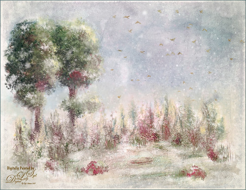
This is a pretty basic post on how to use a Pattern Fill Adjustment Layer to add some subtle detail to image objects. This may be something you are already doing, but if not, give my short workflow below a try. A Pattern Fill Adjustment Layer was used on the flying birds in the digital painting above. The birds are a free download from Cheryl Tarrant – for download link and more image details, see Image 1 info at end of blog. Bird objects work well with Pattern Fills, but any painted strokes, text or objects placed on a layer by themselves will work. Below is the quick workflow and the rest of the blog goes into more detail regarding Patterns.
Workflow for Adding a Pattern Fill Adjustment Layer
- Open up a Pattern Fill Adjustment Layer above image by going to the bottom of Layers Panel and clicking on the Black & White circle icon (fourth one over) and select Pattern (third one down). By default the last pattern in your Pattern Picker list will be selected.
- Clip the Pattern Fill Adjustment Layer to the one below by ALT+clicking between the two layers. (See below for more options.)
- Double click on the pattern to open the Pattern Fill Dialog and choose your pattern. (To add more patterns, click on cog wheel in the upper right corner – PS has packaged several sets that can be clicked on or add your own. See below.)
- Adjust the Scale slider and drag on pattern in image to get the location and size of pattern for the effect required.
- Set the blend mode and opacities for both the Pattern Fill Adjustment Layer and the object layer below.
Difference Between Textures and Patterns and Where Patterns Are Used
A little background material here so you understand what a pattern is much less how to use it in a Pattern Fill Adjustment Layer. In PS, a pattern is a fairly small file, often times repeated without edges (lots of tutorials out there on this), that can be added to an image in various ways. A texture is a much larger file usually using the .JPG file format. Textures are added in as a layer that goes over the whole image – can alter them with a layer mask and/or different blend modes and layer opacities. Since Patterns are much smaller in size, they are added to an image with PS tools, commands, layer styles or a Pattern Fill adjustment layer. Several tools have an option to add a Pattern like the Regular Brush Tool (and Stamp Tool, Smudge Tool, Dodge Tool, Burn Tool, and Sponge Tool) in the Brushes Panel Texture Section, the Spot Healing Tool, Pattern Stamp Tool, and the Paint Bucket Tool (who knew?). (Note: In the Brush Panel, the Texture section is really adding a Pattern from the Pattern Picker to add texture to the stroke.) Also the Rectangular Tool and all the tools grouped with it can use a Pattern when set to Shape – look in the Stroke drop down. The Edit -> Fill dialog with the contents set to Pattern gets some very cool pattern effects with the Script drop-down box. Layer styles using patterns are the Bevel & Emboss Texture subsection, Stroke Fill Type, and Pattern Overlay sections. Oddly enough, the PS filters do not appear to use .PAT pattern files (they use regular texture .PSD files instead). Just wanted everyone to know patterns are located in many places, and sometimes quite hidden places (and I might have missed a few), just in case a need arises and a different technique could be used.
Pattern Fill Adjustment Layer Dialog
My favorite method for using a Pattern is with the Fill Adjustment Layer. It does not have a lot of adjustment sliders (only the Scale can be adjusted but since it is its own layer, the blend mode and layer opacity can be adjusted. There is also a layer mask so the effect can be locally masked in or out. Very easy way to adjust the results. And perhaps best of all, it can be clipped (see next paragraph) to an object layer so only what is on the layer is affected by the pattern effect. That is how the birds above look like a natural brownish color instead of the original black silhouette object. Below is a screenshot of the Pattern Fill dialog that was used on the birds above.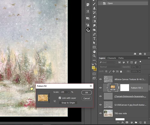 It can be seen that first Pattern Fill Adjustment Layer was clipped (the indented layer) to the birds layer. There are several ways to clip a layer, but my preferred way is to hold down the ALT key and click between the two layers to link them together. Can right click on adjustment layer and select Create Clipping Mask; or go to the Menu and choose Layer -> Create Clipping Mask; or just press CTRL+ALT+G on the highlighted layer – all work equally well.
From the latest Photoshop Manual (can download as .PDF file) search for Pattern: “Click the pattern, and choose a pattern from the pop-up panel. Click Scale, and enter a value or drag the slider. Click Snap To Origin (button) to make the origin of the pattern the same as the origin of the document (pattern opens up set to upper left corner). Select Link With Layer if you want the pattern to move along with the layer as the layer moves (moves with object layer as it is moved in the Layers Panel). When Link With Layer is selected, you can drag in the image to position the pattern while the Pattern Fill dialog box is open.” I usually just select the pattern and set the scale here. The really important thing to know is that by dragging in the image, the pattern can be moved to make it look correct on your objects if the Link with Layer box is checked. The Create a New Preset seem useless since all the patterns are already loaded.
Any color of patterns can be used (although all patterns are added turned to black and whites for the Brush Tools Texture section since brushes only use black to white tones). Using the colorful patterns can give really nice results on objects like birds or rocks or text. The one used above was included in a free Obsidian Dawn’s Grungy Dirty Patterns set which I use all the time. Some other patterns I use a lot are 10 Splatters Patterns by Idealhut and Vintage Floral Patterns by flashtuchka. I tend to like patterns that show bright colors and contrast. Also watercolor patterns are very useful. Try some of the loaded PS patterns, but I do not use them much. To add the patterns into your list, open up the Pattern Picker and select the little pop-out wheel where it says Load. Now just go to where the patterns were saved and open them up. They will appear at the end of your pattern list. Click on Preset Manager to add, remove or change the order (just drag to move) of the patterns loaded. With the Pattern Picker open, the different patterns can be clicked on and a live preview on the image will be seen. For the above the Pattern Fill Adjustment Layer Scale slider was set to 155%, then back on the actual layer, it was set to Normal blend mode at 67% layer opacity. The birds underneath were set to Normal blend mode at 45% layer opacity. The combination gave a really nice subtle bird effect.
Pattern Fill Adjustment Layer or Pattern Overlay Layer Style
There are a couple major reasons I like the Pattern Fill Adjustment Layer. The Pattern Overlay Layer Style can do pretty much everything the Pattern Fill Adjustment Layer does. But it is easy to run into problems with the other Layer Style sections that are applied on top of this section. It can block out the whole section being added. One advantage of the Layer Style is that the blend mode and opacity can be set for the actual dialog, then the adjustment layer’ blend mode and opacity can also be set. I find the Pattern Overlay section works well with text layer especially since strokes and glows can be added in easily. Note that you can use both a clipped Pattern Fill Adjustment Layer and a Layer Style on the bird layer to get extra effects. There is so much that can be done! Just remember that if you want to add a layer mask to the bird layer with a Layer Style on, be sure to check in the Blending Options section “Layer Mask Hides Effects.” Otherwise the masking will look bad.
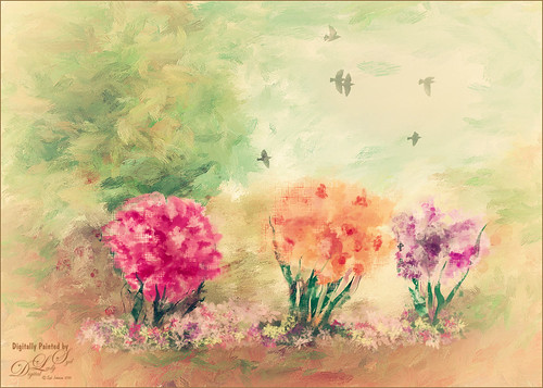
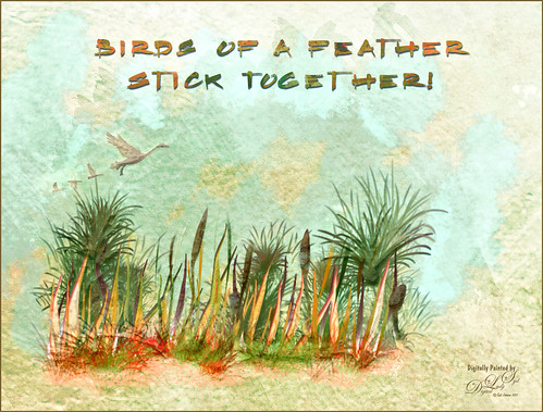 I created this image to show how both Pattern Fill Layers and Pattern Overlay Layer Styles can be combined to get a really nice effect. Several of the plant layers used Pattern Overlay Layer Styles and many have Pattern Fill Adjustments Layers clipped to them. For example, the text layer applied both a Pattern Overlay and Drop Shadow Layer Style sections and a Pattern Fill Adjustment Layer clipped to the text layer. For more info on this painting, check out Image 2 below.
How to Create a Pattern from Your Own Textures
This is probably the easiest part of this blog. I had several great textures I created and bought that would make good patterns. To convert them from a .PSD file or .JPG file to a .PAT file, go to Edit -> Define Pattern. Then name the pattern and it is placed at the bottom of your pattern list to use the next time the Pattern Picker is opened. If you are using PS CS5 or older, there is a Pattern Maker filter in the Other category that can be used to make patterns – not sure why Adobe removed it.
I hope you try this technique on your images. Adding a pattern to just a few strokes on a layer can add some real interest in an image – it does not have to be an object. I am finding I am using patterns more and more to get that extra level of creativity and blending that seems to be lacking in a lot of the original images I am seeing. Know this was a little long, but I hope this helps a little about how to do this!…..Digital Lady Syd
Image Info:
Image 1: This started out as a spring image but finished up as the Last Snow before Spring. That is what I love about Photoshop, sometimes major surprises result! Most of this image was painted in Corel Painter, but many details were completed in Photoshop. This seems to be the only way I can paint. In Painter, mainly used John Lowther’s Landscape Collection brushes along with various Karen Bonaker and Melissa Gallo brushes – all three of these people are incredible digital painters! In Photoshop, 37 layers were created so lots of different brushes went into this image. Several of Grut’s FX Cloud brushes were used along with Seishido Biz Favytunic’s brushes (can’t seem to locate them now-older brushes) and Frostbo’s Grass Set2 brushes. Also used several of Melissa Gallo’s Photoshop brushes from her video class (incredible class BTW). The snow was added using a brush created by following Corey Barker’s Corey’s Universal Particle Brush video which teaches how to make a terrific snow brush. (See my How to Paint in a Snow Storm blog.) The snow appears a lot more natural to me now. Also the birds are from Cheryl Tarrant’s Distressed+Seasonal+Flock+Birds+Brushes set – Brush 05 – some of the nicest bird brushes around. The texture used was by Kim Klassen called Cool Grunge (not sure this texture is still available) and was set to Multiply at 29% layer opacity. My basic PS workflow was followed after creating all the detail layers. Used Topaz (see my Tidbits Blog sidebar for website link) ReStyle’s White Swan Feathers preset. Nik Viveza 2 to draw in focus, and some Curves Adjustment Layers to restore contrast.
Image 2: The Birds of a Feather image was first painted in Paintstorm Studio with each type of brush painted on individual layers – the image was eventually saved as a .PSD file for more adjusting in PS. In this case 13 different Paintstorm layers were created using several of my own brushes, some Double Brushes, Pens, and Multi Brushes and opened in PS. The bottom layer was one of my watercolor textures and two Pattern Fill Adjustment Layers were clipped to it – the first a light beige watercolor pattern set to 417% Scale and Normal blend mode at 91% layer opacity, and the second a Bobby Chiu Colored Paint Texture which was created from his video Building My Favorite Photoshop Custom Brush – it was set to 1000% Scale and Vivid Light blend mode at 25% layer opacity. The birds are on their own layer from Lisa Glanz called Flying Geese (could not find the download link) with a brown watercolor Pattern Fill Adjustment Layer attached. The text layer was added with a Pattern Overlay Layer Style using a bright watercolor pattern set to 265% scale and 39% opacity and a simple drop shadow. Then a Pattern Fill Adjustment Layer was clipped to this layer using a small yellow/orange/green small print pattern set to 417% scale and a layer opacity of 78%. The last step in this image used a Kyle T. Webster layer style called Fresh Fun set to 0 Fill and painted over the plants and birds to give a little extra texture effect.
SOME OF MY FAVS FROM 2016
Thought I would do a short post of my favorite images from the last year – have not done this in a while. For more info on photo adjustments, click on the image to go to Flickr where links to the original blogs are available. Hope you enjoy my favs!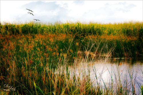 Image above is from the Viera Wetlands in Brevard County and used the Orton Effect.
*****
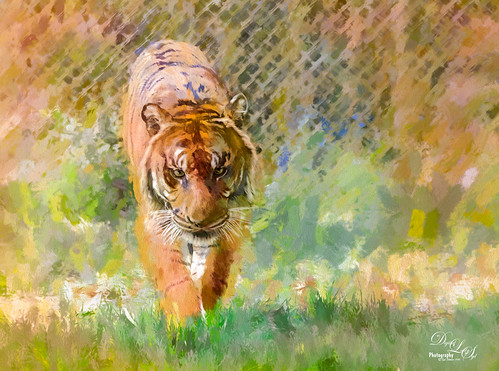 This beautiful Malayan Tiger was post-processed using the fabulous Topaz (for website link, go to my Tidbits Blog sidebar) Impression 2 filter. This is one of my favorite images created using Impression.
*****
 Image of this peach rose is one that was painted in Photoshop with the mixer brushes, and the background was created in Corel Painter – then the layers were stacked in PS.
*****
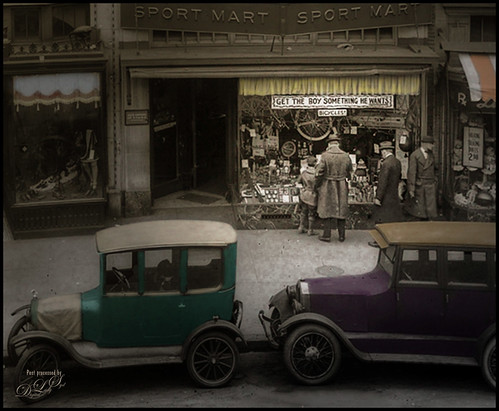 The original image was taken in Washington, DC, around 1922 was cropped and hand-tinted in Photoshop. I find it is really fun to hand-tint old images found at Shorpy.com.
*****
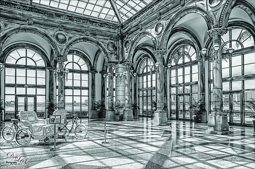 This is the Flagler Kenan Pavillion at the Flagler Museum in Palm Beach, Florida. It is one of the lightest, brightest rooms I have seen and is on the IntraCoastal Waterway. This effect was created with the no longer available Lucis Pro 6.0.9 Photoshop plug-in – too bad that in 2016 it finally became a reasonable purchase and then it discontinued.
*****
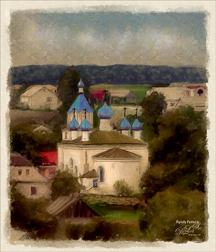 Image is of St. Trinity Church as seen from the Mir Castle in Belarus. This image was painted in Photoshop using Jack Davis’s painting action.
*****
 These three painted Florida birds are presented in a Lightroom template with the background added in Photoshop. The birds were all painted in Photoshop and the bird backgrounds painted in Corel Painter.
*****
 This image is an example of a composite that integrated several elements into a story.
*****
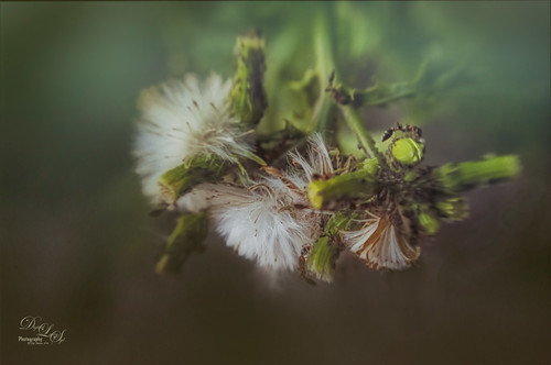 Image taken with a LensBaby Composer on my camera which gives a very lovely soft effect.
*****
 These flowers were painted in Paintstorm Studio, a really nice painting program.
Next week I plan to continue presenting all the Fun Tips and Tricks that can be done in Photoshop with a little painting mixed in!…..Digital Lady Syd
PAINTSTORM STUDIO FUN!
 Know I am taking a little time off from blogging, but wanted to share a new inexpensive painting program called Paintstorm Studio recently purchased (currently $19) that is so much fun. (Can also download to try out for 15 days.) I created a few different brushes created from viewing a few of their videos. The Help tab on the website has several at the bottom – no audio but if you watch closely, some really nice brushes can be created from them to use along with some great ones provided. Check out this 3 minute video if you are interested in what it does – Paintstorm Studio – Overview. Since I love to do flowers, it fits my painting expression very well. Used lots of layers in Paintstorm and then saved as a PSD files so they could be manipulated more in PS – they actually come in with no background layer unless you add one. Created my own background in PS using a brush made from Grut’s OI Shore Cap (check out Grut’s other wonderful brushes – look under the Resources tab for a free Brush Sampler and free Brush of the Week) and in the Brush Engine, changed the brush texture to Gauze with various texture slider changes and layer opacity of 68%. Now the strokes match the ones created in Paintstorm Studio brushes. With this brush a background layer in white was painted on a layer at 55% layer opacity with a Layer Style called Kyle’s Impasto – Just Right with the Gauze texture used to get the nice canvas effect. On a stamped layer, John Derry’s Layer Style Varnish Gloss Light was applied also with the texture changed to Gauze at 69% layer opacity.
Photoshop brushes can actually be brought into this program and many features are similar to both Photoshop and Painter. There is an application for iPads besides the stand-alone program on regular computer. Check out my Purple Flowers Tidbits Blog with another image example.
Also, if you have not heard, Google Nik Collection Photoshop plug-ins are now available for free – this is probably the death toll for these wonderful plugin – they have always been a wonderful supporter of my blog! I love the Nik Viveza plug-in – my all-time favorite. Definitely worth downloading just for this plug-in and the price is right!
Another quick link – Perfectly Clear Photoshop plug-in is offering its Perfect Exposure module for free – I tried it out this week and really like it – lots of sliders to experiment using. So check it out – again, can’t beat the price.
I will try and do some blogs on both Paintstorm Studio and Perfect Exposure as time permits. That was it for this week! Have a nice week trying out all these new things!…..Digital Lady Syd
