
CREATING GOLD USING UPDATED BETA AI IMAGES
Had to try out some of the new features in Photoshop Beta’s newest release – my curiosity got the best of me. I’m sure you have seen all the recent hype about it, and it is pretty amazing. Just thought I would show some of my results. I decided to follow Rikard Rodin at Nuckly’s video called Turn Anything to Gold – Hunger Game Songbird Snake Tutorial to do this. It is a pretty long video with some great resources, so check that out if you like this gold effect. (More on this below.) He also has some nice techniques for getting other results. Overall, a very good tutorial!
AI Impressions
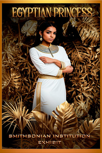
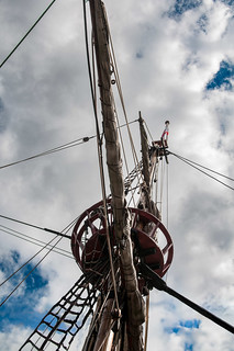
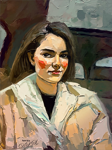
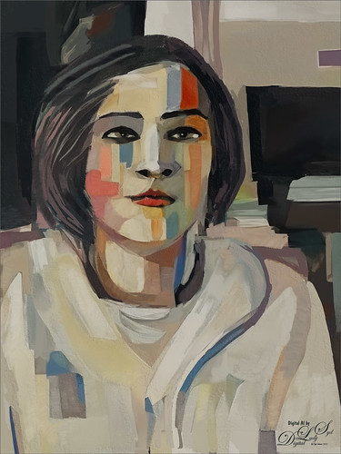
My first impression of what we are getting with Firefly 3 (they skipped 2?) is that it is really improved. People are generated much better without extra body parts. Hands can still be an issue, but they can be fixed pretty quick with the Lasso Tool and another Generative Fill layer. One of the new features involves the Generative Fill panel where using Generate Similar created the model above – it gave several model variation choices – this is found in the three dot icon shown in the different variation thumbnails. Pretty cool. The prompt to get the above princess was “image of a young ancient Egyptian princess standing.” By the way, at this time, regular Photoshop 2024 does not have the upgraded AI Firefly 3 version, but I am sure it is coming shortly. Another fabulous feature is the Reference Image section – see large ship image below that was created from the smaller ship image.

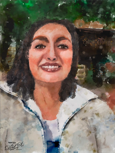
Used similar prompt in AI to get the above model image – “image of a young ancient Egyptian princess standing with arms down and gold crown and necklace.” Firefly did not do that great with the arms, but actually looked good when the whole image was turned to gold. The top model was substituted in for this one to get a little different look (had to use the Apply Image command to do this – see my Placing Any Photoshop Generative Fill Variation on a Layer Easily blog).
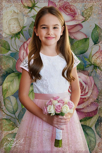
Well I do believe this little girl image below is so cute and it is totally AI generated! To me this is Amazing! The prompt used to get this Generative Fill model was “Image of a young flower girl standing at a wedding.” When I clicked the Generate Similar on this variation I got a whole bunch of the cutest kids with many wearing the same outfit! Hard to choose which to use! I also used Generative Fill to get a better rose nosegay.
A new background was needed so a New Layer was added underneath the model. In the prompt I thought I used “Rose bush with white and pink roses” but actually got “Blue bird sitting on a rose bush with white and pink roses, selective focus; flowers background for greeting card” – got some beautiful blue birds (check out the bottom pix), but not the pink and white roses I thought I would get. A Generate Image Tool created this prompt for me. It brings up all the things that are in Adobe Firefly and gives you ideas on what to put in your prompt based upon what thumbnail is chosen in the Prompt Inspiration section – lots of thumbnails and effects here. But you have to watch the prompt wording that is automatically inserted into the field when one is selected – just check the Effects Adobe used if that is all you want. Once I figured this out, the pretty floral background for this image was created. Using the Lasso Tool, her original nosegay was selected and three new ones were generated. A much nicer one is shown in the image.
Below a new image was created using this small image of the Golde Hinde crows nest (Francis Drake’s boat replica of the original from 1580 in London). The prompt used was “old seafaring sailing boat” – it generated several great looking old ships. The only thing done to this image was to expand the side to set it in the center and make the water a nice blue color. Another amazing feature!

How to Get the Gold
Starting with the totally gold image, this technique came just from Rikard’s tutorial and resources. The leafy background is in his resource file. It looked pretty good I thought. To turn it gold, he selected a Gradient Map using one of his supplied gradients. His trick he says in the video is this: “You don’t want it (the color) to go from just gold to light, you want it to go from dark to light, then back to dark and than back to light – this gives the metallic look.” Amazingly it created this fabulous gold effect! It seems you could do this with almost any color for an interesting look. There are other steps here for darkening and lightening so do watch his video. The Egyptian Princess variations were created in a different document first. The Apply Image layer of the Egyptian variation was copied into Rikard’s gold document, a select subject was executed and a layer mask was added before using the same Gradient Map gradient. In his resources there is a young model he used in his video workflow. My top image used the same steps – brought in the Apply Image layer and placed it above the background, but this time did not add the Gradient Map for the model. His resources also supplied the palm leaves png to place in front of the princesses using the same Gradient Map. Last step was to add two text layers (top font is one of my favorites – Achava and the bottom font is one Rikard suggested). Several layer style effects were added which were supplied.
How to get the gold glitter effect? Design Cuts has a set called Golden Patina Photo Effects which includes a PSD file with layers including the 3 gold textures to create this effect. Also Golden Patina Brushes are included with a couple glitter spatter brushes. Gold Texture 3 was set to 100% layer opacity and a Rose Gold 10 Paper placed on top at 38% layer opacity (paper from Creative Markets Rose-Gold Pigmented Paper by Desire Lange). Then used the supplied brushes to add a little more glitter effect – layer mask was used to remove any marks on the model. A Color Lookup Adjustment Layer was added to give a more vintage feel to the background using On1’s Spooky LUTs 17. Then just used my regular workflow to finalize the image.
Just for fun, on the AI generated bluebird image, I inserted the Apply Image bird layer for the Flower Girl (and all the associated files used with her) and played around with all the different Patina set layers. A couple Spatter brushes I created in 2018 were used to outline the bird using the gold texture and the flowers using the gold rose paper – gives a glittery effect to the brushstroke. To make a similar glitter effect brush, check out my The Bald Eagle and How to Draw One blog. A 200 Free Gold Texture from Deal Jumbo (No. 11) was used on top and set to Hard Light at 55% opacity.

Bottom Line
I have an older computer and it definitely takes longer to process these new features. I also crashed once so watch out for this. The new features are really fun but it is frightening to see how quickly AI is advancing and I still am not sure how I feel about that. The fact that these beautiful images could be created so quickly is downright scary. Well, this is definitely something to think about here……Digital Lady Syd
Related Digital Lady Syd Blogs:
How to Quickly Add a Touch of Gold to Your Text
Several AI blogs since July 2023
AN AI VENETIAN WORLD
I keep saying I am not going to do any more AI images, but then I keep trying out new things that Adobe is adding to their Firefly program to see exactly what it will do now. (Click if you want to try out Firefly – it is free for Photoshop users as the Generative Fill command is based on it.) It is really fascinating! There is a new Reference section that lets you use any Reference image to help generate AI images. Colin Smith of PhotoshopCafe fame (and AI expert) made a short video on exactly how to do this called New Adobe AI Feature Changes Everything Again. His results seemed to be a little better than mine – I found it took many iterations to get something that I liked. My feeling is that Firefly still does not create small objects that well – lots of clean up was required. I will just give you a quick recap so you can see what I mean.
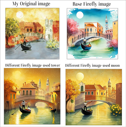
The above shows my Original image that was uploaded into the Reference section. (I am still uncomfortable using other people’s work in AI.) The prompt used to generate the Firefly images was “Venice canal with gondolier and bridge.” The Base Firefly image only used the Structure Strength at 100% and Content type set to Art. The Tower image used the Reference Structure set to 50% Strength; Content type set to Art; Style section with uploaded using my Original image again at 50% Strength; Effect set to Oil Paint; and Color and Tone set to Golden. The Moon image used the same settings as the Tower image except the Style Strength was set to 0%.
According to Colin, once a Structure image is uploaded to Firefly, a Strength slider shows up. By increasing the slider to the right, the generated result will look closer to the original uploaded image. The Strength is just picking the basic outline – the object, size and positioning. This can be seen in the results obtained in all the generated images. When Strength is set to 0, the image is not as close. Use the Styles section to change that part of the image.

Above are examples of other generated images that were not selected and used different strengths and effects. They look pretty good at a very small size, but if you look closely, there are lots of problems. One of the biggest issues with the Base Firefly Image was with most of the building windows – they were all turned different directions, were different sizes, and totally out of perspective. Had to use the Remove Tool to get rid of all but the ones I liked, and then Clone them into other areas to get a nice look. Also had to clone the posts on the bridge so they looked balanced. The gondolier’s arm was not connected in any logical way to the oar. Totally weird and this happened in most of the other generated images. Also a lot of the hats looked really strange upon close inspection.
I guess the bottom line is that this is by no means perfect yet as it appears to be in other AI programs. Be ready to do some massive clean up if using it. There were several layers of painting and cloning in my image above. And my original gondola was added with a sketch line placed around it. It was fun to see what Adobe Firefly is doing to improve their program, but it still has a long way to go. Have a good week!…..Digital Lady Syd
HOW TO CREATE A GUSTAV KLIMT LOOK
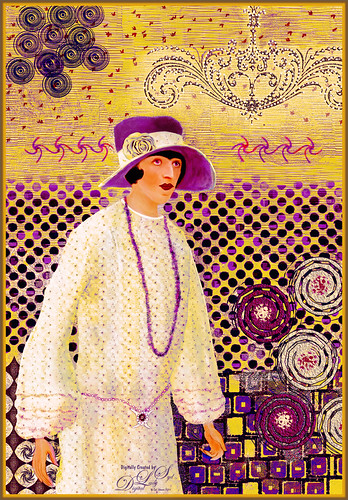
Wow! Where to start with this one! I learned so much about the 1920’s fashion era just by researching the information needed to create this fun Rebelle 7/Photoshop image. I have to thank Corel Master Painter Karen Bonaker of Digital Arts Academy (she has the best free community and classes for anyone interested in digital painting – check out its header) for suggesting to her members to try a Gustav Klimt project, using some special brushes she supplied. (Will talk about below.) I imagine almost everyone knows what Klimt images look like, but here is a link just to refresh your mind. Also, this image could have been done completely in PS if you do not want to purchase Rebelle 7.
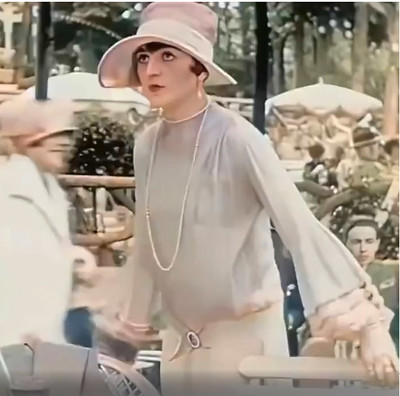
My subject’s appearance is a bit like a1920’s era Flapper with her short-cropped hair and bright makeup, but the dress, shown in the screenshot picture on left below, had long sleeves (not the Flapper’s short-sleeved look) and the fabric was very soft, flowing and elegant. The more fashionable women wore the “Great Gadsby” look based on the classic book from that time period. She is wearing a Cloche Hat worn from before the 1920’s thru 1933, which has an incredible history of its own (several are available on Amazon). The screenshot (apparently of silent movie actress Pola Negri, who had a very interesting life) was from a blurry AI enhanced and colorized vintage 1927 short video of the streets of Paris – it was up sized using Topaz Gigapixel. The sleeves on her dress were so pretty and seemed perfect for a vintage painting. In PS Pola was selected from the screenshot and placed on her own layer; flipped horizontally using the Transform Tool; Puppet Warped to get the arms right; and last, roughly sketched with Kyle’s Animator Pencil (2016) that can be loaded from PS. See sketch below on right. You can see she is not exactly like the actress shown in the video, but I wanted to keep her face and basic dress features similar.

REBELLE 7
The PS document was taken into Escape Motions Rebelle 7, the fairly new painting program that has improved so much it makes Corel Painter look pretty old school. If you watch for sales, it can be bought at a good price, but be sure to get the slightly more expensive Pro version which has all the really cool features. This program seems pretty easy to learn and has some really nice painting brushes to use. This is where Karen’s Klimt and Art Noveu brushes were useful for creating this image. First a background using the Klimt Oil brush Burnish Pattern was painted. Her Nou 3 in the Art Noveu set was used to create the circles in the upper left corner. The red scatter points in the upper area were from the Klimt Pastel Pattern brush. The Klimt Variable Texture brush at the top left was actually duplicated in PS and flipped and placed on the upper right. Since I am still figuring out the brush system, the image was brought back into PS where all my favorite painting brushes can be used on the image. But I still wanted to use some of Karen’s custom Rebelle 7 brushes in PS.
CREATING A BRUSH FROM A PNG OBJECT IN PHOTOSHOP
Since these Rebelle brush sets are basically stamped brushes, they could be converted to PS brushes by downloading her free Klimt and Art Noveu.png brushes from Rebelle’s website. Drag the brush png over to a New Document with a white background (and get rid of the Smart Object by right clicking and choosing Rasterize). Since black creates the mark and white is transparent in a brush, click CTRL+I to invert the image. If the white area is still kind of gray, just add a Posterize Adjustment Layer and move to a level where the white disappears. (Can also use Brightness/Contrast if needed.) Now use the Rectangular Marquee Tool on the png layer to select just the paint dab at the top of the png. Go to Edit -> Define Brush Preset and name. There is your brush! You can use this process on any PNGs with cool objects – just remember they will probably only make stamp-type brushes, not for digital painting. There are no settings associated with the stamp brush just made. For Klimt look, this can be very handy to use since he uses a lot of geometric patterns in his images. The brushes converted to PS from Karen’s Rebelle brushes were mainly from her Klimt set which included Variable Texture3 for the dots behind Pola and the Rough Oily brush for the little individual squares placed.
A few other brushes were also used in PS on this image. PST Twirls brushes were used for the lower right side circles and the twirls by her head (from 2006 (Wow – but Brusheezy and DeviantArt have so many – search for Twirls). The Flourish chandelier effect was created using Vintage and Grunge Element 2 by Katie Lynn (cannot find her 2017 set anywhere but there are lots of flourish brushes available also), and then I created a 12-px Hard Round White Dot brush set to 189% Spacing to add the little lights to it.
MY LADY LAYERS
The Hard Round White Dot brush was also used for the detail on her belt with a small Stroke layer style. And then just a PNG object was used for her rose on the hat from a for sale set called Anemone WC Texture Clipart by YouArtMatter. Of course all of these had layer styles or adjustments layers added to blend them in properly. This is why I have issues with the Rebelle program – it does not have all these features yet. One of the coolest brushes I have downloaded is on Deviant Art and called Pixelstains Lip Texture which adds the neat highlight to the lips. From the video you can see the dress was a plain cream colored dress – not exactly Klimt looking. Her dress was selected and put on a layer, then a Pattern Fill Adjustment Layer was clipped to the dress layer – used DCandies Luxury 3D Patterns at a Scale of 15 and set to Lighter Color blend mode at 40% layer opacity. Next a Hue/Saturation Adjustment Layer clipped on top of it (-26/+4/+19). Finally another Pattern Adjustment Layer was clipped using Resource Boy’s WC 671 pattern (a floral pattern) with a Scale of 12% and the layer set to Hard Light blend mode at 44% opacity. On top of this, another layer was clipped for creating the necklace – used Jessica Johnson’s (this PS expert has some great techniques for creatives) Floral Lace Romance Brush Var with a layer style. This can get complicated, but it is fun to try different techniques and figure out what looks good! To finish up the dress, some shadows were created to make it look like it was soft and flowing. On a New Layer Sam Peterson’s tip for adding shadows (the Layer was set to Multiply blend mode at 34% opacity) was painted on her dress and to parts of the face in shadow under her hat. (See my A Few Photoshop and Lightroom Tips and Tricks, Step 2 for info on how to do this – I really like his technique.)

Above is My Purple Lady image – it has a different feel to it but I like the color combinations. The only difference between the two images is a custom Curves Adjustment on top was set to Color blend mode to create the yellow tones (in the RGB field drop-down, individual color curves were adjusted). The above blog is basically what was done on both images, although a Color Lookup Table Adjustment Layer and a Curves Adjustment Layer were added on the top. It took a lot of time and iterations to get the look needed. If you like to try out different brushes and experiment with layer styles, blend modes, and adjustment layers, this is the project for you! Also below are various digital painting blogs I created using different painters’ styles that you might like. Hope you enjoyed a little of creative journey with this image!…..Digital Lady Syd
DIGITAL LADY SYD RELATED BLOGS:
Masked (following Mark English painting style)
How to Decide which Sketch Brush To Use (based on Francois Flameng Riviera Promenade painting)
A Few Photoshop Digital Painting Tips You May Not Know (based on Amedeo Modigliani painting style)
How to Get a Graphic Look in Photoshop (based on Impressionist painter Charles Courtney Curran Blue Delphiniums painting)
A GOOD USE FOR AI? TO LEARN PAINTING TECHNIQUES

I have been experimenting with all my AI Selfies, mainly trying to see what I like or if I like the results after painting with different types of Photoshop brushes on layers above the AI creations. This has been a hard decision for me on how to use this new technology that is getting more and more popular in certain mediums. The Adobe Firefly and the Firefly Photoshop results are great for me to learn how to use new brushes and techniques, but I do not see any real practical uses for my serious photography – except for the occasional little fixes in an image. And it does appear my AI generated Selfies do have a certain look that sort of gives away the fact an AI process was used. There are so many other expensive AI software programs creating more incredibly realistic images and it is totally hard to tell it is AI. With that said, I believe you must keep up on the new technology if you want to understand what purpose it will have in your own creative expression. Hence my Selfies and what I am learning.
At this point, I am only creating with Adobe AI and using their results to learn how to paint trying different art mediums, hopefully leading to my own original works down the road. Therefore I am displaying a couple more Selfies (since it is my photo, I do not have to worry about who work it is). But first I want to share the info in the Note below that caused me a lot of confusion when generating AI images using less than 100% of the image (which you have to do to get any good results) when I began using all the different processes to do this.
NOTE: This is important to know when using different amounts of the Brightness setting! If you get reverse results (in other words, set to 80 and the image is wild looking instead of somewhat close to normal looking), go back and double click on the Quick Mask to open the Quick Mask Options Panel and change the settings to the other choice. For example, when using Dr. Brown’s action (I do like the fact that his action creates a new document for his AI results – check out my Dr. Russell Brown’s Painting AI Action Set to download) or Unmesh Dinda’s technique (more on this below), Quick Mask needs to be set to “Mask Areas.” You will know if you have it right if at a Brightness of 80, the foreground swatch looks light gray. When using Dave Kelly’s action, it needs to be set to “Selected Areas” (he tells you that in his YouTube text where the link for his action is located. I find this all very confusing so just beware of this.
The top Selfie was created using Dr. Russell Brown’s Painting AI Action set to Pencil Sketch and using the 60% of original action variation group. There were all kinds of variations created, some really strange, but in the middle of the batch, a halfway descent version showed up. Not sure it was really a Pencil Sketch look, but a nice variation for a starter Selfie image. See small image below for the variation. For this image Kyle’s Real Watercolor Detail brush set to Normal brush mode was used a lot. A Mixer brush was used to smooth the face somewhat and the hand had to be reconstructed using the Detail brush and the SJ 36% Blend for face from Grut’s Late Never brush (for settings see my A Few New Selfie AI Tricks blog at bottom – this brush is indispensable for me and the Selfie images). Then the image was opened into Anthropics Portrait Pro. I had never used this plug-in before, but it really gives some interesting results. My Selfie looks like she came right out of the Barbie Doll Collection??? Plan to do a review when I can. Really a lot of fun to use but probably does not work with most artistic media Selfie faces!
For the image above, instead of using Dave Kelly’s action, Unmesh Dinda’s Technique was used – see his Shorts Video Turn Photo to Painting with Generative Fill in Photoshop on YouTube. (If you understand the HSB Brightness concept, he changes the B amount set to 43.) The image above was a bit of a surprise to me when it showed up as a watercolor variation of the Selfie image. In this case, only the Selfie original subject was selected using the Quick Selection Tool to remove the background before applying the Generative Fill command. You can see this in the original variation shown below.
It took several Generative Fill iterations – this time just the prompt “Watercolor” was used for this portrait image. The background was selected, and instead of creating a Firefly AI background, the watercolor trees and flower were from the Let’s Travel Watercolor Set. The Watercolor brushes used on this image were Kyle’s Real Opaque Square, Diluted 90, Watercolor Eraser, and Wamazing-Basic – all in his watercolor set that is free with Photoshop (download from Brushes Panel Hamburger icon and select Get More Brushes).


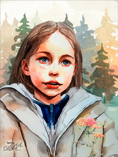
******
This is another variation from the watercolor generated group and used the child image’s process. The background was changed somewhat. See below for original variation result. A second Generative Fill layer was used to replace the squinty eyes (used prompt watercolor eyeballs). Only one eye in the variations looked good, so it was duplicated and flipped, painted over somewhat, and the eye reflection was clone stamped back in (and the Blur Tool was used on the eyes to soften the lash edges). My favorite brush for this image was Kyle’s Real Watercolor Stain Damp Paper 3 which was used to clean up the background on her coat. When doing a special type of Medium, in this case watercolor, I make copies of all the brushes being used for the Selfies so they are all together to use on other Selfies – and often I save the brush to the size I like and not the default size of the brush. The fonts, which work together, were Style Casual and Style Endings with a colorful Pattern Overlay Layer Style over it.
******

The image above used Dave Kelly’s Painting 40 action on the Selfie (Quick Mask needs to be set to Selected Area) – then in the Generative Fill command prompt, typed “Cubist Portrait.” This did not turn out quite like a cubist image, but overall it has an interesting quality to it, so it made a pretty pleasing Selfie effect. The hair was created using Kyle’s Paintbox-Bristle Supreme from his Megabox. The dark lines were created using the Staccato Ink brush from Kyle’s Winter 2024 set. Below is the original variation used to start this creation. Not as much was done on this image as on some of my others. This image mainly used these brushes: a 4-pixel 80% Hard Round brush was used for all of the glasses – this brush is so handy since it gets into tiny areas easily. If made a little larger, it can be used to give really sharp edges like lot of the Cubist images have. A regular Chalk Brush was used to make the background more solid.


Below is a slideshow of several of my recent Selfies that were posted up on my Tidbits Blog (click at top of blog for link where more info is provided on each) and on Flickr in case you missed them.


As a review, once I find a variation to use, I create a New Layer above and go to Image -> Apply Image to place the variation on its own layer. To put this layer in a New Document, right click and select Duplicate Layer and in the dialog drop-down menu, change the Destination Document to New. I save it now and use this file for doing changes and painting to the variation. (The default is Merged. If just a simple change was done, like some eyes created, they can be put it on its own layer by creating the new layer and selecting the “eyes” AI layer in the drop-down, not New – just the eyes will be on the new layer in the original file.) Still have all the other variations in my original file in case I want to use them later or want to generate more variations. The ones that are bad are always deleted.
These are really fun to do and it is a great way to learn how to use all the great Photoshop brushes available, even just using Kyle’s that come with Photoshop. If you have any questions on how to do this, feel free to leave a comment. I am always trying to improve on the process. As far as the AI goes, I am still a bit “on-the-fence” about it, but by using it, you start to learn the power it has. Have a good day!…..Digital Lady Syd
MERRY CHRISTMAS!

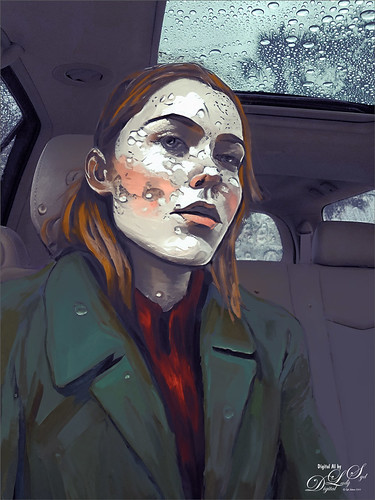
Digital Lady Syd here wishing everyone a very Merry Christmas and Happy New Year! Time to enjoy yourself before getting back to business! My AI selfie above seems to be a bit on the serious side, but I complement her on wearing a lovely green jacket for the season!
Won’t go into a lot of detail with this blog. If you want to see the process being used, just check out several of my last blog posts or go to my Tidbits Blog (click at top of blog to link to it) for more on the brushes and some tips used. Still a learning process but it has been fun! Give me a comment if you have any questions on how to do this.
I will just add a couple things. The background was actually created in Adobe Firefly (free to us Photoshop Creative Cloud users). It gave this really wintry scene (prompt used was Fir tree with snow outside) – just brought into PS as a jpg to use for the background layer after selecting the subject from the original car interior background. I do believe you get different AI looks in Firefly. The subject was generated using the prompt “digital oil painting” for a change – the paint strokes are not quite as heavy as what the “oil painting” prompt gives. Painted her face with Kyle T. Webster’s new 2024 Winter Set Thinner Oil brush (download from the Brushes Panel’s upper right hamburger icon and select Get More Brushes – new set at top of his page). Also used Kyle’s Great Paint brush from his 2023 Fall Set (at end of Kyle’s brush download page).
I am wondering what my selfie will be doing for 2024!…..Digital Lady Syd
A FEW NEW SELFIE AI TRICKS
For a few weeks I have been working hard on getting an AI generated effect I like. Still using my same selfie image from previous selfie posts which has helped me figure out what works and what does not on AI portrait images. All of the selfie variations were created by using a prompt “Oil Painting,” but some had more specific information added to the field. This image uses the same brushes (I relisted them at end if you want to see them along with a new Smudge Brush.) Below are the steps that work really well to get some interesting portraits to paint.
Steps for Creating Portraits From Selfies:
- Open selfie. If you want the person to be generated, after you run Dave Kelly’s free Gen Fill Photo Painting Action (usually set to GF Painting 40 for the effect shown in my selfie images – really need to use Dave’s action as it is so easy to use and be sure to try his different Brightness amounts), the selection is the whole image.
- To get a good portrait result, need to either go to Select -> Subject and OK to discard your current selection, or use the Quick Selection Tool or the Lasso Tool to subtract from the selection to get just the subject selected. Run Generative Fill and look at your variations. Can Generate as many as you want.
- Choose a variation you like and run Apply Image (add New Layer and go to Image -> Apply Image and OK) to put it on a new layer. See my last blog Placing Any Photoshop Generative Fill Variation on a Layer Easily.
- For creating a background, in the Generative Fill taskbar select Subject and Invert Selection – in prompt field type what text for type of background wanted. Can change the prompt to read anything and use any type of style. The prompt used here was “oil paint snow scene.”
- Create another Apply Image on a New Layer placed above this layer to create one with these variations merged into one layer.
- Turn off all but the top layer so the brushes used to clean up the image will work faster. On another New Layer above just start painting and have some creative fun!
Some Selfie Tips
- If you want to use Generative Fill to change something like her lips, which were changed from the original variation on the above, select around the lips with the Lasso Tool and run Generative Fill – the prompt used here was “oil painting lips” and three variations appeared. Add a New Layer above for another Apply Image layer, but this time instead of using the default Merged Layer, open the drop-down and select the Generative Fill lips layer. The lips will now appear on its own layer and can easily be manipulated. In this case the lips were reduced a little in size, and a layer mask was applied so just part of the new lips were added into the image. Be sure to turn off the Generative Fill lip layer to work on the Apply Image lip layer. Used paintbrushes on another New Layer above the lips to blend everything together.
- Another really great tip for cleaning up these AI images, which usually have strange things going on in certain areas like the face, is to use Photoshop’s Liquify filter. This image used the Face-Aware Liquify section for the jawline to make it a little less harsh and on the nose, and the Pucker Tool to adjust a little from her ear. This is so incredible!
- It is easy to add jewelry to your subject – just make sure you have a Lasso selection exactly where you want the jewelry to be added. I had trouble getting her necklace to look straight on this image – AI kept making it squiggly. Finally got a selection to fit properly. Used in prompt “oil painting diamond pendant,” and for earring used “Oil Painting Earring” – neither is exactly what I had in mind, but they look pretty good.
- One last thing, 5 AI Generations were run on this image – background, lips, nose, pendant, and earrings. In all cases, an Apply Image was created (just highlight right above the generative fill layer with the correct variation showing), and the original AI generated layers were placed in a turned off group (might want to use a different variation later or rerun the Apply Image if you really mess up the image). Only used the Apply Image layers as the working layers.
- When painting, be sure to go between the regular paint brushes, Mixers and Blender brushes, and Smudge brushes. I am constantly going back and forth. I have my Mixer brush set to A and Smudge Tool set to U in the Keyboard Shortcuts so I can flip between them quickly. And if a brush does not look right, change some of the settings like the spacing or the Angle Jitter Control or Scatter Amount. If you like the brush, just create a brush preset in the Brush Panel.
To finish off the image, just used my regular photo workflow: Black & White Adjustment Layer, Color Lookup Adjustment Table using 3D Lut File FoggyNight from PS at 55% layer opacity, and a Curves Adjustment Layer. The Snow Overlay is from a free set I created at deviantArt – PNG files so no blend mode needs to be used, just adjust the layer opacity (50% here) and use a Layer Mask to remove snow off certain areas with a brush.
All these images were created from my same selfie image and I keep going back to it to run more variations. Once you find a good selfie to use, it seems logical to use it as the template for other images. Hope this blog made this seem a little easier – it is really fun to do!…..Digital Lady Syd
Painting Brushes I am Using for these Selfies.
Using mainly five brushes:
I like Kyle’s new Fall 2023 brush Great Brush (changed Flow to 54% and Smoothing to 12% in the Options Bar) using a small size for adding clumps of color.
Grut’s Watercolor Late Never brush modified to work as a regular brush blender – works fantastic (here are the settings if you want them: I call it “SJ – 36% Blender for face-from Grut-W Late Never.” set brush in the Options Bar to Size 35 pixels, Mode Normal, Opacity 36%, Flow 100%, Airbrush icon off which is the Buildup in Brush Settings Panel. Then in Brush Settings Panel set Shape Dynamics Size Jitter 0; and uncheck Buildup (should be off if Airbrush icon off in Options Bar) and Protect Texture (not sure why this is even on). I have several variations of this brush, but this one is best for blending, especially with the Great Brush – just sample and blend between colors to smooth them out.
David Belliveau’s free Mixer Blender at 15 px
Fay Sirkis Mixer brush called Short Streaky Detail Blender (not sure it is still available anymore) – any small detail brush mixer would probably work to get the hair look.
Smudge Brush was created using Kyle’s All Purpose Blend Smudge Brush and turning off the Spacing in the Brush Tip Space Brush Settings Panel, Shape Dynamics (no Size Jitter and Control for Size Jitter), Angle Jitter set to 3%, and Angle Jitter Control set to Direction; Transfer checked with 0 Strength and no Control; Noise checked, and in Options Bar Strength set to 92%, and Sample All Layer (check or not) – I named this brush SJ-Painterly Smudge Brush and used it on the background. The cool thing about this brush is that if the ALT key is held down when starting to blend, the Foreground Color appears – this is great for adding in a little color to accentuate the blending. Used this brush to blend some of the harsh lines created in the background on the above.
Related Blogs of Digital Lady Syd
PLACING ANY PHOTOSHOP GENERATIVE FILL VARIATION ON A LAYER EASILY
Just wanted to blog out another pretty cool Photoshop AI trick so that you can work on numerous variations at the same time in the same or in different files. Learned this from Aaron Nace, another really great Photoshop guru that always has lot of tips and tricks to share.
Once you have run the Generative Fill command in Photoshop, there is a way to add each variation onto its own layer and it very simple.
- Highlight the variation you want to place on its own layer.
- Create a New Layer above the Generative Fill AI layer and highlight it.
- Go to Image -> Apply Image. Just use the default settings. Okay.
Now the variation is on its own layer. As long as you have the variation you want on its own layer showing up in the Properties Panel, an image can be made quickly and you can make several layers from the same Generative Fill variations.
This can be very useful, especially if you want to combine two variations into one image. Sometimes you like a sky area in one variation but not the foreground for example. Just run this for each variation and you will find a new layer for each variation in your Layers Panel. Just add a layer mask to one and remove what you do not want to see. And you can put your main subject into different backgrounds by selecting the subject and inverting it – then run all kinds of backgrounds and having different files to put in a screenshow. That is what Aaron did.
The girl above is another variation from my selfie image (Dave Kelly’s free Gen Fill Photo Painting Action set to GF Painting 40 and Generative Fill Prompt: Oil Painting). Put her on her own layer – then created a New Document to do my painting and adjustments to the image. Used four brushes – two Regular brushes: I like Kyle’s new Fall 2023 brush Great Brush (changed Flow to 54% and Smoothing to 12% in the Options Bar) using a small size for adding clumps of color, and Grut’s Watercolor Late Never brush adjusted for smoothing like on her face (for settings, check the Brushes Used on These Images at the end of my Creating an AI Selfie? blog – also more variations from this same selfie image).; and two Mixer Blenders: still using David Belliveau’s free Mixer blender at 15 px, and an older Fay Sirkis Mixer brush called Short Streaky Detail Blender (not sure it is available any more) – any small detail brush mixer would probably work to get the hair look. It is important that you find a few brushes to use for painting clean up on these AI files – they generally are pretty rough.
Well, this was short and sweet but I thought it might be useful to you when trying to figure out how to be creative with this new AI capability. …….Digital Lady Syd
Digital Lady Syd’s Related Blogs:
CREATING AN AI SELFIE?
Just had some fun this week – thought I would try Photoshop AI’s Generative Fill on an old selfie pix taken inside my car while it was raining really hard. I also took some texture images of my moon roof with the water drops on it. Dave Kelly’s Gen Fill Photo Action Painting using GF Painting 40 was applied to all the images and then the Contextual Task Bar Generative Fill command using the prompt “Oil Painting” was applied on the first three images and “Cubist Portrait” on the last one. The GF Painting 40 action means that 40% of the image is rather abstract while the GF Painting 80 action gives a more realistic effect. I think using this action is the easiest way to get good results when using the Generative Fill Command. (To get links for action and info about it, go to my short Tidbits Blog Older Woman of Another Generation.) Got lots of variations – some good and some not and sometimes my white coat showed up in a variation. For the image above called Raining Tears, the raindrops appeared on the subject and her coat which I thought was pretty cool!
For the above which may be the closest to my actual selfie (well she is a little younger but she has my coat on!), the subject was selected by removing part of the GF Painting 40 action selection (note Dave’s action selects the whole image for setting the brightness in Quick Mask Mode), so the Quick Selection Tool with the ALT key pressed was used to remove the background area from the prompt requirement. With the selection still active, the prompt “Oil Painting” was entered in the field. The interior of my car from the photo was left intact while the subject was oil painted. Felt the background was too realistic, so turned off the subject AI layer, highlighted the original selfie layer, and ran the action again applying GF Painting 80 – then ran the Generative Fill command with the “Oil Painting” prompt. Chose a variation and just turned on the top original AI layer – now had two different strengths of oil painting in the same image. BTW, used an oldie but goodie filter, Topaz Lens Effects applying the Gold Left Reflector preset and the Plush Rose Vignette preset at a 12% opacity – gave a nice warm feel to the image. The brush for clean up was my SJ New Chalk Brush (see settings below).

This image was actually a different variation from the top Raining Teardrops image. Only this time the background was selected, just like it was done in the second image, but cleared so a texture could be added. This time a texture was made using the Stamp Tool for the background. (See end of blog on how to do this.) Used all brushes but the chalk one listed at end. The ear lobe was selected to create an earring using Generative Fill with the prompt saying “Oil Paint Earring.” Otherwise the same workflow.
Played action Dave Kelly’s GF Paint 40 and used Generation Fill prompt “Cubist Portrait.” Ran several times but ended up with this variation created in the second generation effort. It did pick up my white jacket also. An Impasto Layer was used to add a touch of texture in the paint strokes on a separate layer and a scatter brush was used to paint over it. (To learn how to do this, check out my older but still good Fun Photoshop Blog and video called How to Create an Impasto Layer Style.) Also painted with a flat square brush areas that had too much impasto on a separate layer above.
As promised, keeping it short. It was fun to try this just to see what it does. As you can see, they are not exactly your image unless you use a very high amount with Dave’s action. It was kind of a crazy but fun thing to do though! Have a good one!…..Digital Lady Syd
ADDITIONAL INFO
Brushes used on these images: And there was a lot of digital painting done using a couple major brushes – Kyle’s Great Brush from his Fall 2023 set (this brush is really great so download it from his “Get More Brushes” link in the Brush Settings hamburger menu); and Grut’s Watercolor Late Never brush that I modified to work as a regular brush blender – works fantastic (Here are the settings if you want them: I call it “SJ – 36% Blender for face-from Grut-W Late Never.” Changed Grut’s Late Never brush in the Options Bar to Size 35 pixels, Mode Normal, Opacity 36%, Flow 100%, Airbrush icon off which is the Buildup in Brush Settings Panel. Then in Brush Settings Panel set Shape Dynamics Size Jitter 0; and uncheck Buildup (should be off if Airbrush icon off in Options Bar) and Protect Texture (not sure why this is even on). I have several variations of this brush, but this one is best for blending, especially with the Great Brush – just sample and blend between colors to smooth them out. Second image brush was just a the Legacy Default Photoshop 36 pixel Chalk brush with a some extra settings: Brush Tip Shape – Angle 15 degrees; Shape Dynamics – on a variation the Angle Jitter Pen Pressure is set to Direction but the main brush has no settings here; Texture – pattern called Pretty Actions Antique but it is basically a medium gray and white marbled look, Scale 87%, Brightness -35, Contrast 75, Texture Each Tip checked, Mode Multiply, Depth 70%, Minimum Depth 63%, Depth Jitter 90%, and Control Pen Pressure; Dual Brush set to Color Burn, Brush Tip oval shaped, Size 200 px, Spacing 29%, Scatter 11%, and Count 7; and Transfer – Opacity Jitter 100%, Control set to Pen Pressure, Minimum 0%, Flow Jitter 0%, Control set to Pen Pressure, and Minimum 0%. (This is a really nice painting brush.) For third image Kyle’s Munch Medium brush was used on the face. The Edvard Munch seven brush set first appeared in 2017 in a 4-part video series called Get Started with Digital Painting Photoshop – they are not part of the PS2021 brushes, but are a free download here at the Adobe Creative Cloud.
Creating the Pattern for behind the 2nd image: First added a new layer, selected the Pattern Stamp Tool and used a brush I created a long time ago called SJ FrenchKiss-Tableau Mirage. (See my older Fun Photoshop Blog How to Paint with a Texture Brush from Your Image with video to show you how to create a brush from any texture.) Obviously French Kiss‘s Tableau Mirage was the texture converted to a brush and made large – 3000 px. I use it all the time for this type of background. On this image Jessica Johnson‘s The Masters Palette Pattern TM103 was selected and just stamped once in blue (note it is not totally opaque) – it can be placed in different places and select different colors for the texture wanted. (Jessica is definitely the Pattern Stamp Queen of Photoshop and has some great ways to using it.) Next created another New Layer and used the same brush with a brownish color and selected a stamp pattern in same set called TM142 – this causes some of the blue to show show through from TM103 but uses the main color light beige color from TM142. Don’t have to use the Pattern Stamp Tool for this.
RELATED DIGITAL LADY SYD BLOGS:
Placing Any Photoshop Generative Fill Variation on a Layer Easily
DRAWING CARTOON DOGS FOR FUN
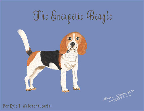
Decided to write this blog just because it has been so much fun creating these dogs and I wanted to share how to do this. I think most people will be able to get some nice results very easily even if you do not do much drawing. Kyle T. Webster’s YouTube video called Digital Drawing Workout: Drawing Dogs with Custom Brushes was used as a guide for creating all these dog images. The brushes in the video are all ones Kyle created – I copied each brush into a Photoshop Brush Dog Group in the Brushes Panel so they could be found quickly while drawing. Also added other relevant brushes (see end of blog for more on this) and some variations of Kyles’s brushes that helped create some of the dog differences.
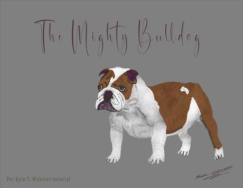
These dogs all followed the steps Kyle discussed in his video. The first step is to find an image of the breed of dog to use as a reference for starting your drawing. All the blog images contain a rough drawing layer that used his Megapack->Inkbox->Kyle’s Inkbox-Brush Beauty brush set to 25% Smoothing in the Options Bar for sketching. (If you do not know where to find Kyle’s free brushes for Photoshop (and Fresco), open the Brushes Panel and click on the upper right hamburger icon drop-down menu – go to Get More Brushes – log in if needed. There you will find for free all of his over 1000 brushes in different sets for download.) Brush Beauty actually worked pretty good so it was used as the sketch brush for all my images (saved it as a preset brush variation). After sketch layer is finished, the Lasso Tool was used to select the whole dog – could use any accurate form of selection. The dominant color of the dog, as shown in my rendition of his demo Greyhound dog below which used white, was painted inside the selection using his Spring 2022 set’s Chef Maltese brush – it adds great texture (and Kyle says to adjust the Brush Settings Panel Color Dynamics Brightness Jitter slider for even more texture)! For the other paint and detail layers, be sure to clip New Layer (ALT+click between your New Layer and the solid paint-filled dog layer) so paint strokes do not go outside the edges when adding the new paint colors. The Woodchop Joey brush (really like this brush for the dog coats) was used to paint in the darker tones and pinks in the Greyhound below. The brush was set to 50 pixels (and saved as a brush variation preset) and used as a detail brush on some areas. Woodchop Joey was also used on the Bulldog above. The shadow areas on the Bulldog used the Megapack->Kyle’s Drawing Box->Kyle’s Drawing Box- Graphite-Control 2 brush with tones of gray. The Spring 2022 set’s Suavy Inky brush was selected for both of these dogs to paint in the dark details. The Beagle used the Chef Maltese brush for painting the dog selection in white, Kyle’s Real Watercolor set’s Warmazing Extra Rough brush for the color areas, and Suavy Inky for details, .

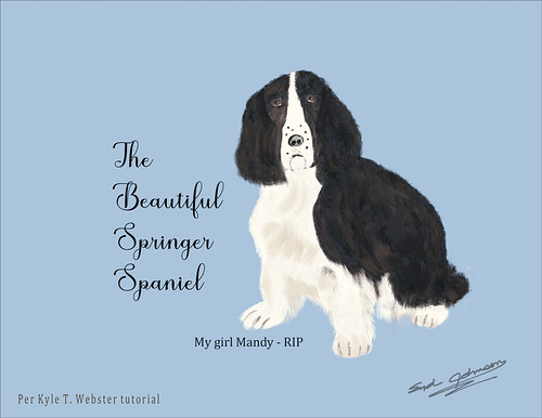
As you can see, pretty much the same brushes for these smoother haired dogs. All the images are shown without the original rough draft layer showing. Had to put up an image of my darling Springer Spaniel I had for many years. Pretty much the same process – white used to paint in the dog selection using Chef Maltese brush, and the dark areas used the Woodchop Joey brush at both large and small sizes. Kyle’s Megapack->Paintbrush->Kyle’s Paintbrush-Bristly Fat Flex was used on her face and a small dotted hair brush to get the hairy edges on the dog coat.
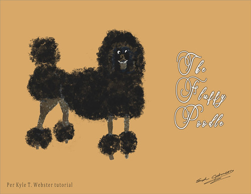
Kyle made a white poodle in his video. He used a brush from his Spring 2020 set called the Bouquet 1 brush which created the great big puffs of hair, and by sizing the brush down gives the smaller puffs. My Poodle used Woodchop Joey for the legs and some of the browner colors in the face. Also his Megapack->Drawing Box->Kyle’s Drawing Box-Pastella Brush was used to fill out the hair.
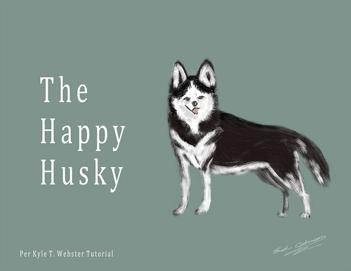
For the Husky Dog the brushes he suggested using were Kyle’s Paintbox-Bristly Fat Flex brush and Megapack->Drawing Box->Kyle’s Drawing Box-Conte Crayon – he did not get this dog done but I finished mine. The drawing below is my rendition of Kyle’s Sheep Dog that followed his video instructions – not exactly original but I liked the way he turned out. Kyle used a really odd brush called Geobot 1 from the Spring 2022 set – all drawn on one layer (over the dog selection, lock the transparency of the layer (the \ key or press the first icon next to Lock in the Layers Panel) and paint with this brush, just sized down the brush for the face area. Can turn on and off the transparency of layer to get the correct edges. If using a tablet, use lighter pressure along the edges and try using different sizes on different parts of the dog.

For more brush choices try downloading from DeviantArt this free set of brushes by Coyotemange called Wildlife Texture Brushes – they are great for painting in missing areas of fur on all kinds of animals and birds. By making them smaller, nice sharp edges can be made. I have used these brushes for all kinds of animal images – by adjusting the color dynamics, size, angle, etc., almost every kind of fur can be created. And be sure to save any variations you like as new brushes by clicking on the plus icon at bottom of Brushes Panel. Also, when finished with your drawings, save the Dog Group as a set by highlighting your dog brushes in the Brushes Panel; then go up the hamburger icon drop-down menu again and choose Export Selected Brushes option to copy the Dog Group brushes as a set to your computer in case you accidentally delete it.
Well I hope you enjoyed this blog – it was so much fun to do and pretty easy. Give it a try even if you are not the greatest drawer. Especially fun if you like dogs which I do. It felt good to write about something different from the Photoshop Generative Fill AI feature! Have a good week!…..Digital Lady Syd
Related Digital Lady Syd Blogs:
Drawing Head Images from Random Brushes
A DAY TO NIGHT QUICK CHANGE
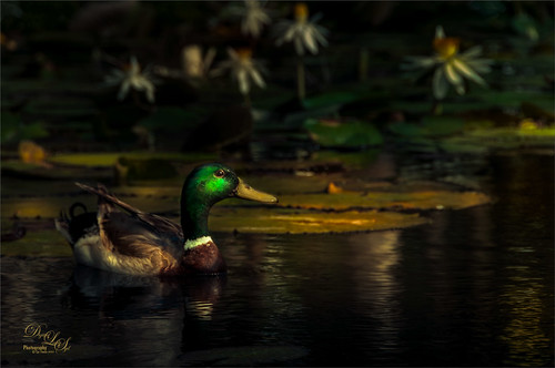
This beautiful Mallard Duck is the major patrol guy at Ames Park in Ormond Beach, Florida. He is totally responsible for watching the goings-on at several lily ponds – very busy! Had some fun with this one as the image was actually taken on a sunny bright morning. Thought I would share how to change an image into night without a lot of work.
The first step was to get the dark but natural effect. In Lightroom (or ACR) to get the evening effect with Serge Ramelli’s American Night Darker preset (preset is from 2019 and has been called the “Harry Potter Effect.” It can be created by following his video called Lightroom Tutorial Dark Moody – Day to Night “American Night” It was used to set some lighting effects on the duck and lily flowers in the background. That is all that was done in Lightroom.
In Photoshop a New Layer was made to add in the glow effect to the duck and water shadows. Etherington Brothers‘s info sheet called How to Think When You Draw – Atmospheric Glow Tip by Steve Stark (not sure how to link but it was in their X Feed of September 13th) was used to paint in more glow on the duck and the water shadows. This involved setting a New layer to the Color Dodge blend mode. Select a soft 20% opacity brush for painting with a yellow color where the glow should be added – then open the Layer Style and uncheck Transparency Shapes Layer. Voila! This creates a really nice soft glow that can be reduced by just changing the layer opacity.
Created Highlights and Darken layers using Sam Peterson’s technique (see my Fun Photoshop Blog A Few Photoshop and Lightroom Tips and Tricks – No. 2).
Applied a Linear Gradient Fill Layer using the 18- washed_away_art preset (a brownish to gold gradient from 2015) set to Soft Light blend mode at 49% layer opacity. Used Blake Rudis’s High Pass Sharpening Action and painted in the layer mask on just the duck mainly (see his video for getting the best detail out of a photo – it is called Don’t Use Clarity – Use This Instead). A Color Lookup Adjustment Layer using an On1-Heat Wave LUT (yes, they can be used in PS) was applied. Viveza II (still my favorite filter) was opened to adjust the color tones – new version of is linked here. Last step was a clean up layer.

This image taken at the Hilton Waikoloa Village on the Big Island in Hawaii is another example of creating a night effect from the day. Not sure this sculpture is one I particular love, but he definitely stands out when walking a little path around one of the hotels. The same workflow as for the duck was used with a few additions. A Color Balance Adjustment Layer was added to make the sky appear more like evening – mask used to just target that area. Also at the end two spotlight layers for lightening and darkening the image were used (see my blog called How to Add a Spot of Light).
Hope you get a chance to try a few of these techniques. I really like Blake Rudis’s High Pass action – it is updated from his first one from several years ago. Also the Atmospheric Glow trick is really nice and gives a nice quick pop to objects in an image. Have a good one!…..Digital Lady Syd
Related Digital Lady Syd Blogs:
MY FLY DUPLICATED ITSELF IN PHOTOSHOP AI!
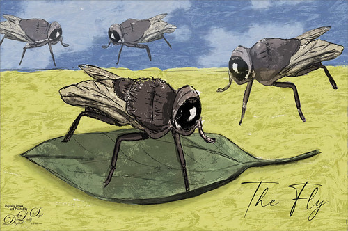
While watching all kinds of sports shows today, I decided to try drawing a fly using an info sheet called How to Think When You Draw – Flies – Part A by the Etherington Brothers (there is also a Part B). If you want to hone your drawing skills, these guys are the ones to help. They have info sheets on all kinds of things. It was fun to just draw something I had never tried before.
To began a rough and final draft layers were drawn of just the foreground fly using Kyle’s Animator Pencil 2016 in his Megapack Drawing Box. On a new layer under the final draft the color was added – used Kyle T. Webster’s Chef Maltese brush in the Spring 2022 set for all of the fly.
Below the fly the sky and ground were painted in using Darbuka Painter from Kyle’s Turkey Syria set (this was a set he sold for the Covid Relief effort in India). Used Aaron Blaise’s free Cloud Brush for the clouds.
Drew a leaf under the fly using the Animator Pen and colored it in with Woodchop Joey from Kyle’s Spring 2022 set also. A Drop Shadow Layer Style was selected to add some depth to the leaf (brownish sampled color, Opacity 41%, Angle 24 degrees, Distance 42 px, Spread 29%, and Size 144 px). This is all pretty standard drawing stuff!
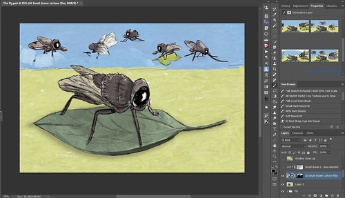
Then I decided to add some more flies into using Photoshop’s AI so a stamped layer was created on top (CTRL+ALT+SHIFT+E) and duplicated (CTRL+J). Using the Lasso Tool, the sky and side areas were selected to indicated where the flies should go while being careful not to include my own drawn fly. In the Generate Prompt box “Small drawn cartoon flies” was typed. After generating, three more versions of my own fly appeared (see screenshot below as an example) – AI used my own drawing as the basis for the additional AI flies in the image! I was totally surprised! Apparently it will take your own design and add it back in. A second Generate was done and different configurations of my flies appeared! The image was taken into the Photoshop Beta just to see if this was a fluke and it also generated more of my flies! Thought this might be something you would find fun to try since it does not seem obvious it will do this, and it definitely can blend the new subjects into your design nicely.
I did not like the extra parts that were added into the image, so this time I duplicated the original AI layer and turned it off in case I messed up the image. On the copy where I wanted to apply the Layer Mask, it is grayed out. To make it work, the layer has to be rasterized first and then the Layer Mask can be applied. The Lasso Tool was used to select around the new flies and inverted so the background could be removed using CTRL + Backspace. Used the Eraser Tool to clean up round edges from the selection. A new layer mask was added and the Gradient Tool was applied to soften the flies in the background. A Color Lookup Table Adjustment Layer (Photo Focus-Joel Grimes Indian Summer preset from an older Luminar Set), a Black and White Adjustment Layer set to Luminosity blend mode (see my How to Use a Black & White Adjustment Layer to See Contrast in an Image blog), and a Curves Adjustment Layer were the final steps (see Denny Tangs Tone Chart Photoshop Action – an oldie but goodie but has made a huge difference in my images for years). The text was called Modernline.
Hope you enjoyed this little AI discovery I made – sort of not what I expected! And I hope you are giving the new AI feature a try – it is a lot of fun!…..Digital Lady Syd
DR. RUSSELL BROWN’S PAINTING AI ACTION SET

The above is what a change you can get with a stock image of horses using Photoshop’s Beta AI. The image was from Unsplash called Horses in Iceland by Alex Iby (can’t seem to find it on Unsplash anymore but here is a link to where it was used on a website). Dr. Russell Brown (this guy is one of the genius’s at Adobe – he has always had the best actions and panels for use with PS) created a free action set called Generative Fill Painting Action that can be downloaded at his YouTube short video site. The actions create artwork from a photo using either a Cartoon Vector Illustration, Oil Paint, Pencil Sketch, or Watercolor action. The action generates in a New Document style variations using 40%, 50%, 60%, 70%, and 80% of the original image – needless to say the 70% and 80% look pretty bad – you can delete these layers later if you do not like them. All you have to do is highlight your image layer and run the action – that’s it. Dr. Brown’s Pencil Sketch Action set to 50% of the original image was used above and this is one of the variations PS suggested. I thought it was pretty impressive! It did required some clean up and Lucis Pro 6 (believe it is still not available as far as I can tell) was added to sharpen it up and and add some contrast, but overall it looked pretty good.
If you are enjoying using the AI capability in Photoshop Beta, it is definitely worth downloading this action. It is pretty nice. Just remember these apply to the whole image. If you want to just apply them to a portion of the image, then use Dave Kelly’s Photo to Art action set (go to his video called Photoshop (Beta Photos to Art) Tips and Tricks (Generative Fill) – the free downloadable action set is on his YouTube video page. See my Some AI Digital Art Results blog, third paragraph down, for a short take of how to use it.)

Dr. Brown’s Oil Painting action was run on my photo of some Lilies taken at Ames Park. Used the 50% of original image layer and then selected with the Lasso Tool the lower right corner to generate a few more flowers there. This was so crazy easy! To finish up the image, a Levels Adjustment Layer was chosen to add a little more blue into the image shadows and a little less the green. Also a New Layer was used for painting in and cleaning up a few of the flower centers. The unused “% of original image” layers were deleted. Lots of fun!

Here is an example of Dr. Brown’s watercolor effect at 40% of original image on my image from the Tower of London. This took the longest of the effects to get a good look. To me the watercolor results never seem quite right in AI. Used two versions of the generated results to get the above – one for the building and one for the sky. Just used a mask to remove the building on the sky layer. Then some clean up. The birds were actually added using some great free bird brushes by Wavenwater brushes – I use them all the time in my images. To get a more painterly look on the birds, a Pattern Fill Adjustment Layer with a bluish pattern was selected and then set the bird layer to 85% opacity. Added highlight and darken layers to the image using Sam Peterson’s techniques (see my blog A Few Photoshop and Lightroom Tips and Tricks, No. 2 item for quick explanation on this). Levels and Black and White Adjustment Layers were added. A Curves Adjustment Layer was the last step. More like my regular workflow for this one.

This is the final action that Dr. Brown provides using the Cartoon Vector Illustration prompt. The original image is no longer available but was a 2005 Turbo Photo stock photo of a European alleyway. After running the action, the 40% of original layer was used and then It took several generations to find a good variation – the one chosen brought interest to the image by adding some little people, but they were squished on top of each other. So the people were selected with the Lasso Tool and a prompt that said “Cartoon Vector Art People” was used to Generate – several Generate buttons later, these people showed up. Still had to paint them in to get a good look along with lots of really messed up areas on the buildings. The Remove Tool worked wonders on much of this. This time a free Color Lookup Table Earthtone preset from Sparkle Stock was added to warm up the image. Then just followed my regular workflow as was done in the watercolor effect.
There are the 4 action results I got from Dr. Brown’s action set – they are pretty nice. I wish he had made an action for 30% of the original image – it could probably done easily. I also think he was adding the 70% and 80% of the original image as a joke as they always seem way out there to me. Still fun to look at! …… Digital Lady Syd
SOME AI DIGITAL ART RESULTS

As promised, here are a few more images showing what the AI feature in Photoshop Beta can create. I am not sure how all this AI is going to affect creatives in the future, but it definitely is interesting to experiment and see just how far along it has already gotten. I have not always been happy with the results. Lots of real bizarre variations and lots of artifacts being created in the added areas. I do believe as time goes on, Adobe is going to get these issues worked out – after all, it is just a Beta version at this point.
IInfo on how the above image was created is listed here so you can see the workflow used. The above Guitar Man image (the original is one of my very favorites to use for practicing – I love the guitar!) was basically composed of two different Generative layers, one for the player and one for the background. The player was selected and Generative Fill was set with the prompt saying “oil painting.” Any kind of Oil Painting effect seems to work well with these images. In this case a really creepy black glove with fingers sticking straight up in the middle of the guitar strings appeared! The Remove Tool took care of it. A Select Subject of the Guitar Man was created again to make a background. By clicking the 2nd icon and choosing Contract Selection at 20 pixels was entered, then Invert Selection by clicking the 3rd icon was done before typing “abstract oil painted nightclub stage” in the Generative Fill prompt field. In both Generative Layers many Generate button variations were created before getting usable. The Guitar tips were created using the Lasso Tool and selecting a area for the objects to be added, then using a Conceptual Bar prompt “Abstract Oil Painting Guitar” – got all types of weird results with this! TIP 1: If you click the Generate button and the variations are all bad, open the History Panel and go back to the step just before the last Generate Fill step was created (probably a Select Variation step). They will disappear instead of having to delete them individually (too many variations can make your image size huge). And many weird things will show up in the variations that have to be removed, mainly by using the Lasso Tool to select them and then just clicking Generate to get another Generative Layer to fix it. In all, 7 Generative Layers were created – 4 were used to clean up the image, like where the pocket was for example. Sometimes just a New Layer on top and using the Remove Tool/Spot Healing Brush will work best.

The AI image above was taken from an image by Christopher Campbell on Unsplash. TIP 2: Use Dave Kelly’s Actions to save time. Dave Kelly’s new action set called Gen Fill Photo Painting with 14 actions corresponding to the Gray Brightness in the Quick Mask tutorials was used. Check out Dave’s video called Photoshop (Beta Photos to Art) Tips and Tricks (Generative Fill) for info on how to use it – his free downloadable action is on this YouTube page. The GF Painting 80 action gives a more realistic feel (if GF Painting 30 action is run, the image would hardly be recognizable). Try different actions to see which looks best. Above GF Painting 80 action was run on the whole image – then in the Generative Fill prompt, typed in Pastel Painting Style. Once the variation was selected, a stamped composite layer (CTRL+ALT+SHIFT+E) was created on top. In the Conceptual Bar, Select Subject was clicked, then Modify Selection -> Contract By 20 pixels, and finally Invert Selection so the background could be replaced. When the Generative Fill prompt was set with “add background of pastel painted trees,” the variation seen above was selected. It took several Generate buttons and the one chosen had a border around part of it. To remove it the Rectangle Marquee Tool was used to select (with a slight overlap) the border areas and Generative Fill filled it in. So don’t worry if a weird border shows up, it can be fixed. A small amount of clean up was done on a layer on top with the Remove Tool and a paintbrush. Last step was adding a Color Lookup Adjustment Layer set to 75% layer opacity.
Big question is do you use Contract Selection when changing out a background layer? An overlap needs to be created so AI knows what effect and or colors to place in the background. After checking lots of my resources (many do and many don’t), I believe at least a Contract By amount of 20 or 30 pixels should be used – then click Invert Selection before running a Generative Fill. Whether you add another prompt here is up to you.

The oil effect above (click here to see the actual photo used) was from a video by Marty at Blue Lightning called Photoshop AI: Create the Look of Fauvist Painting from Photoshop with Generative Fill. Per Marty, “Fauvism was an art movement that flourished in France around the turn of the 20th century – it was know for bold, vibrant colors used in unusual juxtaposition, rich surface texture and spontaneity.” I could certainly agree with that definition when looking at the image. One problem I had with this technique is there were lots of bad variations created and a lot of Generate buttons pushed to get what I liked. It feels like it was generated with a very low Brightness value but 70% gray was used (tried Dave’s action at 30% and got similar results) – not sure why it is so abstract at 70%. Below is one using same technique that I messed up – it was generated from an image of a woman looking sideways – really weird, but I love the cool camel thing going on! HaHa!

Let’s try a little watercolor effect here. This was not easy to do. Followed PSDesire’s technique in his Create Paintings with Dark Channel – Photoshop AI Tutorial video. The results for Windsor Castle left a lot to be desired (lots of variations were needed) – this image looks to me like a spooky place instead of my beautiful castle image – lots of Remove Tool, Spot Healing and painting to clean up. It was a bit of a mess. I am finding that I need to work between the Remove Tool and Spot Healing Brush a lot. TIP 3: Try both Remove Tool and Spot Healing Tool for clean up as sometimes one works better than another. Also, if a large portion cannot be removed at once, try doing the removal in smaller portions. A watercolor brush variation was created for cleaning up this image as there was way too much detail for an actual watercolor in the generated image. (For info on brush and settings used, see end of blog.) Adobe needs to improve their watercolor results if they want a convincing effect.

Following Marty’s technique from his video Photoshop AI Transform Photos into Oil Paintings and typing in the prompt “Vector art cartoon,” the below Guitar Player (same as top image) variations looked pretty good rightaway. Three more parts of the image were selected using the Lasso Tool and generated to smooth them out. The Remove Tool/Spot Healing Brush was used on a layer on top to clean just a few places up and a Color Lookup Adjustment Layer was added for a nice color tone.


The model above is based on an image by Jerzy Gorecki from Pixabay and is also one of my favorites. PS AI does not do that great a job with hands so they had to be reworked as a final step (no fingernail tips or polish appeared and the fingers were bending a little weird but overall they look pretty good). The Select Subject was run and Marty’s (Method 1 in my last blog called AI Digital Oil Painting – How to Do This) was applied before doing a “vector art” prompt. I find that Vector Art is one that does well with Photoshop Beta AI. The background was created using a prompt called “vector floral art.” I actually like this result.

This image used a prompt called “rembrandt painting style” and took a while to get a variation I liked. Not sure I love it all, but it is an interesting effect. This image was by Jude Infantini at Unsplash. Below is one that looks really nice with the same model.

Here is another good example of the Vector Art effect – used “vector line art drawing” in the prompt and used Dave’s GF Painting 70 action to create the effect. Then created a stamped layer, selected the subject, contracted by 20 pixels and invert selection before generating a background using the prompt “small floral pastel colors watercolor painting.” Some clean up and a Black and White Adjustment Layer (How to Use a Black & White Adjustment Layer to See Contrast in an Image blog), which gave her the glow on her face, were the final steps.

Last one is of my silly cartoon guy that I wanted to see if a cute background could be created with a dog. Used prompt “Cartoon park background” and then used the Lasso Tool where the dog should go and ran “cartoon brown dog” to add the pooch. A little clean up and leash had to be added but it was pretty easy to do.
Well that is it for now. I think I am AI’d out but it is still intriguing. If you get a chance, watch Dave’s video and download his action – he makes it really easy to do this. If any new info comes out on using the AI panel, I will blog on it again. Have fun experimenting!…..Digital Lady Syd
Brush Settings for Watercolor brush used: The brush is call “SJ – Basic WC-blends nicely-from Grut-W Late Never” that uses Grut’s Late Never brush. I changed the original Grut brush in the Options Bar as such: the Brush Blend Mode to Normal, Flow to 100%, and turned Airbrush icon off (Buildup in Settings Panel). For the watercolor image a variation of my brush was created by changing the size to 30 and Spacing to 47% in Brush Tip Shape, turned off the Flip Y Jitter in Shape Dynamics, and changed Brightness to -16, Contrast to 36 and Depth to 36 in Texture, along with the Option Bar changes already discussed.
AI DIGITAL OIL PAINTING – HOW TO DO THIS

NOTE: I keep updating this blog as new info becomes available so check out new resources in text. I have found a couple resources to share with you for getting what I consider some really interesting if not fabulous results by just following a few steps with Photoshop Beta. (BTW, I have not had any issues with the Beta version, but using PS2023 for most of my regular work.) Personally it does make me wonder somewhat why I am spending so much time doing digital painting when AI can be used to get possibly as good an end product. At this point, I am not sure that the painting aspect is that great, especially since you cannot use certain painter’s names in the AI prompt, but it certainly does have some great potential here.
The AI images shown were all generated from the right image below. The original image on left was taken at the Natural Bridge Historic Landmark in 2003 – used a 2-MG camera shot. The original image had four different Generative Fill layers added to expand the size of the original image – one for adding area below, one on top, and one on the right. The last one removed the big tree on the middle – this is a good tip – if you want something removed on your AI generated image, select it and run the Generative Fill again with no prompt and it will be removed. The images for Method 1 and Method 2 were all created using the right-hand photo already AI generated image!


METHOD 1: The top oil digital painting was created by following Marty at Blue Lightning’s steps in his video Photoshop AI Transform Photos into Oil Paintings. The technique involves going into the Channel’s Panel and adding an Alpha Channel for a partial opacity selection to use as the basis for the Generative Fill task. In Italics are the basic steps from the video. (Open Channels panel and click on the Foreground Color swatch changing H0/S0/B30 or 40 which is the Brightness – then fill the Alpha Channel with this gray color (ALT+Backspace) on thumbnail; next CTRL+click on thumbnail to create a brightness selection-ok if no pixels selected-they are there; click on the RGB Channel thumbnail and go back to the Layers Panel – since a selection has been created the Regenerative Fill prompt can now be used.) I really liked the results and it is pretty easy to do. The top image used the prompt “very spring oil painting” from the first 4 Generate iterations. Once an effect was selected by highlighting the icon in the Properties Panel, it needed a lot of clean and up. For post-processing info used in the top image, check out my short Same Natural Bridge with Different AI Oil Paint Results Tidbits Blog.
The AI generated image below was just a different icon from one of the Generate button choices for the top image. The Generate button was run two more times with the prompt “river and flowers oil painting.” See my AI Painted Image of Natural Bridge Tidbits Blog for an extensive post-processing discussion on my basic workflow. The results were quite different using the same process. I do not believe adding river and flowers made any difference on what was generated.

METHOD 2: Moving on to the next digital painting video that creates similar results but uses a different process to get a partial selection. Brian Mataish’s Photoshop Generative Fill AI Can Turn Photos into Paintings is also a really good video, but he is using the Quick Mask to make the partial opacity selection – basically it is doing the same thing as the Channel selection. (Here are the basic steps: Highlight the image layer, open Quick Mask mode or press Q, go to Edit -> Fill or SHIFT+Backspace and set to Color with the color set to H0/S0/B30 and OK – a partial mask has been created, exit Quick Mask mode by clicking Q again, and go to Generative Fill to begin process.) He goes into a bit more detail on this and it appears to me that both techniques give about the same results, but I decided to check it out myself. The same extended edge Natural Bridge image was used with the same first prompt – “very spring oil painting” and below is what I decided looked best. This image took 5 Generate buttons with the last iteration being the one I liked. That surprised me since I thought it would give as good a result as Method 1 or at least be as quick! But it finally gave a good result so it worked fine. (Dave Kelly’s videos Photoshop Beta (Photos to Art) Tips and Tricks (Generative Fill and Photoshop Beta (Photo to Art – Part 2) Workflow Change and a New Action to Go with It are also excellent so give them a watch – download his AI action set from Part 2 You Tube page which includes 14 actions using different brightness percents (double-click Quick Mask icon to make sure Selected Areas is set when using) – extremely useful! These include Brian’s Method 2 steps.)

Check out my Another AI Oil Painted Image of the Natural Bridge Tidbits Blog for post-info and resources for this image. There was this ugly blob on the right side of the image which was supposed to be a tree. Had to create a stamped layer and used the Lasso Tool to select the tree area – generated it with no prompt and got what you see in this image which looks so much better. So if you do not like the results, you can always regenerate just a selected portion of the original generated image to remove bad areas. Ah yes, I did add the swan for a focal point.

Another image was generated using the “flowers and river oil painting” prompt and Brian’s Quick Mask technique. Still had problems to find an instance I liked, so one was chosen that was just okay. The left corner was ugly so it was selected and regenerated. Then a selection was made around part of a tree that ended up in the water – no prompt info, just generated it and it removed it from the image. Next the water looked awful in the middle so it was regenerated also. For post-processing info, check out my short A Halloween AI Party Tidbits Blog which lists the resources used to get the Halloween effect. I like to do Halloween images so this was really fun – the idea came from using a Color Lookup Adjustment Layer with the orange and gray tones. Color Lookup (LUT’s) Adjustment Layers can really help change the whole feel of these AI generated images and definitely worth trying out to see what effect they create.
METHOD 3: TOTALLY GENERATED AI PIX WITH NO BACK-UP IMAGE: This process is very similar to Method 2 above except it is a little different since you just adding colors to a New File and are letting AI Generative Fill do the rest. Found this technique from Adobe’s Rob de Winter using his very short 1:15 minute video called Totally Created AI Pix – this is on a Twitter feed. If you do not have Twitter, here are the descriptions as he basically writes them out on his feed:
- On a New Layer draw a rough outline with the brush tool and use different colors for all parts – you do not have to be good at drawing for this (stick figures he was using for a tree as shown below).
- Go to Quick Mask Mode (Q) and select Edit -> Fill – set to Color and in the swatch change it to H0/S0/B70 (70% brightness). The lower the brightness percentage, the more the result will resemble your original sketch (or more cartoon like in his case). Press Q to exit Quick Mask Mode and you now have a 70% opaque selection.
- Click Generative Fill and type in your prompt (like tree, or landscape with mountains – his examples). And press Enter!
This is so easy and fun. Below is what I drew (Step 1 above) before going into Quick Mask. For Step 3 “Digital Oil Summer landscape with mountains, house, and tree” were used in the Generative Fill prompt field. Two of the resulting iterations are shown below – I find this totally Amazing!


The only changes created on the above were using a Smudge Brush in the sky to smooth out the area on the right that had some sharp stroke marks on it and one of the house windows was weird looking so it was painted in straight. That was it! Not even a Curves Adjustment Layer makes it look better!

This image was created using the same file as the one above, but pushing the Generate button a couple more times to get more choices. The only thing done to this image was where a weird edge of a tree showed up in the top right sky area – selected it and ran Generative Fill with the prompt empty to remove it – that was all that was done. I cannot believe it did this from that little crazy drawn layer above! Actually most of the iterations looked great!
I am not sure which method I like best. You can see that all the generated images in both Method 1 and Method 2 showed the rather iconic branch configuration that is seen in my original image. I am leaning towards liking Method One best as it seemed to create better choices using the Channel Method, but I am sure Brian’s Quick Mask Method is probably selecting pretty much if not exactly the same pixels – not sure why the brightness selection would be different. Both could be set up in an action. Rob’s Method is totally incredible – that’s what you get from an Adobe guy I guess – they know how to do this!
I hope this blog has demonstrated what can be done with AI images to make them somewhat your own. I still have a lot of concerns here for creatives when I see Method 3 results. Next time I will create some images using different art media and see how well these methods use them. Someone in a comment suggested trying these types: Watercolor, Acrylic, Pastel, Ink Wash, Spray, Fresco Secco, Gouache, Enamel, Tempera, and Sand to list a few. Will catch ya again soon!…..Digital Lady Syd
PHOTOSHOP BETA AI WITH FENCED ZOO IMAGES

This colorful Wreathed Hornbill image was taken at the Jacksonville Zoo several years ago. I wanted to see if I could really get rid of the fencing like the new technology was supposed to do. Normally this photo would not have been post-processed, but after using the AI features, it is one I am happy to see in my bird image collection. The bad news is that it was not created nearly as fast or easily as all the videos which show using a one or two-click process would make it seem. It still required the same workflow that I normally use on my images after applying the Generative Fill effect. Below is what the raw image photo.

For this bird image, it is pretty obvious what was done. There is a new Contextual Task Bar for both the Beta and PS 2023 which everyone seems to love. To move it out of the way, I pinned it above in the Option Bar area, but it has to be repinned there every time PS is opened. The reason this Contextual Task Bar is important in the Beta version is that once any selection is made, it creates a Generative Fill field (prompt) and Generate button which is the easiest way to apply the major AI magic.
What did not work! The bird was selected using the Contextual Task Bar Select Subject button (Note: at this time the Remove Landscape button does not work as well) – then clicked the Invert Selection icon (2nd over) in the Contextual Task Bar – and finally clicked the Modify Selection (1st icon over) and in drop-down select Expand Selection – Expand by 20 pixels (this number seems to be the one most people use when expanding anything in AI which needs to see what it is selecting around). Then, in this case, the prompt was set to “remove fence and add plant covered background.” (Some people say the Generative Fill prompt will not react to the word remove – I suggesting trying it with and without remove in the prompt as different results can happen.) After two Generate buttons were pressed, all results showed the fence and it was distorted – only one, as shown below, had a background and none had plants.

What did work! So, instead of using the Generative Fill to remove the chain links (which obviously did not work), on a New Layer above the image the Remove Tool (which also uses AI) was chosen with the “Remove after each stroke” unchecked in the Options bar. Then painted with a small brush a little larger than the fence width over just the bird area since the background was going to be AI generated – you can see what is being removed as the Tool creates a red transparent line. Once painted over, press Enter or click the check mark in the Options Bar. (I tried using the Magic Wand with contiguous turned off in the Options Bar, and it did a rather poor job of selecting all the fencing – thought Edit -> Content Aware Fill might work. It is worth a try if you think it will select the fence in your image.)
As shown above, the image looked pretty good with the fencing removed. Still had to select, invert and modify before using Generative Fill to continue adding the background. With the prompt empty and after three Generate button attempts, the top final look was the one that looked best to me (8th look out of 9). I do like the background result – Generative Fill did a good job eventually on this. Don’t be nervous about using the Generate button several time – but do remove the ones you don’t like if the file is getting really large – just click the little icon in the upper right corner to remove the ones that look bad individually. Next my basic regular workflow had to be followed to get the best effect.
*****

This is another image from the Jacksonville Zoo that never would have made the cut without the PS Generative Fill panel. Below is the original just so you can see what was done.
Nice image but the face is half gone. This time the fencing was removed first. So going along with the trick above, used a very small sized Remove Tool brush (45 pixels) and this time painted very carefully. The SHIFT + click can be used with the tool, but I did not run it the whole way, just a few sections at a time and got a better result. I was unable to get rid of the post, so decided to let Generative Fill do the work and basically that is what is in the final image. It put in the paws, face and background with the first Generate and no prompt. The legs were all cut off so first extended the bottom for front paws by using the Crop Tool with a 20 pixel partial edge at bottom of the actual photo. Once the Generative Fill was run, the front paw showed up. Did again on the right side to get some more back paws. One is still cut off but it looked funny when it was added in. Several Generate button iterations had to be done to get a good result. Again, a lot of clean up had to be done, but overall it is a really nice image.
*****
Tips about the Remove Tool
Firstly, I love the Remove Tool! It works great on just overall photo adjustments. Some things I have learned from listening to lots of videos is as follows: 1) Try not to use it in large areas at one time – it can create unnatural patterns, especially on faces. 2) Don’t go over too many time – it can look a little pixelated. 3) Most people keep “Remove after each stroke” unchecked in the Options bar – otherwise it will drive you crazy if lots of marks need to be created. Check out Remove People or Objects from Photos Using Photoshop’s Remove Tool for some good info on using this Tool. Also, Colin Smith at PhotoshopCafe’s video called NEW Photoshop TOOL! better than Generative Fill? that compares it to Generative Fill. I would suggest just playing around with the Tool – lots of people are getting some great results with it.
When to Use the Spot Healing Brush
I find it tricky to tell which tool to use now but I am tending towards the Remove Tool as it seems to give a little better result in most cases. I did have problems with the bear images below – the Remove Tool made a mess of their faces. When used, the hair on the faces looked funny where the fencing covered them. First I decided to try the Spot Healing brush set to Content-Aware but it did not look any better. Finally, I did use the Spot Healing Brush, but it was set to Proximity Match with a Diffusion of 3 – it worked! Proximity Match looks at the pixels just outside of the area you are healing to find matching pixels to use to replace in the selected area – works good when healing smaller parts that look similar to the areas around it. (This is exactly what was needed on the bear faces.) The Diffusion slider determines how large the spread of pixels around your brush is – a low value has little spread which was also what was needed. As an aside, another important thing to consider on the Spot Healing Brush is the Spacing option. Set to 25% is good for most images. Set to 0% and the brush will be really smooth and at 1,000%, very spotty! (Something to think about if getting weird results with one of your Spot Healing Brushes.) Using 50% Hardness and a 100% Round brush are also good settings. (Ever wonder how to get to these settings to change them? I did! Well, you cannot get them through the Brush Settings panel, but you can if you go up on the Options Bar and click the 3rd icon over called “click to open the brush options” – there the settings can be adjusted. Also right click inside the image with the mouse to get the same panel. I created a Tool preset (cannot be saved as a brush preset) to use just for removing fencing with these settings. And you can always click over to Content-Aware while using it if an area is not looking right with Proximity Match.
*****
Here are Lewis and Clark from the Palm Beach Zoo with a new background. These bears actually love to swim and fight around in the water in the afternoons at the Zoo just for fun. (Check out my photo link of the guys really rough-housing in the water!) This image looks different from the one below as it was downsized to a 1024 pixels wide to match the pixel size that the current AI info is using to generate the backgrounds. It looks a little sharp to me but I liked the background branch over the bears’ heads that Generative Fill created. The prompt used was “very wooded background.” This image was completely behind fencing. The water in the foreground is from the actual photo so the fencing had to be removed off it as well as the bears, and just behind the bears was AI generated.

This image looks a little different because it was not downsized before doing all the fence clean up and the Generative Fill for the background. This works because the background does not have to be so in focus since it is so far from the bears and the foreground which are the original parts of the photo. I used “dark forest background” in the prompt area to get this result. It looks very natural to me for the bears. Again, the original image as shown below would never have been selected to post process before Generative Fill.

Therefore, just be aware that if the area you are adding is further away from your focal point, the image does not have to be downsized before running the Generative Fill. Otherwise, watch out for problems. Also I might note, the bottom image had some very bad artifacts in the trees that had to be removed using the Remove Tool so do look carefully at the AI areas being added.
*****
And just because I have been having so much fun with this, here is another of a Sumatran Tiger at the Palm Beach Zoo. Just added a prompt saying “jungle background and rocks” and it turned out pretty nice! This image did not need much work done to it so it was probably the fastest to post-process of all the images.
Therefore, the fencing can be removed very nicely, but it was not as easy as I thought it would be. Well that is about it for this blog. I will be posting my impression of the AI digital painting possibilities next week. See ya soon!…..Digital Lady Syd
SOME COMPOSITING TIPS AND RESOURCES
This week I decided to try out a few of the tips I learned by mostly watching the Photoshop Creativity Virtual Summit a few weeks ago. There were many great instructors and videos with a lot of emphasis on compositing. (If you have never watched these summits before, it definitely is worth the time – Dave Cross, one of the original Photoshop Guys, has been organizing the Lightroom and PS summits for several years doing two a year. Wonderful info!) I also watched a few other videos which I will reference below for you to check out.
Making Brushes from Resources
To begin with, Creative Market had a really nice free give-away (every week they have 4 free downloadable items) a few weeks ago called Herbs of Provence by Yevheniia (not sure if still free). The set contained a folder on Herbs and with 10 PNG herb elements in each sub-folders (Hand-sketched elements, Outlines, Silhouettes, and Silhouettes with Outlines) – very unusual to see this variety of elements! The black silhouettes could immediately be turned into brushes which is what was used to paint in all the plants in this image and got me started creating this image. (And yes, several items in the brush section were checked to make them interesting like Shape Dynamics, Texture, Transfer, and Color Dynamics in some cases – play around with these settings.) A horizon line was created with these plant brushes along with a blue sky and green foreground. To make these kind of brushes which is just a stamp brush, there are many sites that give free downloads with PNG element files, besides just backgrounds and patterns. Also check out Design Cuts (linked to freebies section) and Deal Jumbo (also linked to freebies) that have many similar items as above – any plant PNG can be converted into a brush after filling them with black. Also Scrapbook sites have lots of these types of items, but beware that in most cases they are for personal use only and cannot be used on the internet even! Just be sure to check out the usage requirements. The bird brush 04 that is barely visible in the upper right corner is from Wavernwater at DeviantArt although there are lots of similar free bird brushes everywhere. They are even easy to just draw in on a layer.
Speaking of brushes, Aaron Blaise, the Disney Drawing Guru, gave away a Cloud Brush during the summit (and is still available at the link) that was used to create the clouds in this image. He provides a short video to show you just how to get the right effect in your clouds.
Once you have created your brushes, try painting just painting them on a duplicate layer by setting the Lock Transparency Pixels icon (first icon after the word Lock in Layers Panel or just press / to toggle lock) so the brush strokes are protected. Can go into the Layer Style of the plant layer and add Patterns, Gradients, Embossing, etc. Lots can be done at this stage! I have found using a small pattern in Layer Styles give an interest look to small flying bird layers so they do not look too flat. And don’t be limited to just brushes, those PNG files can be brought into your work individually and then painted using the same technique or by adding Layer Styles. When using a lot of plants, it is best to create a brush. But when just needing one or two, using the PNG files is easier and they can be manipulated using Free Transform or the Liquify Filter to get a good result. The flower on the left of the statue was a painted PNG file.
Filters That Still Work (for me anyway)
Lisa Carney (the Movie Poster Queen) suggested using the Flaming Pear Flood Filter in her video. I got this filter back in 2009 – it was applied to a stamped layer of the sky and plant and grass layers (CTRL+ALT+SHIFT+E) and it still worked in PS2023! The newer version is not much different and is inexpensive. The Flood Filter creates a water layer – an added layer mask can be used to remove parts not needed. On the above, everything but the water was painted over so the cloud and plant layers could be readjusted if needed. Can make some subtle water layers that look very realistic. It is probably still the best water filter around. In the image above, the water line was brought right up to the horizon line. It took a little practice to get the somewhat smooth effect that still looked like water but not large waves.
In the image below, an old Filter from (Google) Nik called Analog Efex Pro 2 was used to create a 4-image triptych effect. For some reason it just looks good show-casing all the elements that were selected in the final image even though this was a much earlier iteration of the final. You can see the plant brushes were different and the statue is sort of just sitting in the water at this point. The tonality was was changed and that was partially done in the filter. The latest DXO Analog Efex Pro 3 has a lot more choices but the original still is not bad. Point is, many times these older filters still work just fine when looking for a certain effect.
Adding in Specific Elements
Now it was time to add in whatever element would look good in this image. This was tricky as I did not start out thinking about the main composition, I was just making brushes and adding in some flood – I believe that is called having some fun just playing! But it was starting to look like something that could make a nice composition. The Buddha element was selected out of an image taken at the St. Augustine Alligator Farm a while back. A sharper shinier version was available from PixelSquid (see next paragraph) but it did not fit the scene correctly. The statue above had a lot more character with a more vintage look. (And it is amazing how many different gestures a Buddha statue can have which was another consideration.) And don’t forget stock photos have some very nice elements that can be selected in PS and moved into your composite (be sure to look at the resolution of the object (Image -> Image Size) and match it to your document before moving to get a good result.) I use Unsplash and Pixabay a lot but Adobe Stock has been adding a nice selection of free photos too. Also try looking at your own images and select an element like I did with the statue.
The Buddha looked funny just sitting in the water, so a rocky base was created to ground it using the Gravel Set from PixelSquid. I have had the PixelSquid plugin since it first began and it is great for adding elements to an image – it can be pricey but watch for their sales for a good discount and well worth the money if you do compositing. Lisa Carney uses it a lot on her movie compositions. Shaun Ryken is a compositer that works with PixelSquid – he has two YouTube videos that cover compositing in general and PixelSquid – check out Recreating Spongebob’s House with PixelSquid Plugin Part 1 and Part 2. I learned a lot from these videos even though they are a bit chatty. The objects come into PS as 3D spinnable objects in the object field – just drag around to see from above and below and all sides – really cool! Once you find a position you like, it will be updated the created layer in PS. Not seeing anything happen? Go into Preferences -> General and check “Always Create Smart Objects when Placing” – otherwise it will not update the object view. Use the Move Tool when working with the PixelSquid layers – by holding the CTRL key, the Free Transform guides appear and the size can be adjusted quickly. And don’t get discouraged if you do not have PixelSquid, it is not necessary.
Once applied, need to watch how the lighting is catching everything! Lots of item layers may need to be rearranged to look correct. By adding a layer mask to the gravel and painting out some of the rocks at a low brush opacity, it looks like they are partially underwater. Adding a few more of the flower plants using the same brushes ties the background in with the foreground. One of Shaun’s tips is “With compositing it is almost 0% of the time do you use black at 100% – 98% is as far as you should go.” Therefore try not to make your shadows totally black.
Some Basic Techniques that Are Easy to Do
To soften the effects of the rocks and the foreground flowers a New Layer was added and the Blur Brush was used to slightly blur them – much easier than using the Gaussian Blur filter and the layer opacity can be reduced or a layer mask added if it does not look quite right! My layer was set to 90% opacity. Also there is a Strength slider to lesson the amount and the Edit -> Fade command can be used if a stroke looks too strong.
For dodging and burning details, use two New Layers set to Overlay blend mode, paint in with a tiny hard-edged brush to paint in the details in black or white where needed. Once again reduce the layers if too sharp or reduce the Brush Opacity or Flow to suit the item. Aaron Blaise also just offered an Ink Brush for free download – it would work great here as it is just 4 pixels with a 24% Size Jitter set to Pen Pressure for tablet use.
One of my favorite new tricks comes from my favorite PS Guru, Corey Barker. To add a little more light or dark, instead of using a soft brush and painting, use the Gradient Tool. Set your Layer to Overlay blend mode as above. Set the Swatches to default black and white colors (D). Now in the Options Bar, set the Gradient to Radial and the Opacity to 50% to start. Use black color and drag out just a very short line in an area you want to add a shadow effect and vice-versa for the highlights. Increase the Opacity if needed. This was done all over this image and it pin-pointed the effect just right. Really nice look!
The Camera Raw Filter was used 3 times in this image: first to mask out the brushed in plants to add some colors; to add a Color Profile for more purple tones in the image; and as a final step to add a vignette and a little grain to further blend the objects together so they do not look like individual items.
Another way to really brighten up a larger portion of the image, as was shown on the right side of the statue, is to add a New Layer set to Overlay blend mode and with white, paint with a large brush (take a 100 px soft round brush with the Enable Air Brush style Build Effect icon clicked on in the Options Bar) set to 100% opacity and 9% Flow. Just paint over where you want to add the light in and then reduce the layer once finished. Mine was set to 64% opacity. Different colors of paint can used to fill areas with the brush also – Pratik Naik, a well-known retoucher, taught me this trick a long time ago. Can also be used to create shadows as shown on the water by the statue. If you want the light or shadow to only be on part of an object and not the whole area around the object, can clip an Overlay blend mode layer to the object layer (ALT+Click between the New layer and the object layer) and it will only paint on the object.
The image below used a texture which really gave it a nice gritty effect so no additional grain was needed at the end. This Flypaper Texture is called Apple Blush and came with the old Adobe Paper Texture Pro by Russell Brown, Adobe PS Guru, who wrote the script for the panel which is linked. (I cannot vouch it will work on your computer but Version 3.1 still works for me in PS2023.) I use it all time just to try out a couple textures to see if a one might work with my image. Definitely a time saver.

Finalizing the Image
As mentioned above, one of my last steps was to add some grain to the image and in this case, Camera Raw’s Effects Panel was set to 24 with defaults for the other sliders. Also the Vignette was created using a Midpoint of 49 and Roundness of +9. Some people like to create a Noise layer that works very much like the Grain slider – I find the Grain slider works really good. This does help blend the image together.
The other thing that can be done is the objects can be selected and a layer mask added – then using a Blur Brush set to 90 pixels at 100% Strength, paint over the edges in the mask – it does not matter if you paint over the object as only the edges are affected by the blur – major cool way to slightly soften the sharp edges to blend the elements into the composition. In the Mask’s properties, the Density can be reduced if the blur is too much.
There are other techniques that I will cover at a later time – still learning a lot of them. Many creatives use textures at various blend modes and opacities to lighten or darken an image overall – adding layer masks if needed also. Many times Layer Style Blend Ifs can be used to pull some texture up through a layer. Many are using Gradient Maps, Black and White, and Color Lookup Adjustment Layers to get some interesting looks. I will try to create a different image or two to show how to use these techniques soon.
The last steps were basically the same one used to finish up any of my images. A final Curves Adjustment Layer was added and some clean up layers were used, but overall that was it. It took me 10 iterations to get the look I liked. Still dealing with the learning curve! If you have any questions on the techniques presented, try doing a search on my website – I have been doing PS blogs since 2010 and have covered a lot of these in more detail. Hope you got a few tips that will help you create some new composite or add a little to your existing images. And check out the linked resources for some new ideas – I think the ones listed all have great design items! …..Digital Lady Syd
SOME MORE DIGITAL PAINTING TIPS

I have been looking at other digital artists’ work and learning some new tips. Started with watching Kyle T. Webster’s video called Illustration Masterclass: Painting Portraits in Photoshop. It was actually a really fun video to create an image with his instructions, but it definitely show cases Kyle’s type of drawing and painting. The Pexel image above I drew and painted following his instructions and using a few other brushes to get my results. He had an excellent response to “When something is off, how do you go about fixing it?” (look at the 41:00 minute mark in video) that you might find interesting – I am letting him explain this one but it is definitely useful and works for anything being drawn.

I drew this Sumatran Tiger from an image taken at the Jacksonville Zoo a while ago. This workflow followed Aaron Baise’s basic workflow which I really like. For more info on this, check out his recent video called My 6 Steps to Digital Painting which does a good job explaining his technique.
During the past several weeks a few new digital painting tips came up in some of my resources being used so here is a list that hopefully will help some of you or at least learn a different way of doing something.
Locking Transparency Quickly
When a layer needs to have its layer transparency locked, instead of going to the Layers Panel and clicking on the first Lock icon under the blend mode drop-down, just highlight the layer and press the forward slash (/) to toggle lock and unlock for transparency. This is very handy when filling in colors especially.
Finding a Forgotten Brush in an Image
If you have forgotten which brush (or other settings in your image for that matter) you used for painting and have gone past the last 7 brushes shown in the Brushes Panel or are coming back to the document later, so this. Everything that has happened in the image can be found by going to File -> File Info (ALT+SHIFT+CTRL+I) and going to Photoshop on the left side of the panel. Can scroll through the text field or can copy it with a CTRL+A inside the text field, and next a CTRL+C – then CTRL+V to put into a text editor like Notepad or Word. If you go to the panel and there is no information, need to go into your Photoshop Preferences (Edit -> Preferences) and on the left side choose History & Content Credentials. Go to Save Log Items and click the Both radial button, then set Edit Log Items to Detailed in drop-down menu and OK out. Now you can find your image info quickly. You will also find this info in Adobe Bridge in the Metadata under Edit History.
How to Make an Image the Same Size as the Reference Photo
If drawing from a reference photo, an easy way to make the document you are working on the same size as the reference photo being used is to 1) open the History Panel and click the first icon (a square with a plus sign in upper left corner) – it creates a new document exactly like your reference photo; 2) fill the duplicate image with white; and 3) add a New Layer on top to start sketching on. I would suggest the first thing to do when you open up the reference photo is go to Image -> Image Size and check out the actual size of the reference image – often they are huge with a very low resolution like 72. By unchecking the Resample box and inserting 300 ppi or 240 ppi (can use lower if just creating a drawing), then recheck the Resample box, the Width and Height sizes should become more reasonable to work with. Then continue with the duplicating process.
Adding Clipping Layers to File
If there are clipping masks already in your document, adding a new layer under a clipped layer will add it as a new clipped layer. This is also true for Adjustment Layers being added. Remember to Clip a layer to the one below, just ALT+Click between the layers or highlight layer to clip and go to Layer -> Create Clipping Mask (can also use ALT+CTRL+G).
Figuring How Much Space All Your Loaded Brushes (and Other Tools) Take Up on Your Hard Drive
This is a little off topic since it is not directly tied to digital painting, but if you want to find out how large the whole set of brushes is taking up on your computer, or you want to totally replace them quickly, can go to the C drive and select Users/(name of your computer)/AppData/Roaming/Adobe/Adobe Photoshop 2023/Adobe Photoshop 2023 Settings – scroll down to Brushes.psp and the Size will show how much space is being used by them. This is another way to back up all your brushes by copying the file to another location. (As opposed to highlighting all the brushes and Exporting them to a file on your computer from the Brushes Panel upper right drop-down.) This is also true for the Actions Palette, Custom Shapes, Gradients, Patterns, Styles, Swatches and Tools among others that are all PSP files and can be backed up this way. I actually copied the brushes from my PS 2023 version to my PS 2021 version with them so they are the same.
The L Recipe for Selecting Highlight and Shadow Colors
The “L Recipe” – this is a little trick David Belliveau used to get colors for his Highlights and Shadows in an image, usually in faces for his type of work. Basically select the color you want to make some color changes to and then slightly increase (for warmth) or decrease (for cooling) the color on the vertical Hue color line. (I don’t always do this.) Then just move the little circle cursor in the color field down and to the right for a darker shadow color or up and to the left for a warmer highlight color. It seems to work really well for me when only a hint of highlight or shadow coloring is needed in an image area.

The above image uses the workflow of David Belliveau who does a lot of people portrait images. Each year he has at least one two-week class on line for free where he teaches the basics for drawing faces. This is an Unsplash image and it took the most time and work to complete. Not sure it is finished yet, but overall it was fun to do. Had to really look for brushes that would blend skin correctly. The one I like best is by Jarod Erwin (a set of brushes come with his inexpensive tutorial that is really good) called JE fgnfgnf1 – it blends when used lightly if you need a good one.

Just thought I would pop in one of my “just playing around in PS” cartoons – could do this all day. This image only used Kyle T. Webster’s Hunky and Heroes Heavy brushes from his free Bowie Set (located in the Adobe Cloud-search for Bowie Toolkit). Love to try out brushes by doing this kind of image!
That is it for me – took awhile to pull these together. Have to keep working at it to get it down, but it is a lot of fun. Will chat at you again soon!…..Digital Lady Syd
MOTHER NATURE’S HELPING HAND

This is just a short blog where I thought I would share a little tutorial with everyone. Overall I tried to get a very textured image here with a Spring-like feeling. This process started with a recent short tutorial from Adobe Creative Cloud called Create a Swirling Gradient in Photoshop by Mirella Fabienne. This sounded like fun so circles of red, bright green and lightish yellow were placed on a layer and the colors were used to paint a real abstract design. After blurring that layer, the Liquify Tool was used for swirling and this is when it started looking like fingers to me. After that, various brushes were used to get the interesting results (most of the flower brushes were from Jessica Johnson (her English Garden brushes are my favorites), French Kiss‘s Dot Grunge brush and a brush I created from her Tableaux Mirage Texture (see my YouTube video called Texture Brush video which shows you how to do this), and Maddy Bellwoar‘s various Leaves and Plants brushes. The last step involved adding Luminar Neo’s preset called Savannah Cool. And it turned out to be a lot fun while using some of my favorite brushes!…..Digital Lady Syd
DRAWING HEAD IMAGES FROM RANDOM BRUSHES

This week I had some fun trying out a a technique that involved just starting out with some brush strokes and creating images from within them. The person above turned out so creepy that I decided to put the face in this poster effect. But let’s backtrack and I will tell you how these images were done.
Last week Kyle T. Webster, the Adobe brush guru, presented one of his newer shows on Twitch called Digital Drawing Den where he created several images with some of his more unique brushes. The first one I tried is the person above that was created using the same steps and brushes Kyle used, and appears somewhat like his although not exactly so I decided to show it. Here are Kyle’s Summer 2022 brushes (see Kyle T. Webster sketch brush paragraph in my How to Decide Which Sketch Brush To Use blog that covers downloading his brushes) that were used: the Chipped Paint 2 brush – a bit of a translucent brush, Chipped Paint – which does not have wet edges like the first one, Mystic, and Azteque Pattern. To create the image, on a new layer above the Background all the strokes were added to the single layer – it just used black, white, and gray tones. The Chipped Paint 2 brush was used first to lay down some random strokes. Then start looking for any image possibility in those strokes and enhance it by sampling different tones until something looks good. The Mystic brush was used for the facial features, and the Azteque Pattern brush was used to add some interest around the person by varying its tone and size. A Sepia Color Solid Adjustment Layer was clipped (ALT+click between the layers) to the drawing layer so the color only affected the drawing. It is sort of amazing that you get anything at all but it was actually lots of fun to do.

This image used a set of brushes from Kyle’s Spring 2020 set – I also somewhat followed along with his instructions, but this time I put different items on different layers. I felt like the hair streaks from the Sabretooth CD brush were too strong so this way the layer opacity could be reduced. The main brush used at the start was Splish Splash 2 and the Splish Splash Variant. The face outline used the Sweetheart Inker, and the Washy Warren brush was used to smooth and lighten the face. A Composite layer (CTRL+SHIFT+ALT+E) of just the face layers (turned off the eyeball to the Background layer so it was not included in the merge) was created after finishing the drawing. This layer was turned into a Smart Object and the Color Efex Pro 4 filters (Darken/Lighten Center, Cross Processing, and Film Grain) were added. Last step involved placing one of my Watercolor Layers on top set to Multiply blend mode – this gave the image the warm tones.
For the top Wild Girl image, different brushes were selected from those used before. I searched for some of my favorite brushes and these were the ones used: from Kyle’s Summer 2021 set the Disastro Spatter brush was used first and sometimes the Color Dynamics was turned off to get the right colors around the discovered face; PS Erodible Pencil (see Aaron Blaise sketch brush paragraph in my How to Decide Which Sketch Brush To Use blog that talks about it) for the facial detail work; then Kyle’s Vortex Variant from the Fall 2021 brush set was used to create some curls in the hair; and finally Rachet, also in the Fall 2021 set, was used for some extra grittiness at the end of drawing. Several extras were added. The orange circle was from Alchemy Magic WC Planets & Flowers-1. In the Layer Style, the Blend If-This Layer white tab was set to 168/196 – ALT+click on tab to get a smooth transition when taking out the white. A 2 Lil’ Owls texture called Daydreamer 20 was placed on top of the background layer – I had previously removed the white for this texture so it was actually an overlay. A light painted texture was placed under it that I made. The bare trees were created from a Corel brush and used to fill in the forest effect. The font is called Fladeo inline grunge.
These were a lot of fun to do. Kyle also has a cartoon face and a shape face using the Lasso Tool as other examples. Check out his video if you want to try something different. Well I kept this blog a little shorter that last few. Hope you give it a try…..Digital Lady Syd
HOW TO DECIDE WHICH SKETCH BRUSH TO USE

The above is the final result of my “Dog Walking His Owner” digital drawing/painting based on Francois Flameng’s painting called Riviera Promenade (from around 1900 – this is one of my favorite paintings!). See more details in the Image Post Info at the end of the blog.
It seems like I have been looking for that one “perfect” sketch brush for a long time, and it just is not happening. Depending on what type of sketching or the response needed from a sketch brush, it may have to be changed. Therefore, I am finding I need lots of different sketch brushes and variations in my arsenal instead of just one totally “go-to” brush. This blog is how I go about this process. It is longer than I wanted, but I hope it covers some things you can do to get a good sketch brush, or for that matter, any brush.
To start with, just taking a hard round brush and setting it to 4 or 5 pixels with no other settings can work great as a sketch brush, and is often very useful for painting in little mistakes for regular photo clean up. For this reason I keep it handy by placing it under the default soft round 90 pixel brush at the top of my listed brushes in the Brush Settings Panel (Windows -> Brushes Panel). This brush would be a good place to start, and then use it to create a few variations for a personalized sketch brush. Check out my paragraph below called “Example of How to Do Brush Adjustments to Make a Sketch Brush” for some ways to do this. (Hint for this one, click the “Always Use Pressure for Opacity” icon in the Options Bar to make this a great sketch brush.) Then it would also be good to create a Sketch Group containing the variations along with other download sketch brushes in the Brushes Panel following the “Where To Put All These Sketch Brushes!!!” paragraph so they are all together for making a quick brush selection.
Where to Find Sketch Brushes
Some great places to find good sketch brushes is to follow the artists who are really doing digital drawings and paintings. There are so many places to find good sketch brushes but the people listed below have many of my favorites:
- Grut Brushes: Nicolai at GrutBrushes – he has some of the very best and inexpensive brushes. His brushes that have a capital P in them are his Pencil brushes which are all good sketchers. Grut’s P Tin Softy brush in his Pencil Set contains a nice light sketching brush (use this one a lot for the initial rough sketching). His Grut I Qwiller Inker has been one of my all-time favorite sketchers for years. If none of the other brushes work well, this one always comes through. And note, this is an inker that works great as a sketcher.
- Aaron Blaise: For a long time I used Aaron’s Erodible Pencil to sketch making little modifications to it, like changing the Softness slider in the Brush Tip Shape settings of the Brush Settings Panel (F5 to bring up) or the Flow in the Options Bar, when needed. Where did I get this brush? Just loaded the Legacy Brushes by clicking on the Brushes Panel upper right icon drop down menu and selecting Legacy – a box appears that asks “Restore the Legacy Brushes Brush Set to the list of Brush Presets?” where you answer yes. The brushes appear in a group at the bottom of your listed brushes. Go to the Default Brushes and select the Pencil brush that is 9 pixels in size. This brush was set to 25 pixels for both the rough sketching and refine layers in the elephant image below after watching the Elephant Painting Tutorial in his Wildlife Painting Bundle. It was slightly changed by setting the Softness to 41 – it makes the line a little slimmer. Also used on the Refine layer of the black and white rendition seen below (created it to see tones before painting). For some of his later videos, I have been using Aaron’s favorite Pastel c brush-without Texture & 100% Flow – it has an interesting dab tip that I have used to create other brushes. It is in his Original Custom Brush Set but was a give-away when signing up for his newsletter at one time and may still be. His brushes are inexpensive and there are many others in this set that are very nice.
- Kyle T. Webster: Can’t pass up all the fabulous sketch brushes Kyle gives you to download just for being a member of the Adobe Creative Cloud. To download his brushes, open the Brushes Panel and click the little upper right icon and in the drop-down menu, select Get More Brushes – you will need to sign into Adobe if you are not already active on the Cloud at the moment and scroll down to download any of the sets he offers that includes over 2000 brushes. The Megapack contains a lot of his sketch brushes in the Drawing group. After downloading, just double-click on the .abr file extension and it automatically loads the brushes into a group at the bottom of the Brushes Panel if PS is open. Check out his Brush Hour: Emulating & Graphite Pencils in Photoshop Part 1 and Brush Hour: Creating a Graphite Drawing in Photoshop Part 2 videos to see some great sketch brushes in action.
- David Belliveau: David is a portrait digital artist and has great free classes he offers a couple times a year to teach you how to do this – see my Where to Find a Good Photoshop Painter blog showing my class result. He has some really nice free Sketching Brushes. This is another great example of someone who actually does digital painting.

Most of the sketch brushes are a form of a Pencil brush so often they say Pencil in their name, but they are activated using the regular Brush Tool, not the Pencil Tool. You do not have to stick to a pencil sketch brush – at smallish sizes ink brushes or charcoal brushes make great sketch brushes too, especially when adding a layer on top of a sketch to refine the look. I learned from Aaron Blaise how to create rough and refined sketch layers to start an image. The regular Kyle’s Tilty Pen Variant as changed below was used on the black and white rough layer in the tonal drawing below. The two light Highlight layers along with a gray layer were used to add more tones into the drawn image using Aaron’s Erodible brush and adjusting the size as needed. Therefore several layers were created using just these two brushes.
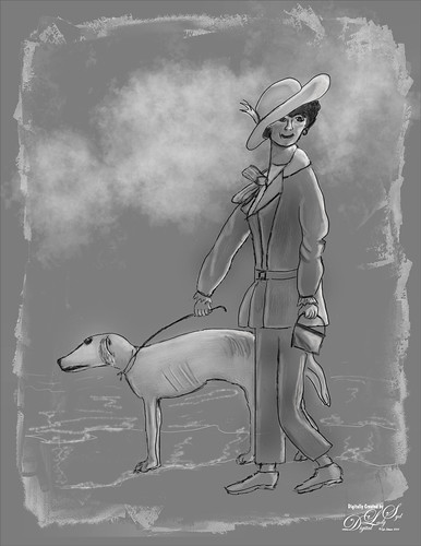
Example of How to Do Brush Adjustments to Make a Sketch Brush
Thought I would show how a brush can be changed to make it your own. Recently I have found that am using Kyle T. Webster’s Winter 2022 Set’s Tilty Pencil Variant Mixer brush converted into a regular brush for doing a lot of my initial sketching. The original Mixer is actually a really good brush that I’ve used in the past. (Kyle’s Part 2 video covers this brush extensively.) What I do not like is that a Mixer cannot use the Tilde (~) key to erase, and when I draw, I do erase little lines when needed – much faster than the Eraser Tool. (The Tilde key is actually just setting the brush in the Options Bar to Mode: Clear when pressed.) The following are the changes made to this brush to create one of my favorites.
- In the Brush Tip Shape settings, changed original Tilty Brush Erodible Tip to Aaron’s Pastel c regular brush Tip – highlighted the dab (when hovered over it says Sample Brush 42) in the Brush Settings Panel – use F5 to bring up. The different dabs (or stamps as Kyle calls them) are from all the brushes you have loaded in the Brushes Panel. You can choose any brush dab you want and still keep the settings of a brush to get a new variation, which is how I started changing the Tilty Pencil Variant. Size was set to 9 pixels. (Drag size slider out to see what the dab looks like in the Preview at bottom.) In this case used same 3% spacing. The Erodible brushes can be a little difficult to use but are popular for creating Mixer brushes. Note the Erodible Tip can be changed in the drop-down Shape settings, so try them out for some variations.
- Shape Dynamics as a Mixer brush setting has only the Angle Jitter and Control drop-down for Pen Pressure or Fade mainly. As a regular brush, all the Shape Dynamics settings open up. If the Options Bar “Always Use Pressure for Size” icon is clicked, a default Size Jitter Control set to Pen Pressure for stylus use is added to brush. In this case it was not depressed, but the Size Jitter slider was changed manually to 11% on the new brush. Try out these settings to get something different.
- Use Texture for a grainy look in your sketch brush. Can change the texture by clicking on the down arrow key and choosing a new one or inverting the one already on the brush by checking the box. You can always download these texture brush patterns from other brushes for some cool effects. Open your other brush and click the little box with a + (plus) sign in it by the texture swatch to add it to the Pattern List. Then when you open up the current brush, it is located at the bottom of your Patterns list and can be selected to replace the one in current brush. For my new brush, used Scale of 28%, Brightness of 60%, and Contrast of 10 – also checked Texture Each Tip which is not available in the Mixer. The other texture settings stayed the same.
- Transfer With Flow Jitter checked for the Mixer – Only the Flow Jitter slider Control was set to Pen Pressure and Minimum set to 3%. (There are sliders for the Wetness Jitter and Mix Jitter but they were not adjusted.) For my regular brush, Transfer was not added. (For info on this check out my How Does a Brush Use Transfer Settings (and Control Pen Pressure) in Photoshop? blog.)
- Used all the other settings from the Mixer including the Brush Panel Scatter settings, Airbrush icon depressed in the Options Bar (this turns the Brush Settings Panel’s Build-up setting on – the longer you press without lifting the brush, the larger the brush gets), and Smoothing. I did set Smoothing to 14% where the Mixer is set to PS default setting of 10% by just turning it on in the Brush Settings Panel.
As the above changes were made, the Screen Preview at the bottom of the Brush Settings Panel showed what was happening to the actual stroke. Below is an example of the my new Tilty Brush Var sketch brush that created the rough sketch layer.

Where To Put All These Sketch Brushes!!!
I usually place ones I like in a Sketch group in the Brushes Panel for easy access. Create a group by clicking on the folder icon at bottom of the Brushes Panel and drag the sketch or any brush into it. If a stroke just is not working right, a different brush can be easily tried. If a brush has not been used for a while, it is deleted by highlighting it and clicking the trash can. And if you like the group of brushes, save them by going to the upper right icon and selecting Export Selected Brushes to save them.
For your information, here is a list of what sketch brushes I am currently using: My favorite at the moment is my 1) SJ Tilty Pencil Variant based on mixer using the changes above – this brush I find is doing great for me; 2) SJ AB Fav Brush Var (actually Aaron’s Pastel c brush) (unchecked Texture settings in Brushes Panel and Pressure for Size icon in Options Bar – otherwise the same brush) – use it for all his tutorial drawings especially and for some refine edge layer lines; 3) Grut’s P Tin Softly brush for very soft line sketching which I like sometimes; 4) SJ Animator Pencil 2016 (KW) – this brush I used a lot before I created the my Tilty Brush – very nice sketcher; 5) Grut I Qwillo brush – keep it loaded as a Tool Preset so I can get to it quickly when I need a sketcher; and 6) a new one added last week called Crescent Pencil from Kyle’s Turkey-Syria set – he occasionally sells small sets for a $1 as a fundraiser to give to humanitarian causes. It is available on a limited basis but maybe you can still get them now. This brush seems to have some really good promise and was used to draw the dog. Some sketch brushes on my computer that are not used that much are: Kyle’s Perfect Pencil 2022 – very easy to use so not sure why I don’t more often; another Kyle brush in the Megapack Drawing Box called Tilterrific 2015 is a sketch mixer that is really nice; and KTW Linolea Inker from the Summer 2021 set – use it for labeling in PS only but works great for this.
As you can see, for me it is constantly a battle deciding which sketch brush really is the best, but I am slowly narrowing it down to what I like. So many digital artists like a texture in their stroke, but it is not something I particularly like. Therefore, brushes are to be set up the way I want them and an SJ is added to remind me. It is worth your time to experiment to see what effects you like as this makes the initial part of the composition so much faster. I hope everyone is still awake after reading all this and that it has helped some of you decide what might make great sketch brushes for your drawings. Chat at ya soon!……Digital Lady Syd
IMAGE POST INFO:
Colored Image Info: Used the Tilty Pencil Variant mixer brush at 14% Smoothing from Kyle T. Webster’s PS Winter 2022 Set. A beach background was created in Corel Painter. For suit stripes, used Kyle’s Rakes set – Drag 1 and to straighten problems areas used Grut – P Tin Softy. After the image was basically drawn and painted, a composite layer (CTRL+ALT+SHIFT+E) was turned into a Smart Object and opened in the old Nik Analog Efex Pro2 filter to give it the vintage feel (Basic Adjustments: Detail Extraction 15%, Brightness 5%, Contrast -13%, and Sat 43; Lens Vignette: Amount 57%, Rectangle all the right, and Size 68%; Frames: Scale 100%, White, and Frame 1st Column and 4th Row; and Levels & Curves: Opacity 100%, RGB – bottom dot on left corner, middle dot on 9,9 and upper right corner set to 14,16; and Luminosity-bottom left at corner, 2nd dot 6,4, 3rd dot 11,10, and right corner 14,16.). The old Nik Viveza 2 (still my favorite plug-in) was used to adjust the final image.
Tonal Image Info: Background is just a 50% gray area. Created a photo mask in Corel Painter by painting black with grayish edges. In PS placed it over the part of the image to be in the frame, then set the blend mode to Screen at 59% layer opacity to get just the edges to show up. The clouds were created using Grut FX Cloud Luft Hi brush (from his great Cloud Set of brushes) and putting the basic grunge brush in the Lazy Brush Set by Vesner (set to 85% brush opacity) on top. And as stated previously the rough and refined layers were created using my Tilty Brush Var and Aaron Blaise’s Erodible Brush at 41% softness. Also two highlight layers and one gray layer used the Erodible Brush.
HOW DOES A BRUSH USE TRANSFER SETTINGS (AND CONTROL PEN PRESSURE) IN PHOTOSHOP?

Above is The Winter Creek painting of mine – learning to draw landscapes is very different from cartoon-type drawings! Learning a lot from Karen Bonaker, a Corel Painter Guru and great digital artist, and from listening to regular painting videos. For Image Post Info, see bottom of blog.
I decided to talk about the Transfer section in the Brush Settings Panel (Click F5 to bring it up) and the “Pressure for opacity” icon in the Options Bar (8th icon from left) since these pressure settings are often added to Photoshop brushes. Many people (including me) could not understand why the pressure settings are different than what they thought was set. So here we go and I hope it helps a little when trying to set the pen pressure for your brush.
One of my favorite Photoshop people has been Lesa Snider and her Photoshop CS6 The Missing Manual (her books are excellent references) had the best explanation as to how this brush section works. So I hope Lesa does not mind, but I am going to quote what her book says in a very straight forward and understandable explanation.
“This category lets you adjust how much paint Photoshop transfers to the ‘paper’ (your document) with each brushstroke. The Opacity and Flow settings here (in Transfer settings) override the ones in the Options Bar (with their default settings-see below), so if you tweak them (the Transfer settings), you may find the Options Bar settings do not seem to work.” CAUTION NOTE: When pressed, the Option Bar “Pressure for opacity” icon will always turn on its default Transfer settings using Opacity Jitter 0 (most opaque), Control Pen Pressure, and Minimum 0 (most transparent). (When hovered over in PS, it says “Always apply pressure for opacity. (It is using the default settings here.) When off, Brush Preset controls pressure.” (I believe brush preset means the Transfer settings.)) Flow settings appear in the default settings so if you had a Flow Jitter set before, after clicking the “Pressure for opacity” icon, it may or may not still be there even though the opacity settings go to a default. (This one drove me crazy – not sure what PS is doing with these settings, but this is why it is so confusing!) But if you turn off the “Pressure for opacity” icon, and turn on the previous Transfer settings in the Brush Settings Panel, the old Transfer settings re-appear for your brush opacity and flow settings – PS remembers them. If the Options Bar icon is turned off, and pen pressure is still present, it means the Transfer section is working at the default settings even if it does not look like it – see if it is checked on or still has settings even if not. A good trick is to keep an eye on the Preview Screen at the bottom of the Brush Settings Panel to see what is happening when you change the icon in the Options Bar and the Transfer settings. And on occasion it just does not seem to work correctly with a brush – that is when I try a different brush and then come back to it – it usually has corrected itself. (Note that the “Always Use Pressure for Size” works slightly different with the Shape Dynamics section.)
Bottom Line: If you want the full opacity and flow as set in the fields on the Options Bar, do not check the Transfer setting in the left column of the Brush Settings Panel and do not press the “Pressure for opacity” icon. If you want to create a more painterly brush effect, add more or less transparency using some of the settings discussed below, do not press the Options Bar icon – it will override the Transfer settings you selected with the PS default settings. If you want a nice Pen Pressure effect and nothing else, press the Options Bar icon – it should automatically turn on the Transfer settings in the Brush Settings Panel.
A tablet with a stylus is needed for this panel to work correctly since the Control settings are based upon the pressure sensitivity of the pen. The Jitter sliders will work with just a mouse though. To find where the Transfer section is, open your Brush Settings Panel and click on the word Transfer to see all the settings that can be used for this. (Just checking the box does not open the settings.) See a Transfer settings screenshot below for Kyle’s most popular brush ever, his Gouache A Go Go Tilt brush (I have a note on the brush that says “make big for texture”) found in his PS Megapack. Be sure to watch the Preview screen at the bottom of the Brush Settings Panel to see a live update of what the settings are doing when changed.

Opacity Settings
Opacity Jitter: Controls how transparent the paint is throughout the brushstroke. Setting Opacity Jitter to a higher percentage makes the stroke more see-through.
For example, if you set your Options Bar Opacity to 100%, but you have the Opacity Jitter slider set to 60%, that’s the most opaque your brush can be (60% of 100%). Thank you Lesa. That explains a lot about the confusion of these settings!
Opacity Jitter Control: Control pop-down menu lets you choose from several types of pressure sensitive controls that can be used with the brushstroke. They include Off, Fade, Pen Pressure, Pen Tilt, and Stylus Wheel. Mainly Pen Pressure is used, but occasionally the Pen Tilt or Fade may be used for an interesting result.
Minimum (in Opacity section): Slider appears when Control is set to something other than Off. When set to 0, the brush becomes more transparent or see through. Set to 100 to get a more solid opaque effect from the brushstroke.
For example, when Opacity Jitter is set to 100, Control to Pen Pressure, and Minimum set to 0, get the most translucent look.
Flow Settings
Flow Jitter – How much paint the brush lays down throughout the brushstroke. To specify a percentage by which the flow of the paint can vary, type a number or use the slider to enter a value. A higher percentage means the flow varies more and lower percentage varies less.
Flow Jitter Control: The settings work very similar to the Opacity Jitter Control.
Other Factors that Might Change the Transfer Setting’s Results
I am finding that often, adjusting these settings only creates a very subtle effect. Sometimes other brush settings (Shape Dynamics, Scattering, Texture, and Color Dynamics all contain Control menus) can cause the Transfer settings not to appear as might be expected. The Panel above shows the Gouache A Go Go Tilt brush with Shape Dynamics on – the Size Jitter Control is set to Pen Pressure and the Minimum Diameter is set to 36% (when set to 0%, means size diameter varies up to maximum size, but when set to 100% no change occurs when pressure is applied). At 36% with a Transfer Opacity Jitter Control also set to Pen Pressure and Minimum set to 57%, a light pressure stroke will be lighter and smaller, and a heavy pressure stroke will be darker (more opaque) and larger. But in this case there is another Control located in the Texture Settings in the Depth settings – it is set to Pen Pressure and makes a huge difference in how this stroke looks. So this is a good example showing that just by changing one brush setting, others may affect the results! And don’t forget the Dual Brush can cause the results to look different also – in this case the edges and coloration were affected. If you want to get more info on this, check out Kyle T. Webster excellent but complex video called Illustration Masterclass: Painting with Color Dynamics (Video 2).
Also note that there are other types of brushes which have various types of Transfer sliders associated with them: Smudge Tool , Mixer Brush, Clone Stamp Tool, Pattern Stamp Tool, Sharpen Tool, Blur Tool, Sponge Tool, Dodge Tool, Burn Tool, and Eraser Tool. Some have Option Bar icons associated with their settings and some do not. Just watch the Preview Screen of the stroke to see what is changing when the settings are added or changed. I think this is another blog topic to cover these.
The best way to understand all of this is to get a fairly complex brush, like the one used above, and just start changing or turning off settings. This definitely helps if a brush is not painting the way it should, just start looking at the Transfer settings and Option Bar settings. Once you find what you want, save the brush as a variant by pressing the little Plus icon at the bottom of the Brush Setting and Brushes Panels. I hope this has helped clean up a rather confusing topic in PS. Whew! Have a great week!…..Digital Lady Syd
IMAGE POST INFO: The main effect was created using great digital painter Georg Ireland’s free Drawing Paper 3. All the sketching and painting was done on top of that texture. There were 13 different kinds of brushes used from all kinds of resources. For the large left tree trunk, I used a soft round brush set to 25 pixels. Created a Pattern (Edit->Pattern) from a rectangular piece of the texture – then used the new texture pattern in the Texture Settings-checked box to Invert, Scale 135%, Brightness 77, Contract 51, checked Texture Each Tip, Mode Subtract, Depth 100%, and Depth Jitter 30%. Only other setting was Shape Dynamics Angle Jitter at 4%. It could now be used to add some of the texture to all the trees and ice in the image. Used Grut’s NM Shard Splay (with changes) to create the flowers. Corel Painter was used to add the initial water and smaller trees.
A FEW PHOTOSHOP DIGITAL PAINTING TIPS YOU MAY NOT KNOW

Recently I have been working hard at drawing and painting different types of images so a lot of what I will be blogging about in the next few months will be about this. As I have been learning (and this definitely has been a several year evolution), I found some “little known Photoshop tips” to me so I thought I would share them. Maybe there are a few new things for you to try out too!
But first a little about my image above. I felt compelled to try drawing something using Amedeo Modigliani’s basic style after viewing The Daily Art Magazine blog showing several of his images. The really elongated necks were not that appealing to me, but the facial expressions and slightly cartoon-looking lines in his portraits were very interesting. Which brings me to an Aaron Blaise class on Clear Expression where he teaches how to draw cartoonish facial emotions like happiness, sadness, anger, etc. (Most of his classes are very inexpensive, especially during his sales and he is a great teacher.) Aaron’s class was an excellent way to learn how to achieve some of the expressions used in Modigliani’s art. La Femme en blouse marine (Girl in a sailor collar) was used as the main example for my image.
For those of you who do not know or remember, the ~ or TILDE key (just above the left TAB key) can now be used as an Eraser using the same stroke as the brush being used when held down while stroking. PS added this a couple years ago and it is very handy – a great time-saver! If your brush is set to 30% Opacity or Flow, it will erase at this lower amount to blend back. Use the regular Eraser at 100% Opacity and Flow to make major changes. Below are listed the rest of the tips:
1. USE THE EDIT-> FADE TO REDUCE THE OPACITY OF A STROKE WITH THE MIXER BRUSH
I have always felt that the Mixer had a shortcoming since there was no way to control the actual Stroke Opacity, especially if the stroke looked correct, but maybe a little over the top when working in detailed areas. Using the Fade Command can really help with this – just remember it must be executed right after the stroke is made or it cannot be used. For the Mixer brush PS does not let you change the Mode but at least you can reduce the effect! I have the Fade Command set up on F4 as a shortcut key.
2. INCREASE THE BRUSH TIP APPEARANCE FOR PAINTING
A small but new feature in Photoshop 2023 and it seems to be very helpful to me. The brush dab icon is often hard to see when painting with a small size brush so often the SHIFT key is set to see where the brush is painting. PS now lets you change the boldness of the brush tip by going to Edit -> Preferences -> Cursors -> and changing the Brush Tip Outline to Extra Bold. It really makes a difference!
3. ALT + DRAGGING WITH THE SMUDGE TOOL TO SMUDGE USING THE FOREGROUND COLOR
This is one that never occurred to me, but when smudging in an image and more color needs to be added into an area, you do not have to switch to the Brush Tool to do this. Just press the ALT key while painting and the Foreground Color will show up – by dabbing, more color is added. Do take note that: 1) Everything depends on which Smudge Brush is being used. Kyle T. Webster’s free All Purpose Blend Smudge Brush in his Concept set will work quite well. Just make sure that the Foreground Color is the one to needed to add in and the Sample All Layers box is checked On if using a New Layer. If the color does not show up, try a different Smudge Brush; and 2) The Strength of the brush in the Options Bar usually needs to be adjusted – it seems the stronger the amount, the better the color. What I like is that just a touch of a different color from another part of the image can be added quickly to tie it into another object on your layer, and it also makes some really nice cloud colors. What is causing this to happen? The PS keyboard shortcut for the Finger Painting option is the ALT key so actually this is being turned on. The Finger Painting option simulates the effect that happens when you drag a finger through wet paint, and it uses the Foreground Color at the beginning of each stroke. When not On, the Smudge Tool uses the color under the brush at the beginning of each stroke, and this is why dabbing adds more color. (This info was from the great PS Guru Deke McClelland.) See next tip to make this work great!
4. REMOVE SPACING ON SMUDGE BRUSH TO GET A GREAT PAINTERLY LOOK
I have found the best way to find good brushes is find out what the artists who really are doing Digital Painting are using. Eric Elwell is one of these artists and has a set of brushes and a video that explained how he uses his Smudge Brushes. By turning off the Spacing in the Brush Settings panel, some very interesting results can be obtained. The slower the stroke, the closer the strokes are for a nice smudgy smooth transition; the faster the stroke, the brush uses the dab and stamps it along the brush path. Stroking an edge breaks up the edge. His theory is he can add soft and hard edges without having to change tools. To test it, the same Kyle’s All Purpose Blend Smudge Brush was selected, but this time the spacing was turned off – not much happened. By checking out Eric’s EE TEx Smudge brush settings, these changes were made to Kyle’s brush: Shape Dynamics (no Control for Size Jitter), Angle Jitter set to 3%, and Angle Jitter Control set to Direction; Transfer checked with 0 Strength and no Control; Noise checked, and in Options Bar Strength set to 92%. (Each of Eric’s Smudge brushes has different settings but all have Spacing unchecked.) What is really great is that if the ALT key is now pressed, the Foreground color comes out brilliantly when Strength is set to 92% and looks totally painterly! By varying the Smudge brush size and direction, some very nice stroke effects can be obtained, even with Kyle’s All Purpose Blend Smudge Brush. You can download Eric’s brushes that I have here, and I believe he has newer sets for sale up on Artstation. His digital artwork is very good! When several of Kyle’s other Smudge brush settings were opened, he has several where the spacing is unchecked and give some very interesting results.
5. HOW TO EASILY CREATE A FACE CIRCLE OR OVAL WITH EDIT -> STROKE
I have a horrible time getting the first circle or oval drawn on my canvas. Why didn’t I think of this before I don’t know! First create a New Layer, select the brush for your basic outline drawing, and choose a color, usually black. Select the Elliptical Marquee Tool and drag out your shape – use the Space Bar to reposition on the canvas. Then go to Edit -> Stroke and set 2 pixels (or however large you want the line to be) and press enter. Then deselect (CTRL+D) to see the line. Free Transform (CTRL + T) can be used to adjust it more if needed.
6. HOW TO ERASE A SPECIFIC COLOR WITH THE PAINT BUCKET TOOL
One again something I did not know. To remove a specific color from a layer (or All Layers box is checked), select the Bucket Tool or CTRL + G (located with the Gradient Tool in the Toolbar). Set the Mode to Clear and Tolerance (mine is set to 32 at the moment). Turn On the Contiguous box if you want only one area to be removed, otherwise all the selected color on the layer(s) will be removed. Just click in the image on the color to removed, and away it goes. If not enough is removed, change the Tolerance to a higher amount or click again on what was missed. This is so fast! Remember to set the Mode back to Normal when you finish.
7. QUICK TOOL TOGGLE KEYS THAT SAVE A LOT OF TIME
Sharpen and Blur Tools toggle with ALT key
Sponge Tool: ALT + SHIFT + D Desaturates and ALT + SHIFT + S Saturates
Dodge and Burn Tools toggle with ALT key: ALT + SHIFT + S targets Shadows, ALT + SHIFT + M targets Midtones, and ALT + SHIFT + H targets Highlights
I hope some of these tips are ones you did not know. I am using several of them often now. I plan to experiment more with the Smudge brushes to get better at the digital effects I want to create. Let me know if you know of any other tips I may have missed. It is amazing how much Photoshop can do! Have a great one!…..Digital Lady Syd
Digital Lady Syd Related Blogs:
Creative Photoshop Digital Art Tips
BACK TO CREATING AGAIN!

Happy Holidays and Happy New Year to everyone! It has been a while since I posted. Sometimes life just gets in the way, but it feels good to get back to doing Photoshop and painting again! I have been watching a lot of creative videos. Sophie’s pix above was one created by following a video called How to Paint a Pet Portrait with Nathan Brown (Part1) using Procreate. Since I am not an Apple person I can’t use Procreate, but the video gave such clear instructions that it was easily followed using Photoshop. Part 2 demonstrates a color effect which I will put on-line soon. The charcoal look actually fits Sophie’s actual gray fur color so I kind of like this representation of her. The drawing was sketched and a lot of Photoshop painting was done with Kyle T Webster’s Real Watercolor Alcohol brush in black (note-this brush is set to Hard Light mode). That gave the texture feel to her fur.
******

The image above was mainly painted in Corel Painter 2022, but at the end a couple PS brushes were used to fill in some areas. Not sure if I could have created the same image in Rebelle, but maybe. If you have Painter and want to learn more about how to create different types of images, check out Corel’s Painter Webinars See More Tutorials Tab at top of this link. By following the Winter Fantasy Fine Art Webinar (above link opens to this) from 2020 by Elite Painter Master Karen Bonaker, this image was painted. There are several different people creating the various tutorials so lots to learn here!
Regarding Karen, she has an excellent site called Digital Arts Academy (DAA) – this is where the brushes and papers can be downloaded for this video (just click on Products tab -> Sale, click on 2 for second page to download the Mountain Majesty paper, and on 3 to download her Pastel Gold Brush Bundle category). Also all kinds of tips and other great digital artist paintings are displayed on her site. This was a really fun project to do and I learned a lot about mountain landscape painting. Thank you Karen!
*****

Another painting software called Rebelle 5 by Escape Motions gave a very deep discount before they released version 6 this week. Thought I would share my opinion of it since it is a fairly simple program and plays nicely with PS. Rebelle 5 was used to paint this Pixabay guitar image above (I played the guitar in the past and am very partial to guitar images). To begin, the model was hand sketched on a layer over the Pixabay image in Photoshop. Then it was taken into Rebelle where their Acrylic Flat Oily brush was selected to paint over the model’s skin and guitar. Since Rebelle has a psd file format capability, the image was brought into PS where my basic workflow was used. The background is my SJ Pastel Watercolor and can be downloaded from Deviant Art, and the fence is from PixelSquid (great site for compositing). Back in PS, the tones on the skin used a Dodge and Burn technique I wrote about in 2016, but is still really relevant. The technique is described nicely in Sam Peterson’s You Tube video called Controlling Light & Shadow (he gives you starter files to use for practicing). His Dodge and Burn brushes (that can be easily created) worked nicely with this image. It is very easy to make a small action to create a 50% gray layer for this technique. A trick to getting smooth edges on the objects and skin is to use a PS Mixer Blender brush – the one I mainly use is David Bellevieu brush that is a free download at this link – to add color just switch it from a blender to adding color by going to the Options Bar and turning on the Current Brush Load – then sample a color(s) (ALT+click in image) for painting. (If you see a multi-color swatch in Current Brush Load field, can open drop-down to select Load Solid Colors Only.) And yes, Viveza was used to get the final image results – still my top PS plug-in!
Overall this is a pretty good program, easy to use, and I plan on painting with it more. I was really surprised that PS has not tried to improve their brush engine since CS6 – Rebelle is a small program but it definitely fills in painting brushes where PS lacks.
*****

So when I am just playing around, usually with a new brush set in either PS or Painter, I end up doing something like this. I called her “My New Plumped Lips” – I have to chuckle when I see them on some of the famous people images. I do not consider myself an expert in cartooning, but it sure is fun for me to do. If you are taking up digital painting, try to find some type of doodling that is just fun – it is amazing how your skill set in other areas of your painting will increase! The above was done mostly in Corel Painter with some clean up in PS which is what I usually do. The background is one I created in Painter and I use all the time, just changing the colors for the image. The hair was painted using the same brush that the mountains used above. I might also add that a long-time friend of mine, Kerry Mitchell, makes some really terrific digitally painted lady portraits, all in Rebelle – check her out!
I have several other items I have been working on and will try to get a blog out more often. Hope everyone is having a Happy Holiday!…..Digital Lady Syd
Digital Lady Syd Related Blogs:
Working on Digital Painting in Photoshop
Painting Acrylics Digitally – Can It Be Done?
SOME PHOTOSHOP WITH SAM PETERSON

A few weeks ago Photoshop Guru Sam Peterson did another two weeks of challenges on the Adobe Creative Cloud website. I have done several of his challenges before, and it is always fun to try out new things following his new videos. Therefore, thought I would show what kind of things were presented in his short, but informative, videos last month. Sam always provides starter files to use for practicing and usually a timeline is added in the YouTube description showing what Photoshop skills were used.
The video covering the fairy image is called Caricatures for Beginners – Photoshop Illustration Challenge. The above fairy was created by first downloading this image from Pixabay (Jerzy Gorecki portraits are the best). In PS the model was selected and put on her own layer before taking the layer into Topaz Studio 2 or just Topaz Impression could have been used (Type 09 brush, Number of Strokes High, Brush Size 0.47, Paint Opacity 1.00, Stroke Color Variation 0.50) for the skin effect – a layer mask was used to paint it off her face a little. The Stroke Color Variation slider created the skin markings. Obviously Liquify layers were used for the eyes. Also a FaerieWings ii4 Falln Stock on Deviant Art brush was used. Fantasy Light Dirt 2-Large Glitter with spacing set to 126%, Opacity 52%, and Flow 62% was used for the fairy dust. The background was just painted using his brush (he tells you about it) and Fantasy Light Dirt 2-Flair 1 was used to create the fog look at the bottom. This was my favorite effect I did.
******

The above is a really nice effect and can be used on any image. What is really nice is that Sam teaches you how to make an action so it can be applied very quickly since several PS filters are used to get the effect. Some of Kyle T. Webster, the Adobe brush guru, watercolor brushes were used to finalize the effect. The photo is by Annie Spratt at Unsplash. The effect is pretty easy video to follow – it is called Watercolor Effect – Photoshop Illustration Challenge. I actually ran it on the baby image from last week and it turned out really nice.
*****

The typography look is another effect that was pretty easy to do – the video is called Text Portrait – Photoshop Typography Challenge. It basically creates a lot of different text layers that are rasterized and merged together to get the final effect. It is done several times and is a creative way to add text to an image. The image is from Pixabay (unable to find a link). A different font was used from the one that Sam preferred – this one is called Naive Deco Sans. The larger text was placed behind the player at 30% layer opacity while the smaller text was laid on top at 91% layer opacity. The background is called Texture Time Music Layer Mask by Evelyn Flint from 2013 (not sure how to find it now) and was set to black and white already.
*****

This video seemed to be the hardest for me – getting an image I liked and then making it look like it was popping off the page was not easy. Still it was a lot of fun to do. The video is called Illustrated Composite Effect – Photoshop Compositing Challenge. It took a while longer to do as there were a lot of steps in the technique. The starter file set has this nice notebook that can be used as a platform for the effect, but I had to mask out the wiring so the wood background could be changed. The image of the model is from Dollar Gill at Unsplash.
Adobe Create Cloud provides several PS experts that create Masterclasses and challenges – there is always something that catches my eye each week. I did not do all of Sam’s challenges this time as there were a few I was not interested in doing. It is fun to try out different techniques when you have a few minutes and Sam’s videos are only about 25 minutes long. In the Related References, there are a few of my blogs that used some of his previous challenges. Let me know if these were fun for you……Digital Lady Syd
