
A GOOD USE FOR AI? TO LEARN PAINTING TECHNIQUES

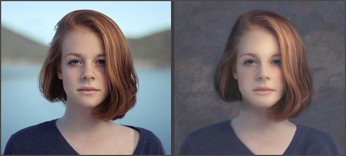
I have been experimenting with all my AI Selfies, mainly trying to see what I like or if I like the results after painting with different types of Photoshop brushes on layers above the AI creations. This has been a hard decision for me on how to use this new technology that is getting more and more popular in certain mediums. The Adobe Firefly and the Firefly Photoshop results are great for me to learn how to use new brushes and techniques, but I do not see any real practical uses for my serious photography – except for the occasional little fixes in an image. And it does appear my AI generated Selfies do have a certain look that sort of gives away the fact an AI process was used. There are so many other expensive AI software programs creating more incredibly realistic images and it is totally hard to tell it is AI. With that said, I believe you must keep up on the new technology if you want to understand what purpose it will have in your own creative expression. Hence my Selfies and what I am learning.
At this point, I am only creating with Adobe AI and using their results to learn how to paint trying different art mediums, hopefully leading to my own original works down the road. Therefore I am displaying a couple more Selfies (since it is my photo, I do not have to worry about who work it is). But first I want to share the info in the Note below that caused me a lot of confusion when generating AI images using less than 100% of the image (which you have to do to get any good results) when I began using all the different processes to do this.
NOTE: This is important to know when using different amounts of the Brightness setting! If you get reverse results (in other words, set to 80 and the image is wild looking instead of somewhat close to normal looking), go back and double click on the Quick Mask to open the Quick Mask Options Panel and change the settings to the other choice. For example, when using Dr. Brown’s action (I do like the fact that his action creates a new document for his AI results – check out my Dr. Russell Brown’s Painting AI Action Set to download) or Unmesh Dinda’s technique (more on this below), Quick Mask needs to be set to “Mask Areas.” You will know if you have it right if at a Brightness of 80, the foreground swatch looks light gray. When using Dave Kelly’s action, it needs to be set to “Selected Areas” (he tells you that in his YouTube text where the link for his action is located. I find this all very confusing so just beware of this.
The top Selfie was created using Dr. Russell Brown’s Painting AI Action set to Pencil Sketch and using the 60% of original action variation group. There were all kinds of variations created, some really strange, but in the middle of the batch, a halfway descent version showed up. Not sure it was really a Pencil Sketch look, but a nice variation for a starter Selfie image. See small image below for the variation. For this image Kyle’s Real Watercolor Detail brush set to Normal brush mode was used a lot. A Mixer brush was used to smooth the face somewhat and the hand had to be reconstructed using the Detail brush and the SJ 36% Blend for face from Grut’s Late Never brush (for settings see my A Few New Selfie AI Tricks blog at bottom – this brush is indispensable for me and the Selfie images). Then the image was opened into Anthropics Portrait Pro. I had never used this plug-in before, but it really gives some interesting results. My Selfie looks like she came right out of the Barbie Doll Collection??? Plan to do a review when I can. Really a lot of fun to use but probably does not work with most artistic media Selfie faces!
For the image above, instead of using Dave Kelly’s action, Unmesh Dinda’s Technique was used – see his Shorts Video Turn Photo to Painting with Generative Fill in Photoshop on YouTube. (If you understand the HSB Brightness concept, he changes the B amount set to 43.) The image above was a bit of a surprise to me when it showed up as a watercolor variation of the Selfie image. In this case, only the Selfie original subject was selected using the Quick Selection Tool to remove the background before applying the Generative Fill command. You can see this in the original variation shown below.
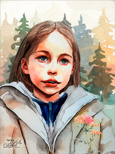
It took several Generative Fill iterations – this time just the prompt “Watercolor” was used for this portrait image. The background was selected, and instead of creating a Firefly AI background, the watercolor trees and flower were from the Let’s Travel Watercolor Set. The Watercolor brushes used on this image were Kyle’s Real Opaque Square, Diluted 90, Watercolor Eraser, and Wamazing-Basic – all in his watercolor set that is free with Photoshop (download from Brushes Panel Hamburger icon and select Get More Brushes).


******
This is another variation from the watercolor generated group and used the child image’s process. The background was changed somewhat. See below for original variation result. A second Generative Fill layer was used to replace the squinty eyes (used prompt watercolor eyeballs). Only one eye in the variations looked good, so it was duplicated and flipped, painted over somewhat, and the eye reflection was clone stamped back in (and the Blur Tool was used on the eyes to soften the lash edges). My favorite brush for this image was Kyle’s Real Watercolor Stain Damp Paper 3 which was used to clean up the background on her coat. When doing a special type of Medium, in this case watercolor, I make copies of all the brushes being used for the Selfies so they are all together to use on other Selfies – and often I save the brush to the size I like and not the default size of the brush. The fonts, which work together, were Style Casual and Style Endings with a colorful Pattern Overlay Layer Style over it.
******

The image above used Dave Kelly’s Painting 40 action on the Selfie (Quick Mask needs to be set to Selected Area) – then in the Generative Fill command prompt, typed “Cubist Portrait.” This did not turn out quite like a cubist image, but overall it has an interesting quality to it, so it made a pretty pleasing Selfie effect. The hair was created using Kyle’s Paintbox-Bristle Supreme from his Megabox. The dark lines were created using the Staccato Ink brush from Kyle’s Winter 2024 set. Below is the original variation used to start this creation. Not as much was done on this image as on some of my others. This image mainly used these brushes: a 4-pixel 80% Hard Round brush was used for all of the glasses – this brush is so handy since it gets into tiny areas easily. If made a little larger, it can be used to give really sharp edges like lot of the Cubist images have. A regular Chalk Brush was used to make the background more solid.


Below is a slideshow of several of my recent Selfies that were posted up on my Tidbits Blog (click at top of blog for link where more info is provided on each) and on Flickr in case you missed them.


As a review, once I find a variation to use, I create a New Layer above and go to Image -> Apply Image to place the variation on its own layer. To put this layer in a New Document, right click and select Duplicate Layer and in the dialog drop-down menu, change the Destination Document to New. I save it now and use this file for doing changes and painting to the variation. (The default is Merged. If just a simple change was done, like some eyes created, they can be put it on its own layer by creating the new layer and selecting the “eyes” AI layer in the drop-down, not New – just the eyes will be on the new layer in the original file.) Still have all the other variations in my original file in case I want to use them later or want to generate more variations. The ones that are bad are always deleted.
These are really fun to do and it is a great way to learn how to use all the great Photoshop brushes available, even just using Kyle’s that come with Photoshop. If you have any questions on how to do this, feel free to leave a comment. I am always trying to improve on the process. As far as the AI goes, I am still a bit “on-the-fence” about it, but by using it, you start to learn the power it has. Have a good day!…..Digital Lady Syd
A DAY TO NIGHT QUICK CHANGE
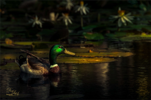
This beautiful Mallard Duck is the major patrol guy at Ames Park in Ormond Beach, Florida. He is totally responsible for watching the goings-on at several lily ponds – very busy! Had some fun with this one as the image was actually taken on a sunny bright morning. Thought I would share how to change an image into night without a lot of work.
The first step was to get the dark but natural effect. In Lightroom (or ACR) to get the evening effect with Serge Ramelli’s American Night Darker preset (preset is from 2019 and has been called the “Harry Potter Effect.” It can be created by following his video called Lightroom Tutorial Dark Moody – Day to Night “American Night” It was used to set some lighting effects on the duck and lily flowers in the background. That is all that was done in Lightroom.
In Photoshop a New Layer was made to add in the glow effect to the duck and water shadows. Etherington Brothers‘s info sheet called How to Think When You Draw – Atmospheric Glow Tip by Steve Stark (not sure how to link but it was in their X Feed of September 13th) was used to paint in more glow on the duck and the water shadows. This involved setting a New layer to the Color Dodge blend mode. Select a soft 20% opacity brush for painting with a yellow color where the glow should be added – then open the Layer Style and uncheck Transparency Shapes Layer. Voila! This creates a really nice soft glow that can be reduced by just changing the layer opacity.
Created Highlights and Darken layers using Sam Peterson’s technique (see my Fun Photoshop Blog A Few Photoshop and Lightroom Tips and Tricks – No. 2).
Applied a Linear Gradient Fill Layer using the 18- washed_away_art preset (a brownish to gold gradient from 2015) set to Soft Light blend mode at 49% layer opacity. Used Blake Rudis’s High Pass Sharpening Action and painted in the layer mask on just the duck mainly (see his video for getting the best detail out of a photo – it is called Don’t Use Clarity – Use This Instead). A Color Lookup Adjustment Layer using an On1-Heat Wave LUT (yes, they can be used in PS) was applied. Viveza II (still my favorite filter) was opened to adjust the color tones – new version of is linked here. Last step was a clean up layer.

This image taken at the Hilton Waikoloa Village on the Big Island in Hawaii is another example of creating a night effect from the day. Not sure this sculpture is one I particular love, but he definitely stands out when walking a little path around one of the hotels. The same workflow as for the duck was used with a few additions. A Color Balance Adjustment Layer was added to make the sky appear more like evening – mask used to just target that area. Also at the end two spotlight layers for lightening and darkening the image were used (see my blog called How to Add a Spot of Light).
Hope you get a chance to try a few of these techniques. I really like Blake Rudis’s High Pass action – it is updated from his first one from several years ago. Also the Atmospheric Glow trick is really nice and gives a nice quick pop to objects in an image. Have a good one!…..Digital Lady Syd
Related Digital Lady Syd Blogs:
DR. RUSSELL BROWN’S PAINTING AI ACTION SET

The above is what a change you can get with a stock image of horses using Photoshop’s Beta AI. The image was from Unsplash called Horses in Iceland by Alex Iby (can’t seem to find it on Unsplash anymore but here is a link to where it was used on a website). Dr. Russell Brown (this guy is one of the genius’s at Adobe – he has always had the best actions and panels for use with PS) created a free action set called Generative Fill Painting Action that can be downloaded at his YouTube short video site. The actions create artwork from a photo using either a Cartoon Vector Illustration, Oil Paint, Pencil Sketch, or Watercolor action. The action generates in a New Document style variations using 40%, 50%, 60%, 70%, and 80% of the original image – needless to say the 70% and 80% look pretty bad – you can delete these layers later if you do not like them. All you have to do is highlight your image layer and run the action – that’s it. Dr. Brown’s Pencil Sketch Action set to 50% of the original image was used above and this is one of the variations PS suggested. I thought it was pretty impressive! It did required some clean up and Lucis Pro 6 (believe it is still not available as far as I can tell) was added to sharpen it up and and add some contrast, but overall it looked pretty good.
If you are enjoying using the AI capability in Photoshop Beta, it is definitely worth downloading this action. It is pretty nice. Just remember these apply to the whole image. If you want to just apply them to a portion of the image, then use Dave Kelly’s Photo to Art action set (go to his video called Photoshop (Beta Photos to Art) Tips and Tricks (Generative Fill) – the free downloadable action set is on his YouTube video page. See my Some AI Digital Art Results blog, third paragraph down, for a short take of how to use it.)

Dr. Brown’s Oil Painting action was run on my photo of some Lilies taken at Ames Park. Used the 50% of original image layer and then selected with the Lasso Tool the lower right corner to generate a few more flowers there. This was so crazy easy! To finish up the image, a Levels Adjustment Layer was chosen to add a little more blue into the image shadows and a little less the green. Also a New Layer was used for painting in and cleaning up a few of the flower centers. The unused “% of original image” layers were deleted. Lots of fun!

Here is an example of Dr. Brown’s watercolor effect at 40% of original image on my image from the Tower of London. This took the longest of the effects to get a good look. To me the watercolor results never seem quite right in AI. Used two versions of the generated results to get the above – one for the building and one for the sky. Just used a mask to remove the building on the sky layer. Then some clean up. The birds were actually added using some great free bird brushes by Wavenwater brushes – I use them all the time in my images. To get a more painterly look on the birds, a Pattern Fill Adjustment Layer with a bluish pattern was selected and then set the bird layer to 85% opacity. Added highlight and darken layers to the image using Sam Peterson’s techniques (see my blog A Few Photoshop and Lightroom Tips and Tricks, No. 2 item for quick explanation on this). Levels and Black and White Adjustment Layers were added. A Curves Adjustment Layer was the last step. More like my regular workflow for this one.

This is the final action that Dr. Brown provides using the Cartoon Vector Illustration prompt. The original image is no longer available but was a 2005 Turbo Photo stock photo of a European alleyway. After running the action, the 40% of original layer was used and then It took several generations to find a good variation – the one chosen brought interest to the image by adding some little people, but they were squished on top of each other. So the people were selected with the Lasso Tool and a prompt that said “Cartoon Vector Art People” was used to Generate – several Generate buttons later, these people showed up. Still had to paint them in to get a good look along with lots of really messed up areas on the buildings. The Remove Tool worked wonders on much of this. This time a free Color Lookup Table Earthtone preset from Sparkle Stock was added to warm up the image. Then just followed my regular workflow as was done in the watercolor effect.
There are the 4 action results I got from Dr. Brown’s action set – they are pretty nice. I wish he had made an action for 30% of the original image – it could probably done easily. I also think he was adding the 70% and 80% of the original image as a joke as they always seem way out there to me. Still fun to look at! …… Digital Lady Syd
MOTHER NATURE’S HELPING HAND

This is just a short blog where I thought I would share a little tutorial with everyone. Overall I tried to get a very textured image here with a Spring-like feeling. This process started with a recent short tutorial from Adobe Creative Cloud called Create a Swirling Gradient in Photoshop by Mirella Fabienne. This sounded like fun so circles of red, bright green and lightish yellow were placed on a layer and the colors were used to paint a real abstract design. After blurring that layer, the Liquify Tool was used for swirling and this is when it started looking like fingers to me. After that, various brushes were used to get the interesting results (most of the flower brushes were from Jessica Johnson (her English Garden brushes are my favorites), French Kiss‘s Dot Grunge brush and a brush I created from her Tableaux Mirage Texture (see my YouTube video called Texture Brush video which shows you how to do this), and Maddy Bellwoar‘s various Leaves and Plants brushes. The last step involved adding Luminar Neo’s preset called Savannah Cool. And it turned out to be a lot fun while using some of my favorite brushes!…..Digital Lady Syd
HOW TO DECIDE WHICH SKETCH BRUSH TO USE

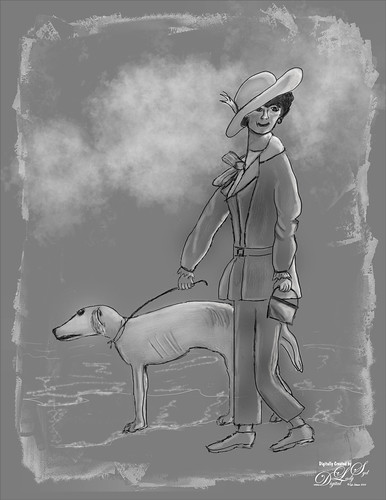
The above is the final result of my “Dog Walking His Owner” digital drawing/painting based on Francois Flameng’s painting called Riviera Promenade (from around 1900 – this is one of my favorite paintings!). See more details in the Image Post Info at the end of the blog.
It seems like I have been looking for that one “perfect” sketch brush for a long time, and it just is not happening. Depending on what type of sketching or the response needed from a sketch brush, it may have to be changed. Therefore, I am finding I need lots of different sketch brushes and variations in my arsenal instead of just one totally “go-to” brush. This blog is how I go about this process. It is longer than I wanted, but I hope it covers some things you can do to get a good sketch brush, or for that matter, any brush.
To start with, just taking a hard round brush and setting it to 4 or 5 pixels with no other settings can work great as a sketch brush, and is often very useful for painting in little mistakes for regular photo clean up. For this reason I keep it handy by placing it under the default soft round 90 pixel brush at the top of my listed brushes in the Brush Settings Panel (Windows -> Brushes Panel). This brush would be a good place to start, and then use it to create a few variations for a personalized sketch brush. Check out my paragraph below called “Example of How to Do Brush Adjustments to Make a Sketch Brush” for some ways to do this. (Hint for this one, click the “Always Use Pressure for Opacity” icon in the Options Bar to make this a great sketch brush.) Then it would also be good to create a Sketch Group containing the variations along with other download sketch brushes in the Brushes Panel following the “Where To Put All These Sketch Brushes!!!” paragraph so they are all together for making a quick brush selection.
Where to Find Sketch Brushes
Some great places to find good sketch brushes is to follow the artists who are really doing digital drawings and paintings. There are so many places to find good sketch brushes but the people listed below have many of my favorites:
- Grut Brushes: Nicolai at GrutBrushes – he has some of the very best and inexpensive brushes. His brushes that have a capital P in them are his Pencil brushes which are all good sketchers. Grut’s P Tin Softy brush in his Pencil Set contains a nice light sketching brush (use this one a lot for the initial rough sketching). His Grut I Qwiller Inker has been one of my all-time favorite sketchers for years. If none of the other brushes work well, this one always comes through. And note, this is an inker that works great as a sketcher.
- Aaron Blaise: For a long time I used Aaron’s Erodible Pencil to sketch making little modifications to it, like changing the Softness slider in the Brush Tip Shape settings of the Brush Settings Panel (F5 to bring up) or the Flow in the Options Bar, when needed. Where did I get this brush? Just loaded the Legacy Brushes by clicking on the Brushes Panel upper right icon drop down menu and selecting Legacy – a box appears that asks “Restore the Legacy Brushes Brush Set to the list of Brush Presets?” where you answer yes. The brushes appear in a group at the bottom of your listed brushes. Go to the Default Brushes and select the Pencil brush that is 9 pixels in size. This brush was set to 25 pixels for both the rough sketching and refine layers in the elephant image below after watching the Elephant Painting Tutorial in his Wildlife Painting Bundle. It was slightly changed by setting the Softness to 41 – it makes the line a little slimmer. Also used on the Refine layer of the black and white rendition seen below (created it to see tones before painting). For some of his later videos, I have been using Aaron’s favorite Pastel c brush-without Texture & 100% Flow – it has an interesting dab tip that I have used to create other brushes. It is in his Original Custom Brush Set but was a give-away when signing up for his newsletter at one time and may still be. His brushes are inexpensive and there are many others in this set that are very nice.
- Kyle T. Webster: Can’t pass up all the fabulous sketch brushes Kyle gives you to download just for being a member of the Adobe Creative Cloud. To download his brushes, open the Brushes Panel and click the little upper right icon and in the drop-down menu, select Get More Brushes – you will need to sign into Adobe if you are not already active on the Cloud at the moment and scroll down to download any of the sets he offers that includes over 2000 brushes. The Megapack contains a lot of his sketch brushes in the Drawing group. After downloading, just double-click on the .abr file extension and it automatically loads the brushes into a group at the bottom of the Brushes Panel if PS is open. Check out his Brush Hour: Emulating & Graphite Pencils in Photoshop Part 1 and Brush Hour: Creating a Graphite Drawing in Photoshop Part 2 videos to see some great sketch brushes in action.
- David Belliveau: David is a portrait digital artist and has great free classes he offers a couple times a year to teach you how to do this – see my Where to Find a Good Photoshop Painter blog showing my class result. He has some really nice free Sketching Brushes. This is another great example of someone who actually does digital painting.

Most of the sketch brushes are a form of a Pencil brush so often they say Pencil in their name, but they are activated using the regular Brush Tool, not the Pencil Tool. You do not have to stick to a pencil sketch brush – at smallish sizes ink brushes or charcoal brushes make great sketch brushes too, especially when adding a layer on top of a sketch to refine the look. I learned from Aaron Blaise how to create rough and refined sketch layers to start an image. The regular Kyle’s Tilty Pen Variant as changed below was used on the black and white rough layer in the tonal drawing below. The two light Highlight layers along with a gray layer were used to add more tones into the drawn image using Aaron’s Erodible brush and adjusting the size as needed. Therefore several layers were created using just these two brushes.
Example of How to Do Brush Adjustments to Make a Sketch Brush
Thought I would show how a brush can be changed to make it your own. Recently I have found that am using Kyle T. Webster’s Winter 2022 Set’s Tilty Pencil Variant Mixer brush converted into a regular brush for doing a lot of my initial sketching. The original Mixer is actually a really good brush that I’ve used in the past. (Kyle’s Part 2 video covers this brush extensively.) What I do not like is that a Mixer cannot use the Tilde (~) key to erase, and when I draw, I do erase little lines when needed – much faster than the Eraser Tool. (The Tilde key is actually just setting the brush in the Options Bar to Mode: Clear when pressed.) The following are the changes made to this brush to create one of my favorites.
- In the Brush Tip Shape settings, changed original Tilty Brush Erodible Tip to Aaron’s Pastel c regular brush Tip – highlighted the dab (when hovered over it says Sample Brush 42) in the Brush Settings Panel – use F5 to bring up. The different dabs (or stamps as Kyle calls them) are from all the brushes you have loaded in the Brushes Panel. You can choose any brush dab you want and still keep the settings of a brush to get a new variation, which is how I started changing the Tilty Pencil Variant. Size was set to 9 pixels. (Drag size slider out to see what the dab looks like in the Preview at bottom.) In this case used same 3% spacing. The Erodible brushes can be a little difficult to use but are popular for creating Mixer brushes. Note the Erodible Tip can be changed in the drop-down Shape settings, so try them out for some variations.
- Shape Dynamics as a Mixer brush setting has only the Angle Jitter and Control drop-down for Pen Pressure or Fade mainly. As a regular brush, all the Shape Dynamics settings open up. If the Options Bar “Always Use Pressure for Size” icon is clicked, a default Size Jitter Control set to Pen Pressure for stylus use is added to brush. In this case it was not depressed, but the Size Jitter slider was changed manually to 11% on the new brush. Try out these settings to get something different.
- Use Texture for a grainy look in your sketch brush. Can change the texture by clicking on the down arrow key and choosing a new one or inverting the one already on the brush by checking the box. You can always download these texture brush patterns from other brushes for some cool effects. Open your other brush and click the little box with a + (plus) sign in it by the texture swatch to add it to the Pattern List. Then when you open up the current brush, it is located at the bottom of your Patterns list and can be selected to replace the one in current brush. For my new brush, used Scale of 28%, Brightness of 60%, and Contrast of 10 – also checked Texture Each Tip which is not available in the Mixer. The other texture settings stayed the same.
- Transfer With Flow Jitter checked for the Mixer – Only the Flow Jitter slider Control was set to Pen Pressure and Minimum set to 3%. (There are sliders for the Wetness Jitter and Mix Jitter but they were not adjusted.) For my regular brush, Transfer was not added. (For info on this check out my How Does a Brush Use Transfer Settings (and Control Pen Pressure) in Photoshop? blog.)
- Used all the other settings from the Mixer including the Brush Panel Scatter settings, Airbrush icon depressed in the Options Bar (this turns the Brush Settings Panel’s Build-up setting on – the longer you press without lifting the brush, the larger the brush gets), and Smoothing. I did set Smoothing to 14% where the Mixer is set to PS default setting of 10% by just turning it on in the Brush Settings Panel.
As the above changes were made, the Screen Preview at the bottom of the Brush Settings Panel showed what was happening to the actual stroke. Below is an example of the my new Tilty Brush Var sketch brush that created the rough sketch layer.

Where To Put All These Sketch Brushes!!!
I usually place ones I like in a Sketch group in the Brushes Panel for easy access. Create a group by clicking on the folder icon at bottom of the Brushes Panel and drag the sketch or any brush into it. If a stroke just is not working right, a different brush can be easily tried. If a brush has not been used for a while, it is deleted by highlighting it and clicking the trash can. And if you like the group of brushes, save them by going to the upper right icon and selecting Export Selected Brushes to save them.
For your information, here is a list of what sketch brushes I am currently using: My favorite at the moment is my 1) SJ Tilty Pencil Variant based on mixer using the changes above – this brush I find is doing great for me; 2) SJ AB Fav Brush Var (actually Aaron’s Pastel c brush) (unchecked Texture settings in Brushes Panel and Pressure for Size icon in Options Bar – otherwise the same brush) – use it for all his tutorial drawings especially and for some refine edge layer lines; 3) Grut’s P Tin Softly brush for very soft line sketching which I like sometimes; 4) SJ Animator Pencil 2016 (KW) – this brush I used a lot before I created the my Tilty Brush – very nice sketcher; 5) Grut I Qwillo brush – keep it loaded as a Tool Preset so I can get to it quickly when I need a sketcher; and 6) a new one added last week called Crescent Pencil from Kyle’s Turkey-Syria set – he occasionally sells small sets for a $1 as a fundraiser to give to humanitarian causes. It is available on a limited basis but maybe you can still get them now. This brush seems to have some really good promise and was used to draw the dog. Some sketch brushes on my computer that are not used that much are: Kyle’s Perfect Pencil 2022 – very easy to use so not sure why I don’t more often; another Kyle brush in the Megapack Drawing Box called Tilterrific 2015 is a sketch mixer that is really nice; and KTW Linolea Inker from the Summer 2021 set – use it for labeling in PS only but works great for this.
As you can see, for me it is constantly a battle deciding which sketch brush really is the best, but I am slowly narrowing it down to what I like. So many digital artists like a texture in their stroke, but it is not something I particularly like. Therefore, brushes are to be set up the way I want them and an SJ is added to remind me. It is worth your time to experiment to see what effects you like as this makes the initial part of the composition so much faster. I hope everyone is still awake after reading all this and that it has helped some of you decide what might make great sketch brushes for your drawings. Chat at ya soon!……Digital Lady Syd
IMAGE POST INFO:
Colored Image Info: Used the Tilty Pencil Variant mixer brush at 14% Smoothing from Kyle T. Webster’s PS Winter 2022 Set. A beach background was created in Corel Painter. For suit stripes, used Kyle’s Rakes set – Drag 1 and to straighten problems areas used Grut – P Tin Softy. After the image was basically drawn and painted, a composite layer (CTRL+ALT+SHIFT+E) was turned into a Smart Object and opened in the old Nik Analog Efex Pro2 filter to give it the vintage feel (Basic Adjustments: Detail Extraction 15%, Brightness 5%, Contrast -13%, and Sat 43; Lens Vignette: Amount 57%, Rectangle all the right, and Size 68%; Frames: Scale 100%, White, and Frame 1st Column and 4th Row; and Levels & Curves: Opacity 100%, RGB – bottom dot on left corner, middle dot on 9,9 and upper right corner set to 14,16; and Luminosity-bottom left at corner, 2nd dot 6,4, 3rd dot 11,10, and right corner 14,16.). The old Nik Viveza 2 (still my favorite plug-in) was used to adjust the final image.
Tonal Image Info: Background is just a 50% gray area. Created a photo mask in Corel Painter by painting black with grayish edges. In PS placed it over the part of the image to be in the frame, then set the blend mode to Screen at 59% layer opacity to get just the edges to show up. The clouds were created using Grut FX Cloud Luft Hi brush (from his great Cloud Set of brushes) and putting the basic grunge brush in the Lazy Brush Set by Vesner (set to 85% brush opacity) on top. And as stated previously the rough and refined layers were created using my Tilty Brush Var and Aaron Blaise’s Erodible Brush at 41% softness. Also two highlight layers and one gray layer used the Erodible Brush.
SOME PHOTOSHOP WITH SAM PETERSON

A few weeks ago Photoshop Guru Sam Peterson did another two weeks of challenges on the Adobe Creative Cloud website. I have done several of his challenges before, and it is always fun to try out new things following his new videos. Therefore, thought I would show what kind of things were presented in his short, but informative, videos last month. Sam always provides starter files to use for practicing and usually a timeline is added in the YouTube description showing what Photoshop skills were used.
The video covering the fairy image is called Caricatures for Beginners – Photoshop Illustration Challenge. The above fairy was created by first downloading this image from Pixabay (Jerzy Gorecki portraits are the best). In PS the model was selected and put on her own layer before taking the layer into Topaz Studio 2 or just Topaz Impression could have been used (Type 09 brush, Number of Strokes High, Brush Size 0.47, Paint Opacity 1.00, Stroke Color Variation 0.50) for the skin effect – a layer mask was used to paint it off her face a little. The Stroke Color Variation slider created the skin markings. Obviously Liquify layers were used for the eyes. Also a FaerieWings ii4 Falln Stock on Deviant Art brush was used. Fantasy Light Dirt 2-Large Glitter with spacing set to 126%, Opacity 52%, and Flow 62% was used for the fairy dust. The background was just painted using his brush (he tells you about it) and Fantasy Light Dirt 2-Flair 1 was used to create the fog look at the bottom. This was my favorite effect I did.
******

The above is a really nice effect and can be used on any image. What is really nice is that Sam teaches you how to make an action so it can be applied very quickly since several PS filters are used to get the effect. Some of Kyle T. Webster, the Adobe brush guru, watercolor brushes were used to finalize the effect. The photo is by Annie Spratt at Unsplash. The effect is pretty easy video to follow – it is called Watercolor Effect – Photoshop Illustration Challenge. I actually ran it on the baby image from last week and it turned out really nice.
*****

The typography look is another effect that was pretty easy to do – the video is called Text Portrait – Photoshop Typography Challenge. It basically creates a lot of different text layers that are rasterized and merged together to get the final effect. It is done several times and is a creative way to add text to an image. The image is from Pixabay (unable to find a link). A different font was used from the one that Sam preferred – this one is called Naive Deco Sans. The larger text was placed behind the player at 30% layer opacity while the smaller text was laid on top at 91% layer opacity. The background is called Texture Time Music Layer Mask by Evelyn Flint from 2013 (not sure how to find it now) and was set to black and white already.
*****

This video seemed to be the hardest for me – getting an image I liked and then making it look like it was popping off the page was not easy. Still it was a lot of fun to do. The video is called Illustrated Composite Effect – Photoshop Compositing Challenge. It took a while longer to do as there were a lot of steps in the technique. The starter file set has this nice notebook that can be used as a platform for the effect, but I had to mask out the wiring so the wood background could be changed. The image of the model is from Dollar Gill at Unsplash.
Adobe Create Cloud provides several PS experts that create Masterclasses and challenges – there is always something that catches my eye each week. I did not do all of Sam’s challenges this time as there were a few I was not interested in doing. It is fun to try out different techniques when you have a few minutes and Sam’s videos are only about 25 minutes long. In the Related References, there are a few of my blogs that used some of his previous challenges. Let me know if these were fun for you……Digital Lady Syd
Digital Lady Syd’s Related Blogs:
ADDING GRAIN TO A VINTAGE COLORIZED PHOTO

This week I decided to colorize more vintage images using Photoshop’s Neural Filters as I have realized most vintage images need a bit of grain added after colorizing them. This is a very subtle change but it does seem to make a difference. There are so many ways to do this, and I tried several different methods out on these images before creating this blog (i.e, created a film grain layer or downloaded one from the internet to use as a grain overlay and possibly using the Overlay blend mode; applied filters from Topaz Studio, Color Efex Pro, Luminar and others grain settings; or downloaded grain brushes and painted onto a new layer only where the grain should appear). My older blog still seems to have the best method of doing this. It is a workflow by Katrin Eismann. Also, I had created a very simple action for it that still works great.
The image above is of a home in Kearney, Nebraska from 1940 and Shorpy.com (click link to see original image – scroll down through the comments to see how different the house now looks!) had it on their site. They have some of the best vintage B&W photos from all over the US that are just perfect for PS’s Neural Filters, especially the Colorize Filter.
NOTE: Wanted to remind everyone when colorizing a downloaded historic photo, especially from this site, the first thing to do is to check its size by going to Image -> Image Size. If it is too large, change the resolution (if needed) to 240 so the image becomes manageable, like somewhere around 10″ X 7″ is what I like – otherwise it is way too large to process. For the other post-processing steps used on the Old House image, check Image 1 info at bottom of blog. The last step involved adding grain using the workflow below:
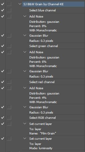
Film Grain Effect Workflow and Action Steps
This workflow was a tip in an older KelbyOne class by Katrin Eismann (another brilliant PS guru) called Color to Black and White Artistry, but the basic grain technique is still quite current. In this blog’s case, it has been used on colorized Black and White images. Using this method gives a really natural subtle result to the image and adds the effect in the areas you want it, mainly the Blue and Green channels, and leaves the Red Channel alone where the subject usually resides. The film grain is added so that the Blue Channel gets the greatest amount of grain, Green channel less, and Red Channel the lowest amount.
1.Create a stamped layer (CTRL_ALT+SHIFT+E) where the grain will be added.
2. Open the Channels Panel. Note that on the sub-steps below, all Channels used the Add Noise Filter radial button with Gaussian and Monochromatic selected.
- Highlight Red Channel (no need to duplicate the channels) and go to Filter -> Noise -> Add Noise and set Amount to 4%
- Highlight Green Channel and go to Filter -> Noise -> Add Noise and set Amount to 6%
- Highlight Blue Channel and go to Filter -> Noise -> Add Noise and set Amount to 8%
3. Next Highlight each channel again and go to Filter -> Blur -> Gaussian Blur and set Radius Amount to 0.3%
4. In the Layers Panel, change the blend mode to Luminosity so any color noise is reduced.
5. Will probably need to adjust the layer opacity as the effect may be is too much. Or a layer mask could be added and the grain added/removed in just local parts of the image.
For the Old House image, the layer opacity was set to 56% which seemed to be just enough to give a nice vintage feel to the whole image. It also made the replacement sky match the house very nicely.
This technique/action works very well on regular black and white images and I am sure it would look good on any regular image that needed a little grain added. Below is a screenshot of my action panel showing the steps so you can reproduce them if you wish:
*****
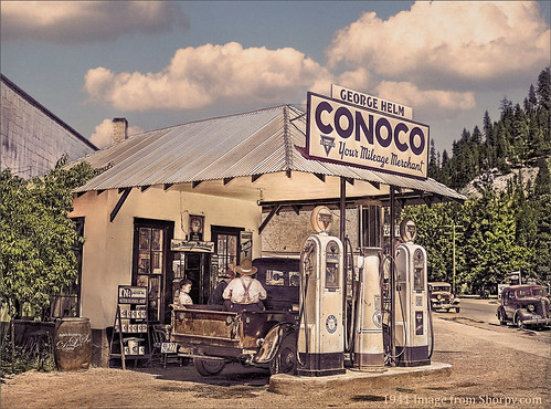
Shorpy.com (click link for original B&W image and great comments again) posted this image a few days ago. I remember seeing one of these little Conoco Stations in Annapolis, Maryland, a long time ago (not sure I ever saw another one). Biggest issue here is that the replacement sky needed some grain to match the image original image grain. By creating a stamped layer on top of the Sky Replacement Group (making sure any layers above it are turned off-by clicking off the eyeballs on the layers above), the grain steps were applied. Then the Sky layer mask in the Sky Replacement Group was copied so only the sky had the grain applied (set layer to 89% opacity). See Image 2 info at end of blog for other post processing steps.
*****

The image above is another Shorpy.com one (click link to see original) and was taken by Fritz W. Guerin in 1902. I wanted only a very subtle colorization (and not a lot of film grain, but enough to match the model to the background. Wanted to mention Skylum’s new Neo Filter was opened – the Relight section (which IMHO makes it worth buying) and Film Grain section were applied just to the background by masking out the model in the filter. See Portrait Image 3 below for the Neural Filters used and other steps. The last step was adding the overall grain to a stamped layer and setting it to 43% layer opacity. Two other methods were tried (one using a created film grain layer and another where the grain was actually painted on using a downloaded grain brush), but the above workflow gave the best results.
This grain gives a really nice effect on vintage images, but don’t overdo it or it will not look good. Have a great week!….Digital Lady Syd
OTHER STEPS FOR IMAGES:
- Old House Image: After resizing the image, the Neural Colorize Filter was added. It really does not matter what order most of the steps are done, just important to do them. Did a Filter -> Neural Filter -> Colorize and used the default settings. Next a PS Edit -> Sky Replacement using a blue sky from their set was done. Did some sharpening using Topaz Sharpen AI, but any sharpening would have been fine for this. On the above, the house lines were not perpendicular, so the Liquify Filter was used to push it all together. A Color Lookup Adjustment Layer using a Cerulean preset was added at 26% layer opacity along with a Levels Adjustment Layer. Viveza 2 was added. This post processing was definitely just a try this and try that until you get a look you like. The last effect was adding the Film Grain using the Workflow above – it was applied to the whole layer and the opacity was reduced to 56%.
- The Filling Station Image: After sizing the image, the image was sharpened. Problem areas were cleaned up – this one had power lines and the kid scratching his face. Created a stamped layer (CTRL+ALT+SHIFT+E) set as a Smart Object, and chose Filters -> Neural Filters -> Colorize. The Adjustments sliders were changed to desaturate it a little to get the overall very sunny effect. (This filter just keeps getting better!) On another stamped layer, the image was taken into Lucis Pro 6 (it appears it is still not available – I keep watching for everyone) to sharpen it just a little more. Then a PS blue sky Replacement Sky was added to add some beautiful clouds. Biggest issue here is that the sky – see blog on image to see how this was handled. A Color Lookup Adjustment Layer was added at 73% opacity using a Cerulean preset. A Photo Filter using Warming Filter (85) with a Density of 56% was added next – it really warmed up the image to make the image look very sunny. A new layer set to Overlay blend mode was created and white color on a brush at a low Flow was used to paint over the gentleman’s shirt, the little boy, and a little on the gas pumps themselves for the focal points. The brush used was just a soft round brush set to 100% Opacity, 9% Flow, and the Airbrush turned on in the Options Bar. The last step added just a slight vignette set to 17% layer opacity.
- Portrait Image: Not a lot of steps although I tried a lot of things with this image. After adding Neo, back in PS the Colorize Neural Filter at the default setting was applied (it gave the nice soft colors – I tried the more colorful look but the shadows were too heavy on the face and chin with this filter) and the Smart Portrait Neural Filter – just used the Expression-Surprise set to +16 and Global Light direction set to -14 (gave her a more serious look). Had some clean up layers, and created a stamped layer on top. To get the nice skin tone, a turquoise Solid Color Fill Adjustment Layer was set to Color Burn blend mode at 29% layer opacity and a Color Lookup Adjustment Layer using a free Sparkle Stock’s Choi Hung Estate 01 preset set to 60% layer opacity was added.
MORE COLORIZE FUN
I have been taking a break for a while – lots was going on with all the many Photoshop conferences and the new versions of Lightroom and Photoshop. Everyone seems to be using this one filter in PS – I can’t say that I blame them. It is turning out to be pretty cool! Since writing a blog called Wow! The New Improved Photoshop Neural Filter Colorize in August, the filter has gotten much more stable and works a lot smoother.
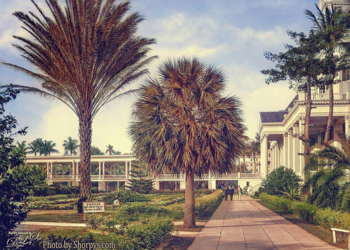
The above is an image of the old Colonial Hotel built in 1901 by Henry Flagler in Nassau, the Bahamas. The hotel burned down in 1922 and the British Colonial Hilton Hotel is now located on this area. The image is from Shorpys.com (see original black and white). The area has some interesting history including scenes from the James Bond Movie Never Say Never Again! Thought I’d include this vintage 1918 postcard of the original hotel from Wikipedia. Wish I could have visited the original – it looks quite beautiful!

For post processing on the top photo the relatively new PS Neural Filter Colorize was selected using just the preset called Retro-Faded. After applying the filter on a New Layer, a stamped (or composite) layer was created on top, and the Edit -> Sky Replacement command was used to add in a more interesting sky. On a new stamped layer, Color Efex Pro 4 was used to soften up the whole image to give an overall nice warm feeling (Ink, Darken/Lighten Center and Film Efex: Vintage filters were used). Last step was a Curves Adjustment Layer for some image contrast.
*****

Below you can see the image of Neptune was larger and what settings were used. (See my 1-minute video called Hilton Waikoloa Village Palace Tower Fountain for other fountain images taken a while ago – I have no idea who created it!) It was cropped down to emphasize the expression on Neptune‘s face (this guy had a bunch of children). It took a lot of steps but the color definitely came from the Colorization Neural Filter. Below is the original image in the Colorize Panel. Just the sliders were used this time.

The main objects were selected, which took quite a while due to the complexity of the subjects and many items had to be covered, removed or added to get a more unified feel in the image – just basic PS clean up. One of my painted backgrounds was used to give a more painterly old feel. An oldie-but-a-goodie filter was brought out to give the image a warmer feel – Topaz Lens Effect’s Gold Reflection filter was applied at 79% layer opacity – then some of the effect was painted out with a layer mask so it was not overdone. Finished up with the Camera Raw to adjust the colors a little more. But overall this is the color palette that was applied from the Colorization filter.
*****

The above image was another Shorpy.com black and white image of Bannack, Montana in 1942. I wanted to show that this image was colorized in the neural filter twice. First converting a duplicate of the original the black and whiter Background layer with the Output to New Color Layer checkbox on (see first screenshot below), and then using four Focal Points, three adding yellow to the dirt road and one to cool down the first hillside area (see second screenshot below). Back in PS the only other things done to the image were a Levels Adjustment Layer and a little bit of Dodging and Burning on the dirt road to define the edges.


As stated above PS has added a couple extra tweaks to the new PS 2022 upgrade and the filter no longer is crashing as much (also my brushes are working correctly again!) I did have one big program blow-out (PS just disappeared!) while adjusting the Focal Points, but when tried again it worked.
Still figuring out the other filters. It seems there needs to be a little more work done to get them working as good as the Colorize Filter. I did learn that if your Neural Filters keep crashing your system or shuts the filter down, you can delete the filter file and let Photoshop restore them when you restart the program. This fixed some of my errors with these filters, but not all. Here is the Adobe troubleshooting link.
Hope you have tried out this filter – it seems like it does have some very nice uses for the PS creative. It is nice to see PS adding a few new items to try out……Digital Lady Syd
WOW! THE NEW IMPROVED PHOTOSHOP NEURAL FILTER COLORIZE
As many of you know I love to colorize images, especially old ones from my own family collection of photos or those from Shorpy’s – the best around for old pix. Now you can actually colorize images that aren’t old black and white shots and get some pretty remarkable results with this updated filter panel. The best information I could find on the Colorize filter is a short YouTube by Photoshop guru Colin Smith called New Neutral Colorize in Photoshop Can do Much More. One thing I found interesting is that the Colorize Filter and the Select Subject command are both using the same AI Sensei Technology PS uses.
The image above is an image by Nairit Prachanda of a Himalayan Free Church from Unsplash. The original image is very dark as seen in the link. By using the Beta Colorize filter, this image can be made to really pop! This filter can be revisited by making the image a Smart Object before beginning the change. Below is a JPG screenshot of what the Colorize interface looked like when opened (go to Filters -> Neural Filters and select Colorize at bottom – need to move toggle to the right to load the panel) and manipulated. In this image an orange triangle told me that the filter had quit working and appeared towards the end of its use – remember, it is a Beta version so it may not work smoothly all the time. The sliders that are checked were adjusted just slightly – a little bit goes a long way. If you do not want the program to do the original adjustments, check Retain original image colors and adjust the sliders manually. To get the warm color on the right, just click in the image and the color picker opens up – choose a color for that area. It will change everything that color so this may have be adjusted back in PS with a layer mask.

Also note that Colorize has Profiles presets that can be used to give a certain feel – this one used the Retro Green to bring out the oranges especially. (Profiles presets include: Retro in all cases and the following words: high contrast, blue brown, light yellow, purple yellow, bright, red, green, faded, denim, dark, and brown). In this case, it was overall a little too much, so the Profile intensity was checked and the slider set to 70. Note that the Profile and the Profile slider amount settings were not retained in the Smart Object although all the other settings were.
Back in PS, used both a Shadow and a Highlight layer (see my A Few Photoshop and Lightroom Tips and Tricks blog-Tip #2 from Sam Peterson), which showed some of the background a little more clearly. Then the Camera Raw filter’s Calibration Panel was opened and the Red, Green and Blue Primary sliders were adjusted.
A second Neural Filter was applied to add a little more green to the top of the structure and make the orange look more painterly. The colors were reset by pressing the arrow and line icon in the upper right, then the Retro Green Profile was selected again and the Profile intensity was set to 50 – that was all that was done this time. A black layer mask was created and just those two areas were painted back.
********

The image above is from my favorite vintage site, Shorpy.com – to see the original Black and White version click here. When doing these colorizations, once the image is loaded into Photoshop, be sure to make sure the size is not crazy – like 80 inches X 60 inches at 72 res. What I always do is go to Image -> Image Size and uncheck the Resolution box and change it to 300 ppi, then check the box again and then go up to the size – it should now have adjusted down to something like 8 inches X 5 inches but it can not be changed to a reasonable size. Otherwise you could have problems down the way with the huge size of the image.
This image was taken into the Colorize Filter and not much was done to it – only a little Red and Magenta were added before bringing it back into PS for further processing. (See panel below.) It was definitely too green so a few things were done to get the image above.

Back in PS, a Color Lookup Adjustment Layer using the Cerulean preset was added to darken it. Next Sam Peterson’s Shadows and Highlight layers were added to emphasize the shadows and lighten up the foreground shrubs. A Red Channel Luminosity Curve Adjustment Layer was added on top. On a stamped layer (CRL+ALT+SHIFT+E) set to a Smart Object, Color Efex Pro 4 was opened where lots of filters were applied (Tonal Contrast, Brilliance/Warmth, Vignette-Lens, Contrast Color Range, Remove Color Cast, White Neutralizer, Sunlight, and Image Borders) – all of these were set to taste. Finished off with a Levels Adjustment Layer changing the black Output Level amount to 14 to get a little more of a vintage feel in it.

The above 1880 Avenue Parisienne painting (click link to see original) by Jean Beraud was selected for trying out the Neural Filter Colorize because it was rather dark but was a very interesting image. It is also one of my favorite paintings. Below is the panel and basically the only thing done with the Colorize filter was to check the Retain original image colors box and set the Saturation to +50. After that the Camera Raw Filter was used to just slightly adjust the skin tones as the faces were really over colorized but it looked good in other parts of the painting. (Color Mixer – Saturation Reds +8, Orange +21, and Yellows -15 and Luminance Oranges +65 and Yellows -6) This step also lightened some of the buildings in the background which show the Parisian architecture of the time. Since the skin was still too bright, a Vibrance Adjustment Layer set to Vibrance +44 and Saturation -19 was add and the layer mask filled with black (CTRL+I) – then just the skin areas were painted back in. This helped a lot. Last step added a Black and White Adjustment Layer set to Luminosity to slightly change the tones a little. I really like both iterations and it was fun to try out the filter with a really good painting.

As you can see, this Colorize filter has a lot of possibilities and I am sure Adobe is working on it as we speak. It is fun just to see what it will do and the creative possibilities are endless. I want to try just bringing a selected area into it to see what it would do in a composite. Hope everyone is having a great summer and gets a chance to play around with this filter and your images…..Digital Lady Syd
DIGITALLY PAINTED OR RETOUCHED?

Hi everybody! I know it has been a while since I blogged, but I really have been busy with Photoshop! Major project going through all brushes! So many to choose from and big decisions on which to use. Of course this is a whole other blog on how to sort through this. The portrait image above, by Christopher Campbell at Unsplash, is one that worked nicely with the brushes for the painting effect required in this blog.
Starting Out
Adobe Creative Cloud has Photoshop Daily Creative Challenge videos that are released for Photoshop every few weeks. A couple months ago Sam Peterson, an illustrator and painter, ran two weeks of some really fabulous PS videos. One was called Brushes where he gives you a starter file and walks you through how to create a similar effect as shown above. The image used PS’s Camera Raw, Angled Strokes and Oil Paint filters to begin the painterly process as Sam demonstrates. He also showed how to create a background to match the image to be painted. This photo used a brush called Clay for the background that was in Kyle T. Webster’s India Set he sold for charity (unfortunately no longer available). It is basically a chunky block brush. For a very similar brush, check out the Brix Brush in Kyle’s Summer 2020 brush set or for the brushe, Disastro or Disastro Spatter in his Summer 2021 Brushes, which uses both the foreground and background colors (press harder or lighter to get variations and a cool texture effect). Lots of different brushes were tried before finding a background brush I liked – but then this is half the fun! For info on how to download and load Kyle’s free PS sets, see my Kyle T. Webster’s Photoshop Brushes blog – scroll down to the How To Find His Brushes and Loading the Brushes sections.
The Mixer Blender
Sam gave guidance on what brush settings to use, but it is up to you to find a brush on which to apply these settings. This process is using a Mixer brush to blend, not a Smudge brush which a lot of people call a blender brush. Mixer brushes are a more advanced version of the Smudge. It does not appear Kyle uses Mixer brushes very often for blending as there are only a few in his sets (there are several Mixers in his Megapack Real Oils section will work nicely). For something like digital painting, I would recommend using Mixer Blenders for this exact and complicated blending. The main thing to remember is that the Wet and Load amounts, which Sam sets at 15% to start, can be adjusted “on the fly” to get a more or less painterly effect from the brush. He did not change his Mix and Flow which were both at 50%. Still okay to change if it helps. Also, if a color is needed to be added in, like for a cheek or lips, there are several ways to do this. I find the easiest is to select a regular brush and splash a bit of color in for blending with the Mixer. In another blog I will discuss some of these Mixer points.
One of my favorite Mixer (blender) brushes, and one I used extensively on this image, is by David Belliveau (free download of 4 brushes at the link and also check out his amazing drawing tutorials – link to my blog on David’s technique is listed below). The settings Sam suggested worked fine with this brush (set to 195 pixels). When set to 15 pixels, used David’s settings to do the detail work on the image, like the eyes, lips, and some hair – mainly where the focal point is, after the original blending was done. The larger brush was used to soften down all the other edges other than the eyes and hair by the right eye which were left sharpened as discussed below. As a reminder, once the settings have been added into the Brush Settings panel for the Mixer, save it down as a new brush. Otherwise all the settings will be lost if you go to a different brush and want to come back to this Mixer.
Once a brush is chosen, it was time to paint with the Mixer – Sam seemed to only paint on one layer, but I found it much better to split it up for the different areas being painted. For the right image below, here is a list of some of the layers created – started with a basic once over on the face smoothing the edges like in Sam’s tutorial, then evening out the lighting effect on the next layer, added color to her cheeks, eyelash layer, pupils layer, iris layer, catchlight layer, fixed the shirt on another layer – just duplicated part of it and blended it together, some hair strands added on another, and lips painted. As you can see, it is a bit labor intensive, but the results are worth it. By putting everything on separate layers, corrections can be made really easily. Below on the left is the original image and on the right is the one that looks like a pretty decent retouch – so what makes it look more painterly?
Getting the Final Painterly Look
Mainly adding a texture is a key to getting the more painterly effect needed to sell the look. Sam has a texture in the PSD file he provides and several other brushing suggestions are given to get this look. Also using Color Lookup Adjustment Layers, and possibly Gradient Map Adjustment Layers, using different blend modes and opacities gives some nice painterly effects. And do not be afraid to stack several of the same kind of adjustments using different blend modes and opacities. Just remember that usually a Curves or Levels Adjustment Layer must be added on top to bring back some contrast. So this is what was done on this image to finish up the “look:”
- Liquify was applied to enlarge her eyes just little and give her mouth a bit of an upturn (this filter is so cool!).
- A stamped layer was created and a Sharpen action was run on the image – a black layer mask was applied and just her eyes, her hair strand on the right and a small section of her ear lob were sharpened.
- A Color Lookup Adjustment Layer set to 80% opacity was run using On1-Heat Wave LUT – one that adds warmth into the image – any warm one you will probably get this effect. This really filled her face with a beautiful light effect.
- Another Color Lookup Adjustment Layer was added and set to 12% layer opacity called Teal Orange Plus Contrast preset (not sure where I got this). It darkened down the blues in her shirt.
- Added a Levels Adjustment Layer to flatten down the blacks a little since paintings do not have true blacks in them usually.
- Added French Kiss Tableaux Mirage-2 Texture – used a Hue/Saturation Adjustment Layer clipped to the texture with Saturation set to -100 so only the strokes from her texture show up. The texture was set to Overlay blend mode at 46% layer opacity. (See link to my blog on how to do this below.) These layers were grouped and set to 62% Group opacity – then the Group’s layer style was opened and the Blend If Slider was set to This Layer Black tab split to 0/86 and Underlying Layer White tab split to 121/255 so the strokes showed up just like I wanted them.
- Next on a New Layer below the Group file, a brush was created from the texture and used to cover the whole image to give it more of a painterly look – the layer was set to a reddish brown brush color, Color Burn blend mode and 93% opacity. It adds some nice soft canvas looking lines in the image, especially on the face. (See link to my blog on how to do this below.)
- A Hue/Saturation Adjustment Layer was clipped to the Group above and the Saturation was increased (+44) and Lightness lowered (-38) to darken down and add more color to the image.
- Last step was a final Levels Adjustment Layer – Black tab to 16 and Output Levels black set to 5.
Hopefully you can get an idea what really goes into these digital paintings. And I am still not sure it is really a “Painting” since the original image was used, but it definitely looks more painterly than just a good retouching effect. I still look at it and see places where it could be improved, but it is a learning process. Definitely it took me several hours just to figure out the Mixer blending to get the effects needed. Enjoyed being back and plan on doing this a lot more. ……Digital Lady Syd
Digital Lady Syd’s Related Blogs:
Where to Find a Good Photoshop Painter – David Belliveau tutorial information
How to Create a Texture Brush to Match a Texture
How to Add Texture to an Image without Adding Its Color (You Tube video link in blog)
Trying Some Creative Art

This week does not include a lot of actual painting, but it does contain a lot of free textures and brushes. I am not sure it matters as long as the creation is one of your own. Once again I followed a Julieanne Kost video called Photoshop Compositing Tools and Techniques from Adobe MAX 2020. It was an excellent fairly short video and a good refresher on how to make “fine art” digitally. Previously I did a Creating Composite Images Using the Julieanne Kost Workflow blog which gave details on her basic workflow. I am still learning her techniques and trying to keep my images as simplistic and to the point as she does. Her art does make me think about what I am trying to do with mine.
Julieanne says the “majority of her photos contain a primary subject, a secondary subject, and are set in a background or landscape that she creates.” All her items are there for a reason and she does not like to add in extraneous items that could be distracting. This is the goal I was trying to achieve with the above image.
I thought it might be helpful to include where my resources are from for this image and some of the basic techniques that were used. I hope this is something most people will find useful to do get a similar effect and quite easily.
- The tree was created first – just used the Filter -> Render -> Tree. No. 4 Maple Tree was selected (Light direction 36, Leaves Amount 1, Leaf Size 0, Branches Height 153, and Branches Thickness 58) which created a tree with no leaves. Lots of trees can be chosen here and the settings can be changed to get different effects easily. Really fun to do!
- Next a free texture was added from Shadowhouse Creations called Daguerreotype-8 to get the really odd foreground pattern. I have talked about his fabulous textures for years and he still has them all available for free. In a layer mask, the Gradient Tool was used to remove the texture from the sky area and leave it in the foreground only. A Black and White Adjustment Layer was clipped to the texture and set to Linear Dodge blend mode.
- Next a sky was needed so back to Shadowhouse Creations to get one called GF-5 – a beautiful painterly texture. A duplicate of the sky was flipped horizontally with the Free Transform tool to get the the look needed. A layer mask on the top one was used to blend the two versions together.
- I felt like a hill would make a nice element behind the tree so one was painted in using a great free set of Chalky Brushes by Ioana Sopov and containing Chalk Noisy-2 texture brush, which gave the painted soft edge – it was set to 89% layer opacity. It still needed more texture so one called GF-3, which is an old post card in the same group of textures as the sky, was added to the image and clipped (ALT + click between the two layers to link the top layer to the bottom one) to the plain painted hill and set to Multiply blend mode. A Hue/Saturation Adjustment Layer was added to blend the hills into the scene, mainly desaturating and lightening it in the Master settings.
- Then to cover up the harsh horizon line, a brush from Jose Rodriguez called PTC Hair Brush set to 200 pixels and a darkish brown color (can download brush for free at his How to Blur Backgrounds in Photoshop video which was very good) was used to create the fence, and I thought it was an important element to further separate the tree and give it more of a sense of loneliness. Note this is a small Hairbrush but it worked great for this image so keep this in mind when using brushes – they are not always what they seem!
- The tree looked too harsh so it was duplicated and taken into Topaz (see sidebar of Tidbits Blog for website link) Studio 2 where Impression was opened with just the Oil Pastel preset applied. (The older version of Topaz Impression would also have worked.) Now it looked a lot more painterly. The original tree layer was turned off permanently now. For the Painterly tree, a Black and White Adjustment Layer was clipped to it and set to 68% layer opacity to almost turn the tree black and white. This is something else to remember, single layers with just one element can often be brought into PS filters to give interesting element effects.
- On two New Layers, the first airbrush found in the Converted Legacy Tool Presets Airbrush folder (loaded just like the Legacy brushes – see my Kyle T. Webster’s Photoshop Brushes blog on how to load brushes) – it was set to a regular brush (it is a Mixer in the Tool Presets so select any regular brush first, then on the Airbrush mixer press CTRL+ALT+ click to switch it to a regular brush – and now adjust the brush settings to 3 pixels Size with Build Up and Smoothing checked) was used to draw along the tree roots – first used a dark brown, then with the same brush a lighter color was drawn next to them to make the roots stand out. If you have not used these older Tool Preset brushes, check them out – there are some good ones in there.
- Added textures – used the Adobe Paper Texture Pro, which is still working in PS for me, but it is no longer available from Adobe. Not sure what has happened, but textures can be added manually quite easily. The first one was called Necropolis that was set to Difference at 55% opacity – this gives a bluish tone to the whole image. Then Villa Adriana set to Color Dodge – opacity 32% and Fill 30% – a black layer mask was added and just the root area and a little bit of the trunk was painted back to get the rather glowy edges for the roots. They are both from Flypaper Textures – I believe I got the textures a long time ago with the PS extension so if you have it or had it previously, you may have already have a nice set of textures.
- Next a Photo Filter Adjustment Layer was added using a dark gold color (#8e7329) at 50% opacity.
- Added a Curves Adjustment Layer – just a straight diagonal line to upper right with a starting point at lower left set to Input 0 and Output 40 – gave a little bit of a matte look to the most dark pixels in the image.
- Next added a Gradient Map Adjustment Layer to give more of a dark blue as opposed to a dark black to the image – this technique was discussed in Julieanne’s video. A stop was added on the bottom of the gradient at Location 20 and a color swatch set to #292d33, a very dark blue. She continued adjusting the Saturation and Brightness amounts in the HSB settings of the swatch, but I did not need this. I liked this color that was being added. Only wanted it applied to the top area of the image, so in the layer mask a black to white gradient was created with the Gradient Tool to blend it in at the horizon.
- Added a New Layer and selected a brush I call “SJ Soft Br (MK) to blend orig. bkgds back into mask for animal pix” created from a Matt Kloskowski webinar. Basically the settings use a 30-pixel soft round brush with the Options Bar set to Opacity 41% and Flow to 26%. Matt uses this brush in a different way than how it was used in this image to soften the edges of the tree trunk so it blended into the background more, and soften some of the sharp color and edges of the smaller branches high up in the tree. A sampled color from the sky was used for this.
- A Color Balance Adjustment Layer was added and just a subtle change was made to add some lightness into the Highlights (Yellow-Blue set to -3) and darkness to the Shadows (Yellow-Blue +4).
- A Color Lookup Adjustment Layer was used to adjust the color in the overall image. The one used was called On1-Heat Wave LUTs-7 but there are so many to choose from that several were looked at before settling on this one – set to Normal at 19% layer opacity. I like to look at these last because LUTs tend to pull colors together really well.
- A Spotlight Effect was made with a New Layer set to Overlay blend mode at 87% opacity – using a white soft round brush to lighten up the middle of the sky where where the branches are. See my How to Add a Spot of Light blog for more on this.
- Last step was to add a Curves Adjustment Layer which was applied to only the top of the image by using the Gradient Tool in the layer mask at 90% layer opacity.
As you can see, it was a pretty large endeavor to get this image. Even though the steps look straight-forward, it definitely was not. Several adjustment layers were added and removed and changes in opacity were made to them as an after-thought. I guess one of my main points is that if you look around there are lots of free resources that can be added into your composites. I wanted to share some of these with you since it is expensive to always be buying products that you may only use once or twice. Some brushes included are all pretty simple to make and several free ones are very nice and totally different from what Kyle Webster offers with PS. And as a second point, if you are like me, I am always trying to find something new and different to do in PS and to add some new dimension to an image. I think Julieanne has lots of good ideas and it did start me thinking. Have a good one!…..Digital Lady Syd
HAPPY HALLOWEEN!

Happy Halloween! Hard to believe it is here already! It is always fun to create a Halloween image. This year a lot of the the imagery came from a nifty little program that JixiPix Software gave away a few months ago. (I have gotten several free software programs from them by just being on their mailing list so sign up if you are interested.) It is called Hallows Eve and was really simple to use. JixiPix has several smaller plugin and stand-alone programs that look really nice also. Below is what the interface of Hallows Eve looked like as I was putting this image together.

A few other elements were added – the Zombie and the Moon from PixelSquid, a great program for adding elements (check it out to see the large amount of objects they have – great for compositing in images) and the objects can be accessed from a panel inside of Photoshop. Viveza 2 was used to balance out the image. The cobweb was a brush from Obsidian Dawn and the font is called Strings.
Hope everyone is having a great holiday. In the meantime enjoy playing around with all the new features in Photoshop 2021 – lots of fun trying them out. Will get back soon with info on some of my favorite plugins and PS features. Enjoy!…..Digital Lady Syd
COMMENTS ON HOW GREAT LUMINAR 4’S AI SKY REPLACEMENT IS

Just popping in (apparently I can’t stay away from blogging very long) to show you an image I did using Luminar 4’s AI Sky Replacement (for website go to my Tidbits Blog sidebar). There has been so much controversy at the moment over what is too much Artificial Intelligence (AI) to apply to an image and what is acceptable. I do believe a lot of AI is being developed for apps to place on phones or tablets, but serious Photographers and Photoshop Users really don’t need or want a lot of it. It takes away some of the creative decisions we like to make. That being said, there are a few major exceptions to this rule of not using AI. I am totally in love with Topaz (for website go to my Tidbits Blog sidebar) Sharpen AI and Topaz Denoise AI (and don’t for get Topaz Gigapixel) – use them a lot, and I am totally crazy about Luminar 4’s AI Sky Replacement Tool (what I see as a filter). The image above is a great example – no matter what you do in PS, it cannot be done this quickly and easily as it is in Luminar. If you do sky replacements often, you have got to try out this software and all the sliders that are available to get a great result.
Below are a couple of Screenshots of the settings used on this image – and with Luminar as a Smart Object plugin in Photoshop, if you do not like the settings, they can be readjusted easily, including adjusting the individual tool layer masks. For information on what each of the Sky Replacement Tool sliders do, check out this Luminar 4’s Manual page on AI Sky Replacement Tool – they are all defined there. Click on each image below to see the Flicker image showing the settings used on this image. There are 29 skies provided by Luminar or you can provide your own sky JPGs. This one is from Karen Hutton’s Heavenly Clouds set called Delicate Staircase (Kelby One supplied these as a bonus a while back). Very easy to substitute in any sky!

I found that by tweaking the Landscape Enhancer Tool, the sky could be made to look even better!

What I like best, is that there is no deterioration in the image after applying it – it looks totally natural!

Below is the original image so you can see what a difference the sky made, and literally in just minutes.

Anyway, thought I would share what I think of this great AI Tool from Luminar. I know they are coming out with a whole new program of AI effects before long, so I cannot comment on what else they are doing. I just know that Luminar 4 has a real winner with the AI Sky Replacement Tool. I have not used the AI Augmented Sky Tool so I do not know how good it is. Will try to evaluate it soon. Hope this was some help for those of you who do want a decent sky replacement program – not sure this can be beat. Will blog again soon…..Digital Lady Syd
Digital Lady Syd’s Related Blogs:
Checking Out Skylum’s Luminar 4
Tree on Fire
HOW TO USE PHOTOSHOP’S MEDIAN FILTER

Not sure why, but last week I started playing around with the Median Filter and found out it is a pretty nifty Photoshop Filter. It is found by going to Filter -> Noise -> Medium. It works great with other filter or plugin effects and seems to be one of those overlooked older filters that Photoshop packs with its software. Using this filter basically creates an image made of softer shapes with less detail.
The funny little Great Orange Tip Butterfly photo taken at the Rainforest Exhibit at the University of Florida’s Museum used this filter. I did use Topaz Gigapixel (as the image was cropped really tight – see my How to Use Gigapixel AI as a Plug In to Photoshop blog) and Topaz Denoise AI since the crop really showed up any noise in the image. (Topaz website can be found in the sidebar at my Tidbits Blog.) Then I tried out the Medium filter – it actually provided a really interesting beginning background for this image. When set to Multiply blend mode, it gave a really rich feel to the background and made lots of the lines fade into the background. (The other filters used in this image were Corel Painter’s Particle Shop using the Heat Trail filter which gave the pretty string effect and Photoshop’s Spherize filter which really rounded up my butterfly – I will blog on this one soon as it is actually a lot of fun to use also.)
How does this filter work? Heads Up – technical info here – skip if you do not care
The filter is controlled by adjusting the size of the Radius slider which goes from 0 to 600. The following info is from Adobe Photoshop Special Effects Focus Guide from 2003. Amazing this filter is still around and useful. If you set a Radius of 25, the Median filter will select the image using groups of 25 pixels. It blends these pixels together according to the closeness of their color and brightness – any pixels that are too different from the average color in a group of pixels will be discarded.
Adobe says the Median Filter “reduces noise in an image by blending the brightness of pixels within a selection. The filter searches the radius of a pixel selection for pixels of similar brightness, discarding pixels that differ too much from adjacent pixels, and replaces the center pixel with the median brightness value of the searched pixels. This filter is useful for eliminating or reducing the effect of motion on an image.” Yawn!
When would you use this filter?
The filter can be used as an alternative to the Gaussian Blur filter to blur parts of an image to change the depth of field. The result can be more natural-looking similar to a real photograph effect.
At a very low level (like 1 or 2), it has a smoothing effect which can help reduce moire patterns and noise in an image. With scanned images, try setting it to a minimum amount to fill in small white scanning speckles. See my Scanning with a Black Box Blog for more on this.
The filter averages out colors that are too different from those found in the set Radius value. Here is an example of a Radius set very low at 19 and it gives a nice soft depth of field with just the guitar strings sharpened by removing the effect with a layer mask using a brush set to black. This image is one of my favorite images for practicing new techniques from ISO Republic called Guitar Man.

At higher levels, it produces soft, abstract images that still contain fairly distinct edges in contrast areas. This could be used for some very interesting effects.
The Median filters seems to work really well to just soften up any distracting things in the background but does a better job than the Gaussian Blur filter. I will try using this more and decide if it really is better. I tried to soften a waterfall with this filter and use a layer mask so only the water was affected. PS says it works well with motion blur, but I actually found the Motion Blur filter works better for this. (See my Smoothing Those Waterfalls Blog on how to do this.) It would probably be an easy experiment so give it a try. I plan on being a little more sporadic with my blogging for awhile but I will continue blogging. Just not on a very regular schedule. In the meantime, continue working in Photoshop and trying out all the cool things it has…..Digital Lady Syd
HOW TO USE TOPAZ SHARPEN AI

I have always liked Topaz (see sidebar at my Tidbits Blog for website link) Sharpen AI. Since I hand-hold my camera when taking pictures, many of my images are just a little soft and is why it has become one of my favorite plugins. Since Topaz came out with the AI version, it seems to have gotten better and better. You can now get a very subtle sharpening effect without having to use a Photoshop mask.
Tips
- In Lightroom or ACR, do not sharpen your image using the Detail Panel, let Sharpen AI do this. Also, be sure to use DeNoise first as the noise will be sharpened along with everything else if taken Sharpen AI first. This is when Topaz AI Clear is often used – where just a little noise reduction is needed. It is located in either Topaz DeNoise AI (which has a Color Noise Reduction slider) or Topaz Studio 2 (which has Exposure and Clarity sliders and I like this personally).
- Duplicate your Background Layer in Photoshop before using the filter just in case you want to reduce the overall sharpening opacity later. Topaz Sharpen AI can also be applied while in Lightroom by right clicking on the image to select the program and choosing Edit a Copy with Lightroom Adjustments.
- Turn off the Auto-update preview button as your computer will be running all the time if you don’t. And it does take a few seconds every time the Update button is selected, so the plugin take a while to process, especially when applying at the end.
- How do you know if you need to update the plugin – this one should be intuitive, but sometimes I get lost on what it is doing. If the Update button is grayed out, it has updated. This is true also when masking. Just make sure it is updated when applying or it will not update when it goes back to PS.
- Use the Navigator to move around your image which is is set to by default to 100% zoom instead of zooming all the way out to view the whole image. It takes a lot longer to update a preview when zoomed out and can crash the program. Topaz should be correcting this issue soon, but at least at 100% View it works just fine.
- When the image is viewed at 100%, it is really viewing at 200% in PS, LR, OnOne, Luminar or most other software. So you are really zoomed in with Sharpen AI and seeing a lot of detail.
- The Auto buttons are pretty good as a “starting place” to use on your images. Now there are two Auto buttons, one for selecting the correct mode and one for the settings.
Mode and Setting Selections
If the mode selected by Sharpen does not look that great, try the others. The Sharpen mode that Topaz selected is just for overall image sharpening. Stabilize mode is good for blurred images caused by motion blur from the camera or the subject. Focus is for images where the focus is in the “wrong plane” according to Joel Wolfson. This is especially useful when the eyes are not sharp but overall the image is good. On some of my furry friend pictures, Focus can cause some really weird sharpening so watch out for this. Stabilize mode usually works best for my image since movement is why my images are soft. When you click on a different mode, the Auto turns off.
Try adjusting the Settings sliders yourself as I have found that the ones Topaz selects are usually just a beginning point. Each time you change a setting or preview area, need to click the Update button if it is not grayed out. If you oversharpen, it will begin to look a little crunchy so watch out for this – sort of defeats the purpose of what you are trying to do. To reset the sliders to their default, just double click on the word “Sharpness” or “Noise Suppression.”

The Screenshot above is set to 43% View for this blog so you can see what is happening, but I would not recommend going below the 100% View. For this image, Topaz had recommended the Sharpen mode, but it did not look good to me so I changed it to Stabilize but did try using the Settings on Auto. It is hard to tell, but the fence and the face are definitely sharper. Since I did not want the fence sharper, the mask below was created. The final settings are shown in the screenshot below.
Masking
I found creating a mask can be a little tricky for me. After watching the Topaz videos at their site (which I recommend you do), following these steps is how to do this correctly.
- First set view to Single Panel (this works easiest for me) and press Update again.
- Then click the Masking button at the top of the interface.
- Select your brush by setting the Size (which can also be adjusted using brackets keys like in PS or using the slider), Softness, and Opacity.
- Paint over areas where the sharpening needs to be applied. If close edges need to be followed, turn on the Edge-aware check box – turn it off when filling in the inside areas for selection as the computer runs a lot when on.
- It is critical that you use the Navigator to scroll around the image (otherwise the program may crash like mine does) while adding in the mask. For the peacock image there was a little bird image in the bottom left corner that was clicked – it selected part of my bird at least. Use the X key to quickly switch between adding masking and removing it. You can see the mask in the little box on the bottom left – note there is a drop-down box with Options like Fill, Invert, Clear, and Delete.
- Once the overlay shows it is all selected, click the Update button if not grayed out.
- Now click Apply Mask.
- Do not do make any other changes in AI Sharpen interface unless you want to Sharpen the whole image again and create another mask.
- Click Apply to go back into PS.
A couple links on using Sharpen AI from Topaz are Sharpen Your Skills with Sharpen AI by Joel Wolfsen and How to Fix Blurry Images with Topaz Sharpen AI by Greg Rostami. The interface in the videos is a little behind what is in the version shown below, but the info will help if you are a little lost as I was when using this program. Below is a Screenshot of image showing the Sharpen AI settings and the Mask section open. This is what the mask looked like right after clicking the bird icon.

Topaz is working hard on getting this plugin to work faster and better and it is being updated often. The program is definitely much better and I find I am using it on most of my images. Using the Sharpen mode will give just a nice subtle sharpening effect when there is not a real problem with the image. I believe that Topaz is still the front-runner in the race for the AI technology in the plugin world. It will be interesting to see where this is all going. Will be taking a week off to catch up on some post-processing work – see ya soon!….. Digital Lady Syd
HOW TO USE GIGAPIXEL AI AS A PLUG IN TO PHOTOSHOP

Recently Topaz (for website link, see sidebar at my Tidbits Blog) made their Gigapixel AI software available as a Lightroom and Photoshop plugin. I thought I would show you what I did after upgrading to this newest version. I was pretty astonished how great it can be. This Windsor Castle weather vane is an example of one of the images I tried using it on. Besides getting more detail in the close up area, Gigapixel is also great for printing out smaller images. Below is the original that was cropped in tight.

This image was taken using Aperture Mode, an 18-200 mm lens set to 200 mm, ISO 200, 1/320 sec Shutter Speed at F/9.0. That is as close as I could get to the weather vane using this lens. A couple things had to be done in Lightroom before opening it into Gigapixel AI. Obviously, first it had to be cropped; then in the Lens Correction Panel, checked Remove Chromatic Aberration and Enable Profile Correction. By zooming in so far into an image, you will probably see some chromatic aberration. To go into Gigapixel, just right click on the image and select it in the list – it will ask what file format you want the image to be brought back into Lightroom. In this case, I used a tiff file with a -Edit added to the file name which was then taken into Photoshop after it came back into Lightroom. Below is a Screenshot of what Gigapixel looked like for the above.

You can see that I let Gigapixel AI Auto detect the Suppress Noise and Remove Blur in the image – it seemed to help since nothing like this had been applied in Lightroom. This does not have to be done and probably would not be checked in most cases. The image was doubled in size by selecting 2X. It is still a small image so I could have used 4X. The final post work in PS involved mainly adding Luminar 4 (for website link, see sidebar at my Tidbits Blog) to the image and adding a sky from a set by Karen Hutton called Heavenly Clouds-the Sunsets. Then the various sliders could be adjusted to fit the sky to my image. This is really a fabulous feature of Luminar.
*******

To do this same thing from Photoshop, you will not find the Topaz Gigapixel AI in the Topaz Lab folder under Filters since changing the size is something that cannot be done as a filter. Therefore, to find the plugin, go to File -> Automate -> Topaz Gigapixel AI and a similar screen will open as shown in the screenshot above. Make your corrections and click save – it will come back into Photoshop as a named “gigapixel layer” and the image will be larger than what it was. This is such a great upgrade – I think I will be using it a lot!

Above is the original image – it was taken through a plastic window using Aperture Mode, an 18-200 mm lens set to 200 mm, ISO 200, 1/60 sec Shutter Speed at F/5.6. It is really not that great an image, but by cropping in close and taking the result into Photoshop, it gives a pretty nice close up of his face. I actually did do some changes in Lightroom before opening the Raw file in Photoshop and cropping. The final work in Photoshop was once again using Luminar to enhance the detail in his face mainly.
If you have not tried Topaz Gigapixel AI, give it a try, especially if you do not have a really major large zoom lens. It has been suggested that you can freeze-frame a video image and use Gigapixel AI to enlarge just the portion wanted. I have not tried this yet, but will. Hope to report back more tips and tricks to using this software after I have tried out a few more pictures. Have a great week…..Digital Lady Syd
Digital Lady Syd Related Blogs:
The Best New Software Around – Topaz A.I. Gigapixel!
Posing for a Portrait
HOW TO COLORIZE USING IMAGE COLORIZER
This week I am trying out a different method of colorization – this was really simple and I have to thank that wonderful guru Unmesh Dinka at PixImperfect for introducing me to this technique. I have always been a big fan of old vintage images, especially those that Shorpy posts and very old family shots. (See below for some other blog links on how to colorize using other methods.) The pictures are only black and white or sepia images.
Recently Unmesh had a short video called Free Tool to Auto Colorize Black & White Photos where a free program called Image Colorizer was used to create color images. If you watch the video, it shows the program taking a long time to process – it appears they have updated the program and it works much faster. To get this started, here are a couple things you need to know:
- The file must be less than 4 MB, less than 3000 px X 3000 px, and be in jpg, jpeg, or png format. So you may have to go in and reduce the size of your image before using this program. I found my images needed to be less than 3 MB to get it to work correctly – it still produced a pretty low res image no matter what the original size was.
- This does not create a perfect colorized image – but it does a really good job for a starting point so do not be disappointed if your image has color splotches on it – this can be fixed in Photoshop.
- The final image will be created by stacking the colorized image set to Color blend mode on top of the black and white image in PS.
Once you have the image set up to us in the software, go to the website – click on this link here. You just drag and drop your image into the square and watch the progress icon – it takes a few moments depending on the original size you put into the program. Then just download the image and open it up in Photoshop or Lightroom to post-process it. (There is also an app available for Apple and Android phones.)

The above photo was from a list of old 1800’s vintage images at a site I cannot now find. The image was 1200 px by 927 px so it fit the criteria just fine. I want to go over a couple of tricks that I found especially handy when using this program. Once the Image Colorizer has been run, place the image over the original black and white background image and set it to Color blend mode. Below is what the image looked like out of the Image Colorizer – it was not too bad but there are some color distortions along the sides of the road and in the water. It does not look that bad overall – just if you zoom in you can see the issues. I found it amazing that just adding this amount of color can create such a colorful final image after PS editing.

Basic Workflow:
1. Run Image Colorizer and download the image.
2. In PS open the original black and white image.
3. Need to check the Image Size (Image -> Image Size) turn off the Resample button and set it to 300 dpi, then recheck the Resample box, and change the size amounts for the final image.
4. Place the Colorizer image on top and set to Color blend mode. Since the colorizer often introduces some color that is not too flattering in places, need to remove it where you do not want it. Two ways to remove color here:
The color in the above was removed by adding a New Layer on top and setting it to Saturation Blend Mode. Then used the Spotlight Brush (here is what I use – select a soft round brush set to 100 pixels and a Flow of 9% and turn on the “Enable airbrush-style buildup effects” icon). Select black (or any neutral color or else it will really saturate the color) and paint on layer where you want the color removed – build up the effect to remove more. This tip was from the great PS guru John Paul Caponigro – still has a DVD that includes this along with many other great tips.
A Hue/Sat Adjustment Layer could have been used also by setting the Sat to -100, inverting the mask to black and painting with white in the mask where color should be removed.
5. One way to remove the lines that do not look good is to go to Filter -> Blur -> Surface Blur and set the Radius to around 30 and the Threshold at 60, or less, – just experiment to see which looks the best. This was not used on this image. Also a good Smudge Brush can be used to even out color striations – there were lot of really funny lines in just the water area of this image. So a Smudge Brush was created from watching some YouTube videos by RArdell for painting watercolor in PS. Used a Smudge Brush set to soft round brush at 16 pixels and in the Options Bar set a Strength of 81% and Sample All Layers checked. Really simple but it creates some nice smooth lines for the water area to remove the subtle color lines. Increase the size if it is too small.
6. To add color in where the software missed it, just add a New Layer on top, set it to Color blend mode – then sample the color needed and paint.
To finalize this image, Luminar 4 (see sidebar at my Tidbits Blog for website link) and Viveza were used on stamped (CTRL+ALT+SHIFT+E) layers. Also two Color Lookup Adjustment Layers were added – one using Foggy Night at 23% opacity and another using a Heat Waver LUT from On1 at 87% opacity to really warm it up. Then some spotlight effect layers were used to add in that additional dodge and burning effect to really add the depth to the image. (See my How to Add a Spot of Light blog. Used White, Black, Yellow and Blue layers to paint in the colors where needed. Also on a separate layer, texture was added to give the water more of a flowing look using Grut NM Tack Ranker brush. The real trick was to add in a blue sky so a Gradient set to yellow and the Difference blend mode was added – just dragged down from the top and used a mask to remove from the sides but left a little light in the distance.
I attempted using Image Colorizer on a black and white low res image of some children, and found using a Frequency Separation method for the skin worked the best. Unfortunately it was taking a long time to get the results that looked good, so it is definitely a work-in-progress. This technique works great as a starting point, but PS filters need to be added to get the great color needed. On the other hand, this is a free program and it does look pretty good considering. Hope everyone has a chance to try it out – enjoy the hot summer days we are having!…..Digital Lady Syd
Digital Lady Syd Related Blogs:
How to Colorize an Old Photo
How to Convert Black and White Images to Colorful Painting with Topaz Studio 2
Giving a Vintage Young Lady a New Appearance
How to Hand Tint a Vintage Image and Create a Brush to Do This
Contemplating Life
REBOOT – HOW TO USE LINEAR DODGE (ADD) & LINEAR BURN BLEND MODES ON IMAGE
Decided to present a Reboot of this blog from July 2016 since I find it a really handy Dodge and Burn technique and it is easy to do – definitely worth a try for some types of images. I used it on the African Lily image above, along with Luminar 4 (once again used the Glow filter which I find gives a nice soft effect) – for website link check out my Tidbits Blog sidebar. A really simple action can be created to do this technique – I made one and set the color swatch to the default so the white comes up each time for the masks. Also created a brush to use with it. Pretty simple. So here it is again.

This technique is another simple way to dodge and burn an image using blend modes. I figure you cannot have too many different techniques for this – some pictures just do better with one over another. (Check out Digital Lady Syd Related Blogs links at end for some other techniques.) The bird above is a Laughing Kookuburra taken at the West Palm Beach Zoo. He has some very beautiful colors in his feathers.
This technique I learned at a Photoshop World several years ago and am not sure who even presented it. It was just in my notes so I thought I would give it a try and got some really nice results! For the bird the Linear Dodge (Add) blend mode really softened his head and the Linear Burn blend mode did a great job on darkening the feathers on his body.
The workflow is pretty simple:
- Duplicate the image twice after doing the basic color and tone corrections to the image.
- Add black layer masks to each layer by holding ALT key while clicking on the Add Layer Mask icon (rectangle with circle in center) at the bottom of the Layers Panel or by pressing CTRL+I in a white layer mask.
- Now on the top duplicate layer, change the blend mode to Linear Burn and name it Darken.
- On the layer underneath, change the blend mode to Linear Dodge (Add) and name it Lighten.
- Using a soft round brush set the Options Bar Opacity to 9% and Flow 55%.
- On the Lighten layer mask paint in white over areas to brighten. Do same for Darken layer mask on areas to darken. Since the Opacity and Flow are set fairly low, it will be a build up effect to get just the amount needed.
It is a very easy way to add a little color and/or focus to different parts of your image. If the effect is too strong, just lower the layer opacity. Also, the Linear Dodge (Add) blend mode could be used as a spotlight effect to fill darker areas with some soft light.
Just to let you know what is happening with this blend mode, here are the blend mode explanations according to Lesa Snider of in her Photoshop CS6 – the Missing Manual book (an excellent book BTW):
Linear Dodge (Add) – “Lightens your images by increasing its brightness. It is a combo of Screen and Color Dodge modes, so it lightens images more than any other blend mode. But since it tends to turn all light colors white, it can make an image look unnatural.”
Linear Burn – “In this mode (which is actually a combination of Multiply and Color Burn), Photoshop darkens your image by decreasing its brightness. Linear Burn produces the darkest colors of any Darken blend mode, though with a bit more contrast than the others. It has a tendency to turn dark pixels solid black, which makes it ideal for grungy, textured collages…”
From this it is apparent that Linear Dodge (Add) can make an image look unnatural so take care when using it. And Linear Burn can give a grungy effect so watch the results of this. Therefore if your image does not look quite right, try changing the layer blend modes to Screen or Color Dodge for the Lighten layer, and Multiply or Darken blend modes on the Darken layer. Experimenting with blend modes can give some great effects!  This image is of a Dragonhunter bug (they like to eat Dragonflies) that was taken at the West Palm Beach Zoo and used this technique to bring out the wing patterns. Just painted areas to lighten and areas to darken. Used Nik Color Efex Pro 4 to add a slight vignette and the Sunlight filter to soften some of the bokeh effect that is a little too bright.
Hope you get a chance to try this little technique – pretty easy to do and can give some great results. See ya later!…..Digital Lady Syd
Digital Lady Syd Related Blogs:
How to Create a Subtle Dodge and Burn Effect
How to Do a Basic Dodge and Burn with a Twist
How To Use Curves Adjustment Layers to Dodge and Burn an Image
The Best Dodging and Burning Technique!
What Does the Difference Blend Mode Do?
How to Use Linear Dodge (Add) & Linear Burn Blend Modes on Image – similar blog but with different images
HOW TO GET A SOFT BLACK AND WHITE LANDSCAPE EFFECT

This week I decided to try to create a soft landscape look. A fabulous German photographer named Christian Zieg inspired me to try to achieve a similar effect. Of course there are several ways to do this both in-camera and in Photoshop. In Photoshop any type of filter using the word glow, radiance or diffusion will probably give a good start to creating this look. I tried several different ways, and the following was the best result for this image in my opinion.
This vacant beach on Spanish Cay (as of February it is now open after the devastating Hurricane Dorian) in the Bahamas used two different types of filters to get the final look. Below is how the image looked after a few basic adjustments in Lightroom.

For this image, Skylum’s (see sidebar at my Tidbits Blog for website link) Luminar 4 was used to get the original soft look. In Luminar these were the “Looks” used: In the Essentials section AI Structure was applied and a Luminar Structure mask was created so only the dead trees were selected. Next in the Creative section the Color Styles (LUT) was applied – the LUT selected was called BW_XInf preset (created by retoucher and photographer Victor Fejes for KelbyOne). By setting the Saturation to -100, the image became a black and white. Next the Glow Look was selected and set to Type: Soft Focus Light, Amount 61, Brightness -18 and in Advanced Settings Smoothness 15 and Warmth 0. The AI Structure layer mask was copied and pasted into the Glow mask, then set the Density slider to 18% so there is not much effect from the mask. By adjusting the Smoothness slider, a very soft effect can be achieved. The last step was to open the Pro section and choose Advanced Contrast where Highlights Contrast slider was set to 39, Midtones Contrast 13, and Shadows Contrast 19. At this point a preset was created called SJ Dreamy Look so the effect could easily be applied to other images. Below is how the image looked after applying the above plugin. I have to admit I sort of liked just this effect.

Now using the Luminar plugin is really great for the soft effect, but to get the dark look, a Gradient Map Adjustment Layer is added using the white to black gradient which creates a beautiful black effect with the white showing up for emphasis. Be sure you have white selected as the foreground color and black as the background on the swatch. A clip-art moon was added to the image with a Levels Adjustment Layer clipped (ALT+click between the layers to clip) to it to adjust the moon tones.
The second filter used is my favorite, Nik Viveza, to adjust the brightness of the different areas in the image and drive the eye to the moonlight. Wanted it to appear as though the moon was lighting up the island and water behind it. Then just a little clean up was done like dodging and burning on a few of the branches so they are correctly lit. (See my How to Add a Spot of Light blog to do this.) That is all that was done to get this effect and it is a lot of fun to do.
There are other ways to get the nice soft effect, but this one worked best for me. I tried Diffusion and Radiance techniques, but they did not look as good as Luminar’s Glow. The Gradient Map Adjustment Layer was great for switching up the blacks and whites. Will catch everyone later!….. Digital Lady Syd
Digital Lady Syd Related Blogs:
How to Add a Simple Glow Effect to Your Image
How to Add a Darker Background Image for a Darker Background Image for a Different Effect
My Glowing Porch Flowers!
Can You Spot the Photo Bombing Kids?
JUST A LITTLE LANDSCAPE LOVE

Taking a bit of a break this week from blogging. Well I thought I was but this image took a very long time to post process so it is a good thing I like Photoshop! I will share with you some of the techniques that went into creating this image.
- This was a 5-image HDR taken at Spanish Cay in The Bahamas several years ago. (It is also one of the places to go through customs when sailing in and out of The Bahamas.) Used the Lightroom HDR program – just made sure the auto settings were turned off so I could do the next step.
- The resulting DNG image was opened in Photoshop. I have been learning how to work with Jimmy McIntyre’s Luminosity techniques for landscapes. The steps he explains in his How to Use Luminosity Masks and Single Exposure video – this is a bit of a complicated technique that uses the Apply Image command, but it gives great results. In my Tidbits Blog of Thursday called Little House on Green Turtle Cay, the same technique was used.
- The resulting image was pretty noisy so on a stamped layer (CTRL+ALT+SHIFT+E), Topaz (See sidebar at my Tidbits Blog for website link) DeNoise AI was added – used the Auto settings and it cleaned it up with just a small amount of the sliders. Best I have seen it do! Also Topaz Sharpen AI was added using Stabilize model (Sharpness 74 and Suppress noise 16). Be sure to watch haloing with this filter – it probably caused some of my clean up issues that had to be addressed later.
- The Lighting Effects filter added some more warmth to the image. Last week I did a blog on this filter – this week Colin Smith came out with a new video called Lighting Photos in Photoshop – add Stunning Sunset Lighting. I felt like it did a good job on this image.
- There were several places with some color discoloration on the water – used a tip I learned from Randy van Duinen. This is the best way to fix it when faced with type of color distortion: make a rough selection of problem area and enter the Quick Mask Tool, go to Gaussian Blur Filter set to a large amount for blending edges (depends on size of selection), go out of Quick Mask, and add a Curves Adjustment Layer (or any Adjustment layer needed) and adjust all the channel curves to match up. See my How to Subtle Adjust Areas of an Image Using Two Methods blog for more on this. This is one of my favorite PS tricks.
- There was a little haloing where the clouds met the treetops – it really was not haloing but it looked bad. To smooth the colors between the clouds and the trees, David Belliveau’s fabulous mixer blender brush was used at a small size – it can be downloaded at his Painter website. The brush is one of the best for blending anything.
- Several areas were accented with a little spotlight effect – set a layer to Overlay blend mode and Brush Options set to 100% Opacity and 9% Flow. Just dab where a little brightness (or darkness or color) needs to be added.
- Last step was to create a little vignette. Since this sunset makes the image off-balance, the vignette techniques I usually like did not work. Went back to Jimmy McIntyre and followed his The Power of Vignettes in Photoshop where he uses two different Curves Adjustment Layers to create the vignette. This technique worked the best and gave a more natural look.
Well that is it for this blog – just a little landscape jargon. Hope everyone is safe and still enjoying learning new things that can be done with Photoshop. I am slowly trying out some recently viewed video techniques – many were used above. Have a great week!…..Digital Lady Syd
HOW TO USE THE LIGHTING EFFECTS FILTER

This week I did some video viewing and trying out the Lighting Effects Filter again. Colin Smith from Photoshop Cafe did a set of 5 videos on this filter the last few weeks. This filter has been around for a while (it is exactly the same in CS6) and I have used it on and off over the years. Colin is an expert at using this filter, and there is a lot more to it than what it appears to be and what I knew.
Colin Smith had one particular video I felt was extremely helpful for lightening the Squirrel Monkey image above and the Butterfly image below. It was called Lighting Portrait Photos in Photoshop, Its Amazing – Part 2. The other videos are definitely worth the time to watch if you are enjoying using this filter, but this one was the most helpful to me. An Alpha Channel selection to limit the effect to just certain areas in the image was not created for my images (but is discussed in great detail in the other videos and looks great on some images), but several minutes into the video Colin shows you how to adjust the lights and use the filter.
Basic adjustments: The above image is of a Squirrel Monkey at the Jacksonville Zoo. To use the Lighting Effects Filter (Filter -> Render -> Lighting Effects), it is best to begin with a stamped layer on top (CTRL+ALT+SHIFT+E) that has been turned into a Smart Object (or Filter – they are the same thing). It is good to use it as a Smart Object so the settings can be re-adjusted after applying the effect. A default Spot Light is shown when the filter is first opened. Dragging your mouse around the points on the light give you several options for adjusting the actual light (Move, Rotate, and Scale Width or change its size).
Available lights: Three types of lights were added in the above: Spot Light, Infinite Light and Point Light – Colin goes into detail on each of these types of lights in the 5 videos, but he seems to prefer the Spot Light effect. If you look in the Options Bar Presets drop-down, the first one listed is called 2 o’clock and is a good starting place. (There are many choices in the drop-down menu – check out the Adobe link below for the list.) An Infinite Light was added to basically just lighten up the whole image. The Point Light was just a small light placed on his face to brighten it up a little more.
To get good results: Need to just go back and forth making adjustments between the “Color and Intensity slider” and the “Colorize (swatch for tint of the overall lighting) and Exposure slider (controls highlight and shadow detail).” Clicking on the color swatches bring up a Color Picker with an adjustable Intensity slider which makes the color lighter and is using 32-bit lighting (per Colin).
Other sliders: There is a Texture field that does not have to be added to your image but it can really help an image that is lacking a little in detail. First set in the Texture field drop-down the Red Channel (it appears to be the best channel to use for this) and a Height of 1 (if you want texture to be in the other direction, use -1) – it really sharpened up this guys fur. Moving the Height slider too much can give some really weird looks. For a natural look keep it to 1 or 2. The Metallic and Gloss sliders work mainly as contrast sliders. Ambience is one of my favorite sliders as it lightens up or darkens the surrounding areas around the lighting edges.
This filter requires a lot of playing with sliders, which is what I really like to do! For more info on the post-processing of the Monkey, check out the end of the blog. Here is the Adobe Photoshop link to the Lighting Effects Filter.
*****
 This image is of a Malay Lacewing Butterfly (took this pix at the Butterfly Rainforest in Gainesville, Florida) and was much easier to post process. (See post-info at end of blog). Used a stamped layer that was turned into a Smart Object before selecting the Lighting Effects Filter. A single Spot Light was added – similar to the giraffe image below. No Texture field was added since textures were added before on other layers in PS. The light was directed to the left side of the wing where the light was naturally falling onto the butterfly.
A couple tips when using the Light Effects Filter:
- It is a little cumbersome to use and sometimes it is hard to adjust the lights. To zoom out, click on the bottom left corner and change the amount in box to zoom, or hold the ALT key with the scroll wheel (this did not always work for me).
- When the interface is in the way so you cannot tell what you are looking at, do a CTRL+H to toggle the tools on and off.
- When I open this filter an awful scary dialog box called Embedded Profile Mismatch comes up – just click Cancel to use the filter. Get same dialog when applying the filter – still clicked Cancel and it applied the filter. Not sure if anyone else will see this, but this does work.
- Need to be in 8-bit mode to use this filter now (used to be also for 16-bit, but no more).
- For a dreamy glow effect, set the Metallic slider to -100 and then move the Gloss slider towards the right to achieve a nice result.
*****
 The above is an image I had shown before, but it used the Lighting Effect Filter. This bronze giraffe sculpture is part of the Philip Hulitar Sculpture Garden in West Palm Beach and was created by Henry Mitchell in 1959 – and was one of my favorites at the Garden. To get this effect and see what Lighting Effects filter settings were used, check out my How to Get a Fantasy Feel in Photoshop blog that shows a Screenshot of the filter. You will see in the older blog that a Red Channel was used for a Texture and the Height was set to 9 to emphasize the really nice markings on the giraffes. In this case it is okay to set the Height slider amount up a little.
*****
Below is another older image taken at Flagler Beach in Florida and the Lighting Filter Effect was used for adding a little sunlight effect in a painted image sky. It shows a different way the filter can be used to add some artistic interest.
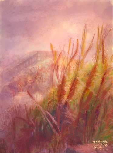
Since this is a Photoshop filter, it is an easy one to try out and produces some really terrific lighting results. And since photography is all about light, it has a lot of possibilities. I have used it for years on and off, and I am going to try it out some more now that I have learned a few more things about how to use it. Hope everyone is doing fine and will be able to get out and start taking pictures soon……Digital Lady Syd
Image Post-Processing Details:
Squirrel Monkey Image: To begin this image, a texture group was created using FrenchKiss’s Stone Blush texture (these are fabulous painted textures) and Kim Klassen’s Epic texture (and yes, Kim is doing her wonderful textures again). The textures were put in a Group and set to 30% opacity – this gave the image a really beautiful pastel spring-like feel. The monkey was selected and place on top and lots of clean up was done, including adding some fur in strategic places (used coyotemange brushes Rough Tuft and Long Fur from last week’s blog). Next on a stamped layer Skylum (see sidebar at my Tidbits Blog for website link) Luminar 4’s Sky Replacement look for this image was applied – it found all the white areas and added in the sky – totally Amazing! On another Smart Object stamped layer, the Lighting Effects Filter in PS was added. This really sharpened up his fur by setting the Texture field to Red Channel (appears to be the best default channel to use for this) and a Height of 1. A Spot Light was used first on the whole image. Next an Infinite Light basically just lightened up everything. Last a Point Light was just a small one placed on his face to brighten it up only and get that backlit feel. The rest of the image was the standard clean up layer, Curves Adjustment Layer, and Levels Vignette.
Butterfly Image: Just used Topaz (see sidebar at my Tidbits Blog for website link) Sharpen AI (love this filter) and Topaz DeNoise AI first. Then added a texture called BB Orange and Gold Bokeh (not sure where I got it as it is from 2008) set to Overlay blend mode at 72% layer opacity – duplicated texture and set it to 17% blend mode. On a new layer painted in some Bokeh circles sampling the colors from the texture (used a brush from MiniPixBox-Bokeh 34). Did some clean up and the image just looked a little drab to me. On a stamped layer turned into a Smart Object, the Lighting Effects Filter was opened – only a single Spot Light effect was added – similar to the giraffe filter settings. No Texture was added – here are my settings on a Spot Light set from upper left to lower center right: Color White and Intensity 26, Hotspot 22, Colorize (light yellow H58/S27/B75 and Intensity +1.50) and Exposure -76, Gloss -32, Metallic -6, and Ambience 26. It definitely added the light in the area on the wing where the light was coming onto it.
WHEN DO YOU USE TOPAZ DENOISE AI, SHARPEN AI, AND AI CLEAR?

I was going to do a review of the updated Sharpen AI, but decided instead to write about when to use all these fabulous Topaz AI plugins since I think it is personally very confusing. I actually had this blog half-drafted a whole year ago and did not publish it as I could not figure out exactly what was going on. This week I finally got some answers in a couple Topaz (see sidebar of my Tidbits Blog for website link) Webinars that Joel Wolfson did in the last few months. So here is my take on what is going on and how I am using these products.
Always apply Topaz DeNoise AI (or any denoise product for that matter) first before applying Topaz Sharpen AI (or any sharpening filter) – you do not want to sharpen any noise residing in your image. Lots of photographers do their RAW processing first, then use DeNoise AI, and finally apply Sharpen AI – both programs can be reached directly from ACR, Lightroom, OnOne, and several other software programs or from within Photoshop as a plugin.
Topaz DeNoise AI
They have upgraded DeNoise AI several times since it was first released a year ago. It has been greatly improved with each revision. DeNoise AI also includes AI Clear and I will discuss that in more detail below.
So why use DeNoise AI? It is especially good for images set to a higher ISO, especially with lots of dark areas like night images. More noise will show up in the shadows and with the newer cameras especially, the ISO can be cranked way up to get that all-important detail. DeNoise AI has the ability to find just the noise in the darker (or lighter areas) areas and leave other noise-free areas alone. I have an older DSLR camera and the higher ISO setting images show lots of noise – this program has been a life-saver for me as I want to take those night-time shots too. The image above was taken in low evening light using 2000 ISO, which is unheard of for me and my camera. Below is the screenshot of what DeNoise AI was able to do to clean up this image – it may appear a little soft looking here, but at 100% it is still pretty sharp.

What the Sliders Do:
First, turn off the Auto-update preview or your computer will go nuts running all the time – just remember to click Update when ready to see the changes. Also note that at the top there is a Brightness button – it sometimes helps to see the noise better. To me the Auto button does not recognize the correct amount of noise in my images, so I do not use it. When adjusting these sliders manually, I usually over-adjust the Remove Noise amount, then move it back to the correct setting. And yes, keep hitting the Update button to see the change if Auto Update is turned off. What does the Sharpen slider do if there is a Recover Original Detail slider? According to Topaz, “It sharpens the details in your image since removing noise can sometimes soften the details in images, this allows you to retain that sharpness after processing your image.” The Recover Original Detail slider allows for refinement of details in the image to achieve a more realistic look if it appears that DeNoise AI has over-corrected the image. Still not clear on this, but it does seems to improved some images. It helps add some detail back when the image looks too smooth, especially with Portrait images – it definitely helped this flower image too. Looking at other images, it appears most people use Recover Original Detail somewhere around 25 to 35 for a setting. If there is color noise in your image, moving the Color Noise Reduction slider is very useful – a Size slider will appear where you must decide how much more of the image each pixel will look at – Joel says 0.50 is a good setting for this.
TOPAZ SHARPEN AI
The above image also had Topaz Sharpen AI applied after Topaz DeNoise AI from above. This is turning out to my very favorite Topaz product because I do not often shoot with a tripod and it has saved me on many occasions. One thing Joel pointed out is that when you are looking at your image set to 100% in Topaz, it is really the equivalent of looking at your image at 200% in Photoshop or other image processors. So if your image looks a little “crunchy,” it will not look like that at 100% in Photoshop. I do believe I get some really tack sharp images with this filter and often do not use DeNoise at all, but go directly to this filter before doing any other post work. One down side about this filter is that it takes a while to process and the larger the image, the longer it will take to Update and Apply.
 What the Sliders Do:
So more confusion here. Personally I do not use the regular Sharpen mode – it corrects for just general out-of-camera softness and does not do too much for my photos. But usually I will try both the Stabilize Mode (for motion blur or camera shake issues) and Focal Mode (great for bringing an eye in really sharp focus – corrects up to 10 pixels of focus blur). Sometimes one gives better results than the other. I will use the Auto button as a starting point for this filter – it appears to be a little better than DeNoise AI’s. Also, turn off the Auto-update Preview if you do not want to update every time you move a slider or the image – just remember to click Update when ready to see the changes. Obviously the Sharpness slider will sharpen. But why yet another Suppress Noise slider? Topaz says it is to help remove noise so I am not sure why they put it here when they have DeNoise AI. I have found that if I do not quite remove all the noise in DeNoise AI because I am losing too much detail, by going into Sharpen AI, the noise can be adjusted a little more accurately to keep the sharpness tack sharp. But that is a bit of a pain to do. I never use the Add Grain.
Here is the best part about this filter – it now has masking capabilities and you can paint in just where you want the sharpness to be applied. So if you are doing a portrait and want the eyes sharper, just adjust the whole image for the eyes only, then click on the brush icon at the top, adjust the brush size, and paint out the eye only. The rest of the image stays just how it was. This is a fabulous addition. I like that you do not have to sharpen the background of an image to get a really sharp foreground such as a bird or animal in the foreground. The brush has settings for Edge Aware, Radius Size, Softness, and Opacity. A red Overlay can be turned on and off to show where the mask is being applied and a small mask window appears in the bottom right. Just click apply mask, click update again, and Apply.
AI CLEAR
In the DeNoise AI filter, there is an AI Clear Model. This is supposed to be exactly the same filter as the one that is in Topaz Studio – one big difference is that you can adjust the View with the Scroll Bar in Studio while you must use the parameters Topaz gives in you in DeNoise AI – mainly 100% and 200% are the most useful. I will not go over all the settings as there is an overlap between them and the DeNoise AI sliders – basically one is simplified for quick use. Below is a screenshot of the red flower using only the AI Clear filter in Topaz Studio and using the extra Exposure and Clarity sliders.

I personally like having the other two sliders to help adjust the lost contrast that denoising causes. Also, I noticed that the Recover Details did not work well on this image using either filter. Below is an image of Piccadilly Circus in London after AI Clear (Remove Noise High, Enhance Sharpness High and Recover Details 55) and Topaz Sharpen AI (Model Stabilize, Manual mode, Sharpness 100 and Noise 100) was used. For some reason, when Topaz DeNoise AI Mode was applied it lost a lot of the detail, especially of the very back building.
 Here is a screenshot of part of the original so you can see all the noise in the image – it was taken at ISO 1600 and F/7.1. I was totally surprised that AI Clear would do a better job, but it did here. I would suggest trying both modes in DeNoise AI if you do not the like the results of one of them.

What is the difference between DeNoise AI and Sharpen AI?
From Topaz website “DeNoise AI uses AI algorithms specifically made for digital noise removal. Its sharpening functionality is used primarily to smooth out any artifacts created during the process, and aren’t nearly as advanced as Sharpen AI, whose AI algorithms are custom built for focusing images.”
What is the difference between Sharpen AI and AI Clear?
From Topaz website “The Stabilize (shake reduction) and Focus (focus correction) modes in Sharpen AI have no AI Clear alternatives. These modes serve the purpose of InFocus classic plugin (with better results) rather than pure output sharpening.
The Sharpen module in Sharpen AI does have similarities with AI Clear. The difference here is a bit more subtle and come from the training process between these two products. AI Clear was trained on images with generally more noise, whereas Sharpen AI was trained on images with generally less noise but more blur. Resulting in AI Clear’s main detection is noise whereas Sharpen AI’s main detection is to recognize blur. This makes Clear optimal for noisy images and Sharpen more effective for a bit more blurry images.”
What is the difference between DeNoise AI and AI Clear?
Joel answered this question and I have found it very helpful. Most DSLR camera’s have a low pass filter in front of the sensor which blurs the image a little. AI Clear is basically a Capture Sharpening and he personally applies it on every normal image first thing. He does not need a lot of denoising or sharpening, but just a little. I know I have used AI Clear in Topaz Studio (he uses it from DeNoise AI) for a long time and it is one of my favorite filters. You should use DeNoise AI when there is a bigger noise issue.
Bottom Line
Use DeNoise AI for images that just have too noise. The Sharpen slider adds back any softness that the filter may have caused, but it has limited capabilities.
Use Topaz Sharpen AI to fix up any images that are a little soft from shake or lack of focus. Especially useful for helping images that were hand-held. The DeNoise slider in this tool does not seem to be as robust as using DeNoise AI’s Remove Noise slider but does work some.
Use Topaz AI Clear (in Topaz Studio or DeNoise AI) for capture sharpening at its default settings for most images. Just really sharpens them up the right amount and helps with the final look.
For me Topaz Sharpen AI may be the best filter on the market right now – it is totally incomparable IMHO! The new Masking Brush is just an added bonus. By having the Suppress Noise slider, it will find any excess noise that was missed in DeNoise AI. I would definitely get this filter if I did not already own it. I think DeNoise is a fabulous program but it is not usually my issue. AI Clear does a wonderful job in Topaz Studio for me so I stick with it. I believe if I upgrade my camera soon, DeNoise AI may be much more important since I will be using those higher ISO settings, but right now, AI Clear fixes most of my noise issues.
Hope this cleared up a bit of the confusion on these filters. It has been a struggle for me to figure out when and which one to use. Have another great week and I hope everyone is catching up on some of that post work that seems to be always waiting for you! ….. Digital Lady Syd
SCANNING WITH A BLACK BOX

To keep busy I have been watching a lot of videos, especially some drawing videos by Aaron Blaise, possibly the greatest wildlife illustrator around (and he has some great deals on his site right now), and Johannes Vloothuis, a fabulous painter and teacher (he creates these great “paint-along” videos using regular paint media, but the information applies to digital painting very nicely). Also this week I did try to get a bit creative with my photography and made a small black box out of cardboard to scan some of my yard flowers.
Quick Workflow
- Took a small cardboard box (7″ X 10″) and cut the bottom and top off of it. Then cut down the sides so they were only 3″ tall. With some flat black matte spray paint, sprayed the inside of the box. Also sprayed one side of a flat piece of cardboard to use as a top – made it a little larger than the inside of the box. (Note: in the related blog at end, a black sunglass case was used as a black box for a small bloom.)
- Plucked a couple flowers off my Plumbago Plants growing outside and pulled a couple of leaves off also.
- Put the black box on the scanner with the top off and laid out my flowers and leaves. Put the black top piece facing down on the cardboard box.
- Fired up my old scanner (a 16-year old Epson Perfection 3200 scanner – I can’t believe Amazon still has it????) that is actually working fine – set the resolution to 3200 and tiff output.
And a rather interesting image appeared! I really liked the soft look of the flowers it created.
Issues to Look Out For
- The scanner software I use is called VueScan X64 which was bought ages ago. They continually upgrade it and it has always worked for me until their latest upgrade in March – I had to remove it and go back to the earlier version. I guess my scanner model is getting too old so just beware when upgrading your scanner software.
- I tried a few different arrangements. Found out that these flowers wilt very quickly, so you have to do this pretty quickly or pick more fresh blossoms to scan.
- I had not cleaned my scanner glass very well and it was also dusty even under the glass. Be sure to clean the top of the glass before doing your scanning. I have no idea how to clean the inside area.
There were lots of white dots showing up in my image with the black background. Luckily Photoshop came to the rescue. To get rid of these nasty white dots, went to Filter -> Noise -> Median and set the Radius to 2. It can be previewed easily while you adjust the slider. This got rid of most of the dots. Just remember the filter also softens up your image just like any noise filter does so don’t overdo it. A layer mask was added and the areas to keep sharp were painted back. Since there were still a few white dots left over and on some of the flowers painted back in, a New Layer twas added for the Spot Healing Brush to finish the clean up process. I could not believe how well this worked.
The image was sharpened using Topaz (for website link, see sidebar at my Tidbits Blog) Sharpen AI before doing the white dot clean up – it definitely did help sharpen up the blossoms. The vintage border was from Heybing Supply Company. A little dodging and burning was done using lighten and darken Curves Adjustment Layers – painted in where the dodging and burning should occur using black layer masks. (See my How to Use Curves Adjustment Layer to Dodge and Burn an Image blog for more on this.)
What I liked about the black box effect is that the colors of the flowers were pretty close to what the blossoms really looked like. A slight depth-of-field was obtained with this method which I found rather pleasing. Lots of fun but I did learn a few things along the way. Hope everyone is doing well and trying out some new techniques! Have a great week creating! ….. Digital Lady Syd
Digital Lady Syd Related Blogs:
Scanning a Bloom for a Different Look
HOW TO ADD A LITTLE EXTRA DETAIL

This post was going to be a review about one of my favorite filters, the now updated Topaz Sharpen AI filter that contains a brush for creating a mask to locally sharpen certain areas of the image. There appears to be a few bugs yet so I am not ready to review it. Instead I went back into my archive to find some new things to work on during this stay-at-home time. Therefore this week is going to be just a short blog on getting a little detail into an image, in this case some Jellyfish images. Hum!
The Moon Jellyfish image above seems to be both creepy and beautiful at the same time. (Their body is white in color, round, and very transparent so when the sun or the moon is shining on them, they look just like a lit-up moon.) What was really interesting to me was how to get all the nooks and crannies of this image to look as transparent as the jellyfish really looked. The Camera Raw Filter was opened and a free Profile in a Sparklestock set called Lemon – Pumpkin 02 profile at 106% was selected (they have many great presets and all have free samples). Then the basic sliders were adjusted so that the background was a little darker and the light lines showed up a better. Some Texture and Clarity were also added. Since I did not have my Topaz Sharpen AI working, I decided to use my back-up which never lets me down – Luminar 4 (see sidebar at my Tidbits Blog for website link). It has also been recently updated for Landscapes or Portraits. Sometimes the AI Enhance Tool is used, but in this case it was lightening up the background too much. The AI Structure Tool (Amount 73 and Boost 43) and painted in a mask where on the areas needing sharpening was used first. Then applied the Details Enhancer Tool (Small Details 49, Medium Details 25, and Large Details 37). These are usually the only two filters needed to get some great detail from Luminar. Now here is a great trick when working with objects with thin lines – go into Topaz (see sidebar at my Tidbits Blog for website link) Studio 2 and apply the Edges Filter. This filter can do wonders to give a little more edge to objects. In this case these filters and settings were used: AI Clear: Remove Noise Auto, Enhance Sharpness High, Exposure 0.02 and Clarity 0.40 (I still love this filter in Studio and just by adding a little Clarity here helped quite a bit in this case); and Edges: Edge Type – Monochrome Line, Edge Tone – Light, Edge Strength – 0.67, Simplify Edge – 0.04, Suppress Weak Edges – 0.35, Suppress Small Edge 0.84, Edge Thickness 0.12, and Edge Resolution – 0.84 – painted off any long white lines which looked over the top. That was basically all that was done on this image, but the sharpening process turned out really good.
So for this image the following items were used to add the detail: (1) Camera Raw Filter and the Texture and Clarity sliders in particular; (2) Luminar 4 using their AI Structure and Details Enhancer Tools; and (3) Topaz Studio 2’s AI Clear (especially the Clarity slider) and Edges Filters.
*****

This image is of a more traditional looking Jellyfish, the kind I have seen in the ocean before. This time a more painterly effect was applied and most of this was done in Topaz Studio 2 where the more artistic filters can be found. This time an older version of Topaz Sharpen AI (Model: Stylize at Sharpness 0.90 and Suppress Noise 0.20) was used to do my initial sharpening – and it did a great job. Luminar 4 was applied on a stamped layer and the Dramatic set Mystic Look preset was applied which gave it an overall painterly feel. Then on another stamped layer Topaz Studio 2 was opened and AI Clear applied – Remove Noise: Auto, Enhance Sharpness: High, and Clarity 0.78. Next the wonderful Edges filter set to 100 Opacity, Multiply blend mode, Edge Type Monchrome Edge, but this time Edge Tone: Dark instead of Light as above. All the other sliders refine the original Edge Strength (0.78) setting: Simplify Edge 0.40, Suppress Weak Edges 0, Suppress Small Edges: 0.00, Edge Thickness 0.40, and Edge Resolution 1.00. In layer mask with brush set to Transparency 0.50, Radius 0.03, Softness 0.50 and Edge Aware On, painted effect off in a mask where the lines were just too dark – this still left an enhanced line but was not as obvious. The Impression filter was set to Type 13, Background Color Original in Texture section, and in inverted layer mask, just painted over the top of the Jellyfish with brush at 0.78 Transparency. Back in PS, the background was created by using 3 different colors on 3 different layers using the Shadowhouse Creations texture brush set to a large size (it was the 2nd example created in my recent How to Create a Texture Brush to Match a Texture blog). Then put layers in a group and set it to 82% layer opacity. On a New Layer on top, the top part of the Jellyfish was smoothed with a Mixer brush. Then on another New Layer, a small brush was used to add in some of the tentacle lines that were missing. Text was Hardwired Script Update and it was a lot of fun to use – the creator added in many variations for the letters. Still more clean up, but these were pretty much the steps. Once again Studio’s Edges filter was a great help.
For this image, these detailed items were used: (1) Topaz Sharpen AI; (2) Topaz Studio 2’s AI Clear and Edges filters; and (3) actually drew in any small lines that needed emphasis using a tiny small brush.
*****

More Moon Jellyfish – this time in a sepia tone. Did initial sharpening in Lightroom using the Detail Panel before applying the old Nik Silver Efex Pro filter to the image. Just the default preset was used to start and then changes were made using Toning Preset 9 to give a slightly bluish look. Back in PS the image was inverted (CTRL+I on the image). A Color Lookup Adjustment Layer was added using a Color Negative Device Link preset (not sure if this is from PS or not) set to Hue – it added the nice sepia effect. The Moon is from Rule by Art (in Design Cuts Planet-Space-Explosion-Background and Ancient Texture set) and it was also adjusted to match the Jellyfish using the same Silver Efex Pro and Color Lookup Adjustment Layer settings. Another Color Lookup Adjustment Layer was added and set to the Foggy Night preset at 63% layer opacity and Overlay blend mode. Used the same Hardwired Script Update font. Last step was a Curves Adjustment Layer to add a little contrast back.
In this case, the only sharpening needed was in Camera Raw. It is interesting to see that each image had such different requirements.
Hope everyone is taking it easy and trying out some new techniques. That is what I was trying to do with my images – try a few different things and see what I like. It is actually nice to be able to slow down and think about this – just hope it is not for too long. Stay safe!…..Digital Lady Syd
