
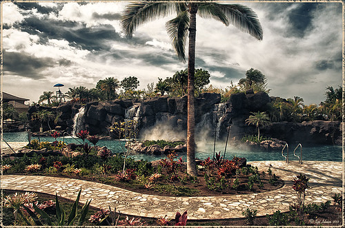
JUST A LITTLE LANDSCAPE LOVE

Taking a bit of a break this week from blogging. Well I thought I was but this image took a very long time to post process so it is a good thing I like Photoshop! I will share with you some of the techniques that went into creating this image.
- This was a 5-image HDR taken at Spanish Cay in The Bahamas several years ago. (It is also one of the places to go through customs when sailing in and out of The Bahamas.) Used the Lightroom HDR program – just made sure the auto settings were turned off so I could do the next step.
- The resulting DNG image was opened in Photoshop. I have been learning how to work with Jimmy McIntyre’s Luminosity techniques for landscapes. The steps he explains in his How to Use Luminosity Masks and Single Exposure video – this is a bit of a complicated technique that uses the Apply Image command, but it gives great results. In my Tidbits Blog of Thursday called Little House on Green Turtle Cay, the same technique was used.
- The resulting image was pretty noisy so on a stamped layer (CTRL+ALT+SHIFT+E), Topaz (See sidebar at my Tidbits Blog for website link) DeNoise AI was added – used the Auto settings and it cleaned it up with just a small amount of the sliders. Best I have seen it do! Also Topaz Sharpen AI was added using Stabilize model (Sharpness 74 and Suppress noise 16). Be sure to watch haloing with this filter – it probably caused some of my clean up issues that had to be addressed later.
- The Lighting Effects filter added some more warmth to the image. Last week I did a blog on this filter – this week Colin Smith came out with a new video called Lighting Photos in Photoshop – add Stunning Sunset Lighting. I felt like it did a good job on this image.
- There were several places with some color discoloration on the water – used a tip I learned from Randy van Duinen. This is the best way to fix it when faced with type of color distortion: make a rough selection of problem area and enter the Quick Mask Tool, go to Gaussian Blur Filter set to a large amount for blending edges (depends on size of selection), go out of Quick Mask, and add a Curves Adjustment Layer (or any Adjustment layer needed) and adjust all the channel curves to match up. See my How to Subtle Adjust Areas of an Image Using Two Methods blog for more on this. This is one of my favorite PS tricks.
- There was a little haloing where the clouds met the treetops – it really was not haloing but it looked bad. To smooth the colors between the clouds and the trees, David Belliveau’s fabulous mixer blender brush was used at a small size – it can be downloaded at his Painter website. The brush is one of the best for blending anything.
- Several areas were accented with a little spotlight effect – set a layer to Overlay blend mode and Brush Options set to 100% Opacity and 9% Flow. Just dab where a little brightness (or darkness or color) needs to be added.
- Last step was to create a little vignette. Since this sunset makes the image off-balance, the vignette techniques I usually like did not work. Went back to Jimmy McIntyre and followed his The Power of Vignettes in Photoshop where he uses two different Curves Adjustment Layers to create the vignette. This technique worked the best and gave a more natural look.
Well that is it for this blog – just a little landscape jargon. Hope everyone is safe and still enjoying learning new things that can be done with Photoshop. I am slowly trying out some recently viewed video techniques – many were used above. Have a great week!…..Digital Lady Syd
TRYING OUT THE UPDATE TO PHOTOSHOP PLUGINS
 This week just sharing a few images using some of the new programs that are out there. It seems you just have to try them all out and push the sliders to the limits to see what you get. I have been really pleased with all the ones used in these images. Note that all the shown plugin/software websites are linked in the sidebar of my Tidbits Blog.
On1 Photo Raw 2019
The above macro shot is of some Plumbago blooms growing in my backyard. Very little was done to this image in On1 Photo Raw 2019, but what it did was significant. I really like how sharp and clear this image is. The Effects tab was opened and the image was warmed up a little using the Color Adjustment Filter’s Yellow button, then the Default Sunshine filter, and the Dynamic Contrast (my favorite On1 filter) that just sharpened up the image beautifully. Last thing done was to open up the Local Adjustments tab and add some Detail Structure set to 40 and paint on the petals in a mask. This was all done while using this program as a plug-in to Lightroom. The image was finalized in PS so that I could put a signature block on it and a layer style stroke around the outside for posting. I am really starting to love the update they have made to this program.
******
Luminar 2018
 This image was first worked on in Lightroom – used one of Serge Ramelli’s presets from his Welcome Kit called Bad Weather 4 – it gave a good place to start adjusting the image. His preset uses a lot of Gradient Filters and Radial Filters that need to be adjusted and moved for each image so that was done here to get the beautiful lighting effect. In PS, the new Content Aware-Fill command was used to clean up the background which had several buildings sprinkled around. The secret sauce in this image was using Skylum’s Luminar 2018. To get the really sharp effect, Skylum’s free download category called Joel Grimes Preset Pack was selected – I love this set of presets. (Here’s the link to download them directly – they are called Pro Photographer and Artist Presets – then go to File -> Add Custom Presets Pack and select them to add in). The Detailed Warmth preset was selected and set to 39% opacity. A New Layer was added above and the AI Filter Boost was set to 40, and the new AI Sky Enhancer Boost set to 33. The Image Radiance filter was set to an Amount of 38 and an overall filter Amount of 89. Back in PS, a Curves Adjustment Layer and Flypaper Bird Brushes Crows 3 were added at 43% layer opacity. So the birds look natural, I always clip (ALT+click between the layers) a Pattern Adjustment Layer to them – in this case a dark brown pattern set to 100% scale. On a New Layer set to Overlay blend mode was added on top – with a soft low opacity black brush, the foreground was painted in lightly to darken it slightly. That was it. Luminar does such a beautiful job on landscapes. Definitely their strong point!
******
Aurora HDR 2019
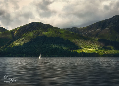 I have loved this program from the moment I tried it out. I like the fact that it does not create that sort of exaggerated HDR effect that was so popular a while back. And I love that just one photo works fine in the software. This image was taken somewhere in the highlands of Scotland – I was wishing I was on the sailboat when I took this image. Not a lot was done in Aurora – just applied a preset that really caught my attention in the Dramatic Collection called Sleepy Drama. In PS a Color Lookup Adjustment Layer was added and my favorite preset called Foggy Night was added and the opacity was set to 60%. On a New Layer the Sharpen Tool was used on the Sailboat. The biggest problem with this image was the sky. On another New Layer one of my very favorite brush sets, Grut’s FX Cloud Brushes, was opened and the Cloud Lumens Hi was selected using a touch of gray color to it to add into the clouds – the layer was then set to 76% opacity. These brushes are just excellent for these kind of quick touch ups! Last step was to add a Curves Adjustment Layer the add a little more contrast into the image. The original image was in tones of blues and green and looked very dreary. It is amazing what this plugin did for this image.
I am slowly figuring out which software works for which type of image I am going to using. If the image does not look good with my first choice, it is great to have several other choices to try out. I totally love the AI Clear in Topaz Studio, which I did not show in this blog, but use on almost all my images now. It does a remarkable job of just doing a very subtle sharpening. But then I find that On1’s Dynamic Contrast is awfully close and I use it quite a bit too. Both seem to do a slightly better job of sharpening than Lightroom. And sometimes I do both, even though I am not supposed to – I find it works okay. I hope this gave you a little more to think about when using these plugins and making a decision as to which you want. I really enjoy all of them so this is hard for me to choose the best one. Have a good week…..Digital Lady Syd
WHICH HDR PROGRAM TO USE? WHAT A DILEMMA!
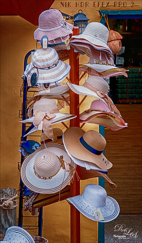
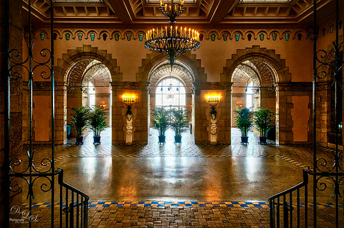 This week I performed just a little comparison of the my HDR programs. I get so confused about which one I want to use and what the differences are between them so I decided to take the same image and run it through each of them. What I found out is although the basic image is the same, depending upon the HDR program used, a totally different look will be achieved. So what my final conclusion is that you need to decide up front what effect you like, and then choose the program that gives this result. That is why running an image through each program is so informative – it shows the subtle differences that need to be known to make the an intelligent choice. So below is the image example and a little info I learned about each software as I experimented. The image was taken of a Hat Rack that is outside a store on St. George Street in the historic district of St. Augustine, Florida. Also, all three images had a little work done in Photoshop – the price tag amounts were removed, the same High Pass filter set to 2.0 Radius and Overlay blend mode was used on each (except the On1 image which was sharpened enough and it caused haloing), and a Red Channel Luminosity Adjustment Layer was applied although different RGB settings were used for each. The top image is a 3 image HDR of the ballroom at Whitehall (Flagler Museum), Henry M. Flagler’s Residence in Palm Beach, Florida. It was post-processed using Aurora 2018.
Aurora 2018
To begin with, I love this new HDR software. Why? Because it is so easy to use. Aurora (for website link see sidebar at my Tidbits Blog) have canned presets (and some more can be downloaded for free from within the program) and the interface is pretty simple. That said, there are a few problems if you are a Windows user. It is hard to navigate around the image when zoomed in is my first pet-peeve. The biggest problem is when using the Dodge & Burn filter which I really like on the image. The program did a great job in removing ghosting but the colors seem to be a little off to me. Below is the result I got using this program. (Here are the settings used on it: AU 2018 – HDR Basic: Temp 9, Tint 16, Exposure -0.44, Contrast -2, HDR Enhance 79, Smart Tone -31, Highlights 24, Whites 36, and Blacks -20; Color Vibrance 44, HDR Structure: Amount 78; Image Radiance Amount 41 and Brightness -20; HSL Sat Red 47, Orange -11, Aqua -67, and Blue -58; Dodge & Burn – set brush to 12% Strength and painted with Darken around the edges and with Lighten on the lighter parts of the hats; Vignette: Amount -62, Size 32, Roundness -51, Feather 53.) Overall, this is a great program, especially for Apple people, but it needs to be updated to the Apple version for Windows people to really get the full punch of the program.

NIK Efex Pro 2
I decided to include this one since everyone probably owns it since it is free. When this program first came out several years ago there was a lot of excitement generated by this HDR software. I found it still works really good. There are lots of presets to try out and that is exactly how this image was started. It looks very different from the above – the colors are much truer. Is that the look I wanted? Maybe. The disadvantage in this program is there is no Dodge and Burn filter which is what I think made the first image more interesting. (Here are the settings used on this image: NIK HDR Efex Pro 2: Selected Pale & Structure and changed Tone Compression to -18%, Method Strength 41%, HDR Drama far left and the Color Sat to -14%. Add control point to reduce the effect on the bright items in the door on right. Added Vignette Lens 3 vignette and changed amount to -5%.) This is not a fatal flaw since this can be done in Photoshop. I am a little disturbed by the slight amount of haloing that I could not figure out how to reduce in the plug-in so I ended up hand cloning out – still some present. I am not sure this plug-in is still available as a stand-alone, but I have never used it this way. Overall, it gives a nice result and I am sure the haloing issue could be avoided with the proper settings.
On1 Photo Raw 2018 HDR
On1 software (for website link see sidebar at my Tidbits Blog) has come a long way in the last few years and their HDR filter within the software interface is pretty great. The HDR section is set up so that once the HDR images are selected in the Browse module, the Create HDR dialog opens showing two tabs, Tone & Color tab (with are the standard LR Basic sliders) and HDR Look (which has the compression slider among others). Once the HDR image is saved and created, the program lets you use their Develop module or Effects module to further enhance the image which opens a lot of extra possibilities. (Here are the settings used in image below: Create HDR-Tone & Color – Exposure -0.2, Contrast -12, Highlights 0, Shadows -17, Whites 1, Blacks -14, Structure 17, Haze -9, Temp 4650, Tint 4, and Vibrance 37 and HDR Look: Compression 51, Details 21, Clarity 27, Vibrance 10, Glow 0, and Grunge 7. Effects module: HDR with the settings from HDR Look show up; Dynamic Contrast: Small 6, Medium 61, and Large 43, Highlights 17, and Shadows -4; and Color Enhancer: Red Sat 10; Orange Brightness 10; and Blue Sat -11; and Vignette: Big Softy preset and Brightness -51, Size 38, Feather 100, and Roundness -56.) I have done several HDR images with this program and really like it. I found on a water scene it had a little trouble with the ghosting of some sailboat masts. But other than that I have gotten some great results. In this image it seems that the whites are much better than th two above.

Lightroom HDR
This is very easy to do in Lightroom – just select the images to create the HDR image, right click and choose Photo Merge -> HDR and in the HDR Merge Preview dialog, check the options you want and click Merge. It brings the new HDR image back into LR as a DNG file. I do not use DNG files usually, but have found not problems with it. Now you can do all the same adjustments that are made in LR normally. Major great and easy! The HDR image allows the Exposure slider to go from (+5) to (-5) to (+10) to (-10). I found the resulting HDR image almost sterile looking – no noise, color absolutely correct – almost a flat look. On the other hand it is very realistic. After doing the Basic changes in LR (Settings were: Basic panel-Tint +21, Exposure +0.71, Contrast -16, Highlights -100, Shadows -7, Whites +2, Blacks -48, Clarity +2, Vibrance +18, and Saturation +4; HSL Panel Luminance Orange -20 and Yellow -8; and with the Adjustment Brush set to Exposure 0.80, Clarity 77 and Sharpness 83, the hats were painted over.), the photo was taken into PS. A Color Balance Adjustment Layer was used to add a little more brown-gold look to the image. Since there was not texture at all in this image on the background, a Digital Grain texture I had created a while back was applied on top. It did seem to help a little.
 So which of these programs did I prefer? This is such a hard one to decide. I did not use Photomatix Pro as I own version 3.3 and apparently they are on version 6.0 – I did not mind using it a few years ago as it gave very good results. They all gave sharp and clean images. I believe that Lightroom’s HDR effect is extremely realistic and that is perfect when you need something with really sharp lines. It does a fantastic job with this. On1 has this great advantage of also being tack sharp which one of the things I like about this program even when not doing HDR – their Dynamic Contrast filter is just fabulous! Their HDR is also very good. Nik HDR Efex Pro 2 may be lagging just slightly behind, but this is extremely power HDR software and if you cannot afford to buy new program, just download this one. It is still just fine for most image. The new guy for me, Aurora 2018, is really good – it is the brainchild of Trey Radcliff, a major HDR guru, so this is why it is so good and easy to use. I thought it did a really good job on the Flagler Museum image which has a lot of exposure issues in it. Overall, the best way to figure this out is to try them all. I can see if I do not like the results of one software, try a different one – it will look different!
Hope you enjoyed this blog – have a great week…..Digital Lady Syd
Digital Lady Syd Related Blogs:
Sunny Florida
Checking Out Aurora HDR 2018 for Windows
Trying Out On1 Photo Raw 2018’s New HDR Filter
Digital Lady Syd Reviews Nik HDR Efex Pro 2
HDR Using Photoshop Merge to HDR and Nik”s HDR EFex Pro and Silver Efex Pro? Wow!
TRYING OUT ON1 PHOTO RAW 2018’S NEW HDR FILTER
 This sunset was taken at Spanish Cay in the Bahamas. Just doing a really quick blog and discussing the new HDR filter in On1 (for website, see sidebar link at my Tidbits Blog) Photo Raw 2018 software. I really gave the software a tough image to process – lots of wind so the flags and the lines on the foreground boat were slightly moving. I took 5 hand-held shots. All the midground and background objects looked perfect. But the foreground was a problem.
In On1’s HDR dialog, the HDR was set to Very High for deghosting, but the ghosting effect was still obvious. I decided to compare the results with Lightroom’s fairly new HDR Photo Merge (select images and right click Photo Merge -> HDR) where the Deghost Amount was set to High – had no ghost issues at all! The problem for me is that I liked the Tone and Color effects in On1 better than what could be achieved in Photoshop or Lightroom. So what I did was highlight both HDR images in Lightroom (a tiff for On1 and dng for LR) and right clicked, and selected Edit In -> Open as Layers in Photoshop. In PS an Auto-align command (Edit -> Auto-align layers) and Crop Tool was done first. With a mask applied to the top On1 layer, the problems with the foreground lines and flags were corrected by using the Clone Stamp Tool set to 80% brush opacity. This took a lot of time but I liked the result. Basically what I wanted to pass on is, if possible do use a tripod to take your HDR images – it will help in abnormal conditions. If having a big problem with post-processing it with On1 HDR, then do a second HDR image using Lightroom’s Merge to HDR and stack the images.
This being said, I have used the On1 HDR filter with no problems. This was a very difficult image with the high winds. Also, just to double check, I took the 5 images into Nik HDR Efex Pro2 and a little ghosting occurred in this HDR image with the flags. Therefore, it confirmed it was a pretty hard image to create. Overall with the stacking, the image turned out pretty good – and the sunset really did have those rays. I believe that On1 has some really nice settings to adjust to get very good HDR images. Have good weekend!…..Digital Lady Syd
Digital Lady Syd Related Blogs:
Work Around to Get Luminar for windows to Work with Photoshop (image in blog is a On1 5 shot HDR image)
How to Use Google (Nik) HDR Efex Pro 2
HOW TO USE GOOGLE (NIK) HDR EFEX PRO 2
 This week I thought I would just show a quick image that used Nik HDR Efex Pro 2, one of the 7 plug-ins in the now free Google (Nik) Collection. I do not do much HDR shooting anymore, but here is an image taken a few years ago that used 5 bracketed shots. If you like to shoot HDR, I would definitely check out this software – it is different from both Lightroom’s and Photomatix Pro’s HDR results. I had done a previous review years ago (see my Digital Lady Syd Reviews Nik HDR Efex Pro 2 blog) and still love the plug-in as much as before. So here were the quick steps that got this effect:
- From Lightroom, all the images were selected and opened in Photoshop as individual files.
- Next the plug-in was opened in Photoshop by going to File -> Automate -> Merge to HDR Efex Pro2 – press the “Add open file” and then the Merge Dialog button. You can click the check box for Create Smart Object so you can go back in and adjust effect. (Can apply plug-in from LR by going to File -> Export with Preset -> Merge to HDR Efex Pro2.)
- Check Alignment if images not shot on a tripod. Same with Ghost Reduction – move slider at bottom to show image that shows image with movement that looks best as in clouds or trees. Always check Remove Chromatic Aberration.
- Now just presss Create HDR – a tiff file is created.
- The Default preset is automatically applied to the image. Now the fun is going through all the presets and see which one(s) look best on the image. Experiment with the sliders on the right. Tone Compression is the amount of HDR effect seen – set all the way left there is no HDR effect. Method Strength slider goes from very weak to very crunchy looking. All the other sliders can create some nice effects. If you find a combination you, just create a preset by pressing the (+) sign in the Custom section on the left. The above image used the Deep 2 preset to start.
- Note this image is now set to 32-Bits/Channel – this is a huge file and lots of PS effects and actions will not run on it. I change it to 16 or 8 bit mode so I can do things as in the next step. Go to File -> Mode -> 8-Bits/Channel. This causes the file to be merged down and the Smart Object is rasterized. (If you duplicate the Smart Object and rasterize the layer, turn the eye off the bottom Smart Object layer, and now change the mode, select Don’t Merge Layers, the Smart Object info can be retained in the layer that is turned off – sort of a hassle, but it can be done.)
- Here is a tip from one of my favorite Photoshop people, Scott Kelby, which he offered in his videos on this plug-in. Apply the HDR effect and then take the resulting effect into Nik Color Efex Pro 4 (another wonderful plug-in and is included in the download bundle) and select the Glamour Glow filter set to the default preset. He says it is the magic that really pulls the realistic HDR effect together and does not look over-the-top. That is what was done above.
To finish up the image, the waterfall was blurred so it looks a little more like a long exposure. (See my Smoothing Out Those Waterfalls blog on how to do this.) In this case, two Motion Blur layers were created since the water flows in a couple different directions. Also the slight blue chromatic aberration edging in the small sky in the upper left was removed by using the technique in my A New Look at Chromatic Aberration blog – worked beautifully. That is all that was done.
********
Here is an image that used the Nik HDR Efex Pro 2 plug-in that was done a while back. Just another good example of how this looks. I really like the effect in the skies. This image used Grannys Attic preset.
 ********
The London of Parliament image taken several years ago used both the free Nik HDR Pro Efex 2 and free Nik Silver Efex Pro 2 (see my Make an Ordinary Image Interesting Tidbits Blog for info on how to do this.)
 ********
Here is another example using the previous version, Nik HDR Efex Pro – I really liked how this image turned out – it the used Grannys Attic preset, but it had some different parameters in the first edition, which was also very nice.
 Hope you will download this Google (Nik) collection of plug-ins – you will not be disappointed. As far as the HDR Efex Pro 2 goes, as Scott Kelby says, try it as it has a little different look from other HDR software and you might really like it. This is true of all their plug-ins – give them a try. I have always loved the Nik plug-ins – they run very smoothly even on older computers. When used with a Smart Object, the settings are preserved, even the control points that are used to localize the effects, so you can go back and adjust later. Sad to see this is probably the end of this plug-in but at least everyone now has a chance to use it. Have a great week experimenting!…..Digital Lady Syd
HOW TO USE LIGHTROOM CC”S NEW MERGE TO HDR COMMAND
 Images in this blog are of my local Flagler Beach, Florida, and were taken with my Nikon 10-24 mm wide-angle lens. This week I decided I should address this new technology that is only in Lightroom CC. Since I have not been shooting HDR for a while, it is not something I use that much. I have always used Photomatix and Nik HDR Efex Pro 2 plug-ins for my HDR images, so this is definitely an interesting update for Lightroom. Many die-hard HDR fans are not liking the results. My take on this process is that it is very good and it comes with Lightroom so you don’t have to buy it. I will probably use it when I can.
So I am going to go through my Lightroom workflow real quick so you can see the screenshots for each step. The actual shooting using bracketed images to create an HDR image is a huge topic that I am not covering in this blog. It is recommended that you first do the Merge to HDR before doing any other changes in LR, especially the Adjustment Brush changes.
1. Need to first highlight each of the images to be merged into HDR. My images selected were using Exposure Compensations of -2 1/2, -1/2, and +1 1/2. Adobe says you only need to use 2 images, but some people say noise appears unless 3 are used. Apparently 3 images are enough to get good results, even if you have more bracketed.
2. Right click on one of the selected images and choose Photo Merge -> HDR. The following dialog will open showing the basic merged image.
 I decided to use all three HDR Options even though a tripod was used to shoot these images. Always use the Auto Align to be sure they are lined up correctly. Use Auto Tone to bring in the information for the light and dark tones from each image. Only need to use Deghost when you have some sort of action in the image. This could be people moving around or, as in this case, clouds and waves that can be moving quite a bit so the High setting was selected. By checking the Show Deghost Overlay, you can see where it deghosted. I believe it was quite windy when I took these images, so that is why the plants on the right foreground were deghosted. With each change selected, the image updates.
3. Click the Merge button when all settings are correct.
 Above shows the expected rather flat merged DNG image. The DNG file format is the same as a RAW file – it is just Adobe’s file extension for RAW files. I do not usually save my RAW files as DNGs, but use Nikon’s NEF file format when I import. This is really just personal taste.
4. Apply settings to really pop your image.
First adjust the Exposure slider which now can be set between +10 to -10. The normal settings are from +5 to -5. Now since the blacks and whites are making the image so flat looking, set these. To get the best Auto blacks setting, hold SHIFT and double-click on the word Blacks – it will now be set at the position to get the best effect. You can still adjust it more if you do not like the results. Do the same for the Whites slider. Then add some Clarity and Vibrance to finish up. See the image under Step 6 to see the settings along with the HSL settings.
5. Use Lightroom’s Adjustment Brush to Dodge and Burn localized areas.  The Adjustment Brush was used to some Brightening to very localized areas – the waves and some of the rocks. Above is a screenshot showing these areas as painted as a red overlay on the the image, and the brush settings used to get these results. Just a little Exposure was added (+0.47), some Clarity, and Sharpness so the waves show up a little better. Note that in this case the brush was set to a 100% Flow, but I do not always do this. For a more gentle effect, use a lower Flow amount and build up the effect as needed.
 Above the Adjustment Brush was used to add some Darkening or Burning effect to some localized areas – only the Exposure was set to -0.39 and a few parts of the sand were darkened. You can see the white dot that shows where the dodging was added before. Just click on it to further adjust the dodging effect.
6. Adding HSL slider settings.
 Here are the settings used for the Basic settings and the HSL Luminance settings for this image. I did not feel it needed anymore changes to the colors other that the Oranges and Blues adjustments. Overall the image looked pretty nice and balanced to me.
Below is another image created using the HDR process in Lightroom. I am really pleased with the lack of noise in the image – the DNG file was very sharp, but the colors still needed a little tweaking. Some overall sharpening was done to the image in Lightroom and an Adjustment Brush was used to even out the shadows in the dark window shutter behind her. Also two Radial Filters were applied – just decreased Exposure slider for the darker vignette effect, and then increased it slightly to get the face and body lightened slightly. In Photoshop some clean up was done using the Spot Healing Brush and Clone Stamp Tool to remove a restraining rope that ran in front of the umbrellas. Also a final Curves Adjustment Layer was applied to just add a bit more contrast in the blacks. This could have been done in Lightroom as well.
 That is about all there is to it! It is very easy to do and by having the Lightroom sliders available, it is easy to adjust just the way you want. You can still work on the image in Photoshop or add some special effect presets in Lightroom. Lots of options. Hope you try out this new command, and try out shooting some HDR if you have not tried it yet. I believe it can really take your image to a higher level of detail and color. Chat at ya next week!…..Digital Lady Syd
How to Get That Creative Painterly Look
This week I decided to give a few examples of how I am getting the beautiful painterly look on images. This is the part of Photoshop I love the most – the creative part. And this is where I can take advantage of some wonderful plug-ins and textures that are now available.
 I did not start out creating this fantasy painterly looking image, but I like it more the more I look at it. This image used just a basic cloud texture and Topaz (for website link see my Tidbits Blog sidebar) Simplify 4 to get this dreamy effect. The image uses 5-shots taken along the road to Flagler Beach, Florida. I have always loved this house – it just looks like a Florida beach house to me. The HDR tone-mapped image was created using Photomatix Merge to 32-bit HDR in Lightroom and the resulting Tiff file was then processed. Once opened in Photoshop, Topaz Detail 3 was selected where the Lighten preset was first applied, and then the Overall Medium Detail II preset with the sky painted out to keep it smooth looking. Shadowhouse Creations beautiful free Puff Clouds texture was added in Normal blend mode at 100% opacity. I added a layer mask and painted out the clouds and started getting this really dreamy look by only removing the clouds from the house. Next Painted Textures 2 for Friday Seafoam texture was added and set to Overlay blend mode at 50% opacity. The last step involved creating a Composite layer of all the layers (CTRL+ALT+SHIFT+E) and applying Topaz Simplify 4 Painting V preset to it. On a New Layer above, a Mixer Brush was used to blend in the rough edges of the clouds and give an overall painterly look. A Curves Adjustment Layer was added and the Blue Channel Curve was moved to get the color of blue in the image. That was it! Not real hard but definitely a very abstract artsy look. This was a lot of fun to create!
Tips for Getting the Painterly Look:
- If you like to get a quick painterly feel, Topaz Simplify 4 cannot be beat! The nice thing is that once you apply the filter, even though it may look somewhat canned, you can always use Photoshop’s Mixer Brushes, layer masks, and various textures to make the image your own look – that is exactly what I did on the image above. Topaz Adjust also has several presets that can also give a very nice base painting look. See my blog Digital Lady Syd Reviews Topaz Simplify 4 for more information on this blog.
- I cannot say enough about using the right texture. Most of the sites I listed have either free or fairly inexpensive small sets to try out to see if you like what they do. Try different textures, and when you find a few you really like, put them together in a special file so you can get to them quickly when needed. (Click on Categories Textures for several links on this topic.) If you like what the color is doing to an image at a particular blend mode, leave it in place. With a layer mask you can paint in localized areas of texture.
- Photoshop’s Mixer Brushes just cannot be beat for getting some really nice artistic results. They are great for hiding that very contrasty background, or for smoothing out edges, or blending colors that have too sharp a transition. The pink flowers below have the whole background smoothed to get rid of a very contrasty green garden behind them. On a separate layer, a larger sized Mixer Blending Brush was used to fill in the dark contrasty areas, then a smaller size was used to smooth edges. You can always erase areas where you make a mistake since the Mixer Brush strokes are on a separate layer. A couple things to remember when using the Mixer Brushes is that (1) in the Options Bar be sure you are set to Sample All Layers and turn off the layer eyeball if you do not want to pick up color from some of the layers; (2) the Blender Brush is probably the type to be used the most and should be set to a higher Wet field in the Options Bar to work easily – at least 20% and up to 100% give really nice results; and (3) the larger the brush, the longer it takes to lay down a stroke so keep it under 75 pixels if you can. Also take History Snapshots every now and then (or add a Padlock to your base image so you cannot paint on it) so if you get on the wrong layer, which is easy to do, you can go back to a previous step without losing all your previous painting. If you want to add color with a Mixer Brush, just click on the “Load the Brush After Each Stroke” icon (5th one over) in Options Bar. Make corrections with layer masks and apply them (right click and choose Apply Mask) as you go along. Create clone and paint on layers above and merge down (CTRL_E) – then use a Mixer Brush to blend. See my blog Adobe Photoshop CS5′s Mixer Brushes for lots more info on how to use them.
- There are a couple other ways to get a really nice painterly effect. The brilliant Russell Brown has developed two scripts panels to use inside Photoshop that guides you along as you paint. The oldest is called the Adobe Painting Assistant which has different download links for CS6 and CS5 versions – just keep scrolling. The newest panel is the Adobe Watercolor Assistant Panel that can only be used with CS6. These are all free downloads at this link. The Watercolor Painting Assistant takes some practice to get a really nice result, but it will give a beautiful result. See my blog Dr. Brown’s Painting Assistant Panel for CS6 and CS5! and Think Pink! Rally for the Cure Pink Rose for more information on the older and more user-friendly Painting Assistant Panel.
- The last effect that has proven to be a real hit the last couple of years is the new Oil Paint filter in Photoshop CS6, although it can be added to CS5 by using the Pixel Bender Panel. See my blog Photoshop’s CS6 (and Pixel Bender’s) Oil Paint Filter for more information on how to use this filter. It is a lot of fun and easy to do!
 To create this painterly effect, the pink Belarusian flowers were brought into Photoshop and cleaned up. A New Layer was created and Fay’s Signature Watercolor Smooth Blender Brush was used to smooth out the whole contrasty background. I have looked at lots of painting tutorials and Fay Sirkis tutorials make the most sense to me. If you are a member of NAPP (National Association of Photoshop Professionals), and you should be if you love Photoshop – best value and site for Photoshop nuts, Fay has several great webinars on line there and you can download all her brushes. Here is a link to a great article on her unique technique where she shows how she made one of her Monet Blender brushes – if you want to give it a try – Fay Sirkis: Painting Magic, Adobe Photoshop CS5. Next Kim Klassen’s Cloth & Paper magicfilm3 texture, which is a black scratched up texture, set to Linear Dodge blend mode at 56% opacity was added – it gives just a touch of texture without losing all the strokes from the Mixer Brushes. The Sharpen Tool was applied to the center of the two main flowers to draw the eye and a Darken Layer was added and set to 56% to emphasize edges. (See my The Best Dodging and Burning Technique! blog for more info on this.)
……
 The painterly effect in the Flagler Fishing Pier image was created using a solarized preset and some soft painting with the Mixer Brush. Just had to get out and do a little shooting even though it was major chilly and windy at the beach. The original image was created from 5 images put together using Photomatix 32-bit Merge to HDR for Lightroom. Once in Photoshop I added two New Layers and added my Cloud Brushes SJ Clouds 1 brush (layer set to 60% opacity) and SJ Clouds 11 brush (layer set to 35% opacity) at 5000 pixels. A New Layer was added on top and filled with black, set to Soft Light, and the opacity set to 23% to increase the overall contrast of the image. (Check out Mark S. Johnson’s Photography Site Photoshop Workbench 374: Creating Dramatic Lighting with Blend Modes on how to do this.) A Curves Adjustment Layer was added and Auto button pressed to get a nice contrasty image. Next Topaz (for website see sidebar) Adjust 5’s Solarized Dreams III preset was applied with Detail Strength set to 0.82 and Detail Boost set to 0. A New Layer was created and Fay Signature Watercolor Smooth Blend Mixer Brush was used to smooth out details in the foreground sand. A Selective Color Adjustment Layer was used and the Blues Cyan was set to +17 and Yellow to +24 – the layer mask was converted to black (CTLR+I inside the mask to invert) and the sky was painted back with a soft white brush. Another Selective Color Adjustment Layer as added to make the sand look the right color in the foreground – Yellows Cyan was set to +100, Magenta -14, and Yellow +1, and Greens Magenta +19. Next French Kiss Artiste Fauve Rainbow texture was set to Hard Light blend mode at 28% opacity. A Hue/Saturation Adjustment Layer was clipped (CTRL+click between the layers) and Saturation was set to -100 to remove the color from the texture but leave the canvas look. This is one of my favorite textures to give a real painted appearance to my images. A Levels Adjustment Layer was added and the center tab set to .85 to add just a little more contrast to the midtones. I really was surprised how painted this image turned out.
…..
 This image uses Topaz Simplify 4 again and textures to get the painterly look. I decided to show this image as it is a favorite technique of mine to use the power of good textures to give that painterly effect. The basic image was very nice with to begin with and probably would have been fine with just the Lightroom tweaks, but I thought it would make a beautiful painterly piece. Topaz DeNoise was run on this image since it had a 2000 ISO setting. On a duplicate layer Topaz Simplify 4 was applied using the Watercolor II preset – in the Localized Adjustments section, the pink and white flowers were lightly painted back to bring back some detail but leaving the background with a very soft look. Once back in Photoshop the detail was still not strong enough so the DeNoise layer was duplicated and placed on top of the Simplify layer. A black layer mask was added and the flowers were softly painted back using a white low opacity brush to add a bit more localized detail to the image. Two beautiful textures from Melissa Gallo at Painted Textures were added on top: 2 for Friday Set 2 Creamsicle at Hard Light blend mode at 74% opacity, and Cyber Monday Set 1 Winter Wheat set to Linear Light blend mode at 78% opacity. On the top texture a Layer Style was opened and on the Blending Options page, the B channel was turned off. One of my new favorite textures is by French Kiss – Studio 3 White Wash – it was added using the Overlay blend mode at 65%. All of these textures are really great for getting the painterly effect. Once all these textures are added, you really have to try different blend combinations and opacities. It is not at all unusual to have to add a layer mask and paint out areas that are not working right. In this image I added a layer mask to the white wash texture and painted out just a little bit around the edges of the flowers to get them to stand out a little. In fact I had actually added a different top texture and decided I did not like it and started looking for a different texture when I came up with the white wash texture. I had to back and add a Mixer Brush layer to get rid of some distractions in the original image once the textures had been added and it looked bad. If you do not like the way the painterly effect is flowing, it probably is not quite right and you need to walk away and come back again later – it really is a work of art you are working on.
If you just want a nice painterly brush texture on top of the whole image, check out my Getting a Nice Painterly Landscape Effect with Topaz Simplify and Texture for a short workflow – this gives a nice finishing look to an image if there is not enough of a painterly effect already.
I hope you got some new ideas for creating that artsy look. Check out some of my related blogs for more examples and resource links that might help you along. This was a lot of fun to put together this week and I hope you enjoyed it!…..Digital Lady Syd
Digital Lady Syd Related Blogs:
Digital Lady Syd’s Rule No. 6: Try Something New!
Photo Art Compositing For Fun
Digital Lady Syd’s Photo Art Workflow
Using Topaz Simplify for That Artistic Feel!
Using a Couple of My Textures
Simplifier and Simplify Filters
Topaz Adjust Using Painting Venice Preset – Beautiful Effect!
Topaz Simplify and Lens Effects Saves an Image!
My Version of Photoshop Tennis!
I really love taking photos but I am slowly realizing that once in Photoshop, I end up with something entirely different than what I had in mind! There is an older book, Photoshop Secrets of the Pros by Mark Clarkson, where players “pass images back and forth making changes as they go” for a set number of rounds, ie., Photoshop Tennis. This book first got me thinking about doing radically different effects to images. Last week I did a blog on Digital Lady Syd’s Photo Art Workflow where I basically showed what I do to give a different feel to an image. This week I am continuing with that theme showing other options to get more of that photo art look. The images are also examples of what happens when I start playing around with different combinations of effects in Photoshop – I am never quite sure what I will end up with. I also downloaded and tried Photomatix Pro’s new program Merge to 32-bit HDR this week so that was part of the first two images’ workflow.  This image of the Ormond Heritage Condominiums (located where the old Hotel Ormond used to reside in Ormond Beach, Florida) was first processed as a five-image HDR shot using Merge to 32-bit HDR. The really neat thing is that if you already own Photomatix HDR Pro 4.2 and Lightroom 4.2, you can download it for free from the link above. All you do is select all the HDR images in Lightroom, go to File -> Export and select Merge to 32-bit HDR (or just right click and go down to Export and select the program). A dialog opens where I chose the following: Preprocessing and Merging (Align Images, Crop aligned result,by matching features, and include perspective correction) and Remove ghosts; and Name Merged File: Combined file names and check Stack with first selected photo and Scale pixel values to fixed range. The images are processed very quickly and a TIFF file is placed back with the original images, just as if you had done this in Photoshop’s Merge to HDR, except Photomatix never opens up a program – it all happens inside Lightroom. What a cool little program from Photomatix! The above image was mainly processed in Topaz photoFXlab (see sidebar for website at my Tidbits Blog) plug-in using Topaz Adjust presets. See Image 1 settings below for more info.
 When adjusting the crop on the top image in Lightroom, I got a quick look at what a small crop would look like. Basically I just liked the way it looked – the frosted light of the lamp post and the comfortable porch balconies make you want to sit outside and enjoy the view and weather. The only thing done on this image in Photoshop was using Nik Color Efex Pro 4 and stacking a bunch of filters: High Key, Sunlight, Detail Extractor, Dark Contrasts, Bi-Color Filters and Image Borders. It just works!
……
 This image was also processed in Lightroom using PhotoMatix Pro’s Merge to 32-bit HDR. I then did my adjustments on the resulting TIFF file in Lightroom. In Photoshop I decided right away to use the new Topaz photoFXlab program where Topaz Simplify and Topaz Lens Effects were used from the Plugins tab. See settings for Image 3 for the exact info on how this was applied.
 Here is the same image with exactly the same settings as in the image above except for the framing, but the twist is that a Hue/Saturation Adjustment Layer was clipped to the Vivid Light texture and set to a Difference blend mode at 71% opacity. I loved the way it looks like as if it is being drenched in some bright light – almost a spooky feeling. I am glad I did not stop with just the image created above as I think I like this one better – there may be more of a story in this image.
……
The next two images show an example of starting with a night photo taken with my point-and-shoot camera at the Gold Lion Cafe in Flagler Beach, Florida, and turning it into a really interesting almost wintery looking sketch. I did not exactly plan this result. The night image is definitely what it looked like that night as I sat topside and listened to the ocean waves rolling in. But I really like the final image with the artistic pop added.

Here is the image with a more photo art feel.

Both images took a lot of manipulation but the second one used the Layer Styles dialog to get the beautiful color out of it. See Image 6 settings below to see how this was done.
As you can see, if you stick to the basic workflow, which all these images did, but add in that new tool or different feature (like the Layer Style Blend If sliders or the new Lookup Adjustment Layer or a unique crop or blend mode combinations), you can get some very different and interesting images and end up in a totally different spot. As always, every time I work on images, it is always completely consuming and lots of fun – otherwise, why do it? Tennis anyone?…..Digital Lady Syd
Settings:
Settings for Image 1: Once the Tiff image is taken into Photoshop after making Lightroom adjustments, the background layer was duplicated Topaz photoFXlab plug-in was opened. After duplicating the layer, the Mask tab was selected and the plain sky was deleted. A new cloud image was load using +From File and placed under the top layer. A stamped layer was created using +From Stack and Topaz Adjust was opened up and Photo Pop preset was applied. In the Brushes tab, detail was increased throughout the image. PhotoFXlab was exited. The background was duplicated again and put on top in Photoshop. This layer was taken into Topaz photoFXlab again and Topaz Adjust’s preset Painting Venice was applied. Back in Photoshop a black layer mask was added and the bright areas of the image were painted in to add depth to the trees in the image. ShadowHouse Creations You’d Be Surprised texture was applied using Overlay blend mode at 34% opacity. Finally a Curves Adjustment layer was added. My frame layer style (see DLS Free Layer Style Frames) was added sampling colors from the image.
Settings for Image 3: Duplicated layer in plug-in. In Adjustments tab used these settings: Temp -4, Tint 23, Sat -12, Exp 1.80, Contrast -8, Dynamics 49, Sharpness 51, and Shadows 22. In InstaTone tab image from 500 px of an orange leaf from Aliona Shewtsova and set the layer to Saturation blend mode at 74%, which really brought out the colors. Next a +From Stack stamped layer was created. In Plugins tab Topaz Simplify was opened and the BuzzSim preset was applied as is. In the Adjustments Tab these settings were used: Temp -17, Contrast -5, Dynamics 87, and Sharpness 3. Layer opacity was set to 83%. Stamped using +From Stack. Plugins Tab used Lens Effects and applied Vignette Selective section-Soft Olive Green preset with these settings: Center on right side of slide, Vignette Strength 0.21, and Opacity 50%. Exit plug in. Exit Topaz photoFXlab. Flypaper Apple Blush taster texture was applied using Vivid Light blend mode at 100% opacity. A Curves Adjustment Layer was applied with the individual channels being adjusted to bring out the colors I wanted. My thin double edges layer style was applied (see DLS Free Layer Style Frames).
Settings for Image 5: After basic color adjustment in Lightroom (just a single shot), this image was opened in Photoshop CS6 and Nik Color Efex Pro 4 plug-in was opened. These filters were stacked: Midnight using Neutral Color Set set to 65% Overall Transparency; Bi-Color Filters using the #1 Color Set; and Photo Stylizer using Cool Silver, Style 1, Strength 38% and Overall Opacity 61%. Back in Photoshop Sarah Gardner’s Blush Ginger texture was added and set to Overlay blend mode. The new Lighting Effects Filter in CS6 was used to add some soft light to the center lantern lights – the Spotlight effect was used at an Intensity of 7 and Ambience of 60. A Color Lookup Adjustment Layer set to Abstract and Gold-Blue and the layer was set to a Screen blend mode at 64%. OnOne PhotoFrame (see sidebar for website at my Tidbits Blog) Emulsion 02 was added sampling a dark color from the image for the color.
Settings for Image 6: After applying the same Color Efex Pro filters as Image 5, the image was opened up into Topaz Simplify and a Sketch preset I had previously created was applied so that the lines looked pretty much like a black and white sketch. (To create, use Mode Edges; Colorspace RGB and all sliders in Simplify section – set all to 0.00 except Details Boost 1.00, Remove Size 0.08, and Remove Weak 0.10; Adjust section – Brightness 0.00, Contrast 0.73, Saturation 1.40, and Saturation Boost 1.92; and Edges – MonoEdge Normal, Edge Strength 5.00, Simplify Edge 0.22, Reduce Weak 0, Reduce Small 0, and Flatten Edge 2.28. To adjust the sketch detail and darkness, adjust the Simplify Edge slider.) Now here is the tricky part – a Layer Style was added by double clicking on the layer and in the Blending Options dialog, the Blend If section is used. On This Layer, the black tab was split by ALT + clicking on the tab the split tabs set to 0 and 164 – the white tab was left at 255. On Underlying Layer, the White Tab was split and set to 0 and 72 and the Black Tab left at 0. It looks really weird but it gave me the color effect I liked. This layer was set to Lighten at 100% opacity. A composite layer was created (CTRL+SHIFT+ALT+E) and using Select -> Color Range, the white was selected. CTRL+Backspace to delete the white from the image. Two layers were created underneath the top layer and using Best Mcbad Watercolor Brushes 22 and 30, a watercolor sky was created using blue and light pink. A Hue/Saturation Adjustment Layer was added to increase the saturation in the Yellows. A Curves Adjustment Layer was added to increase contrast. This image used different settings for the Lighting Filter – Intensity 5 and Ambience 93 – only wanted a slight glow since it is daylight. Some clean up was done. My Layer Style (see DLS Free Layer Style Frames) was added to frame the image and that was it! Whew!
My 100th Post! – My Favorite Things About Photoshop
Since I have reached this major milestone, I decided this week I would show a few examples of what I use the most in Photoshop and what is the most fun for me when using Photoshop. In some of these cases, I will be mentioning certain products or people but that is mainly because I really like what they do – they do not know me. Also, no external plug-ins will be discussed here.
- Photoshop’s Merge to HDR 32-bit ability that can be adjusted in Lightroom 4.1 (see my blog New Lightroom and Photoshop 32-bit Processing Capability)
- Photoshop’s Puppet Warp magic (see Straightening with Puppet Warp!)

Several things were done in Photoshop to process this image of a sailboat model of the USS Constitution located at The Casements in Ormond Beach, Florida. The most important is that a 32-bit tone-mapped image was created in Photoshop’s Merge to HDR, saved as a TIFF file, and then brought into Lightroom 4.1’s Develop module using the sliders to bring out all the details. This now makes Photoshop’s HDR processing on par with several of the other HDR software programs. The TIFF image goes back into Photoshop to finish up using another one of my favorite tools – Puppet Warp – to straighten out the extreme warping in the original image (it was actually applied twice). It was a difficult image to work on since it has a square glass encasement and the horizontal louvered blinds in the background. Just using the arrow keys is sometimes enough to push and pull the image pins the correct amount and Puppet Warp works much better than Lens Correction or the new Adaptive Wide Angle filters for me. Puppet Warp can be used in a Smart Object for readjusting later if needed.
- Russell Brown’s Paper Texture Panel for Photoshop CS5 and CS6 (see Russell Brown’s Paper Texture Panel Updated!)
 I am slowly really getting into textures – they just do so much for a boring image. The texture above was created using one of the best panels you can apply to Photoshop and that is Dr. Brown’s (may be the top Photoshop guru of all time and works for Adobe) Paper Texture Panel – biggest time saver for anyone that likes to experiment with textures! This is one feature I use all the time and can’t believe I used to go through my textures individually to try them out. To really enhance this process, create a folder on your desktop that contains several sub-folders to place copies of your favorite textures. He recommends keeping these folders to around 20 textures as it takes a while to load if it is much bigger. I have sub-folder on textures I created, my favorite textures I use all the time, and a few on textures I have downloaded or bought. You can switch folders very quickly in the panel. This image used Paul Grand’s Scratches Texture and Gavin Hoey’s beautiful grunge frame 1. I am also putting a plug in here for my favorite texture guy, ShadowHouse Creations, who offers all kinds of beautiful textures for free, and I use them all the time. I reference his textures in many of my older blogs.
- Photoshop Brushes including the wonderful Mixer Brushes! (see Adobe Photoshop CS5′s Mixer Brushes)

Those wonderful brushes in Photoshop! My very first blog featured the above image where I actually used a Photoshop Mixer Brush to paint in the petals of the flowers. This is still one of my favorite painted images – the Oleander flowers in the original were not near as pretty. The background was a Karen Sperling texture called 08Sperling (I believe this now has to be purchased – not sure how I got it) that added was a very delicate complement to the image. She is actually a Corel Painter Master and does some wonderful things in that program.
- The Curves Adjustment Layer (see I Didn’t Know That! Curves Adjustment Layers)
 Totally indispensable! The last step I always do before I save an image. A few months ago I viewed a short video tutorial at Kelby Training called Mastering Curves: Adjusting Tonality by Ben Wilmore, another great Photoshop guru, who teaches how to use Curves correctly. (I have found the Kelby Training tutorials to be the best you can find on every aspect of photography and photoshop.) The basic thing to know about Curves is that by selecting the hand tool in the top left of the adjustment panel and dragging straight up in the image it lightens it up, and down darkens it. If you get two dots close and rather flat on a Curve line, you will lose detail. A black layer mask can be created to target just the areas you want changed. It is a pretty simple technique but can improve an image quickly. Also you can save Curve settings if you want to apply them again. The image above of the beautiful birds in the Spring at the Rookery used several Curves Adjustment Layers to match the tones for the composite.
- Layer Styles to create simple framing effect (see Digital Lady Syd’s Free Layer Style Frames).
 I have been using this Double Edge Frame layer style a lot on my images – gives a nice clean look with colors that can be sampled from the image. Also plain black borders can easily be created. To download this layer style for free or directions on how to create it, see my blog referenced above. There are many other uses for layer styles that I love, but I use the frames the most. Also a couple textures were added here with Dr. Brown’s Paper Texture Panel.
- Smart Objects (see Black and White Photo or Not? Give It a Try on That Difficult Image)

I love the way you can go back in and fix your settings if you do not like the way they look. Most of the plug-ins I use have Smart Object capability and this is why I use them. I can’t tell you how many times I have gone back into Nik’s Viveza 2 and adjusted my control points! Just another great Photoshop feature. The image above of the Hilton Time Share swimming pool on the Big Island in Hawaii used Smart Objects for both the Nik HDR Efex Pro using Granny’s Attic preset and Viveza 2. Also two Curves Adjustment Layers were used.
I could go on and on about all my favorite features I love. The above are some of the ones I use the most. I thought about writing on the new Defringe section in Lightroom 4.1 and Adobe Camera Raw that works wonders on this problem – better than any of the noiseware software available for controlling the ugly fringe problem. The new sliders in both are much improved and both now do a great job on reducing noise too. Also the Graduated Filter is much improved. Back in Photoshop I love being able to use LAB mode to sharpen some of my images selectively. Content-Aware tools cannot be beat but I still use the plain old Clone Tool the most. And the improved Sharpen Tool is fabulous for those little areas that need a detail boost. I even love the Color Replacement Tool that hardly no one uses! And all the blend modes just add so much to an image. Needless to say, there is a lot to like about Photoshop and so many ways to do things. I guess the real fun is learning new ways to use it and that is why I blog! Hope you have enjoyed some of what I have learned these past couple years!…..Digital Lady Syd
Digital Lady Syd Reviews Nik HDR Efex Pro 2
 I am a big HDR fan. There is always a big discussion about which is the best application – the NAPP Photoshop Guys RC Concepcion loves Nik HDR EFex Pro, Matt Kloskowski swears by Photomatix Pro, and Scott Kelby love Photoshop’s HDR. As you can see everyone is all over the place on this issue. Several people have felt that Nik has a very steep learning curve and it is hard to get good results easily. Even with the first version of HDR Efex Pro, I have not had many problems getting good results. Therefore, I was pretty excited to hear a new version had come out. All the images in this blog have been processed using this new version.
The above image was taken at the Halifax River (Intracoastal Waterway) at Fortunato Park in Ormond Beach, Florida. The skies had been building all morning and we did have a big drenching in the afternoon. I had been wanting to try some HDR imaging with my wide angle AF-S Nikkor 10-24 mm 1:3.5-4.5 G Ed lens – for some reason I have not tried this. I love the results I got above using 5 images between -2 and +2 bracketed. For all the steps and settings used to create all the images, see information listed under “Steps and Settings for Each Image.”
What I Like!!!!
1. Sliders corresponding to the new Adobe Camera Raw sliders have been added in the Tonality section which makes it very user friendly. Temperature and Tint sliders have also been added.
2. The new Graduated Neutral Density section is proving to be very handy to even out the tone in landscape images. I have used it several times now – it can have a very nice subtle effect.
3. HDR Method section gives you more flexibility than you had in version 1.0. You can now adjust individually the Depth, Detail and Drama of an image.
4. The Detail in the images is really good – seems better than other programs I have used.
What I Don’t Like!!!!
1. (UPDATED) The Smart Object issue that included the problem of ending up with an 8-bit image and no changes appearing after applying the plug-in is no longer an issue! Nik has released a new update – Version 2.002. (If you had bought an earlier version, be sure you have this new one applied now.) This will create a 32-bit image with the Standard CS6 version (they suggest using Photoshop CS6 64-bit compatible version due to the high memory usage) and I am no longer having Smart Object issues. Thank you Nik! I feel much better about recommending this plug-in now.
2. They have deleted several of the presets I liked – Clean City 1 and Clean City 2, for example. I cannot seem to figure out if there are equivalent ones in the new version, but so far I am struggling with this. When I compared Granny’s Attic preset from version 1 with version 2, I had trouble seeing how the settings have anything to do with each other. I wish they would put a list of equivalent presets together for those of us who were familiar with the old version.
3. Personally I miss all the method drop down choices we had in version 1.0. Again not sure how to recapture some of those settings to apply to the upgraded version.
4. If you opened HDR Efex Pro 2 up from inside Lightroom, then when saving your tone-mapped image there is no choice where to save it – it goes back to the one with the original HDR images. Small nag here.
5. I am slightly concerned about all noise I am encountering when using the program, especially in the sky area. Using the Noise Reduction Luminance slider in Lightroom or Adobe Camera Raw should help reduce noise issue.
Here is great link to Nik’s Support Page that discusses various questions about HDR Efex Pro 2 – scroll down for the page for more information on this plug-in.
…..
 This image was taken under the Granada Bridge in Ormond Beach, Florida. This time the HDR settings were created using just the Default setting and going through all the sections. A preset was created at the end to retain the information. See Picture 2 for detailed steps and settings. This took a good amount of adjusting to get the look I really wanted but it did come around. I might mention that it is a good idea to go through the On Demand Video Lessons Nik has presented on how to use the program – they give you a good overall feel for the program.
…..
 This is all that is remaining of the beautiful old Hotel Ormond that was torn down after a fire in 1992. Once again in this image Nik HDR Efex Pro 2 was accessed from Lightroom. Since you can’t save the settings down as a Smart Object, there is no reason not to do this from Lightroom where you can continue processing the TIFF image with Lightroom sliders before going into Photoshop. See Picture 3 below for further processing information.
…..
 This shot of the pennant on top of the cupola in image above gave me real problems. Five images were taken into Nik HDR Efex Pro from Lightroom and some really horrible white filled in edges around the pennant wrought iron pieces appeared. It looked awful and totally unsuitable to process. Therefore I decided to take the image into PhotoMatix Pro 4.1.1 (the major competitor) to see if those marks were also visible in that program – oddly enough, no problem! Also, in Nik HDR Pro Efex 1.0, there was no problem. This really disturbed me since I really like Nik products and this should not be happening. I took the image back into HDR Efex Pro and this time choose a different image to use for deghosting. This seemed to be the magic bullet – once this was done the image turned out much better. You can still see there is some white around the point in the HDR Efex Pro image. See the comparison of the tonemapped TIFF files below with Nik HDR Pro 2 on the right and PhotoMatix Pro 4 on the left.

This may look pretty bad, but it actually was fairly easy to clean up. Since the detail and color is so much better in Nik’s HDR, I decided to stick with it even though the other program did create a little better tonemapped image in this case. Also, there is more noise in the Nik image and I am not sure why that happened. Imagenomics Noiseware was used to clean this up some. The PhotoMatix image also had quite a bit of noise in it. For more info on processing, see Picture 4 below.
…..
Bottom Line
Since it is a Nik product you know it is good. Not sure I see that much difference with the first version, but I imagine as I work with it more, I will find more things I like about it. Nik has great webinars on their site and they will be doing several on this new software, so I should be able to get more information on how to use it effectively and will pass it on. I use Nik a lot for my HDR processing, but sometimes I will use one of the other HDR software programs to get the look I want. At this point that is all I can say. It is reasonably priced with its major competitors, it was and still is a fine program! I can’t say enough good things about how quickly Nik responded to the major issues this plug-in had – that in itself makes using their plug-ins great!……Digital Lady Syd
Digital Lady Syd Related Blogs:
HDR Using Photoshop Merge to HDR and Nik”s HDR EFex Pro and Silver Efex Pro? Wow!
This and That – Just Having Some Fun!
Nik HDR Efex Pro Example
Keeping Focus Where You Want It Using Focal Point 2 and Color Fill Adjustment Layer
Steps and Settings for Each Image
Picture 1: I accessed the program from inside Photoshop for this image. The settings for Nik HDR Efex Pro 2 are listed here: Settings for Nik HDR Efex Pro 2: Started by applying Granny’s Attic preset. Tone Compression: Tone Compression slider 65%, Method Strength 35%: HDR Method: Depth 3rd dot, Detail 2nd dot, and Drama 4th dot; Tonality: Exposure 6%, Shadow 100%, Highlights 73%, Contrast 65%, Blacks 95%, White 0, and Structure 28%; Color: Saturation -54, Temperature 0, and Tint 0; Selective Adjustments: 3 control points spread across lower water with same settings, Exposure 34%, Contrast -1, Saturation 0, Structure -100, Black 0, and Whites 57; Vignette: Lens 2, Place center in lower middle, Amount -2, Circle – under little c, and Size 67%; Graduated Neutral Density: Upper Tonality -0.51 stops, Lower Tonality 0.44 stops, Blend 61%, Vertical Shift -30,and Rotation 0, and Levels and Curves: Film (EV+0). Created preset SJ ICW Ormond Beach. As you can see, there are a lot of things that need to be adjusted. In this case I wanted to take the plug-in through its paces so everything was tried out. To get this image to look like it does there were several other steps that had to be taken: Nik’s Color Efex Pro 4 was used to add stacking the Cross Processing filter set to Method 802 at Strength 29% and overall opacity slider set to 80%, and Polarization with Rotate set to 106 degrees, Strength of 200%, Highlights 50% and overall opacity slider set to 68%. A layer mask was created to paint out some of the sky that got over-processed. A Curves Adjustment layer was created to add some additional contrast to the image. Imagenomics Noiseware was added set to the Landscape preset, and Nik Viveza 2 was used to add some sharpening to the far shoreline and smoothing out of the foreground water. A new layer was created to sharpen the shoreline more using the Sharpen Tool. Finally a layer style from Wow-Frame 09 was used to finish up the image. This was not a really quick image to process but the final results look like the extra time was taken to get a beautiful result and the Nik HDR Efex Pro2 worked like a charm.
Picture 2: First the five images were opened in Nik HDR Efex Pro 2 from Adobe Lightroom and these settings were used. Tone Compression: Tone Compression 68%, and Method Strength 63%; HDR Method: Depth 3rd dot, Detail 2nd dot, and Drama 3rd dot; Tonality: Exposure -11, Shadows 41%, Highlights -100%, Contrast -19%, Blacks 100%, Whites 53%, and Structure 51%; Color Saturation 11%, Temperature 0%, and Tint 0%; Selective Adjustments – no control points placed; and Finishing: None used. After saying OK, the tone-compressed image is brought back into Lightroom as a 16-bit TIFF file. This is really great since you can now adjust your images more with Lightroom’s sliders – in this case Contrast (-20), Highlights (+29), Shadows (-20), Blacks (+43), Clarity (_45) and Vibrance (+35). This is also when the colors were adjusted individually to bring in the correct color: Luminance: Red (-9), Orange (+46), Green (+20), Aqua (+100), and Blue (+19) and Saturation: (Red (+11), Orange +35), Yellow (+33), and Blue (-13). The Lens Correction section was used to select the lens and check Remove Chromatic Aberration. Finally the image was taken into Photoshop CS6. The image just looked bland to me so this time Topaz’s new photoFXlab was used to bring out the contrast – layer duplicated in plug-in and with the InstaTone tab and 500 px selected, Memory Drift by Richard Baxter was applied to the image inverted in the Masks tab and just clouds painted in. Then another duplicated layer was created this time InstaTone 500pxx Swinging by Miles Story was applied – the clouds were painted out in the Masks tab. Now the layers were stamped (+From Stack) and in Adjustments tab these settings were applied: Exposure .27, Contrast 1, Dynamics 17, Sharp 0, Highlights -50, Shadows 16, Whites 0, and Blacks -8. Stamp again and paint in detail in distant shoreline and houses with Detail Brush Strength set to 0.29, stamp again and smooth clouds using Brush Strength of -.59 on clouds, stamp again and desaturate using Brush Strength of -0.51 on clouds and set layer opacity to 88%, and stamp again and pain in a little saturation into the sky and burn the center and horizontal lines of bridge. Noiseware was applied and it was done.
Picture 3: In Lightroom image was opened up in Nik HDR Efex Pro 2 using these settings: Started with the Structured 1 preset; Tone Compression: Tone Compression 64%, and Method Strength 81%; HDR Method: Depth 4th dot, Detail 4th dot, and Drama 5th dot; Tonality: Exposure 41, Shadow -31, Highlights 20, Contrast 27, Blacks 100, Whites 97 , and Structure 80; Color: Saturation 34, Temperature -6, and Tint 2; Selective Adjustments: Two Control Points in clouds set the same, Method to -59, White 59, and Structure -100; Finishing: Vignette – Black Frame 2, Amount -41, Circle under a, and Size 72; Graduated Neutral Density – Upper Tonality 0.02 Stops, Lower Tonality 0.54 Stops, Blend 91, Vertical Shift -100, and Rotation 0; and Levels and Curves – N/A. After processing in HDR Efex Pro 2, these Lightroom sliders were used: HSL: Luminance – Red -13, Orange -59, Yellow -96, Green -33, Aqua -24, and Blue -11; and Saturation – Red -2, Orange 43, Yellow 19, Green 6, and Blue -26. The Profile was set and Remove Chromatic Aberration was checked in Lens Correction section. Nik Viveza 2 was used to sharpen the flag and body of the cupola. Imagenomics Noiseware using Full (weaker noise) preset. My layer style for the frame was used and colors sampled from the image (see DLS Free Layer Style Frames blog).
Picture 4: The pennant image was taken into HDR Efex Pro 2 from Lightroom. These settings were applied: Started by applying Bright 1 preset. Tone Compression: Tone Compression slider 56%, and Method Strength 27%: HDR Method: Depth 3rd dot, Detail 2nd dot, and Drama 2nd dot; Tonality: Exposure 11%, Shadow -17%, Highlights 49%, Contrast 44%, Blacks 71%, White 53, and Structure 16%; Color: Saturation 0, Temperature -2, and Tint 0; Selective Adjustments: 5 control points with 3 spread across sky and all set to Saturation +37, 1 placed on the cupola set to Saturation -27, and one placed on the pennant with settings of Exposure 6%, Contrast 0, Saturation 59, Structure 49, Black 0, and Whites -42; Vignette: set to Off; Graduated Neutral Density: Upper Tonality 0.33 stops, Lower Tonality -0.23 stops, Blend 40%, Vertical Shift -20,and Rotation -24; and Levels and Curves:Neutral with points set at 15 over and 15 up, 9 over and 14 up, and 13 over and 0 up. In Lightroom the image was cropped, the Lens Profile set, Removed Chromatic Aberration was checked, Exposure set to +0.39 and Contrast to +63. In Photoshop the Nik Color Efex Pro 4 plug-in was opened using these filters stacked: BW Conversion using BW Conversion set to Filter Color 53 degrees, Strength 73%, Brightness -16%, Contrast 49%, Shadows 31%, Highlights 32%, and overall Opacity 58% – two control points placed on pennant and red cupola area so color really showed through; Pro Contrast: Correct Color Cast 15%, Correct Contrast 47%, and Dynamic Contrast 96%; Vignette: Color black, Shape 2, Adapt Edges 52%, Transition 77%, Size 20%, and Opacity 26% with center placed on pennant; and Image Borders: Type 1 at Size -54%. A Curves Adjustment layer was applied to increase contrast in image. Imagenomics Noiseware was set to Stronger luma noise preset. Unsharp Mask applied to just the lettering and pennant with Amount 64, Radius 11.7 and Threshold 3.
Using Topaz photoFXlab to Replace Skies
Now that the latest version of photoFXlab (see my Tidbits Blog sidebar for website link) has been released for several weeks, I have had a little time to come to grips with how to use the program and integrate it into my workflow. I have been surprised by how often I am using the Masking Brush to add new skies to my landscape images.

The above depicts a really cool private bar on the beach on one of the more remote roads in Marsh Harbour in the Bahamas. I had the fortune of sailing there a couple years ago and am revisiting some of the images I did not process. It is so clear for starters because I converted it to a 32-bit HDR image in Photoshop CS6’s Merge to HDR and then processed the resulting TIFF file in Lightroom. (See my blog New Lightroom and Photoshop 32-bit Processing Capability for info on how to do this). So many of my images from Marsh Harbour had no clouds in them – so I added a few in the background for effect. Now that I am getting familiar with the Edge Aware Masking Brush in photoFXlab, it is turning out to be one of my favorite selection tools.
These are the basic steps to replace a sky and it is very simple:
1. Once inside the plug-in, duplicate the bottom layer (always do this when using photoFXlab – it can save you from a lot of problems in the long run.)
2. Go to +From File button and select a cloud image you like – watch out for the way the sun is lighting up the clouds. If you took the original image in the middle of the day, use a cloud image from a similar time of day. Also be sure it is a jpeg or a psd file (it will flatten the layers when it comes in) – photoFXlab does not open up camera raw files. I took a NEF file I liked and saved it down as a jpg in Photoshop – pretty easy.
3. Use the Tools tab in photoFXlab to Scale, Move or Rotate (or flip) the cloud layer to fit the area you want to fill – line up the part of the image you like, even if the edges go outside the original image size.
4. Move this layer underneath the duplicated image layer.
5. Now the magic starts! Select the Masks tab and create a fairly small size brush setting the Strength to 0 (creates a black line on the mask so you see through to layer underneath), Hardness around .20 (shows a fairly large feather size – set to 1 it has no feather), Flow 1.00 (if you make this .5, you only get a gray or 50% black color and it is hard to keep the tone the same), and Edge Aware 1.00 (set to 0 it will detect no edges). Start painting on the mask – make sure the crosshairs or inner circle of the brush do not enter into any part of the image you want to keep. Let the feather area of the brush slip over other areas so edges between image layers will be sharp. Zoom in if you need to get the details. Paint around the horizon edges first, and then fill in the background with a larger brush size and Edge Aware set to 0. Voila – there is your new sky.
What is really neat is that even if your little edges disappear – like the coat hangars and chain in the above image, the details can sometimes be brought back by lowering the opacity of your cloud image just a little – in this case I set it to 54% since I did not want the clouds being the major center of attention. Just be careful around the horizon lines – set the Strength to 255 (white) to clean up areas that you painted over – it actually acts like an eraser.
The +From Stack button was clicked to create a Stamped or Composite layer on top. In the Adjustments tab the Saturation was set to 23, Contrast to -23, Dynamics to 51, Highlights to -21, and Shadows to -4. The image was brought back into Photoshop where a Curves Adjustment Layer was added for additional contrast and that was it.
This is so much faster than using the Photoshop selection tools or any of the masking plug-ins, but it really works best on skies. I believe other programs should be used when you have a more complicated selection. Still, this is one of the major things I need it for and it works great!
…..
I listened to Topaz Webinar A Closer Look at Edge-Aware Brushes with Nicole Paschal, who does a great job creating interesting and useful webinars that highlight all the Topaz products and how they work together. You can type in questions in an interactive way with both the staff and Nicole as she is presenting the webinar – very informative. Several webinar tips are listed below along with a few of mine:
- If you find that you are not getting a good distinct line between the items you are trying to select, change the brush size down to a smaller size – it will give you a better result as large brushes do not recognize edges as well. The Edge-Aware technology is based upon the color under the crosshair so this gives a smaller and more accurate sample.
- Can either brush or click to fill area. Usually the first pass of brushing will leave little areas not covered completely or with a little haloing, but if you brush back over it , they disappear. Nichole finds that it is easier for her to just click several times as she moves through the area of the image instead of actually brushing.
- Make sure your inner circle is not touching any color you do not want selected.
- Set the Brush Strength to 255 to paint back in areas that you accidentally covered up when painting on the mask. If you set the Strength to 125, the area allows 50% of the layer below to show through, as done in the last image below.
- Probably best to create another +From Stack layer if you want to add some of the Brushes effects to an image. Nicole says she likes to do just one major brush effect to each layer at a time. There is then more flexibility in adjusting opacity and changing blend mode for each change done.

If you look closely, you can tell this Marsh Harbour image used the same cloud image, this time at full strength. The same workflow was used to get the clouds in the image. Normally at this point the Adjustments tab and the Dynamics slider would have been used, but it just did not give me the look I wanted. Therefore Nik Color Efex Pro 4 was selected with these filters stacked: Detail Extractor with control points removing it from the sky, Darken/Lighten Center which gives the slight vignette effect, and Pro Contrast using the Dynamic Contrast slider which I do not always like. Nik Viveza 2 was also used to add detail into the water and sharpen the stones a little. Sometimes you have use more than one plug-in to get the right effect, but the sky still looks great using the Masks tab.
…..

This beautiful Lion’s Face is atop a tower on Flagler College (the old Ponce de Leon Hotel) in St. Augustine, Florida. They are all over the campus and city. These slightly different steps were followed: The Adjustments tab settings were: Saturation set to 2, Contrast -37 and Dynamics +96. From the +From File, Shadowhouse Creations Marshmellow Skies was opened, then scaled and rotated in the Tools tab so it was on a diagonal to fill out the sky area. A Stamp layer was created by clicking the +From Stack button, and in the Effects tab the Black and White Effect preset called Opalotype-Hand Tinted Cream preset was applied. This layer was set to Lighten Blend Mode at 100% Opacity. In the Masks tab again, the middle of image was painted out using a large brush set to a Brush Value of 145 (middle gray) so it just clears the effect from the lion’s face a little. Back in Photoshop my layer style frame was used (see DLS Free Layer Style Frames blog).
Pretty easy and fast to replace a sky in this new program from Topaz. If you have some of their products already, download the photoFXlab trial and see what you think – I personally like the feel of the new interface and am using it a lot!…..Digital Lady Syd
Digital Lady Syd Related Blogs:
Digital Lady Syd’s Review of Topaz photoFXlab v1.1
Using photoFXlabs v1.1
New Lightroom and Photoshop 32-bit Processing Capability

This new feature is taking the Photoshop world by storm! What a great new addition to Lightroom’s 4.1 upgrade. If you have Lightroom 4, you have got to try this. Matt Kloskowski, one of the NAPP Photoshop Guys, created a nice short video, A New HDR Feature in Lightroom 4.1, on how to process your images using the Merge to HDR in Photoshop, and then bringing the 32-bit tonemapped image back into Lightroom to use with the camera raw sliders. The image above is from the Hilton Waikoloa Village – some of the unusual art that is in this complex. After processing the 32-bit image using Lightroom sliders, Nik Color Efex Pro 4 was applied within Lightroom using these filters: Detail Extractor adding (+) control points on only the sculpture itself, Midnight using Neutral mode, and BiColor User Defined Preset 02 Brown/Pink and using (-) control points on the sculpture. The image was taken back into Photoshop (now as a 16-bit psd file) to add OnOne PhotoFrame acid burn controller 06 (see sidebar for website in my Tidbits Blog), which could have also been added in Lightroom. The Nik plug-in could have been added in Photoshop and a Smart Object used to save the setting – instead I created a Note in Photoshop to recall how the settings were used used in Lightroom.
…..
What is absolutely amazing about this addition to Lightroom is that the images are so sharp and clear with little noise especially in the skies like you get with the other HDR processes. It is totally amazing that neither of these images had any sharpening or noise reduction applied. Wow!

Here is my first attempt at creating a 32-bit image using three bracketed images hand-held of the beach on the perimeter of the Hilton Waikoloa Village – not a very good place to sunbathe but nice and breezy. No other plug-ins were applied to this photo. I was major happy how clear and sharp this image came out. The frame was created using the layer style instructions for my Digital Lady Syd’s Free Layer Style Frames – colors can be sampled from image and changed out easily.
What is happening here is that inside Lightroom you select your bracketed images, right click and Edit In – Merge to HDR. This opens up the HDR program in Photoshop where set the tonemap setting to 32-bit, not 16-bit. Next check the Remove Ghosts box. Close and if you do not have your Preferences set up in Lightroom to save your HDR’s as TIFF’s, you need to do a Save As, name file, and select TIF as your format to bring back into Lightroom. Once back in Lightroom you are free to use all the sliders available to create the look you want on the 32-bit image. The image can be taken back into Photoshop to add your framing or plug-ins if you want, where it is now back at 16-bit mode.
…..

I am still amazed how great these images are looking. This image is of some colorful plants at the entrance to the Lightner Museum, in the old Alcazar Hotel, St. Augustine, Florida. After processing as a 32-bit image in Photoshop and bringing back into Lightroom, the image was taken back into Photoshop and the new Topaz photoFXlab v1.1 plug-in (see sidebar for website in my Tidbits Blog) was opened and the Dynamics slider applied at 55. I also removed a very small amount of noise with Imagenomics Noiseware. This is my free Thin Double Edge layer style frame (see link above) with colors sampled from the image and that was it. This image is incredibly clear!
…..
 My last example once again was processed in Lightroom as a 32-bit hand-held HDR. I did apply a little Nik Color Efex Pro 4 Detail Extractor to the gargoyle only to sharpen it a little. No noise reduction was applied, only my Thin Double Edge Frame layer style applied to the image. Very easy. This image was taken at Flagler College (the old Ponce de Leon Hotel) in St. Augustine, Florida.
I am going to have to go back through my old HDR images and update them. This process is totally amazing if you want a very natural HDR look. Wonderful new feature! It is a pretty easy procedure to follow and the results are definitely worth keeping!…..Digital Lady Syd
Digital Lady Syd Related Blogs:
32-Bit HDR Using Lightroom and CS6
This and That – Just Having Some Fun!

Usually I try to have a particular theme for my major blog. I have been busy this week but doing all sorts of different things so I decided to just post some of my favorites. The image above is from the Big Island in Hawaii and it was not a first pick when I was processing. After I got a chance to play around in Photoshop with it though, it turned out to be one of my favorites. Sort of represents the kind of terrain that the trees in the area have to contend with and the light was very nice at this spot.
This is a 3-image hand-held HDR shot that ended up with a lot of different steps, starting first with Photoshop’s Merge to HDR to align and remove any ghosting. That tone-mapped image was then taken into Nik’s HDR Efex Pro and one of my favorite presets, Grannys Attic, was applied. Next Nik’s Color Efex Pro 4 was applied using another one of my favorite presets, Midnight at 3% blur, which gives the tree more of a silhouette feel. Wow – not finished yet! Next Topaz Adjust 5 (see website link in my Tidbits Blog sidebar) was applied with the Timeless IV preset. But there’s more – one of my favorite textures, Shadowhouse Creations Paper Texture Scratchbox4 which has a golden lower half and a light greenish-turquoise top half set to Overlay at 80%, gives the image the warm vintage tones. A Levels Adjustment Layer was added for some tonal contrast. Finally, my Thin Double Edge Frame was applied (see DLS Free Layer Style Frames blog) – it creates a really nice slim framing and the colors can be changed easily by sampling within the image. Done!
…..

This wall art image is on display in the open-air one mile long corridor that contains all sorts of art at the Hilton Waikoloa Village on the Big Island in Hawaii. Just one of the very unusual pieces that is available to view on your leisurely stroll about the resort, but this guy means business or else he has some really bad breath!
This time I tried a sharpening technique in Photoshop’s Merge to HDR (see John Paul Caponigro’s blog Creative Sharpening with HDR Software) as a first step. Next, using Russell Brown’s Paper Texture Panel (see links at end for blog link), two Flypaper textures were added, Paper Texture Creme Anglaise Taster set to Blend Mode Exclusion at 100% Opacity which turned the whole image dark and Paper Texture Touchstone Taster set to Color Burn Blend Mode at 64% Opacity. A slight S-Curve Curves Adjustment Layer was added to increase contrast a little. Finally OnOne’s PhotoFrame (see website link in my Tidbits Blog sidebar) acid burn controlled 04 frame was used with the color being sampled from the image.
…..

Oh no! Where did he come from? Back in my blog again?? – this is my office-mate Ted – had him way before he got famous. Seems to be enjoying himself. Hum! (See my Tidbits Blog My Office Friend Ted.)
Ted was processed using the wonderful Topaz Simplify 3 plug-in (see website link in my Tidbits Blog sidebar) and here are my settings used: Simplify – Colorspace YCbCR, Simplify Size 0.52, Feature Boost 3.83, Details Strength 1.51, Details Boost 1.27, Details Size 0.62, Remove Small 0, and Remove Weak 0.16; Adjust – Brightness 0.01, Contrast 1.07. Saturation 1.03, and Saturation Boost 0.97; and Edges – Mono Edge Fine, Edge Strength 4.47, Simplify Edge 0.39, Reduce Weak 7, Reduce Small 0.07, and Fatten Edge 4.11. A composite was created above this layer (CTRL+SHIFT+ALT+E) and set to Linear Light at 37%. Next Sarah Gardner’s texture Blush Cherry was added (the website is no longer offering this texture but ShadowHouse Creations Pastels Texture Set Pastel-10 is very close) set to Soft Light Blend Mode at 100% Opacity lightened up the image. A text layer was created using Sassys Teddys 3 font and a Layer Style with these settings were added to the text layer: Bevel & Emboss set to Contour and Texture, Style Inner Bevel, Technique Smooth, Depth 100, Direction Up, Size 7, Soften 0, Angle 25 wit Use Global Light checked, Altitude 30 and the rest default settings; Outer Glow set to Normal Blend Mode, Opacity 100, color R77/G30/B19, Technique Softer, Spread 0, Size 237 and the rest default settings; and Drop Shadow – just dragged around on screen a bit in Multiply Blend Mode and Black, Opacity 75%, Angle 25 & Use Global Light checked, Distance 29, Spread 0, and Size 7. Whew! Finally the same Layer Style was applied as for the first image using different colors in the frame.
…..

Thought I would finish off with an effect that reminded me of one of my kids favorite books from forever ago, The Berenstein Bear’s Spooky Old House. This old building image I use a lot for practice with the plug-ins is in Jackson, Mississippi and stands under one of the most striking buildings in the area, the Lamar Life Insurance Building (see my Tidbits Blog Topaz Adjust 5 Is Here! First Look!).
The processing for this image was practically all in Nik’s Color Efex Pro 4 – four filters were stacked: Detail Extractor, Tonal Contrast, Pro Contrast, and Midnight using Color Set Blue and Blur set to6%. These are some of my favorite filters and are used often with various other filters for different looks. Got to love Color Efex Pro! A Curves Adjustment Layer was added for a little more contrast and OnOne’s PhotoFrame Jack Davis 02i. Pretty simple but really cool looking.
…..
Hope you enjoyed some of the images I was working with this past week and hope I did not put you to sleep with all the details. Most of these images did not require a lot of work and the plug-ins gave a really nice boost to the final look in all of them……Digital Lady Syd
Digital Lady Syd’s Related Blogs:
HDR Using Photoshop Merge to HDR and Nik”s HDR EFex Pro and Silver Efex Pro? Wow!
Using Color Efex Pro and Texture for a Warm Hawaiian Landscape Effect
Russell Brown’s Paper Texture Panel Updated!
White Daisies! Using Color Efex Pro Midnight Filter
Can a Pseudo HDR Image be as Good as the Real Thing? (Part Two)

Last week I used this bike picture to create an HDR image from three bracketed shots. The image above was created from just the 0 exposure to use as a basic single image to try out the other workflows (this one uses only Lightroom adjustments) and to compare with my own single image workflow. See Can a Pseudo HDR Image be as Good as the Real Thing? (Part One). This week I wanted to explore some of the vast number of workflows that give an HDR feel even though all are single exposure images, and try to decide – can a Pseudo HDR image really be as good as the real thing?
The top image used just a simple Lightroom preset (HDR Strong) furnished by Matt Kloskowski, one of the NAPP Photoshop Guys, that gives a pretty good place to start when just using Lightroom for the effect. It is a more realistic look, but still has that detail oriented feel HDR images present. (In this case, three Adjustment Brushes were used on the image: a Sharpen brush painted over just the bikes to bring out the edges cleanly; a Contrast brush to make the white wall in the background appear more gritty; and a Clarity brush painted on the closer posts and the sitting girl.) In Photoshop, a Curves Adjustment Layer was added along with the OnOne PhotoFrame (see my Tidbits Blog sidebar for website link) – that was it. I believe this gives a nice realistic look to what I saw but not exactly the HDR feel I wanted to.
…..

The image above used Topaz Adjust 5, one of the best and most inexpensive Photoshop plug-ins that can be bought. (See sidebar on my Tidbids Blog for website link.) That being said, I also used Topaz Detail, Topaz Simplify 3 and Nik Viveza 2 on the image. In the image below, you can see a comparison as each filter was brought into the final image. To be honest, I really liked the results even though, once again, the HDR image trumped this one for really sharp detail and color saturation.

You can see that just applying the Spicify preset in Topaz Adjust gives a pretty nice start to the pseudo HDR effect. The other plug-ins each added a little more detail and color toning. It seems logical that by trying different plug-ins together, you should be able to get some fairly good approximations to the real HDR look.
…..

This image used OnOne’s Perfect Effects where filters are also stacked in a similar manner as Nik’s Color Efex Pro 4. The image was processed as above in Lightroom, and then taken into Photoshop where the Perfect Effects plug-in was opened. (The following filters were stacked: Photo Filter -> Blue using a custom blue color of R16G32B136 using a Strength of 39; Movie Looks -> Faux HDR; Landscapes -> Golden Hour Enhancer using the Mask Bug to target the brickwork in top of image and Opacity set to 45%; Color & Tone -> Tonal Contrast with Shadows at 52, Highlights at 92 and Clarity 13 and Strength to 50%; and Detail -> Texture Booster with Blacks at 4.) Image was sharpened and the OnOne PhotoFrame added. This gives a very strong HDR feel but the bikes do not stand out quite as nicely against the brickwork. With a little effort this image could be adjusted to bring it more in line with the original HDR from last week.
…..

This image gives the closest and cleanest approximation to the true realistic HDR look. It was created using three Lightroom virtual copies of the same image with the exposures sliders set for to 0, -2, and +1.37. Other settings were also adjusted to enhance individual areas of the image. (For example, the 0 exposure image was adjusted to bring out the midtones clearly. The -2 exposure was used to bring out the gritty appearance of the gray back wall and tree. The +1.37 exposure was used to lighten up some of the brick that was too dark and to enhance the silver and white on the bikes. They were all selected in Lightroom. By right clicking on one of the images, select Edit In -> Stack as Layers in Photoshop option in the menu. In Photoshop, they all appeared in one document as individual layers. Now Black Layer Masks could be added (ALT+Click on Layer Mask icon) to the top two layers. With a low opacity brush, carefully paint back in the areas you want exposed at the different levels.) It is a really great way to stretch the tones in an individual image without using any HDR software or third party plug-ins. Create a composite on top and do localized sharpening where needed. I learned this great technique from Harold Davis and am finding I use it a lot to really get great detail in my images. He calls this technique “Hand HDR” and it is described in his book The Photoshop Darkroom. He has a new book coming out Creating HDR Photos: The Complete Guide to HDR Photography that I am really forward to getting.
…..
I created several other iterations of this image with varying amounts of success. Nik’s Color Efex Pro 4 was used following a very helpful recipe presented in a short Nik blog called My Go-To Recipe for Bringing Out Details with Ellen Anon. The single image was also taken into PhotoMatix Pro and the results were pretty good. Both of these examples had to be readjusted in Camera Raw again before I liked the results. Also processing a single image in Nik’s HDR Efex Pro gives some really interesting results although not all a true HDR effect. Several different Adjustment Layers in Photoshop can help get the color and tone in the image. Experiment to find out which ones work for you.
What an advantage to have a real HDR shot for comparison. Based on this, my conclusions on the pseudo HDR look is as follows:
- I believe it is possible to get that HDR feel with with just one image, but, and this is a big one, how good the results obtained will be depend on the image you are trying to use. Do not expect a huge landscape with a really large dynamic range to have the detail a true HDR is going to have. If the image does not have a large light to dark range, you will probably have some pretty nice results. The image in this blog has an average range of highlights and shadows, but as seen above there is still some detail missing in all the images.
- Saturation of the colors can easily get messed up with HDR images, much less with the pseudo imaging look. All of my examples had a real problem getting that nice brick color that my original HDR image contained. The single images required using Camera Raw processing (sometimes twice) since it is the only filter/program in Photoshop or Lightroom that handles the orange tones. Haloing can occur with the saturation shifts and then other steps need to be taken to reduce the obvious shading.
- Sharpening is an absolute necessity if doing pseudo HDR – otherwise it just does not have that sharp detail look a real HDR has.
- Watch the gritty look – it occurs a lot with regular HDR images. With pseudo HDR images, it seems to be even easier to get a totally over the top look if you are not careful.
There are several resources that give some great advice. Ferrell McCollough in his book Complete Guide to High Dynamic Range Digital Photography makes a great statement. “…. the choice to shoot a single image rather than an HDR image set should be based on the contrast of the scene. A low contrast scene is easily captured and tone mapped for a single image, but a medium contrast scene can go either way in terms of quality.” RC Concepcion (one of the NAPP Photoshop Guys) has a great book, The HDR Book, that covers single image HDR processing very well and has some great tips on post-processing to get the look.
After comparing all the results, I believe that my best result was with the Harold Davis workflow – it had the sharpest edges and no halos or noise developed by the stacking of the three exposure copies. It also took the longest time to complete since several layer masks had to be created to get the final look. I still like many of the other processes though – I know I will still use my Lightroom preset from last week’s blog, and both Topaz and OnOne have the potential of creating a very good fake HDR look. But this was not just about how the different workflows create the HDR look.
The real question is – is the final result as good as a true HDR. Based on my experimentation, it is not (and to be honest I am not surprised but my curiosity made me look into this). After doing a lot of research and trying many different methods on the same picture (I am tired of this image!), I don’t think any of the results were quite as good as the original tone-mapped HDR image. You can get close, and if you did not have a true HDR image to compare to, you might think several of the single image results were good enough. But bottom line, the detail, color and tonal range is just not up to true HDR standards. I decided the image I liked best is below because it is not competing at all with the original HDR look. It was created by using the Davis Workflow image and adding Topaz Adjust to it. The Curve was changed to Negative and the Adaptive Exposure, Details, and Color sections were adjusted. The effect was then brushed off the reading girl. I love the colors – it gives a really fantasy look and the bikes show up great!

Maybe the real question is what is HDR? Is it that over-saturated look or that super-detailed look? Or is it a totally different looking image as above that is definitely an HDR look but way out there! My advice is that if you think you want an HDR look, no matter what kind, you need to bracket and take the shots. If you take 5 images, you should be able to get a nice HDR image, even if all the shots are not great. If you could only get one shot, there are some pretty easy ways to get that HDR appearance. It may take some effort to pull the final look together, but at least you got the shot the way you wanted it! Hope you enjoyed this blog and it helps you with your single image processing…..Digital Lady Syd
Digital Lady Syd Related Blogs:
Pseudo HDR Using NIK Color Efex Pro 4
With One Good Photo – Try the Pseudo HDR Effect
Another Pseudo HDR from Me!
Another Pseudo HDR Image with NIK CEP4 – Got to Love the Effect!
Settings for Vivid Drawing Look ACR/Lightroom Preset and NIK Color Efex Pro 4 Pseudo HDR Recipe
Can a Pseudo HDR Image be as Good as the Real Thing? (Part One)

This week I have been pondering this question. Since this is such a large subject for me, I am making this a two part blog so I can show some other workflows to try next time. (See Can a Pseudo HDR Image be as Good as the Real Thing? (Part Two))It seems there is so much software and so many tutorials on both subjects available and it gets pretty confusing. What really works and is it possible to get that HDR look with just one photo (hence Pseudo HDR)? In my many past blogs on Pseudo HDR, I have had a pretty fair amount of success getting one image pretty close to a true HDR look. When creating a Pseudo HDR image, only one image is used. I have to admit that I am horrible about dragging my tripod with me so I hand hold when shooting – many times one or more of the images are totally blurry so I am stuck using just one.
The image above is the actual HDR image to use for a quick comparison. It was taken at Flagler College (the old Ponce de Leon Hotel) in St. Augustine, Florida. Only three shots were bracketed using exposure compensations set to 0, -1, and +1. The shot was taken knowing it would make a great HDR image – the girl never saw me taking the image as she was so engrossed in her book, but she really makes the picture pop. Katrin Eismann’s method for processing HDR images (see my blog HDR Using Photoshop Merge to HDR and Nik”s HDR EFex Pro and Silver Efex Pro? Wow!) was used although there are several other techniques out there that do a great jobs in HDR (see Related Blog Links below for more information on this). Basically I just followed her workflow.
…..

This image used my SJ Pseudo HDR preset in Lightroom (or ACR) to begin the HDR process on the the 0 Exposure Compensation image. I followed my workflow (see my blog Pseudo HDR Using NIK Color Efex Pro 4 for steps and all download links) which entails using my SJ Pseudo1 Recipe in NIK Color Efex Pro 4. Below is the original NEF file as downloaded from the camera. The presets I created for Lightroom and ACR create a warmer tone than the original image and the processing in both Katrin’s HDR workflow and my Pseudo HDR workflow produced dramatically different colors. To get this closer to what the beautiful brickwork really looks like in the single image, I used Dr. Brown’s ACR script twice to cool down the original major orange yellow tint. Adobe Camera Raw is the only place that is easily accessible to adjust orange (especially for skin tone adjustment) so it was the logical place to work on this color issue. The first attempt I adjusted the HSL panel and changed all three settings for the Reds, Oranges, Yellows and Greens. I still did not like the result so the second time around the Temperature and Tint was adjusted and more Hue changes. I think I finally got the result I like, but it still has a little too much beige-yellow tone in it. (See my blog Edit Layers with ACR (Adobe Camera Raw) Script.) The true HDR image has more colors in the image and the detail is still a little more distinct even though the pseudo image was sharpened extensively. On the other hand, the bikes pop more in the single image and appear to be closer in color to the original image.

Above you can really see in this 2 to 1 blow up of the back wheel chain area the difference between the detail and color toning. (Single image on left and HDR on right.) I definitely like the sharper detail on the true HDR but the color and saturation of the colors in the single image is quite appealing, especially when viewed overall.

When I look at the original, I have to admit I even like the softer tones. Makes you ponder whether an HDR was really necessary in this case – which is a whole other area to cover. Next week I am going to apply some Topaz Adjust and OnOne Perfect Effects filters (for website links, see my Tidbits Blog sidebar) to this image and see if the results are as good. Both plug-ins give some great HDR results with the right image. I also have another totally different type of workflow using just one image that can give some fabulous results when used correctly. Until then, try processing a single image and compare it to your HDR results and see what you get. I am not sure which one of mine I like best…..Digital Lady Syd
Digital Lady Syd Related Blogs:
Different Images – Same Look Using HDR!
Pseudo HDR Using NIK Color Efex Pro 4
With One Good Photo – Try the Pseudo HDR Effect
Why I Love Topaz Adjust!
Nik HDR Efex Pro Example
Another Pseudo HDR from Me!
Problems for Big Ben
Pseudo HDR in OnOne Perfect Effects
HDR Using Photoshop Merge to HDR and Nik”s HDR EFex Pro and Silver Efex Pro? Wow!
 Every time I listen to a new webinar or tutorial on Photoshop, a different way of doing something pops up. That is exactly what happened this time when I listened to Creating Texture, Color, & Sharpness by Katrin Eismann, a recent Nik Webinar. I have always loved Katrin – she was a good presenter at the Photoshop Worlds I attended and has a great book called Photoshop Masking & Compositing that is currently being updated. Katrin has come up with an interesting way of processing HDR photos and I have to say it works as good as any other method I have tried. Katrin uses this method whenever she wants to bring out the image texture, color or sharpness.
The above image is the Subaru Telescope on top of Mauna Kea (altitude 13,460 feet) on the Big Island in Hawaii and is located near the Keck Telescopes. Katrin uses a very basic way of processing her HDR photos. This image was composed of five HDR images (hand-held – I was lucky as it was very cold and windy when this was taken) and follows her basic workflow. Below are the steps to create this type of HDR image:
1. Without making any changes to the images, in Bridge select your HDR images and go to Tools -> Merge to HDR Pro or in Lightroom select the HDR images, right click, and choose Edit In -> Merge to HDR Pro in Photoshop.
2. Once opened up in Merge to HDR Pro in Photoshop, a tone-mapped image appears. Check the Remove Ghosts box and one of the thumbnails will be selected with a green border around it. Click on each thumbnail to see which image has the most pleasing effect in the areas with movement such as the wind in the trees, water movement, clouds in the sky, etc. Choose the image that has the most pleasing look in these areas. Click on it to choose if not the one selected. No other adjustments are made – just click OK and go out of Merge to HDR Pro. She does this step because of the ease of using this “deghosting” feature. Say okay to go back into Photoshop.
3. Right click on image layer and select Convert to Smart Object.
4. Go to Filter -> Nik Software -> HDR Efex Pro. This takes your single Photoshop processed HDR image into the Nik program. She starts by looking at the presets – her favorite is the Clean City 1 preset even for landscapes. Katrin usually increases the Global Structure slider to 20% or so to make the detail sharper. At this point the Method can be changed globally and Control Points can be added to increase or decrease the individual effects in localized parts of the image.
5. Go to Filter -> Nik Software -> Silver Efex Pro 2. She likes the High Structure (Harsh) preset but look at others for one you may like. The color filter, film type, grain, tones, edges, and vignette can now be changed or added. Try all the sliders to get the right effect. Click okay and go back to Photoshop.
6. The image is now black and white but color is what is needed. Therefore, double-click in the right-hand side on the little icon for the Silver Efex Pro 2 Smart Filter line item. This brings up the Blending Options dialog box. Try out different blend modes on the image and set different opacities. If parts of your image are too dark or too light, go back into your filter by double-clicking on the text in the left side of the line item and open up the filter again – add a control point and/or adjust sliders to fix problem areas – this is the beauty of Smart Filters! You can still set a different blend mode and opacity for your top Smart Filter Layer too!
That’s it! Pretty simple technique that gives some really nice detailed images. For the top image while in Nik HDR Efex Pro, Clean City 1 preset was used with a control point added to the building itself (Structure slider set to 100%, Contrast to 30% and Warmth to 85%) so texture and detail of the building could be further captured. Since I wanted a golden sunny tone, the Fine Art Process preset was selected in Silver Efex Pro 2 and changes were made to the Color Filter Details settings (Hue 53 degrees and Strength 150%), and Finishing Adjustments Toning settings (changes to Strength 73%, Silver Hue 30 degrees, Paper Hue 50 degrees, and Paper Toning 73% – gives the yellow glow) and Vignette settings (Amount -6%, Full Rectangle, and Size 33%). For this image, the Hard Light Blend Mode was applied at 42% opacity to the Silver Efex Pro line item (see Step 6).
 Here is another image of the smaller telescopes on Mauna Kea – this is a pretty busy place for so high up in the air and that is snow in the center left! Now, what is really cool is that the same settings for the first image were applied to this image without even going into the programs. You still have to take your images into Merge to Photoshop Pro and create a single tone-mapped image and then turn the layer into a Smart Object (Steps 1 and 3 above), but then all you do is drop and drag the individual smart filters line layers into your new image and it now matches the first image in tone and color. If the result is not quite right, go back into the individual filters and delete any localized Control Points that will still be set from the first image. The above is not as pretty an image as the first one, but it definitely got the correct tone and color saturation as the Subaru Telescope picture. To finish off both the images, I added Nik Viveza 2 to the Smart Filter layer. The Smart Filter layer was duplicated (CTRL+J), then flattened by right clicking on the layer and choosing Rasterize in the pop-out menu. The final steps are your own workflow – I added layers for clean up, noise removal, Sharpen Tool to add localized sharpening, final contrast using a Curves Adjustment Layer, and OnOne PhotoFrame grunge 13 (see sidebar at my Tidbits Blog for website).
 These beautiful mums are only 1 1/2 inches across and I grow them in a container on my porch. Still followed the workflow above using the Clean City 1 preset in Nik’s HDR Efex Pro with Global Structure set to 23% and Method to 20%. In Silver Efex Pro the High Structure (Smooth) was used instead of Harsh, and Control Points were added to the Flower Centers (Contrast 29%, Structure 100%, Amp White 29% and Fine Structure 80%) and one around all the white petals (Brightness 9%, Structure 70%, Amp White -100%, Amp Black 85%, and Fine Structure 97%). The Silver Efex Pro Smart Filter line item layer was set to Soft Light Blend Mode at 79% Opacity to turn the B&W image back to color (see Step 6). Viveza 2 was used to add more localized contrast. Next noise was removed and the image was sharpened. OnOne PhotoFrame acid burn controller 11 was added in a deep blue – this is a frame that really complimented the image and covers a lot of background distraction. A layer mask was added to the PhotoFrame to paint back in the parts of the flowers that should be not be covered with the frame.
I am going to try this process out on several other images but so far I have to admit, they all look pretty sharp, colorful and detailed. Listen to the above linked webinar – it is very interesting as Katrin also covers several other topics. Try this method and see what you think!…..Digital Lady Syd
Digital Lady Syd Related Blogs:
Use NIK Color Efex Pro 4 and Silver Efex Pro 2 Together to Create Fabulous Landscapes!
NIK’s Champion Plug-in – Silver Efex Pro 2
Digital Landscape Effects with Nik Software
Getting That Vintage Look!
Where Am I?
Pseudo HDR Using NIK Color Efex Pro 4

Yep, it can actually do a pretty nice job of creating an HDR effect. I am providing you with the information needed to get the same effect so here we go. The image above is of the inside of one of the most beautiful libraries you will ever see, the Minsk Library in Belarus. I love the results and how Color Efex Pro 4 (CEP4) has turned this image into a reasonable HDR look with just a single image.
To create this effect, the following steps were done:
1. First process the image in Adobe Camera Raw (ACR) or Lightroom to adjust tone and contrast. On four of these images, I used my SJ-Vivid Drawing Look preset as a starting point. Gives a nice starting point for a pseudo HDR effect.” Then adjust the exposure or any other settings to get the feel you want. (To get the actual settings, see my Tidbits Blog “Settings for Vivid Drawing Look ACR & Lightroom Preset and NIK Color Efex Pro 4 Pseudo HDR Recipe.”)
2. Next, either open the image as a Smart Object directly from ACR or Lightroom, or convert a duplicate layer to a Smart Object (right click on layer and choose “Convert to Smart Object.”) before opening the plug-in. This is really an important step since CEP4 will save your settings and control points when working on a Smart Object layer.
3. Go to Filters -> NIK -> Color Efex Pro 4 plug-in. My SJ Pseudo HDR1 recipe can be downloaded here. NOTE: Appears the link will not work if the download button is pressed directly, but if you right click it and select “Save Link As”, it will download. (To import, go to the Recipes section on left and at bottom click on the Import button, then navigate to file – it is put in the Imported section, or put the file in this folder for Windows Users: [User Name]\AppData\Local\Nik Software\Color Efex Pro 4\UserPresets). The Detail Extractor may need to be adjusted, especially if the image has too many artifacts or too much noise – try setting the Effect Radius to Large in this filter. Other filter effects may be added such as a Vignette or Color Effects. For settings, click on my Tidbits Blog link above in Step 1.
4. Press OK button to apply the filters . If you do not like the results or want to add another filter, change settings by double-clicking on the actual plug-in name (Color Efex Pro 4) underneath the Smart Object layer. If you click on the symbols to the right of the line, a Blending Options (Color Efex Pro 4) dialog box appears where the opacity and blend mode of the plug-in results can be changed. (Try this out to get some more interesting effects.) Can also paint with black on the Smart Filters layer mask to reduce the effect of all the filters applied to the layer.
5. A noise filter may need to be applied at this point. It can be done right on the Smart Object layer – the filter will be added on top of the Color Efex Pro filter. Not all images need it, but it can happen whenever you are doing an HDR type effect. (If you do not have a noise reducer, the image can be brought back into ACR by using Dr. Brown’s script as explained in my blog “Edit Layers with ACR Script” and using the Noise Reduction panel – I do this all the time and it works great!)
Basically your image is finished unless you want to add a Curves Adjustment Layer to adjust contrast or add a layer style stroke or border around the outside. Many resources say to sharpen the image at this point – try it but watch your noise carefully.
Once you have the Pseudo HDR1 recipe in place, it is very easy to get good results. Just remember to use a Smart Object so you can go in afterwards and tweak a slider or two or add another filter to the stack if you want.
…..

This Tower of London image was first processed in Lightroom using the SJ Vivid Drawing Look preset. Once in Photoshop but before going into CEP4, clouds were added onto a layer above the image from my SJ-Clouds brush set, and then a layer mask was created to paint out any overlap. A composite layer was created on top (CTRL+SHIFT+ALT+E) which was immediately converted into a Smart Object. This image was created using my recipe as in the first image, but then a Bi-Color User Defined filter was added to make the sky and clouds bluer (Upper color a blue R94/G111/B155 and Lower color off-white R192/G192/B192) – it started as an ugly gray.
…..

Another good example of what you can do with just one image in CEP4. This image just used the Pseudo HDR1 recipe. I did adjust the Detail Extractor slider in that filter and that’s it! The original image was adjusted a bit in Lightroom using no preset before bringing into Photoshop. The image was taken at the Hilton Hawaiian Village in Oahu, Hawaii.
…..

This beautiful Great Egret was processed in Lightroom with the SJ Vivid Drawing Look preset and then in Photoshop using NIK’s CEP4 plug-in and the recipe provided, but also adding Vignette Blur and Vignette filters. Back in Photoshop a layer mask was added to selectively sharpen just the bird.
…..

This image (of me and my photography buddy, Gary, at the Old Drugstore in St. Augustine) uses the same Lightroom Vivid Drawing Look preset and CEP4 Pseudo HDR preset. I am actually shooting into a huge mirror on the wall!
I really wanted to present the range of images that can be converted into a fairly convincing HDR effect with just one image. I hope you get a chance to try this recipe out and see what you think. This may be the easiest way to get that pseudo-HDR look that I have found! I will show several other examples over the next few weeks – it is really easy to do and gives a nice look to just about any picture. Once again, it goes to show why this updated plug-in from NIK is really great!
Hope you enjoy the recipe and let me know what you think!…..Digital Lady Syd
Related Blog Links by Digital Lady Syd (or click under Categories – HDR Effect):
NIK Color Efex Pro 4 – Digital Lady Syd’s Review!
Another Pseudo HDR Image with NIK CEP4 – Got to Love the Effect!
Pseudo HDR in OnOne Perfect Effects
The New Film Efex-Vintage Filter From NIK CEP 4
Digital Landscape Effects with Nik Software
NIK Color Efex Pro 4 – First Try!
With One Good Photo – Try the Pseudo HDR Effect
Digital Lady Syd’s Review of Nik Color Efex Pro 4!
Anyone who has followed my site knows that I am a big fan of Photoshop plug-ins. I remember wanting a copy of this plug-in’s first version. NIK is still one of the best companies making Photoshop plug-ins and this new upgrade does not disappoint! Here is a link to their product site.

The new program now allows you to stack filter effects – in CEP 3.0 you had to exit out of the plug-in and come back in to apply a different one. Now, instead of saving individual presets for each filter, you save recipes which contain the settings of each of the stacked filters. For example, this image contains the following filter effects: Detail Extractor (one of the new filters and why the details in the leaves are sharp), Foliage, and Vignette Blur. I still used my border from OnOne PhotoFrames though.
…..

The image above of Metal Chris at DCHheavyMetal.com on The Mall in front of the Capitol Building in Washington, DC, was first processed in Photomatix Pro 4 using five shots to form this HDR image. Then the final tone-mapped image was processed with Color Efex Pro 4 using a new stack of these filters: Darken/Lighten Center, Brilliance/Warmth, Tonal Contrast, and Image Borders. Finally I sharpened the image using the Photoshop’s High Pass Filter at 9.1 Radius.
…..

In this Orlando Building image an HDR feel was actually created by the stacked plug-in effects: the Detail Extractor (I really like this new effect!), Brilliance/Warmth, Vignette: Lens, and Bi-Color User Defined filter effects. I first used Photoshop’s Lens Correction to straighten the buildings before processing. Afterwards, the image was sharpened using the High Pass Filter with the sky painted out so no sharpening occurred on the clouds which were looking overprocessed. The original of this image is shown below to show you what a change these filters can make to an image.

See my Tidbits Blog “NIK Color Efex Pro 4 – First Try!” for another example of this new plug-in.
…..
What I Like
- The ease of use of the plug-in. It always comes up quick and it is easy to see what the original vs. the filter looks like. Now there is a new History section where you can go back to a previous state of filter application. Be aware that, just like in Photoshop, once you exit out of the plug-in, the History states disappear even when applying the plug-in as a Smart Object.
- There are several new filters that are totally terrific! Many of the older filters have also been updated. Here is a link showing all the filters in the plug-in that can be sorted to show the new and updated filters.
- Love the fact the filter effects can be stacked and saved to be reapplied on another image as a Recipe.
- Most of the effects have an opacity slider so you can tone them down a bit if they appear too strong.
- The Control Points are fabulous as always. Place a Plus Control Point to add the filter effect to a specific area and a Minus Control Point to remove the effect from a certain area. The points have the ability to not remove the effect from radically different adjacent regions so your image always looks right. The opacity for these control points can also be set and several points may be added to an image. Very quick to adjust. CEP 4 lets you copy all the set Control Points from one filter to another one – this has been a real time saver for me!
- Canned presets are now viewable with suggested settings to get a good starting place for each effect.
- The ability to drag the effects into a different order gives some very different looks.
What I Don’t Like
- The biggest issue I have is that you have lost the ability to set a preset for each individual effect. Instead you have to save it as a recipe. Unfortunately you do not have the ability to stack several recipes – if you change to a different recipe, you lose all the filter effects you had set before. The work around is to stack all your favorite filters with your favorite individual filter settings into one large recipe, then selectively delete effects you do not want to apply to the image you are working on. I contacted NIK Technical support regarding this issue and this was their response “Unfortunately, no, there is no way to bring your Color Efex Pro 3.0 presets into Color Efex Pro 4. I do see what you are saying about having a preset for an individual filter in addition to the recipes. It would improve and expand workflow capabilities, so I will put in that recommendation to our development team!” This is a big problem in my mind. A large number of Recipes will have to be generated to cover all the presets and scenarios for all your images.
- It is very easy to forget to click the “Add Filter” button. If you go to another effect, you immediately lose all the currently stacked filters and their settings – there is no warning note. I have lost my settings several times by forgetting to do this. (I have watched several videos where the instructor has done the same thing!) The work-around is to remember to click on the History section to restore it immediately.
- When you save a recipe, you do not retain the Control Points you have set. It would be nice if you had this option so you can reapply the settings to a similar image since you now can apply them to several effects at the same time. The partial work-around for this is to make your layer a Smart Object before going into the NIK Color Efex Pro plug-in, then you do not have to save the recipe or the control points – just apply the filters. This is only good for the current image. (To see what settings and points were applied, just double click on the Color Efex Pro 4 line, and they can be adjusted.)
- Need to remember to Save Recipe if you plan on using these same filters on another image. Here is a partial work-around. If image is converted to a Smart Object before applying the plug-in, you can access the settings and control points from image by going back into the filter later (see 3 above). Now you have the opportunity to save the filter stack as a Recipe (without the control points) that can be reused on other images. I am already starting to build up a huge amount of Recipes so this could get to be a real problem after processing images for several weeks.
- The new Image Borders filter is nice but still not up to the OnOne PhotoFrames level. Still a nice edition for quick processing and I give them kudos for trying to make it easy.
- It is not a cheap plug-in but then again, it offers lots of options.
Final Thoughts
Well, if NIK could fix a few of the problems I mentioned above, Color Efex Pro 4 may be the best plug-in ever made. Their effects are top-notch and they have added 7 new and very good filters to this version. (See my Tidbits Blog “The New Film Efex-Vintage Filter From NIK CEP 4” for information on just this one new filter.) They also updated several of their other filters although I have not had much time to play with all of them. The Brilliance/Warmth filter has a new slider called Perceptual Saturation that is fabulous. This was always a favorite effect of mine to begin with and now it is even better! I will be exploring some of the new filter effects in my Tidbits Blog in the next few weeks as I believe they deserve more attention than just a passing look.
Try downloading the Trial Version and see what you think. I believe you will be as impressed as I am…..Digital Lady Syd
Digital Lady Syd’s Related Blog:
Use NIK Color Efex Pro 4 and Silver Efex Pro 2 Together to Create Fabulous Landscapes!
With One Good Photo – Try the Pseudo HDR Effect
I am one of those people that does love the HDR effect and I do wish I always had the tripod at my beckon call, but usually it just does not work that way for me. I have spent a lot of time trying to get an HDR look anyway. My camera takes a good image most of the time, so the challenge is to find the right program/filters to get that HDR effect without all the perfectly matched images. This blog addresses what I have come up with so far and all sections used Photoshop CS5.
HDR Toning Adjustment Mode

The above Green Turtle Cay Beach is an example of a JPEG image. It was processed in Photoshop using HDR Toning Adjustment Mode. It is possible to get a decent HDR effect with a JPEG image but not all images turn out good using this method.

This image had all the ingredients to make a nice HDR image – the beautiful detail on the restaurant and the windows and stone on the surrounding buildings. (All the rest of the images are camera RAW files.) This process usually gives a bit of the surreal look as shown in the above. Recently Scott Kelby released his CS5’s HDR Pro preset called Scott 5 that creates a really great “Pseudo HDR” effect. All of HDR Pro’s preset along with this preset will appear in the HDR Toning Adjustment Layer also. This preset was used here with a small increase of the Highlights slider to bring out the color a little. Otherwise that was it. If you have only a single image with some great detail in it, try out the preset in HDR Toning. The results are considered hit-or-miss and will probably not be as good as using three HDR images. Check out my blog, Different Images-Same Look Using HDR! – HDR Toning for Single Images section, for more information on this adjustment. Also, several of my images in my blog, Why I Love Topaz Adjust, used this technique before applying the Topaz Adjust plug-in.
****************
Shadow and Highlight Adjustment Mode

This image had the great bright colors that I thought might create a really nice HDR effect. Unfortunately, when CS5’s HDR Toning Adjustment Mode was tried, it just did not look right, even with the Scott 5 preset. Some people have had success using the Shadows and Highlights Adjustment Mode, so that effect was used on this image. It took a lot of manipulation of all the sliders in the dialog, but I believe the “Pseudo HDR” look is present, just not as pronounced as with the HDR Toning Adjustment Mode.
****************
The Sharpen Tool


The image above required a lot of prep work before even thinking about adding an HDR feel to it. The antennae had to be cloned out first.The Color Replacement Tool (see my Tidbits blog, Like a Chameleon – The Color Replacement Tool) was used to make the sky a blue – this tool was used since the sky and steeple were so close in color, it would have been hard to get a really clean selection. By using Options Bar settings as follows: the Mode to Color, Sampling Background Swatch (in this case, sampling the beige sky color to set as the Background Color and my new sky color, #c2d0d8, set as the Foreground Color), Limits to Find Edges, Tolerance 15% and Anti-Alias checked, it was pretty fast to paint over just the sky area. I used my SJ-Cloud Brush Set to paint in a couple clouds on a separate layer and created a composite above (CTRL+SHIFT+ALT+E).
I did not think the other pseudo-HDR techniques would work on this image since it had a rather flat look to it. I also did not want to HDR the clouds that were just added – only wanted the steeple and roof to have the detail effect. This week I listened to a NAPP Grid where Bryan Hughes, Product Manager for Adobe Photoshop, discussed how much the Sharpen Tool had been improved in CS5 and that it now has the best sharpening capability in Photoshop. That gave me the idea to use it for an HDR effect since I only wanted specific areas processed. So that is how this technique began. Select the Sharpen Tool and in Options Bar, set it to Mode Darken and 50% Strength. Paint over all the areas where the HDR look is to be added. Last, add Curves Adjustment Layer to give a little snap to the color. It may not be as effective as a true HDR processed image (the shadows are probably not as opened up as they would be in a true HDR image), but it does have some of the feel.
****************
Lightroom HDR Preset
Many people say that with the correct settings, a decent HDR effect can be achieved with Lightroom or Adobe Camera Raw. Here is an example of about as close as I could get to this effect using Lightroom and Photoshop.

For this Hawaiian landscape, a Lightroom preset from William Petruzzo Photography called HDR Effect – Heavy was applied. The Blacks slider was increased a small amount and a Curves Adjustment Layer added in Photoshop for contrast. I tried this preset on a couple other images and got some pretty bad haloing so you need to find the right image to get this nice look. It definitely is worth trying. I am not sure if there is an ACR preset is created at this time, but if you or a friend have Lightroom, you can easily copy the settings over to create an ACR preset.
I hope this has given you a couple new techniques to try and see if you can get a close copy to the HDR effect. I will keep my eyes open for any new ideas and present them as they become available. In the meantime, have fun playing in Photoshop!…..Digital Lady Syd
Why I Love Topaz Adjust!
I have been doing Photoshop for several years now – I actually learned the program using Adobe PhotoDeluxe, which came with my printer (this was the precursor to Photoshop Elements). When first learning Adobe Photoshop, plug-ins were way too expensive for me. A few years ago, I finally bought my first plug-in, Topaz Adjust (for website link see sidebar in my Tidbits Blog), and it has been totally worth the money! Topaz Adjust is the whole package and at a very reasonable price (at the moment it is $50 – for link see Tidbits Blog tab above).

The image above is one of my all-time favorite pseudo-HDR images – it was taken from the London Eye as it was moving. Therefore I had to use Topaz Adjust if I wanted an HDR feel to the image. To get this particular look, I applied the plug-in twice, first using the HDR Pop preset and next using HDR Spicify preset (use a layer mask to paint out any portions you do not like from the top layer). Remember to open up the shadows by increasing this slider and possibly lowering your highlights a bit – check the contrast slider too.

I do love the HDR effect. Since I am not always very good about using a tripod, especially when taking travel pictures, Topaz Adjust has saved the day many times for me. On the Jackson downt0wn picture, I hand-held my camera for HDR and got such a garbled mess, I ended up using Topaz Adjust’ s HDR Pop preset on the middle exposure image. This preset needed a few adjustments to get the right look, but don’t pass it over with the first glance. Rick Sammon, who is one of the great HDR guys, did an excellent video for Topaz called “Awaken the Artist Within” where he discusses his settings for this preset. What I did was create a Rick Sammon HDR Pop preset using his adjustments and applied these settings with very little tweaking – and it took just a few seconds to do! (Rick Sammon also has written a very good basic book, “HDR Photography Secrets for Digital Photographers,” which I found to be very useful, although both Photomatix Pro and Topaz Adjust have updated their software since its publication. (There is some controversy on what people expected from his book – I still found his discussions on when to use HDR very useful. I hope Rick is considering updating his book as it has the best information on Topaz Adjust and how to use it.)
…..

I wanted to show a comparison of using a single image with HDR Toning in CS5 and the Topaz Adjust HDR Pop preset. For Photoshop CS5, go to Image -> Image Adjustment -> HDR Toning. (Note: the program will flatten your image for this adjustment so save to a single layer first.) This brings up a dialog box that gives a convincing HDR effect when limited to just one image. There are various Presets in a drop-down menu and you can save your own presets here if you find some settings you like. Overall it is a very nice addition to Photoshop and you should definitely explore it. (Check out my previous blog “Different Images-Same Look Using HDR!” for more information on HDR Toning.) The image on the left was created using this technique. A Nik CEP Tonal Contrast filter was also added to get more detail into the image. The image on the right just used Topaz Adjust using Rick Sammon’s HDR Pop preset and the same Nik CEP Tonal Contrast filter. I find that combining two different plug-ins can really make an image pop and that is what happened when the Tonal Contrast filter was applied.
When you look at the two images, they look pretty similar – the HDR Toning effect is missing a bit of detail, the color is not quite the same – even the OnOne PhotoFrame (for website see sidebar of my Tidbits Blog) looks different even though it is the exact same frame for each image. I spent an hour just manipulating this image trying to duplicate Topaz Adjust’s look – I ended up using some Burning to bring out the detail on the white stones and after trying every adjustment layer, I settled two, a Hue/Saturation Adjustment Layer and the Photo Filter Adjustment Layer set to Cooling Filter (LBB) at 44% density to get the closest proximity for color. Now I would not normally spend all this time trying to get two images looking exactly the same, but I wanted to show it is possible to get a very similar look without purchasing a plug-in. I personally still like the Topaz image as the detail and color makes the image look like it did when I saw it – and after all, that is the name of the game!
…
Below, the top image was processed using three images with Photoshop CS5’s Merge to HDR Pro and underneath, the Topaz Adjust plug-in on one image.


Very similar look. The Topaz Adjust plug-in used the Rick Sammon HDR Pop preset I created and the Nik CEP Tonal Contrast filter. A PhotoFrame was added and that was it – very quick. The Photoshop HDR Pro image took a lot longer – the trees did not match perfectly and caused me to bring in one of the images to clean this up. It looked a bit flat to me so I had to Burn in some detail. It once again took about an hour to get this adjusted the way I like it. Since I am only using one image in Topaz Adjust, the tree line looks sharp and crisp and I like the way the windows popped. Therefore, once again the Topaz plug-in created a nice effect faster and with great detail from a single image.
Here is what the original middle exposure RAW file looked like straight from the camera, and the one used in the Topaz Adjust image, in case you are interested in what these programs can do with a pretty uninteresting subject.

The one thing I have had trouble figuring out it is when to use HDR and when to use Topaz Adjust. Rick Sammon explains in his book, ” If the dynamic range of your scene is 3 F-stops, you can manage it in Photoshop.” Therefore, if you have an image with a lot of contrast, you will need an HDR program to get all the detail. Otherwise, Adobe Camera Raw (see how to get back into ACR after opening file in my blog “Edit Layers with ACR Script“), CS5’s HDR Toning, or Topaz Adjust can be used on a single image. Raw file format is the best choice, using your image with the most contrast from the HDR set of images, if you took them. You will not get anymore detail in your image using three HDR images that only has 3 F-stops of information. (See above images.)
When doing HDR, you will probably still have to do some adjustments in Photoshop afterwards. Adding a Topaz Adjust preset or a Nik CEP Tonal Contrast filter can finish up an image – it is that extra step that might make the picture better than the average HDR. Use layer masks to mask out effects and Curves Adjustment layers to emphasize contrast.
…
The final image is another example of using Topaz Adjust but this time it is giving an artsy look by using the Spicify preset and increasing the Noise Suppression. This was another of Rick Sammon’s examples in the linked video above. I made another preset to duplicate his basic settings. Below is the result.

I could go on-and-on with what this little plug-in can do. It definitely adds to my total pleasure while working with Photoshop – and I definitely would not use it if it was not fun! I hope you will download a trial of the Topaz Adjust plug-in. I believe you will enjoy a lot of the results you get. I find that I use this plug-in about as much as the regular HDR programs to get that really interesting effect, whether using HDR or pseudo HDR – and you got to love the way it can make a really boring picture interesting! Good luck experimenting!…..Digital Lady Syd
Different Images – Same Look Using HDR!
This week I am going to just show some of the results from taking images in Jackson, Mississippi. For starters, this is a classic place to get good pictures – HDR (high dynamic range) or not. It has lots of history and many beautiful churches and government buildings that make for great photography.
There is so much information on how to get an HDR look, and to be honest, I do not think it is all that hard once you get comfortable with one or more of the HDR programs. I have been taking HDR pictures for several years and I still love the effect, but there are many people who do not enjoy this type of artistic expression on an image.
Photomatix Pro 4.0
This first image is of an old abandoned church in downtown Jackson.

The effect above was created using Photomatix Pro 4.0. This is the program I used to learn how to do HDR post-processing, and I still go to this software first when processing HDR. It is reasonably priced with NAPP members getting a 25% discount, and Mark S. Johnson Photography gives a 15% discount. I have had trouble with slight camera movement since I do not always shoot my HDR images on a tripod. The latest upgrade provides a very good correction due to camera jiggle, or tree branches, people or water movement.

The above image is an HDR Image of the beautiful Mississippi Capitol Building using Photomatix Pro 4.0.
Nik’s HDR Efex Pro
I tried using Nik’s HDR Efex Pro in the image below using the Vibrant Details and Colors preset and then adjusted with some control points. That’s it. If you are interested in HDR, take a look at this software – it has a very different interface from the Photomatix Pro program. Since I love all NIK products, it is hard not to like this program.

Because I got curious, I decided to put the Mississippi State Capitol Building into Nik HDR Efex Pro. Since this software has a bunch of presets to try out on the image before you apply the final settings, I decided to use the Vintage preset that definitely gives a nostalgic feel to the image. This effect would have been harder to achieve in Photomatix or CS5 – to get this result an action would have to be applied in Photoshop after the image was created in the HDR program.

Adobe Photoshop CS5’s Merge to HDR
The HDR effect below was created using Photoshop’s own Merge to HDR command. I used my “Use with Vivid Drawing preset” (download in next section) as a starting point and made adjustments to suit the image. Personally, I think CS5 does a pretty good job.

Adobe Photoshop CS5’s HDR Toning for Single Images
I was unable to get three good image shots off (the picture was taken from the car while at a stop light). Therefore, Photoshop CS5’s new Single HDR Adjustment was applied. First the picture was adjusted using my SJ-Vivid Drawing Look Develop preset in Lightroom (download here) or in Photoshop ACR (download here – wrong extension in the zip folder on file – change to .xmp to get it to work) which gives the start of an HDR effect, and then I opened CS5 to finish the look by going to Image -> Adjustment -> HDR Toning. To apply this effect in Photoshop, the image must be flattened so save your original first and create a new flattened version to apply the HDR Toning. To use the settings used here, download the “Use with Vivid Drawing Preset” I created for the HDR Toning Preset field. It needs to be placed in the following folder for Windows users: (User Name)\AppData\Roaming\Adobe\Adobe Photoshop CS5\Preset\HDR Toning.

Here is another image using the same Lightroom/ACR preset and the downloaded Use with Vivid Drawing Look preset for the HDR Toning dialog in Photoshop. These settings work very well on landscape images with bright colors. Since the sky was flat, it was replaced after running my favorite plug in Kill White that I have added to Adobe Pixel Bender.

There are many good references if you want to learn more about HDR post processing or just to learn the latest techniques. Trey Radcliff is the HDR guru. His “Stuck in Customs” blog (one I have followed for several years and is one of my favorite all-time blogs) is probably the best you will find on HDR, and he has a great HDR tutorial. RC Concepcion just released a new book called “The HDR Book: Unlocking the Pros’ Hottest Post-Processing Techniques” that appears to cover the programs I used above. Richard Harrington has a good video at TipSquirrel called “HDR with Photoshop and HDR Efex Pro” and they have many other HDR videos available – so check these out. This is just touching the “tip of the iceberg” on this subject.
Try some of your other filters (Topaz Adjust with the Spicify preset a popular look right now – see my Tidbits Blog sidebar for website link) or add some textures on these images after you have applied the HDR effect. There are many, many possibilities to get some great looking pictures! Go shoot some HDR images and experiment with the post-processing!…..Digital Lady Syd
