
MERRY CHRISTMAS!

Digital Lady Syd here wishing everyone a very Merry Christmas and Happy New Year! Time to enjoy yourself before getting back to business! My AI selfie above seems to be a bit on the serious side, but I complement her on wearing a lovely green jacket for the season!
Won’t go into a lot of detail with this blog. If you want to see the process being used, just check out several of my last blog posts or go to my Tidbits Blog (click at top of blog to link to it) for more on the brushes and some tips used. Still a learning process but it has been fun! Give me a comment if you have any questions on how to do this.
I will just add a couple things. The background was actually created in Adobe Firefly (free to us Photoshop Creative Cloud users). It gave this really wintry scene (prompt used was Fir tree with snow outside) – just brought into PS as a jpg to use for the background layer after selecting the subject from the original car interior background. I do believe you get different AI looks in Firefly. The subject was generated using the prompt “digital oil painting” for a change – the paint strokes are not quite as heavy as what the “oil painting” prompt gives. Painted her face with Kyle T. Webster’s new 2024 Winter Set Thinner Oil brush (download from the Brushes Panel’s upper right hamburger icon and select Get More Brushes – new set at top of his page). Also used Kyle’s Great Paint brush from his 2023 Fall Set (at end of Kyle’s brush download page).
I am wondering what my selfie will be doing for 2024!…..Digital Lady Syd
A NEW LOOK AT CHROMATIC ABERRATION
 Thought I would share a tip that can really improve your photos, especially landscapes. Wikipedia says “Chromatic aberration manifests itself as “fringes” of color along boundaries that separate dark and bright parts of the image.” This seems to be very apparent in blue skies in landscapes with lots of trees. The above image was taken at the Jacksonville Zoo of a vintage-looking carousel (see my Only in Florida! Tidbits Blog for a closer look). Just a few Basic panel adjustments Lens Corrections (checking just the Enable Profile Corrections and Remove Chromatic Aberration boxes) were done in Lightroom before opening up Photoshop.
This technique was passed along by one of my favorite Photoshop people, Blake Rudis (who says he learned it from Steve Perry), at his f64 Academy in a video called The Color Blend Mode – there is a free downloadable action here to do this technique. The image had some empty branches against the blue sky along with was some real blue-cyan chromatic aberration. In Lightroom the Remove Chromatic Aberration checkbox did not remove this and to be honest, I did not notice it until I was in Photoshop since only the upper corners were affected. Below it can be seen what a subtle difference the technique makes – you can definitely see the cyan color shift due to the Chromatic Aberration in the sky. It is hard to see, but the branches on the right side image look a bit darker and sharper, especially where the larger branches are present. This was also true on the upper left side of the image.

So here are my steps to get rid of this ugly blue edging in this case but it will work on any color of chromatic aberration.
- Duplicate the Background layer (CTRL+J) and turn it into a Smart Object by right clicking on the layer text area and selecting Convert to Smart Object. A stamped layer (CTRL+ALT+SHIFT+E) could be used and duplicated if in the middle of post-processing.
- Go to Filter -> Blur -> Gaussian Blur and set the Radius somewhere between 6 and 20. I used 6.8 for this image.
- Change the layer blend mode to Color – now the whole image is blurred.
- Click in the Smart Filter layer mask and CTRL+I to turn it black. With a regular soft round brush, paint with white just in the areas you want the blur to correct the chromatic aberration.
Blake does not use a Smart Object, just applies the filter and adds a black layer mask – then paints back areas that need correction. This technique also works if the chromatic aberration is not completely removed when using the Camera Raw filter. What is really useful is that this is a localized correction and only affects the part of the image that needs the correction. The Blur does not affect the whole image! I find this gives a very subtle and sharp result to the bad areas. Here is a link to one of my Tidbits Blogs called Defringe that Nasty Blue Edge from Trees On a Bright Blue Sky! done a while ago where 4 other ways to remove Chromatic Aberration are presented if you would like to try out some other techniques.
There were lots of steps used for final processing in this image – Topaz (see sidebar at my Tidbits Blog for website link) Glow, Topaz DeNoise, Photo Filter Adjustment Layer, Vignette, and clean up layers. Overall I was pretty happy with the final results.
Give this Chromatic Aberration trick a go, especially if you have cyan blue going around those branches in trees. It works really great! Also check out Blake’s f64 Academy website as he has lots of great ideas on improving pictures. Well, back to my organizing until next week…..Digital Lady Syd
CREATING WINTER WONDERLAND EFFECT!
 This week turned out to be a little strange as my prepared blog needs some permission clarification before posting. Therefore, I decided to pay tribute to my kids and friends up north who were blanketed with over 20 inches of snow. I found this beautiful free stock image on pixabay (original image linked) and added my own touch to it. The deer that is photo bombing the image was supposed to go in the background, but he just so looked so natural in that spot, so that’s where he remains.
Here is a quick run down of how I achieved this sort of old-fashioned look. In Lightroom Trey’s Free Packs A Beautiful Release (from Jan 2015) preset was applied to the original downloaded image – an Adjustment Brush was used to paint the blue color out of the trees from the gradient in the preset. In Photoshop Topaz (see sidebar at my Tidbits Blog for website link) Clarity was opened where a Basic Tone Preset by Blake Rudis (here are the settings: Micro Contrast 0.13, Low Contrast 0.28, Medium Contrast 0.16, and High Contrast 0.26) was selected. A black layer mask was added once out of the plug-in and just the center area of the image where the creek turns was painted back for more detail. A New Layer set to Overlay blend mode and a soft round black brush set to 12% opacity was used to burn in a little contrast in the tops of the short trees in the middle. (See my The Best Dodging and Burning Technique! blog.) A Curves Adjustment Layer was put on top. A stamped layer was created on top (CTRL+ALT+SHIFT+E) and the Nik Viveza 2 plug-in was opened to adjust the color tone in the center and soften the outer trees. On another stamped layer Nik Color Efex Pro 4 filters were stacked: Midnight Neutral at 67% opacity, Reflector Efex Silver to add light from the left, and Vignette Blur using Shape 2 and Type 1. This is when I got the great idea to add a deer – this little beauty is an image from Tara Lesher that she graciously let people use. The deer was removed from it’s background using Topaz ReMask 5 and placed in this image. Two Exposure Adjustments Layers were used to sharpen the eyes and the nose. (See my How To Do a Quick Eye Sharpening in Photoshop blog.) Two free snow overlays were added: one by Shadowhouse Creations called Snow Overlay 11 set to Screen blend mode at 74% layer opacity, and one by me called SJ-Snow2-Overlay-slightly blurred, which is a png file, set to 20% layer opacity. Last step was to add Kim Klassen’s Downtown Collection Edith texture (unfortunately I do not believe her textures are available anymore, but 2 Lil’ Owls (see sidebar at my Tidbits Blog for website) has some very similar vintage effect textures) on top set to Overlay at 50% layer opacity. And that is my winter wonderland image.
 Here is another wonderful wintry landscape from pixabay. Just screamed HDR effect to me, although it really is more of an illustrative look. This image used another Trey Radcliff’s free Lightroom preset in the package linked above called Xmas Pants Asunder. That is about all that was done to the image in Lightroom. The background was duplicated (CTRL+J) and Photoshop’s Oil Paint Filter was applied. I usually do not use this filter as it looks so canned, but it does one thing really good – it makes snow look fabulous! Also always set as a Smart Object (Smart Filter) so you can go back in and adjust the settings if the effect gets “over-the-top.” (Here are the settings: Stylization 0.8, Cleanliness 8.3, Scale 0.99, Bristle Detail 9.5, Angular Direction -151, and Shine 1.5 – remember to adjust them if the resolution of you image is very high or low.) The trick is not to use too much Shine, but if you do need it stronger, just paint out the areas that have too much striping effect going on in the filter mask. In this image, some of the snow had a little strip-look going on and it was painted out with a black brush in the mask. On a stamped layer (CTRL+ALT+SHIFT+E) Nik Color Efex Pro 4 was opened up as a Smart Object and three filters were stacked: Tonal Contrast using Balanced Contrast Type, Darken/Lighten Center using Shape 2 and centering effect on the barn, and Vignette Filter using Shape 2 – sampled a whitish color from the image and set the Opacity slider to 81%. Nik Viveza 2 was used to draw focus to the main little building in the front. My SJ Snow1 Overlay from same link as above was added on top and set to 20% layer opacity.
These were just some very easy winter looks that can be added to give your winter shots a very unique feel. Do try out the Oil Paint Filter on snow – the settings I used worked pretty well on a couple of different images I did. Also check out pixabay if you need a new image to work with – they have a great assortment of free stock images. Stay warm until next time!…..Digital Lady Syd
DIGITAL LADY SYD’S PLUG-IN WORKFLOW
 This week I just did what I call some “fun” Photoshop and just played. Know I have touched on these things before, but liked the results so thought I would share again and go through my plug-in workflow. This time I have added small images showing the results of each plug-in layer. Also wanted to say thanks to the Photography Club of Flagler County, the club to which I am a proud member, for letting me “bend their ears” for an hour on my passion of painting using Photoshop. So many of its members are totally excellent photographers so check them out!
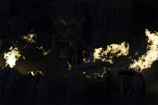
As I said before, for some reason I really loved Universal Studios Orlando and got some different shots when visiting. This image was from The Eighth Voyage of Sindbad Stunt Show. I liked the flames and graininess that were due to the high ISO (1250) needed to take this shot. The original RAW file was extremely dark (see below). Probably not the best image for drawing your eye to the focus point, which to me was the girl, but I still liked the image so here it is. In the original image as it came from Lightroom, Seim’s Super Gentle X preset was applied as a starting point. Have not talked much about Gavin Seim’s Power Workflow 4.1 Lightroom presets (see sidebar at my Tidbits Blog for website link) – I really like them and find I almost always use them over playing with the sliders in Lightroom now. They are different from others I have bought – uses a lot of curves and HSL changes to get some very natural effects. You can download a free sampler, which is how I got started with them, and if interested, watch for the good sales he offers every now and then. He also has a really interesting You Tube video called Gavin Seim’s History of Photography. The Noise Luminance was set to 26, Detail 59, and Contrast 30 to handle some of the noise issue. Below is the RAW file and the file as it looked when brought into Lightroom. If that does not sell you on using Lightroom or Camera Raw, I am not sure what will!
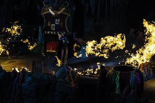
Next Topaz (see sidebar at my Tidbits Blog for website link) Clarity was used – I did not want to sharpen the noise, but definitely wanted a more natural sharp look to the image so Clarity was used instead of Topaz Detail. The Micro Color Boost II preset was used with a few adjustments (Dynamics White Level -0.55; Hue/Sat/Lum settings: Hue Orange -0.06 and Magenta -0.61; Sat Orange 0.42, Yellow 0.03, Green 0.47, Blue 0.77, and Overall 0.33; and Lum Red 0.17, Orange -0.14, Green 0.38, Aqua 0.33, Blue 0.19, Purple 0.16, and Magenta 0.36). Back in Photoshop a black layer mask was added so the effect was removed, and then it was painted back in where I wanted the nice saturated colors showing up, mainly the foreground and flames. The image below has just Clarity applied. Very subtle difference from the Lightroom preset image – mainly shows up in the colors in the foreground.
 On a duplicated layer (CTRL+J) Topaz Black & White Effects was opened and the Toned Collection Sepia II preset was chosen. This time a lot of the settings were changed, or else it would look like sepia, right? Here are the settings used (Selected the 4th over teardrop which set the settings for Section 4 Finishing Touches Silver and Paper Tone. Left Basic Exposure with preset settings. Adaptive Exposure was set to 0.24 and other setting left as set. Creative Effects Diffusion set to Softness 0.71, Diffusion 0.67, and Diffusion Transition 0.56. Finishing Touches used the Quad Tone settings provided by the preset. Vignette was set and centered on the girl. Vignette Strength set to -0.28, Vignette Size 0.61, Vignette Transition 0.83, and Vignette Curvature 0.82. Transparency set to 0.40 to just bring a little color back into the image). What is really neat about Black & White Effects is that the Local Adjustments section has so much variety that you can sort of sculpt the image. Therefore all the brushes were used to enhance most of the special effects above. First the Detail brush was used to paint over the girls face and body to emphasize it a little more. Used these settings for all brushes: brush opacity of 0.14, Hardness 0.00 and Edge Aware of 0.50. This is just enough opacity to see a change. Painted over the area again where more detail was needed. Second, painted with the Color brush over the flames once, her face several times, and her body once. Also the foreground color was lightly painted over. Third, painted with a Smooth brush over the flames – I usually do not see much of a change here with this brush but I wanted the overall feel soft, so it was used. Fourth, painted with the Burn brush on the areas that shows up too bright around the edges. This included part of the flames on the right edge. Fifth, painted with Dodge brush just around the large pot in the foreground and her pant legs to brighten these areas up just a little. In Photoshop a white layer mask was added and some of the detail was painted back in the foreground and flames – that is because the Diffusion settings were pretty strong in this plug-in. I wanted to use it for a more ethereal feel, but there are places that needed more detail. The Local Adjustment brushes did add some of this detail back, but there is a little more painting control back in Photoshop. Once again the difference was very subtle, but there is some definite darkening going on by adding this plug-in. Also, this plug-in’s layer was only set to 59% layer opacity which also lessens the effect. Below is how the image was starting to appear with Black & White Effects applied.

Two Curves Adjustment Layers were added to darken the edges down and brighten the girl just a little. Below you can see the Adjustment Layer mask’s were turned black (CTRL+I inside the mask to turn it black) and a white brush was used to paint back the localized sections to reveal. Since I am never one to leave things alone, Nik’s Viveza 2 was used to add the red tones to the flames (actually used the little eyedropper under the Hue slider and sampled the red in the flame to add more) and pop her face a little (mainly used just a little Contrast of 28% and Structure of 44% to make the face show up just a little more). You can see the flame settings in the screenshot below. (Click on image to see settings larger in Flickr.)
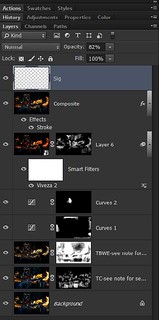
 Since the effect was still a little strong, a black layer mask was added and just the areas I wanted more were painted back in white, of course using my Chalk Brush 60 with 19% Angle Jitter. How cool to use so many of my favorite plug-ins in one image. The final image is shown at top of blog and below is an image of the Layers Panel from the finished file. (Click on the Layer Panel to see close-up in Flickr.)
 Well I hope this gave you some insight into how to do use plug-ins effectively in Photoshop. You do not have to overdo the effect – can just add a black layer mask in Photoshop and paint back with white where you want the effect to show up. Or try changing the Layer Opacity or Blend Mode to get a different look. And don’t forget to try some different types of brushes other than the Round brush when painting in that layer mask. Lots of choices here! Until later…..Digital Lady Syd
Digital Lady Syd Related Blogs:
How Topaz Black & White Effects Can Create Some Surprising Results!
More Clarity on Topaz Clarity
Digital Lady Syd Reviews Topaz Clarity
Nik’s Viveza 2 Plug-In – A Hidden Gem!
