
CREATING GOLD USING UPDATED BETA AI IMAGES
Had to try out some of the new features in Photoshop Beta’s newest release – my curiosity got the best of me. I’m sure you have seen all the recent hype about it, and it is pretty amazing. Just thought I would show some of my results. I decided to follow Rikard Rodin at Nuckly’s video called Turn Anything to Gold – Hunger Game Songbird Snake Tutorial to do this. It is a pretty long video with some great resources, so check that out if you like this gold effect. (More on this below.) He also has some nice techniques for getting other results. Overall, a very good tutorial!
AI Impressions
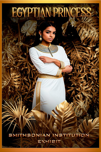
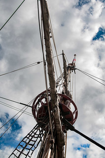
My first impression of what we are getting with Firefly 3 (they skipped 2?) is that it is really improved. People are generated much better without extra body parts. Hands can still be an issue, but they can be fixed pretty quick with the Lasso Tool and another Generative Fill layer. One of the new features involves the Generative Fill panel where using Generate Similar created the model above – it gave several model variation choices – this is found in the three dot icon shown in the different variation thumbnails. Pretty cool. The prompt to get the above princess was “image of a young ancient Egyptian princess standing.” By the way, at this time, regular Photoshop 2024 does not have the upgraded AI Firefly 3 version, but I am sure it is coming shortly. Another fabulous feature is the Reference Image section – see large ship image below that was created from the smaller ship image.

Used similar prompt in AI to get the above model image – “image of a young ancient Egyptian princess standing with arms down and gold crown and necklace.” Firefly did not do that great with the arms, but actually looked good when the whole image was turned to gold. The top model was substituted in for this one to get a little different look (had to use the Apply Image command to do this – see my Placing Any Photoshop Generative Fill Variation on a Layer Easily blog).
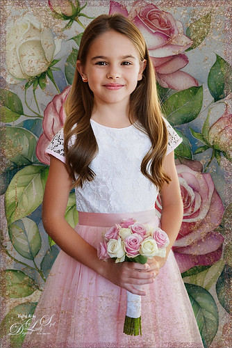
Well I do believe this little girl image below is so cute and it is totally AI generated! To me this is Amazing! The prompt used to get this Generative Fill model was “Image of a young flower girl standing at a wedding.” When I clicked the Generate Similar on this variation I got a whole bunch of the cutest kids with many wearing the same outfit! Hard to choose which to use! I also used Generative Fill to get a better rose nosegay.
A new background was needed so a New Layer was added underneath the model. In the prompt I thought I used “Rose bush with white and pink roses” but actually got “Blue bird sitting on a rose bush with white and pink roses, selective focus; flowers background for greeting card” – got some beautiful blue birds (check out the bottom pix), but not the pink and white roses I thought I would get. A Generate Image Tool created this prompt for me. It brings up all the things that are in Adobe Firefly and gives you ideas on what to put in your prompt based upon what thumbnail is chosen in the Prompt Inspiration section – lots of thumbnails and effects here. But you have to watch the prompt wording that is automatically inserted into the field when one is selected – just check the Effects Adobe used if that is all you want. Once I figured this out, the pretty floral background for this image was created. Using the Lasso Tool, her original nosegay was selected and three new ones were generated. A much nicer one is shown in the image.
Below a new image was created using this small image of the Golde Hinde crows nest (Francis Drake’s boat replica of the original from 1580 in London). The prompt used was “old seafaring sailing boat” – it generated several great looking old ships. The only thing done to this image was to expand the side to set it in the center and make the water a nice blue color. Another amazing feature!

How to Get the Gold
Starting with the totally gold image, this technique came just from Rikard’s tutorial and resources. The leafy background is in his resource file. It looked pretty good I thought. To turn it gold, he selected a Gradient Map using one of his supplied gradients. His trick he says in the video is this: “You don’t want it (the color) to go from just gold to light, you want it to go from dark to light, then back to dark and than back to light – this gives the metallic look.” Amazingly it created this fabulous gold effect! It seems you could do this with almost any color for an interesting look. There are other steps here for darkening and lightening so do watch his video. The Egyptian Princess variations were created in a different document first. The Apply Image layer of the Egyptian variation was copied into Rikard’s gold document, a select subject was executed and a layer mask was added before using the same Gradient Map gradient. In his resources there is a young model he used in his video workflow. My top image used the same steps – brought in the Apply Image layer and placed it above the background, but this time did not add the Gradient Map for the model. His resources also supplied the palm leaves png to place in front of the princesses using the same Gradient Map. Last step was to add two text layers (top font is one of my favorites – Achava and the bottom font is one Rikard suggested). Several layer style effects were added which were supplied.
How to get the gold glitter effect? Design Cuts has a set called Golden Patina Photo Effects which includes a PSD file with layers including the 3 gold textures to create this effect. Also Golden Patina Brushes are included with a couple glitter spatter brushes. Gold Texture 3 was set to 100% layer opacity and a Rose Gold 10 Paper placed on top at 38% layer opacity (paper from Creative Markets Rose-Gold Pigmented Paper by Desire Lange). Then used the supplied brushes to add a little more glitter effect – layer mask was used to remove any marks on the model. A Color Lookup Adjustment Layer was added to give a more vintage feel to the background using On1’s Spooky LUTs 17. Then just used my regular workflow to finalize the image.
Just for fun, on the AI generated bluebird image, I inserted the Apply Image bird layer for the Flower Girl (and all the associated files used with her) and played around with all the different Patina set layers. A couple Spatter brushes I created in 2018 were used to outline the bird using the gold texture and the flowers using the gold rose paper – gives a glittery effect to the brushstroke. To make a similar glitter effect brush, check out my The Bald Eagle and How to Draw One blog. A 200 Free Gold Texture from Deal Jumbo (No. 11) was used on top and set to Hard Light at 55% opacity.

Bottom Line
I have an older computer and it definitely takes longer to process these new features. I also crashed once so watch out for this. The new features are really fun but it is frightening to see how quickly AI is advancing and I still am not sure how I feel about that. The fact that these beautiful images could be created so quickly is downright scary. Well, this is definitely something to think about here……Digital Lady Syd
Related Digital Lady Syd Blogs:
How to Quickly Add a Touch of Gold to Your Text
Several AI blogs since July 2023
HOW TO CREATE A GUSTAV KLIMT LOOK
Wow! Where to start with this one! I learned so much about the 1920’s fashion era just by researching the information needed to create this fun Rebelle 7/Photoshop image. I have to thank Corel Master Painter Karen Bonaker of Digital Arts Academy (she has the best free community and classes for anyone interested in digital painting – check out its header) for suggesting to her members to try a Gustav Klimt project, using some special brushes she supplied. (Will talk about below.) I imagine almost everyone knows what Klimt images look like, but here is a link just to refresh your mind. Also, this image could have been done completely in PS if you do not want to purchase Rebelle 7.
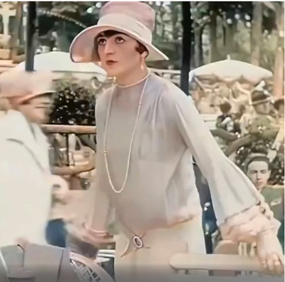
My subject’s appearance is a bit like a1920’s era Flapper with her short-cropped hair and bright makeup, but the dress, shown in the screenshot picture on left below, had long sleeves (not the Flapper’s short-sleeved look) and the fabric was very soft, flowing and elegant. The more fashionable women wore the “Great Gadsby” look based on the classic book from that time period. She is wearing a Cloche Hat worn from before the 1920’s thru 1933, which has an incredible history of its own (several are available on Amazon). The screenshot (apparently of silent movie actress Pola Negri, who had a very interesting life) was from a blurry AI enhanced and colorized vintage 1927 short video of the streets of Paris – it was up sized using Topaz Gigapixel. The sleeves on her dress were so pretty and seemed perfect for a vintage painting. In PS Pola was selected from the screenshot and placed on her own layer; flipped horizontally using the Transform Tool; Puppet Warped to get the arms right; and last, roughly sketched with Kyle’s Animator Pencil (2016) that can be loaded from PS. See sketch below on right. You can see she is not exactly like the actress shown in the video, but I wanted to keep her face and basic dress features similar.

REBELLE 7
The PS document was taken into Escape Motions Rebelle 7, the fairly new painting program that has improved so much it makes Corel Painter look pretty old school. If you watch for sales, it can be bought at a good price, but be sure to get the slightly more expensive Pro version which has all the really cool features. This program seems pretty easy to learn and has some really nice painting brushes to use. This is where Karen’s Klimt and Art Noveu brushes were useful for creating this image. First a background using the Klimt Oil brush Burnish Pattern was painted. Her Nou 3 in the Art Noveu set was used to create the circles in the upper left corner. The red scatter points in the upper area were from the Klimt Pastel Pattern brush. The Klimt Variable Texture brush at the top left was actually duplicated in PS and flipped and placed on the upper right. Since I am still figuring out the brush system, the image was brought back into PS where all my favorite painting brushes can be used on the image. But I still wanted to use some of Karen’s custom Rebelle 7 brushes in PS.
CREATING A BRUSH FROM A PNG OBJECT IN PHOTOSHOP
Since these Rebelle brush sets are basically stamped brushes, they could be converted to PS brushes by downloading her free Klimt and Art Noveu.png brushes from Rebelle’s website. Drag the brush png over to a New Document with a white background (and get rid of the Smart Object by right clicking and choosing Rasterize). Since black creates the mark and white is transparent in a brush, click CTRL+I to invert the image. If the white area is still kind of gray, just add a Posterize Adjustment Layer and move to a level where the white disappears. (Can also use Brightness/Contrast if needed.) Now use the Rectangular Marquee Tool on the png layer to select just the paint dab at the top of the png. Go to Edit -> Define Brush Preset and name. There is your brush! You can use this process on any PNGs with cool objects – just remember they will probably only make stamp-type brushes, not for digital painting. There are no settings associated with the stamp brush just made. For Klimt look, this can be very handy to use since he uses a lot of geometric patterns in his images. The brushes converted to PS from Karen’s Rebelle brushes were mainly from her Klimt set which included Variable Texture3 for the dots behind Pola and the Rough Oily brush for the little individual squares placed.
A few other brushes were also used in PS on this image. PST Twirls brushes were used for the lower right side circles and the twirls by her head (from 2006 (Wow – but Brusheezy and DeviantArt have so many – search for Twirls). The Flourish chandelier effect was created using Vintage and Grunge Element 2 by Katie Lynn (cannot find her 2017 set anywhere but there are lots of flourish brushes available also), and then I created a 12-px Hard Round White Dot brush set to 189% Spacing to add the little lights to it.
MY LADY LAYERS
The Hard Round White Dot brush was also used for the detail on her belt with a small Stroke layer style. And then just a PNG object was used for her rose on the hat from a for sale set called Anemone WC Texture Clipart by YouArtMatter. Of course all of these had layer styles or adjustments layers added to blend them in properly. This is why I have issues with the Rebelle program – it does not have all these features yet. One of the coolest brushes I have downloaded is on Deviant Art and called Pixelstains Lip Texture which adds the neat highlight to the lips. From the video you can see the dress was a plain cream colored dress – not exactly Klimt looking. Her dress was selected and put on a layer, then a Pattern Fill Adjustment Layer was clipped to the dress layer – used DCandies Luxury 3D Patterns at a Scale of 15 and set to Lighter Color blend mode at 40% layer opacity. Next a Hue/Saturation Adjustment Layer clipped on top of it (-26/+4/+19). Finally another Pattern Adjustment Layer was clipped using Resource Boy’s WC 671 pattern (a floral pattern) with a Scale of 12% and the layer set to Hard Light blend mode at 44% opacity. On top of this, another layer was clipped for creating the necklace – used Jessica Johnson’s (this PS expert has some great techniques for creatives) Floral Lace Romance Brush Var with a layer style. This can get complicated, but it is fun to try different techniques and figure out what looks good! To finish up the dress, some shadows were created to make it look like it was soft and flowing. On a New Layer Sam Peterson’s tip for adding shadows (the Layer was set to Multiply blend mode at 34% opacity) was painted on her dress and to parts of the face in shadow under her hat. (See my A Few Photoshop and Lightroom Tips and Tricks, Step 2 for info on how to do this – I really like his technique.)

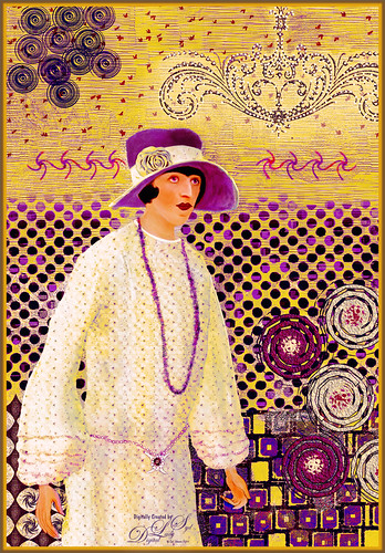
Above is My Purple Lady image – it has a different feel to it but I like the color combinations. The only difference between the two images is a custom Curves Adjustment on top was set to Color blend mode to create the yellow tones (in the RGB field drop-down, individual color curves were adjusted). The above blog is basically what was done on both images, although a Color Lookup Table Adjustment Layer and a Curves Adjustment Layer were added on the top. It took a lot of time and iterations to get the look needed. If you like to try out different brushes and experiment with layer styles, blend modes, and adjustment layers, this is the project for you! Also below are various digital painting blogs I created using different painters’ styles that you might like. Hope you enjoyed a little of creative journey with this image!…..Digital Lady Syd
DIGITAL LADY SYD RELATED BLOGS:
Masked (following Mark English painting style)
How to Decide which Sketch Brush To Use (based on Francois Flameng Riviera Promenade painting)
A Few Photoshop Digital Painting Tips You May Not Know (based on Amedeo Modigliani painting style)
How to Get a Graphic Look in Photoshop (based on Impressionist painter Charles Courtney Curran Blue Delphiniums painting)
SOME AI DIGITAL ART RESULTS

As promised, here are a few more images showing what the AI feature in Photoshop Beta can create. I am not sure how all this AI is going to affect creatives in the future, but it definitely is interesting to experiment and see just how far along it has already gotten. I have not always been happy with the results. Lots of real bizarre variations and lots of artifacts being created in the added areas. I do believe as time goes on, Adobe is going to get these issues worked out – after all, it is just a Beta version at this point.
IInfo on how the above image was created is listed here so you can see the workflow used. The above Guitar Man image (the original is one of my very favorites to use for practicing – I love the guitar!) was basically composed of two different Generative layers, one for the player and one for the background. The player was selected and Generative Fill was set with the prompt saying “oil painting.” Any kind of Oil Painting effect seems to work well with these images. In this case a really creepy black glove with fingers sticking straight up in the middle of the guitar strings appeared! The Remove Tool took care of it. A Select Subject of the Guitar Man was created again to make a background. By clicking the 2nd icon and choosing Contract Selection at 20 pixels was entered, then Invert Selection by clicking the 3rd icon was done before typing “abstract oil painted nightclub stage” in the Generative Fill prompt field. In both Generative Layers many Generate button variations were created before getting usable. The Guitar tips were created using the Lasso Tool and selecting a area for the objects to be added, then using a Conceptual Bar prompt “Abstract Oil Painting Guitar” – got all types of weird results with this! TIP 1: If you click the Generate button and the variations are all bad, open the History Panel and go back to the step just before the last Generate Fill step was created (probably a Select Variation step). They will disappear instead of having to delete them individually (too many variations can make your image size huge). And many weird things will show up in the variations that have to be removed, mainly by using the Lasso Tool to select them and then just clicking Generate to get another Generative Layer to fix it. In all, 7 Generative Layers were created – 4 were used to clean up the image, like where the pocket was for example. Sometimes just a New Layer on top and using the Remove Tool/Spot Healing Brush will work best.

The AI image above was taken from an image by Christopher Campbell on Unsplash. TIP 2: Use Dave Kelly’s Actions to save time. Dave Kelly’s new action set called Gen Fill Photo Painting with 14 actions corresponding to the Gray Brightness in the Quick Mask tutorials was used. Check out Dave’s video called Photoshop (Beta Photos to Art) Tips and Tricks (Generative Fill) for info on how to use it – his free downloadable action is on this YouTube page. The GF Painting 80 action gives a more realistic feel (if GF Painting 30 action is run, the image would hardly be recognizable). Try different actions to see which looks best. Above GF Painting 80 action was run on the whole image – then in the Generative Fill prompt, typed in Pastel Painting Style. Once the variation was selected, a stamped composite layer (CTRL+ALT+SHIFT+E) was created on top. In the Conceptual Bar, Select Subject was clicked, then Modify Selection -> Contract By 20 pixels, and finally Invert Selection so the background could be replaced. When the Generative Fill prompt was set with “add background of pastel painted trees,” the variation seen above was selected. It took several Generate buttons and the one chosen had a border around part of it. To remove it the Rectangle Marquee Tool was used to select (with a slight overlap) the border areas and Generative Fill filled it in. So don’t worry if a weird border shows up, it can be fixed. A small amount of clean up was done on a layer on top with the Remove Tool and a paintbrush. Last step was adding a Color Lookup Adjustment Layer set to 75% layer opacity.
Big question is do you use Contract Selection when changing out a background layer? An overlap needs to be created so AI knows what effect and or colors to place in the background. After checking lots of my resources (many do and many don’t), I believe at least a Contract By amount of 20 or 30 pixels should be used – then click Invert Selection before running a Generative Fill. Whether you add another prompt here is up to you.

The oil effect above (click here to see the actual photo used) was from a video by Marty at Blue Lightning called Photoshop AI: Create the Look of Fauvist Painting from Photoshop with Generative Fill. Per Marty, “Fauvism was an art movement that flourished in France around the turn of the 20th century – it was know for bold, vibrant colors used in unusual juxtaposition, rich surface texture and spontaneity.” I could certainly agree with that definition when looking at the image. One problem I had with this technique is there were lots of bad variations created and a lot of Generate buttons pushed to get what I liked. It feels like it was generated with a very low Brightness value but 70% gray was used (tried Dave’s action at 30% and got similar results) – not sure why it is so abstract at 70%. Below is one using same technique that I messed up – it was generated from an image of a woman looking sideways – really weird, but I love the cool camel thing going on! HaHa!

Let’s try a little watercolor effect here. This was not easy to do. Followed PSDesire’s technique in his Create Paintings with Dark Channel – Photoshop AI Tutorial video. The results for Windsor Castle left a lot to be desired (lots of variations were needed) – this image looks to me like a spooky place instead of my beautiful castle image – lots of Remove Tool, Spot Healing and painting to clean up. It was a bit of a mess. I am finding that I need to work between the Remove Tool and Spot Healing Brush a lot. TIP 3: Try both Remove Tool and Spot Healing Tool for clean up as sometimes one works better than another. Also, if a large portion cannot be removed at once, try doing the removal in smaller portions. A watercolor brush variation was created for cleaning up this image as there was way too much detail for an actual watercolor in the generated image. (For info on brush and settings used, see end of blog.) Adobe needs to improve their watercolor results if they want a convincing effect.

Following Marty’s technique from his video Photoshop AI Transform Photos into Oil Paintings and typing in the prompt “Vector art cartoon,” the below Guitar Player (same as top image) variations looked pretty good rightaway. Three more parts of the image were selected using the Lasso Tool and generated to smooth them out. The Remove Tool/Spot Healing Brush was used on a layer on top to clean just a few places up and a Color Lookup Adjustment Layer was added for a nice color tone.


The model above is based on an image by Jerzy Gorecki from Pixabay and is also one of my favorites. PS AI does not do that great a job with hands so they had to be reworked as a final step (no fingernail tips or polish appeared and the fingers were bending a little weird but overall they look pretty good). The Select Subject was run and Marty’s (Method 1 in my last blog called AI Digital Oil Painting – How to Do This) was applied before doing a “vector art” prompt. I find that Vector Art is one that does well with Photoshop Beta AI. The background was created using a prompt called “vector floral art.” I actually like this result.

This image used a prompt called “rembrandt painting style” and took a while to get a variation I liked. Not sure I love it all, but it is an interesting effect. This image was by Jude Infantini at Unsplash. Below is one that looks really nice with the same model.

Here is another good example of the Vector Art effect – used “vector line art drawing” in the prompt and used Dave’s GF Painting 70 action to create the effect. Then created a stamped layer, selected the subject, contracted by 20 pixels and invert selection before generating a background using the prompt “small floral pastel colors watercolor painting.” Some clean up and a Black and White Adjustment Layer (How to Use a Black & White Adjustment Layer to See Contrast in an Image blog), which gave her the glow on her face, were the final steps.

Last one is of my silly cartoon guy that I wanted to see if a cute background could be created with a dog. Used prompt “Cartoon park background” and then used the Lasso Tool where the dog should go and ran “cartoon brown dog” to add the pooch. A little clean up and leash had to be added but it was pretty easy to do.
Well that is it for now. I think I am AI’d out but it is still intriguing. If you get a chance, watch Dave’s video and download his action – he makes it really easy to do this. If any new info comes out on using the AI panel, I will blog on it again. Have fun experimenting!…..Digital Lady Syd
Brush Settings for Watercolor brush used: The brush is call “SJ – Basic WC-blends nicely-from Grut-W Late Never” that uses Grut’s Late Never brush. I changed the original Grut brush in the Options Bar as such: the Brush Blend Mode to Normal, Flow to 100%, and turned Airbrush icon off (Buildup in Settings Panel). For the watercolor image a variation of my brush was created by changing the size to 30 and Spacing to 47% in Brush Tip Shape, turned off the Flip Y Jitter in Shape Dynamics, and changed Brightness to -16, Contrast to 36 and Depth to 36 in Texture, along with the Option Bar changes already discussed.
PHOTOSHOP BETA AI WITH FENCED ZOO IMAGES

This colorful Wreathed Hornbill image was taken at the Jacksonville Zoo several years ago. I wanted to see if I could really get rid of the fencing like the new technology was supposed to do. Normally this photo would not have been post-processed, but after using the AI features, it is one I am happy to see in my bird image collection. The bad news is that it was not created nearly as fast or easily as all the videos which show using a one or two-click process would make it seem. It still required the same workflow that I normally use on my images after applying the Generative Fill effect. Below is what the raw image photo.

For this bird image, it is pretty obvious what was done. There is a new Contextual Task Bar for both the Beta and PS 2023 which everyone seems to love. To move it out of the way, I pinned it above in the Option Bar area, but it has to be repinned there every time PS is opened. The reason this Contextual Task Bar is important in the Beta version is that once any selection is made, it creates a Generative Fill field (prompt) and Generate button which is the easiest way to apply the major AI magic.
What did not work! The bird was selected using the Contextual Task Bar Select Subject button (Note: at this time the Remove Landscape button does not work as well) – then clicked the Invert Selection icon (2nd over) in the Contextual Task Bar – and finally clicked the Modify Selection (1st icon over) and in drop-down select Expand Selection – Expand by 20 pixels (this number seems to be the one most people use when expanding anything in AI which needs to see what it is selecting around). Then, in this case, the prompt was set to “remove fence and add plant covered background.” (Some people say the Generative Fill prompt will not react to the word remove – I suggesting trying it with and without remove in the prompt as different results can happen.) After two Generate buttons were pressed, all results showed the fence and it was distorted – only one, as shown below, had a background and none had plants.

What did work! So, instead of using the Generative Fill to remove the chain links (which obviously did not work), on a New Layer above the image the Remove Tool (which also uses AI) was chosen with the “Remove after each stroke” unchecked in the Options bar. Then painted with a small brush a little larger than the fence width over just the bird area since the background was going to be AI generated – you can see what is being removed as the Tool creates a red transparent line. Once painted over, press Enter or click the check mark in the Options Bar. (I tried using the Magic Wand with contiguous turned off in the Options Bar, and it did a rather poor job of selecting all the fencing – thought Edit -> Content Aware Fill might work. It is worth a try if you think it will select the fence in your image.)
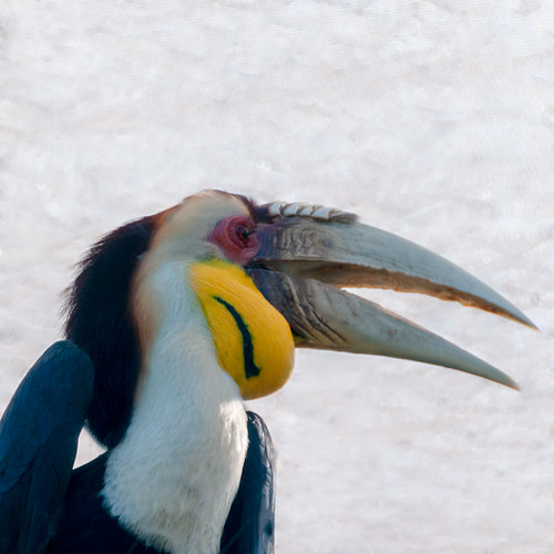
As shown above, the image looked pretty good with the fencing removed. Still had to select, invert and modify before using Generative Fill to continue adding the background. With the prompt empty and after three Generate button attempts, the top final look was the one that looked best to me (8th look out of 9). I do like the background result – Generative Fill did a good job eventually on this. Don’t be nervous about using the Generate button several time – but do remove the ones you don’t like if the file is getting really large – just click the little icon in the upper right corner to remove the ones that look bad individually. Next my basic regular workflow had to be followed to get the best effect.
*****

This is another image from the Jacksonville Zoo that never would have made the cut without the PS Generative Fill panel. Below is the original just so you can see what was done.
Nice image but the face is half gone. This time the fencing was removed first. So going along with the trick above, used a very small sized Remove Tool brush (45 pixels) and this time painted very carefully. The SHIFT + click can be used with the tool, but I did not run it the whole way, just a few sections at a time and got a better result. I was unable to get rid of the post, so decided to let Generative Fill do the work and basically that is what is in the final image. It put in the paws, face and background with the first Generate and no prompt. The legs were all cut off so first extended the bottom for front paws by using the Crop Tool with a 20 pixel partial edge at bottom of the actual photo. Once the Generative Fill was run, the front paw showed up. Did again on the right side to get some more back paws. One is still cut off but it looked funny when it was added in. Several Generate button iterations had to be done to get a good result. Again, a lot of clean up had to be done, but overall it is a really nice image.
*****
Tips about the Remove Tool
Firstly, I love the Remove Tool! It works great on just overall photo adjustments. Some things I have learned from listening to lots of videos is as follows: 1) Try not to use it in large areas at one time – it can create unnatural patterns, especially on faces. 2) Don’t go over too many time – it can look a little pixelated. 3) Most people keep “Remove after each stroke” unchecked in the Options bar – otherwise it will drive you crazy if lots of marks need to be created. Check out Remove People or Objects from Photos Using Photoshop’s Remove Tool for some good info on using this Tool. Also, Colin Smith at PhotoshopCafe’s video called NEW Photoshop TOOL! better than Generative Fill? that compares it to Generative Fill. I would suggest just playing around with the Tool – lots of people are getting some great results with it.
When to Use the Spot Healing Brush
I find it tricky to tell which tool to use now but I am tending towards the Remove Tool as it seems to give a little better result in most cases. I did have problems with the bear images below – the Remove Tool made a mess of their faces. When used, the hair on the faces looked funny where the fencing covered them. First I decided to try the Spot Healing brush set to Content-Aware but it did not look any better. Finally, I did use the Spot Healing Brush, but it was set to Proximity Match with a Diffusion of 3 – it worked! Proximity Match looks at the pixels just outside of the area you are healing to find matching pixels to use to replace in the selected area – works good when healing smaller parts that look similar to the areas around it. (This is exactly what was needed on the bear faces.) The Diffusion slider determines how large the spread of pixels around your brush is – a low value has little spread which was also what was needed. As an aside, another important thing to consider on the Spot Healing Brush is the Spacing option. Set to 25% is good for most images. Set to 0% and the brush will be really smooth and at 1,000%, very spotty! (Something to think about if getting weird results with one of your Spot Healing Brushes.) Using 50% Hardness and a 100% Round brush are also good settings. (Ever wonder how to get to these settings to change them? I did! Well, you cannot get them through the Brush Settings panel, but you can if you go up on the Options Bar and click the 3rd icon over called “click to open the brush options” – there the settings can be adjusted. Also right click inside the image with the mouse to get the same panel. I created a Tool preset (cannot be saved as a brush preset) to use just for removing fencing with these settings. And you can always click over to Content-Aware while using it if an area is not looking right with Proximity Match.
*****
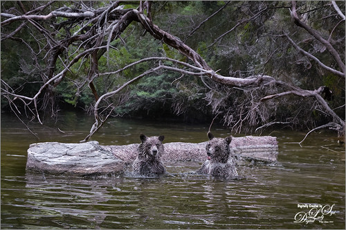
Here are Lewis and Clark from the Palm Beach Zoo with a new background. These bears actually love to swim and fight around in the water in the afternoons at the Zoo just for fun. (Check out my photo link of the guys really rough-housing in the water!) This image looks different from the one below as it was downsized to a 1024 pixels wide to match the pixel size that the current AI info is using to generate the backgrounds. It looks a little sharp to me but I liked the background branch over the bears’ heads that Generative Fill created. The prompt used was “very wooded background.” This image was completely behind fencing. The water in the foreground is from the actual photo so the fencing had to be removed off it as well as the bears, and just behind the bears was AI generated.

This image looks a little different because it was not downsized before doing all the fence clean up and the Generative Fill for the background. This works because the background does not have to be so in focus since it is so far from the bears and the foreground which are the original parts of the photo. I used “dark forest background” in the prompt area to get this result. It looks very natural to me for the bears. Again, the original image as shown below would never have been selected to post process before Generative Fill.

Therefore, just be aware that if the area you are adding is further away from your focal point, the image does not have to be downsized before running the Generative Fill. Otherwise, watch out for problems. Also I might note, the bottom image had some very bad artifacts in the trees that had to be removed using the Remove Tool so do look carefully at the AI areas being added.
*****
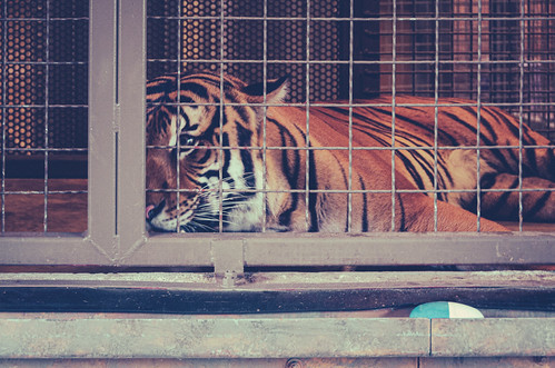
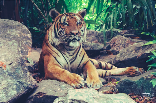
And just because I have been having so much fun with this, here is another of a Sumatran Tiger at the Palm Beach Zoo. Just added a prompt saying “jungle background and rocks” and it turned out pretty nice! This image did not need much work done to it so it was probably the fastest to post-process of all the images.
Therefore, the fencing can be removed very nicely, but it was not as easy as I thought it would be. Well that is about it for this blog. I will be posting my impression of the AI digital painting possibilities next week. See ya soon!…..Digital Lady Syd
HOW DOES A BRUSH USE TRANSFER SETTINGS (AND CONTROL PEN PRESSURE) IN PHOTOSHOP?

Above is The Winter Creek painting of mine – learning to draw landscapes is very different from cartoon-type drawings! Learning a lot from Karen Bonaker, a Corel Painter Guru and great digital artist, and from listening to regular painting videos. For Image Post Info, see bottom of blog.
I decided to talk about the Transfer section in the Brush Settings Panel (Click F5 to bring it up) and the “Pressure for opacity” icon in the Options Bar (8th icon from left) since these pressure settings are often added to Photoshop brushes. Many people (including me) could not understand why the pressure settings are different than what they thought was set. So here we go and I hope it helps a little when trying to set the pen pressure for your brush.
One of my favorite Photoshop people has been Lesa Snider and her Photoshop CS6 The Missing Manual (her books are excellent references) had the best explanation as to how this brush section works. So I hope Lesa does not mind, but I am going to quote what her book says in a very straight forward and understandable explanation.
“This category lets you adjust how much paint Photoshop transfers to the ‘paper’ (your document) with each brushstroke. The Opacity and Flow settings here (in Transfer settings) override the ones in the Options Bar (with their default settings-see below), so if you tweak them (the Transfer settings), you may find the Options Bar settings do not seem to work.” CAUTION NOTE: When pressed, the Option Bar “Pressure for opacity” icon will always turn on its default Transfer settings using Opacity Jitter 0 (most opaque), Control Pen Pressure, and Minimum 0 (most transparent). (When hovered over in PS, it says “Always apply pressure for opacity. (It is using the default settings here.) When off, Brush Preset controls pressure.” (I believe brush preset means the Transfer settings.)) Flow settings appear in the default settings so if you had a Flow Jitter set before, after clicking the “Pressure for opacity” icon, it may or may not still be there even though the opacity settings go to a default. (This one drove me crazy – not sure what PS is doing with these settings, but this is why it is so confusing!) But if you turn off the “Pressure for opacity” icon, and turn on the previous Transfer settings in the Brush Settings Panel, the old Transfer settings re-appear for your brush opacity and flow settings – PS remembers them. If the Options Bar icon is turned off, and pen pressure is still present, it means the Transfer section is working at the default settings even if it does not look like it – see if it is checked on or still has settings even if not. A good trick is to keep an eye on the Preview Screen at the bottom of the Brush Settings Panel to see what is happening when you change the icon in the Options Bar and the Transfer settings. And on occasion it just does not seem to work correctly with a brush – that is when I try a different brush and then come back to it – it usually has corrected itself. (Note that the “Always Use Pressure for Size” works slightly different with the Shape Dynamics section.)
Bottom Line: If you want the full opacity and flow as set in the fields on the Options Bar, do not check the Transfer setting in the left column of the Brush Settings Panel and do not press the “Pressure for opacity” icon. If you want to create a more painterly brush effect, add more or less transparency using some of the settings discussed below, do not press the Options Bar icon – it will override the Transfer settings you selected with the PS default settings. If you want a nice Pen Pressure effect and nothing else, press the Options Bar icon – it should automatically turn on the Transfer settings in the Brush Settings Panel.
A tablet with a stylus is needed for this panel to work correctly since the Control settings are based upon the pressure sensitivity of the pen. The Jitter sliders will work with just a mouse though. To find where the Transfer section is, open your Brush Settings Panel and click on the word Transfer to see all the settings that can be used for this. (Just checking the box does not open the settings.) See a Transfer settings screenshot below for Kyle’s most popular brush ever, his Gouache A Go Go Tilt brush (I have a note on the brush that says “make big for texture”) found in his PS Megapack. Be sure to watch the Preview screen at the bottom of the Brush Settings Panel to see a live update of what the settings are doing when changed.

Opacity Settings
Opacity Jitter: Controls how transparent the paint is throughout the brushstroke. Setting Opacity Jitter to a higher percentage makes the stroke more see-through.
For example, if you set your Options Bar Opacity to 100%, but you have the Opacity Jitter slider set to 60%, that’s the most opaque your brush can be (60% of 100%). Thank you Lesa. That explains a lot about the confusion of these settings!
Opacity Jitter Control: Control pop-down menu lets you choose from several types of pressure sensitive controls that can be used with the brushstroke. They include Off, Fade, Pen Pressure, Pen Tilt, and Stylus Wheel. Mainly Pen Pressure is used, but occasionally the Pen Tilt or Fade may be used for an interesting result.
Minimum (in Opacity section): Slider appears when Control is set to something other than Off. When set to 0, the brush becomes more transparent or see through. Set to 100 to get a more solid opaque effect from the brushstroke.
For example, when Opacity Jitter is set to 100, Control to Pen Pressure, and Minimum set to 0, get the most translucent look.
Flow Settings
Flow Jitter – How much paint the brush lays down throughout the brushstroke. To specify a percentage by which the flow of the paint can vary, type a number or use the slider to enter a value. A higher percentage means the flow varies more and lower percentage varies less.
Flow Jitter Control: The settings work very similar to the Opacity Jitter Control.
Other Factors that Might Change the Transfer Setting’s Results
I am finding that often, adjusting these settings only creates a very subtle effect. Sometimes other brush settings (Shape Dynamics, Scattering, Texture, and Color Dynamics all contain Control menus) can cause the Transfer settings not to appear as might be expected. The Panel above shows the Gouache A Go Go Tilt brush with Shape Dynamics on – the Size Jitter Control is set to Pen Pressure and the Minimum Diameter is set to 36% (when set to 0%, means size diameter varies up to maximum size, but when set to 100% no change occurs when pressure is applied). At 36% with a Transfer Opacity Jitter Control also set to Pen Pressure and Minimum set to 57%, a light pressure stroke will be lighter and smaller, and a heavy pressure stroke will be darker (more opaque) and larger. But in this case there is another Control located in the Texture Settings in the Depth settings – it is set to Pen Pressure and makes a huge difference in how this stroke looks. So this is a good example showing that just by changing one brush setting, others may affect the results! And don’t forget the Dual Brush can cause the results to look different also – in this case the edges and coloration were affected. If you want to get more info on this, check out Kyle T. Webster excellent but complex video called Illustration Masterclass: Painting with Color Dynamics (Video 2).
Also note that there are other types of brushes which have various types of Transfer sliders associated with them: Smudge Tool , Mixer Brush, Clone Stamp Tool, Pattern Stamp Tool, Sharpen Tool, Blur Tool, Sponge Tool, Dodge Tool, Burn Tool, and Eraser Tool. Some have Option Bar icons associated with their settings and some do not. Just watch the Preview Screen of the stroke to see what is changing when the settings are added or changed. I think this is another blog topic to cover these.
The best way to understand all of this is to get a fairly complex brush, like the one used above, and just start changing or turning off settings. This definitely helps if a brush is not painting the way it should, just start looking at the Transfer settings and Option Bar settings. Once you find what you want, save the brush as a variant by pressing the little Plus icon at the bottom of the Brush Setting and Brushes Panels. I hope this has helped clean up a rather confusing topic in PS. Whew! Have a great week!…..Digital Lady Syd
IMAGE POST INFO: The main effect was created using great digital painter Georg Ireland’s free Drawing Paper 3. All the sketching and painting was done on top of that texture. There were 13 different kinds of brushes used from all kinds of resources. For the large left tree trunk, I used a soft round brush set to 25 pixels. Created a Pattern (Edit->Pattern) from a rectangular piece of the texture – then used the new texture pattern in the Texture Settings-checked box to Invert, Scale 135%, Brightness 77, Contract 51, checked Texture Each Tip, Mode Subtract, Depth 100%, and Depth Jitter 30%. Only other setting was Shape Dynamics Angle Jitter at 4%. It could now be used to add some of the texture to all the trees and ice in the image. Used Grut’s NM Shard Splay (with changes) to create the flowers. Corel Painter was used to add the initial water and smaller trees.
A LITTLE AARON BLAISE DIGITAL DRAWING PRACTICE
If you enjoy wildlife animals and want to try your hand at drawing them, Aaron Blaise has some of the best videos to fine-tune your skills. I can honestly say, it is taking me a long time to get a good workflow, but I am finding that most digital artists follow similar steps no matter what the subject matter or media they are using is.
The videos used for the Tiger images are in Aaron’s Digital Painting in Photoshop (20 videos and 12.5 hours of lessons) set that were created a while ago (December 2017). In you catch a one of his recent YouTube videos, he still follows the same basic workflow as presented, just uses a different brush. If you are interested in any of many videos he offers, click the link above to sign up for his newsletter – he has fabulous sales several times a year that include his great brushes and many videos (he offers them for $1 to $5 and gives an extra !0% off if you get the newsletter). Since I am on a pretty tight budget, this has been wonderful!
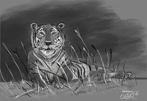
The Malayan Tiger above resides at the Palm Beach Zoo – I have some great images of their tigers so I tend to draw them. Aaron suggests using your own photo images for drawing and painting (especially if you plan on posting or selling your art) as the drawings are still considered under copyright laws of the image. This was just a black and white rendering to practice using your brush in a tutorial called Getting Started-Sketching in Photoshop. Here you learn to use your sketch brush and how to do rough sketch layer, refined sketch layer, highlight or white line layer, and background layer. It’s a great way to practice your drawing skills. These digital drawings are similar to drawing them on a piece of paper with a regular pencil. They have a very grainy line in most cases.
These images both used the Legacy Default 9 Pencil brush that comes with Photoshop – it is an Erodible Pencil and Aaron used it for these videos. I did try several other brushes but ended up using the Pencil 9. I did find the Erodible Pencils have problems a lot in PS2022 – the computer runs hard and sometimes the PS History Panel says a stroke is being laid down, but it is does not show up. It seems to happen often when toggling to the Eraser Tool or the Tilde key. (Also check to make sure your brush is not set to Clear mode in the Options Bar.) By clicking on another brush or tool, it usually comes back, but this is very annoying. My personal work-around was to reload PS2021 for just drawing as there are no brush issues with it. I am hoping Adobe gets this fixed soon.
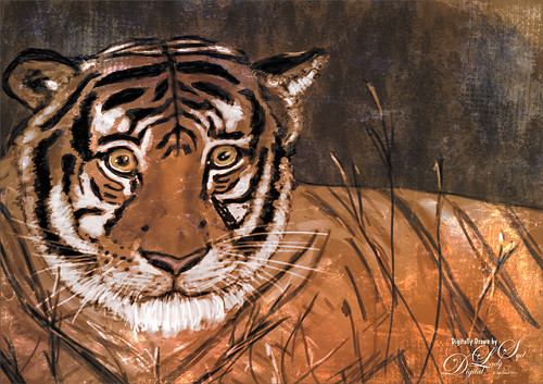
The above used the same workflow, but this time some color was added and a texture placed over him for a different look. This is a Sumatran Tiger from the Jacksonville Zoo. To get him colorized, a Color Lookup table preset color Edgy Amber was added at 72%, then Viveza was used to spot color the orange in (this filter is still the overall best for doing all kinds of things including adding local color to areas). Kim Klassen’s The Studio Collection texture beekeeper (not sure this available anymore) was applied on top using the Divide blend mode. I just posted another example of this technique on my Tidbits Blog called Living in the Abstract – it used some of Kyle Webster’s newly released Spring 2022 brushes.
TIGER TALK: Both these tiger subspecies are on the critical endangered species list. There is no clear difference between Malayan Tigers and Indochinese Tigers except for their geographical location (Malaysian Peninsula) and they are a little smaller, but it is a subspecies of its own. They can swim, can eat elephants, and are born blind. They live in tropical and subtropical forests, shrubland, and grassland, Compared to other subspecies, the Sumatran Tiger, which is only found in Sumatra, has a darker orange color in its fur and stripes that are closer together, and it is the smallest of the tiger subspecies. Their color pattern allows them to blend into their habitat. They prefer tropical forests with dense cover, freshwater swamp forests, and peat swamps. They eat larger ungulates, including tapir, wild boar and deer, as well as smaller animals, like monkeys, birds, and fish. Of the nine subspecies of Tigers, three of them are now extinct. So sad….
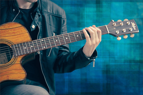
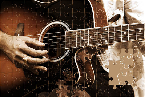
I have not finished doing all the tutorials – presently working on an Elk with many Color, Highlight and Shadow layers – lots of fun. One clever thing he did teach us is how to apply a texture to fit an object or subject. Below is my favorite free stock image called guitar man where the guitar material was changed from a solid yellow to a wood texture. To do this, clip the texture to the image, then use the Free Transform Warp tool to adjust to the guitar. If needed add a layer mask after adding the texture and brush away any that is not needed. In this case, the layer was set to Color Burn blend mode and 58% layer opacity. Pretty cool technique and pretty easy! The background used a brush I created from French Kiss Tableaux Mirage texture a long time ago – just stamped it down with different colors, blend modes, and opacities.
Last week I posted a short Tidbits Blog called Waiting for Sunset that used one of the atmospheric effect techniques from this set. I have learned that to get good at drawing, you have to practice some every day or so. It is really easy to lose the stroke feel with the brushes. And Aaron has many other sets of videos including several “How To Draw” animal videos. See the first three links below showing some other images I drew from other sets of his videos. Also see my Learning to Draw a Wolf! blog which is a link to a free YouTube showing his basic workflow that is similar to what he is teaching here – I would suggest you check it out to see if you like his style of drawing and teaching.
Well that is it for now. Hope you try out some of Aaron’s drawing techniques – it is a lot of fun to see what results you get without using a camera! Have a great week…..Digital Lady Syd
Digital Lady Syd Related Blogs:
Got Some Free Time! Try Drawing!
Painting Acrylics Digitally – Can It Be Done?
PUZZLED

Decided to start the New Year off doing something different. I had been working on this really intricate Taj Mahal Jigsaw Puzzle and got to wondering why did I enjoy doing this so much? Then I started looking at all the pretty colors and the intricate things the subjects were doing and realized this was a pretty impressive puzzle. Even the painting strokes were interesting, especially in the sky. It appears that many puzzles are made by very serious painters and much research is done to correctly finalize them. The image above did not actually use a separate puzzle effect as created below – it used the background of a phone image from one of my put-together puzzles for the effect. See Image One below for how this was done and what resources were used. This to me was what I wanted to create, but then I decided it would be interesting to learn how the actual puzzle effects for Photoshop were made. So below is what I learned.
The big question was how do you get the Puzzle Effect? These are the choices I found:
- Use an overlay that can be downloaded from the internet. I created a free basic Jigsaw Puzzle overlay for you to download on my DeviantArt site since I could not find a free link.
- Download the Free Puzzle Pieces action by Bojan Zivkovic from Adobe Exchange (can do a search on the internet for it and then just log into the Creative Cloud to download – a zipped file goes into your download folder along with a nice PDF on how to use it. It will create 2 – 192 puzzle pieces all placed on individual layers.
- Go to the Layer Styles panel and click the little upper right icon – in drop down select Select Legacy Styles & More -> All Legacy Default Styles -> Image -> Puzzle. When the style is applied, in the Bevel and Emboss Texture section, there is an Adobe Puzzle Pattern. More on this in Example of Step 3.
See examples for each Jigsaw Effect below.
Example of Step 1: This image was finalized before adding the effect. It was created by following Maddy Bellwoar’s video tutorial on Behance called Painting Beautiful Birds in Photoshop. Her videos are a wonderful way to learn to draw and paint. Now the Jigsaw Puzzle overlay could be added.

Just use Free Transform (CTRL+T) to adjust the overlay if needed – it is set to a 2:3 aspect ratio (can rotate to 3:2 for Portrait view as shown above). Use layer masks, adjustment layers (try clipping it to the puzzle layer – right click and choose Create Clipping Mask), layer styles including Blend If sliders, blending modes and layer opacity can be adjusted. (The settings for the robin image above were as follows: The jigsaw overlay layer was set to Luminosity blend mode to start; double clicked on this layer to bring up its Layer Style and used the Stroke effect – set Fill Type to Color and sampled a light color from the image and selected a slightly lighter Color, Size 8, Position Inside, Blend Mode Normal, and Opacity 100%; and opened the Bevel & Emboss effect and set Style to Emboss for more of a puzzle effect, Technique to Chisel Soft, Direction Down, Size 16 and Soften 0, Highlight Mode Screen at 48% opacity and Shadow Mode Multiply at 55% opacity. The layer was set to 46% opacity.) Definitely play with the sliders in the Layer Style – the Bevel and Emboss settings can really make some cool looks on the piece edges.
*****
Example of Step 2: This action is very easy to use and there is a great short video on how to do this called How to Create Puzzle Effect in Photoshop by ReVon. Basically the biggest thing you need to worry about is the Aspect Ratio of your image so the action runs correctly. Open Image -> Image Size to see how large your image really is – this one was 6″ X 4″ roughly or a 3:2 aspect ratio. Go to the Crop Tool and set an Aspect Ratio that works if needed. Load the Puzzle.atn (just double-click on the action in the Explorer and it puts it in the Action Panel in PS). Open the action to see lots of choices – just beware that each puzzle piece is going on a separate layer so if the image is large, watch the size of the file. This image (called Pixabay Electric Guitar) was set to 3:2 aspect ratio and 54 piece set. When running the action, the top left puzzle piece will be highlighted, and the Drop Shadow Effect (it was turned if off for the above) and Bevel & Emboss Effect (used Depth of 100, Size 3) will be checked and can be adjusted before applying it to all pieces. He has included another action called Change Layer Style to use if you do not like the effect results when finished. The Puzzle action creates a New Document so the original file is not affected. To remove a piece(s), select the Move Tool and hold CTRL + click over the piece to be removed or turn off the layer eyeball on left. This actually gives a pretty nice result and is fast. Read the accompanying PDF for more tips. The Jigsaw brushes from Image One were used on a layer above the puzzle pieces and a Photofocus Sepiatone LUT (not sure where to find it)I at 65% layer opacity.
*****

Example of Step 3: Here is another type of puzzle effect that used an old Adobe Pattern for the puzzle template that PS provided with PS2019. (Who knew?) (Used my favorite ISO Republic Guitar Man for a subject.) Download it as discussed in Step 3 above. To find it, double click your layer to open the Layer Style and on the top left, select Styles – go down to the bottom and Puzzle should be listed there. You can see that it has a Bevel & Emboss effect applied to it along with a Texture. The Texture is the key to this puzzle effect – go into the Texture and you will see a Pattern that looks like a puzzle preset. Here you can Scale the piece size for your image (slide right for larger size up to 1000% – this image used 695%). I found turning off the Invert button and changing the Depth to +297 gave a more realistic puzzle look. The pattern can also be dragged around in the image to line it up right. Need to check in the Blending Options area the “Layer Mask Hides Effects” so the next step can be done. Say Okay and add a Layer Mask to the image. Paint out in the mask the little tabs from the edges to look like edge pieces. Create a stamped layer (ALT+SHIFT+CTRL+E) and underneath fill a New Layer with a background color – then add a Layer Mask to the stamped layer and paint out puzzle pieces to remove the puzzle pieces as if the puzzle is not done. This process definitely takes a more effort.
*****
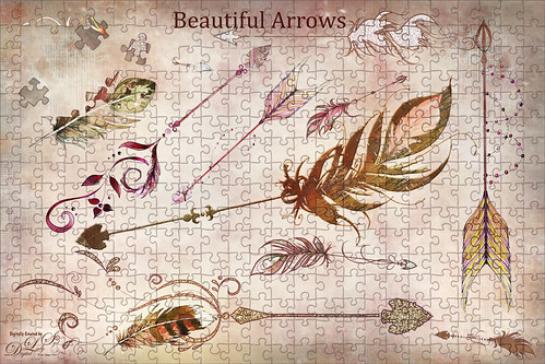
Used a different jigsaw pattern (that is no long available on the internet) on the above. After loading the Pattern into PS, the Pattern Fill Adjustment Layer was scaled to the Puzzle using a Scale of 110% for the Arrows image – it fit pretty good, but this will depend on the size of your image and the size of the pieces wanted. Then the Pattern Fill Adjustment Layer was duplicated and rasterized by right clicking on the pattern and the original adjustment turned off by clicking on the layer eyeball. Why did I do this? So the Free Transform command could be used to adjust the edges exactly right. A Layer Mask was added to the rasterized layer and the tabs on the edges were painted out. The overall puzzle layer was set to 32% layer opacity so as not to overtake the elements in the image. See Image Two below for more info on creating the design.
Bottom Line is to use whatever works for you. I think the Adobe Free Action has a lot of possibilities but I did not spend that much time using it. I hope you at least enjoyed finding out the different ways the puzzle effect can be applied and what different results occur. Stay warm…….Digital Lady Syd
IMAGE RESOURCES AND POST PROCESSING INFO
Image One: Of course, the first image above was just for fun – got some new resources this past month and thought I would try out a few. But the actual background puzzle image is one worked awhile ago of bird stamps (Finchley Paper Arts from Milton Bradley) – a phone image of the finished piece was taken and was placed over a Rusty 3 Vintage Paper by Suna Kosem. To get the paper to show up, used Blend If This Layer settings (56/138 and 162/255). A layer mask was used to paint the pieces off the face. (The face is from an old free brush set on Deviant Art called Phrenology Photoshop brushes by hogret.) The individual Jigsaw Puzzle pieces were from jigsaw(set07)briarrose_icons and are also available from Deviant Art. The Puzzled font is one of my very favorites called Everleigh Serif Font by Gleb Guralnyk – along with the paper, these items were in a Christmas $5 bundle from Design Cuts. Twice a year they run a great deal on some of their best items. The font at the bottom is Rosabelia SLDT, one I have been using a while – just like the way it looks, and it was from Creative Market, another great resource spot (check out their Free Goodies of the Week – this is how I got this font).
Image Two: The rest of the Arrow image was just adding a few arrows and feathers from the same Design Cuts set – this one was called Boho Arrows Clip Art – then changing the colors and adding some layers styles. I really like the pretty arrows so I wanted to try some type of creative image with them. To get the individual loose puzzle pieces from the actual image, a couple of the jigsaw pieces were painted out in Quick Mask to select them. They were put on separate layers and spun a little. 2 Lil’ Owls Mosaic Set’s Delfine Grunge (not sure it is still available) was the background texture (one of my favorites sets from her). It was a lot of fun to do!
LET IT SNOW!

Happy Holidays!
I had so much fun creating these animated snow GIFs the past few days. Thought I would share how it is achieved since I have been looking for easy tutorials on this forever. BTW, the image above is of a beautiful Holiday item one of my friends had in her living room. The subject was first separated from the background and then snow and lots of other steps added to the it to get the start of a snowy effect before adding the animated snow layers.
The GIF tutorial I followed is by one of my very favorite PS guys, Corey Barker. If you are member of Kelby One, check out the November/December 2019 edition of Photoshop User Magazine, Shaping and Styling a Custom Holiday Scene article, and at the bottom click on the Learn More button – a nice 7 minute video on how to do this is shown and it works perfectly! A more complicated video called Create Realistic Animated Snow in Photoshop that uses 3D by Corey is also very good – basic steps are the same at the end of the video so it does not have to be done with a 3D effect (had to try this in CS6 but any snowy layer should work). Corey used a Pattern Layer Style in a timeline to get his snowy effect and that is what you see above and below. For the top image, two layers with layer styles were used – one that used the ornament image snow layer and one using my blurry snow overlay turned into a pattern. By dragging the blurry snowy pattern a little sideways in the Pattern Layer Style, a soft windy feeling could be achieved. The speed seems to be a bit of issue with this method as I could not figure out how to slow the rate of falling snow down a little.
*****

The ornament is a shape that was also explained in the PSUser magazine and everything else was painted or used Christmas brush strokes. And for your info, the crazy Fisheye effect is a filter in Topaz Lens Effects, one of my favorites (and it sure is a lot cheaper than buying a fisheye lens). Need to put your image together the way you want it before adding the animation effect. The green tree background was created using a silver colored pattern fill and clipping a Select Color Adjustment Layer to it for color. The bulbs were copied from one of old tree pix. And the branch edges and some ivy painted across some of the more bare areas were painted on using JS Scully’s Christmas Accent Brushes at DeviantArt. Also in the center were some PNG snowflakes from a while back that were turned into large soft brushes (I love doing this!). This time just created one layer with snow that would only show up inside the ornament. This was my first attempt and it took a while to figure out how to set it all up.
*****

This image is from Deeezy’s 33 landscape photos free set and used a little different process to create the snow animation. This time the Photoshop marvel Colin Smith created a nice video called How to Make Animated Snow in Photoshop – it contains three snow layers in a Smart Object that ultimately ends up on top of your image (or videos). I thought this was an easier way to do the gif, but I had a lot of problems with the slight jiggling when the 5 second loop starts over. I think a lot of experimentation has to be done to get smooth snowfall. But overall it turned out pretty nice. In PS the Landscape Mixer Neuron Filter was set to the first preset image to turn the summery image into a wintry scene. Also a few layers were painted to add a snow accumulation effect to the objects. This effect has a more natural snow look with the snow layer animation speeds set to different amounts. This way of animating the snow does allow from some falling snow rate adjustment so that give a very different feel to the images.
*****

What is really great is that this animation layer can be placed on a different photo (this last image is from Unsplash by Atikh-Bana) to make it an animation also. I cheated and duplicated the animation smart object layer from the Deeezy image above to this image and then changed the opacity of the different snow layers by opening the copied snow layer’s smart object and resaving. Then Color Lookup and Levels Adjustment Layers were applied before converting the image to a gif animation. To do this correctly, go to Colin’s video link above and scroll down to follow his saving directions so the snow layer can be easily be added into another image easily.
This is very challenging to do, but once you start to understand the Photoshop Timeline Panel, it is pretty easy to figure out. It was fun to have a challenge and hopefully I will learn a few tricks to make this easier, especially with adjusting the snow speed and how the loop interacts. Everyone have a Great Holiday and I will see you next year!………Digital Lady Syd
MORE COLORIZE FUN
I have been taking a break for a while – lots was going on with all the many Photoshop conferences and the new versions of Lightroom and Photoshop. Everyone seems to be using this one filter in PS – I can’t say that I blame them. It is turning out to be pretty cool! Since writing a blog called Wow! The New Improved Photoshop Neural Filter Colorize in August, the filter has gotten much more stable and works a lot smoother.
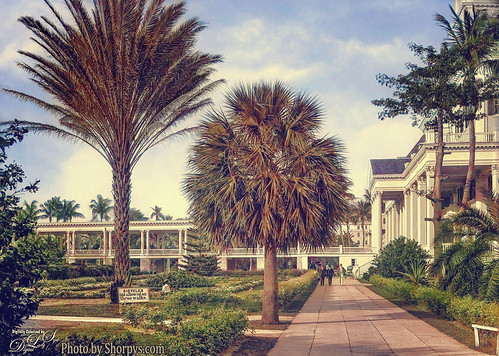
The above is an image of the old Colonial Hotel built in 1901 by Henry Flagler in Nassau, the Bahamas. The hotel burned down in 1922 and the British Colonial Hilton Hotel is now located on this area. The image is from Shorpys.com (see original black and white). The area has some interesting history including scenes from the James Bond Movie Never Say Never Again! Thought I’d include this vintage 1918 postcard of the original hotel from Wikipedia. Wish I could have visited the original – it looks quite beautiful!

For post processing on the top photo the relatively new PS Neural Filter Colorize was selected using just the preset called Retro-Faded. After applying the filter on a New Layer, a stamped (or composite) layer was created on top, and the Edit -> Sky Replacement command was used to add in a more interesting sky. On a new stamped layer, Color Efex Pro 4 was used to soften up the whole image to give an overall nice warm feeling (Ink, Darken/Lighten Center and Film Efex: Vintage filters were used). Last step was a Curves Adjustment Layer for some image contrast.
*****

Below you can see the image of Neptune was larger and what settings were used. (See my 1-minute video called Hilton Waikoloa Village Palace Tower Fountain for other fountain images taken a while ago – I have no idea who created it!) It was cropped down to emphasize the expression on Neptune‘s face (this guy had a bunch of children). It took a lot of steps but the color definitely came from the Colorization Neural Filter. Below is the original image in the Colorize Panel. Just the sliders were used this time.

The main objects were selected, which took quite a while due to the complexity of the subjects and many items had to be covered, removed or added to get a more unified feel in the image – just basic PS clean up. One of my painted backgrounds was used to give a more painterly old feel. An oldie-but-a-goodie filter was brought out to give the image a warmer feel – Topaz Lens Effect’s Gold Reflection filter was applied at 79% layer opacity – then some of the effect was painted out with a layer mask so it was not overdone. Finished up with the Camera Raw to adjust the colors a little more. But overall this is the color palette that was applied from the Colorization filter.
*****

The above image was another Shorpy.com black and white image of Bannack, Montana in 1942. I wanted to show that this image was colorized in the neural filter twice. First converting a duplicate of the original the black and whiter Background layer with the Output to New Color Layer checkbox on (see first screenshot below), and then using four Focal Points, three adding yellow to the dirt road and one to cool down the first hillside area (see second screenshot below). Back in PS the only other things done to the image were a Levels Adjustment Layer and a little bit of Dodging and Burning on the dirt road to define the edges.


As stated above PS has added a couple extra tweaks to the new PS 2022 upgrade and the filter no longer is crashing as much (also my brushes are working correctly again!) I did have one big program blow-out (PS just disappeared!) while adjusting the Focal Points, but when tried again it worked.
Still figuring out the other filters. It seems there needs to be a little more work done to get them working as good as the Colorize Filter. I did learn that if your Neural Filters keep crashing your system or shuts the filter down, you can delete the filter file and let Photoshop restore them when you restart the program. This fixed some of my errors with these filters, but not all. Here is the Adobe troubleshooting link.
Hope you have tried out this filter – it seems like it does have some very nice uses for the PS creative. It is nice to see PS adding a few new items to try out……Digital Lady Syd
A FEW PHOTOSHOP AND LIGHTROOM TIPS AND TRICKS
This week I thought I would present a few handy tips and tricks that you may not know or had forgotten – some are from a few years ago. These are ones I found while experimenting on my latest images. Maybe they will be helpful for you while working on yours. The image above was drawn and painted from an photo I took at the Jacksonville Zoo a while back. I love her expression. So here we go…..
- CHECK VALUES QUICKLY (PS): Sam Peterson from Adobe Creative Live, has this excellent way to turn your photo to black and white to see how the image values are looking. First need to set up the panel. In PS go to View -> Proof Setup -> Custom and in Customize Proof Condition Dialog, set Proof Conditions – Device to Simulate to Dot Gain 20%, Rendering Intent to Relative Colorimetric, and check Black Point Compensation. Now these settings will always remain. Simply press CTRL+Y and instantly you will see the whole image in B&W. Just press CTRL+Y again and it removes the effect. Also, the Color Picker still works when image is in B&W so you can see what color is causing a problem if you do not like the results. Really cool! I am using this all the time now for a quick view of what is happening with the tones in the image.
- SHADOW AND HIGHLIGHT LAYERS (PS): Another Sam Peterson trick – this guy does have some really interesting techniques! For images with really neutral lighting, he creates a New Layer and sets it to Multiply blend mode and selects a grayish-blue tone (try #8e969e). Clip this layer to object layer for keeping shadows confined to the object only. Otherwise can use on the whole image. Use any brush, soft Airbrush or hard edged, to paint in the shadows. (Can create a gobo lighting effect doing this with an interesting stamp brush – see my Photoshop Gobo Lightng Effect blog.) He does the same technique for Highlights using a Color Dodge blend mode and a darkish mid-gray color (try #42403d). These two layers work well together and give some beautiful results. By using these colors and adjusting the brush opacity and flow, a subtle result can be achieved.
- BRUSH SMOOTHING FOR TRACING (PS): This tip is from Paul Trani also from Adobe Creative Live. When tracing over an image and are having problems controlling the brush strokes, set the brush Smoothing up to 50 and the lines stroke much easier. It does slow the brush down a little, but it really helps to create nice smooth curves lines. I am finding this very helpful anytime I am using a very small sized thin line brush – used it to add some tree branches on a trunk recently.
- SELECT AND MASK REFINE EDGE BRUSH (PS): I have always struggled with getting good results in this panel. Well Sam Peterson once again gave me some insight for this tool. With the layer mask highlighted, go into the Select and Mask Panel and choose the Refine Edge brush icon, 2nd down on left side. In Tool Options Bar at top, open the drop-down next to the brush size field and set the brush Hardness to 0, Spacing to 25%, Angle to 0, Roundness to 100% and Size to Off. Also note that the Radius is set to 0, Smart Radius is not checked, and Object Aware selected. Once I did this, I found it was much easier to get good results on the edges, particularly when selecting hair or fur. He also cautions that dragging the brush too much inside selection will allow the edges to creep in. Drag on the very edges outside of object for best results. Use the ALT key and paint back any area that leaks in or use the Brush Tool (3rd icon on left) to clean up.
- CAPS LOCK TO FIND AND PAINT WITH BRUSH (PS): Kim Klassen of texture fame put me onto this one. When painting with a very tiny brush or very large brush where it is hard to see, just press the Caps Lock to get a small cross so you can see where the center of the brush is. It works with painting with a very tiny sized brush. I use this trick all the time when using cleaning up areas with small brushes like cleaning up halos, etc.
- SMUDGE BRUSH AND MIXER BRUSH LAG ISSUES (PS): These tips comes from Kyle T. Webster, the Adobe Brush Evangelist. If your Smudge or Mixer brush are acting very sluggish, you may need to turn off Sample All Layers due to several layers in image. Can also go into the Brush Settings Panel -> Brush Tip Shape section and – for Smudge Tool, uncheck Spacing and for Mixers set the Spacing to 5%. Try reducing the brush size also. It helps to close other documents open in PS and any open web browsers to speed things up too.
- DEHAZE SLIDER TIPS (LR): Two major Lightroom and Photoshop gurus offer these tips. Moose Peterson, of wildlife reknown, says that whenever he uses Dehaze, he always lowers the Blue Saturation in the HSL/Grayscale tab since the slider tends to crank up the blues. John Paul Caponigro, possibly my favorite PS guru, says that Neutral areas may turn magenta, and Shadow areas pick up strong blue or green casts. Can reduce Saturation after using, but what he likes to do it create a Virtual Copy. On one copy use no Dehaze and on another use it. Highlight both images in filmstrip, right click on an image, and select Edit In -> Open as Layers in PS. Put layer with no Dehaze on top and change to Color blend mode. Something to try IMO.
- ADJUSTING PRESENCE SLIDERS IN LANDSCAPE IMAGES (LR): This info comes from Randy Van Duinon, a very good architectural and landscape photographer, who uses an interesting LR workflow. He starts by first adjusting the Texture slider which works in the fine detail adding contrast in these areas; next the Clarity slider which adds contrast in the midtone areas (he keeps this amount around 35 and more on cloudy days); and finally Dehaze which adds contrast to the larger areas. Then he continues with the Basic settings. This has worked out well for me at times.
- USING PROFILES IN LIGHTROOM (LR): Daniel Gregory, a professional fine art photographer, came up with what I consider is a rather common sense tip. Since the image can change rather dramatically just by changing a profile, he believes that it should be applied first as he would be making different setting decisions depending upon which profile he uses. The Adobe profiles do not have an amount slider, but usually creative profiles that are downloaded have this slider. Consider the Amount slider the same as an Opacity slider on a layer in PS. I will add that many people do not add the profile until the end (Matt Kloskowsky for example) so this is definitely something to try.
- PARAMETRIC AND LINEAR CURVES (LR): This tip is from Tobi Shinobi, a bright young newcomer on the PS scene. In the Tone Curves section, first adjust the Linear Curve (2nd white round circle) and add your points. Press ALT to reset the curve and ALT+click over the curve to set a point to adjust. Right click to delete point. The go to Parametric Curve and adjust – they work independently of each other. Use this order to add some finesse to your images.
I hope there were some new ideas presented in these tips. Some really great PS and LR gurus have some great ideas! It was fun putting this together. See ya soon again…..Digital Lady Syd
DIGITALLY PAINTED OR RETOUCHED?

Hi everybody! I know it has been a while since I blogged, but I really have been busy with Photoshop! Major project going through all brushes! So many to choose from and big decisions on which to use. Of course this is a whole other blog on how to sort through this. The portrait image above, by Christopher Campbell at Unsplash, is one that worked nicely with the brushes for the painting effect required in this blog.
Starting Out
Adobe Creative Cloud has Photoshop Daily Creative Challenge videos that are released for Photoshop every few weeks. A couple months ago Sam Peterson, an illustrator and painter, ran two weeks of some really fabulous PS videos. One was called Brushes where he gives you a starter file and walks you through how to create a similar effect as shown above. The image used PS’s Camera Raw, Angled Strokes and Oil Paint filters to begin the painterly process as Sam demonstrates. He also showed how to create a background to match the image to be painted. This photo used a brush called Clay for the background that was in Kyle T. Webster’s India Set he sold for charity (unfortunately no longer available). It is basically a chunky block brush. For a very similar brush, check out the Brix Brush in Kyle’s Summer 2020 brush set or for the brushe, Disastro or Disastro Spatter in his Summer 2021 Brushes, which uses both the foreground and background colors (press harder or lighter to get variations and a cool texture effect). Lots of different brushes were tried before finding a background brush I liked – but then this is half the fun! For info on how to download and load Kyle’s free PS sets, see my Kyle T. Webster’s Photoshop Brushes blog – scroll down to the How To Find His Brushes and Loading the Brushes sections.
The Mixer Blender
Sam gave guidance on what brush settings to use, but it is up to you to find a brush on which to apply these settings. This process is using a Mixer brush to blend, not a Smudge brush which a lot of people call a blender brush. Mixer brushes are a more advanced version of the Smudge. It does not appear Kyle uses Mixer brushes very often for blending as there are only a few in his sets (there are several Mixers in his Megapack Real Oils section will work nicely). For something like digital painting, I would recommend using Mixer Blenders for this exact and complicated blending. The main thing to remember is that the Wet and Load amounts, which Sam sets at 15% to start, can be adjusted “on the fly” to get a more or less painterly effect from the brush. He did not change his Mix and Flow which were both at 50%. Still okay to change if it helps. Also, if a color is needed to be added in, like for a cheek or lips, there are several ways to do this. I find the easiest is to select a regular brush and splash a bit of color in for blending with the Mixer. In another blog I will discuss some of these Mixer points.
One of my favorite Mixer (blender) brushes, and one I used extensively on this image, is by David Belliveau (free download of 4 brushes at the link and also check out his amazing drawing tutorials – link to my blog on David’s technique is listed below). The settings Sam suggested worked fine with this brush (set to 195 pixels). When set to 15 pixels, used David’s settings to do the detail work on the image, like the eyes, lips, and some hair – mainly where the focal point is, after the original blending was done. The larger brush was used to soften down all the other edges other than the eyes and hair by the right eye which were left sharpened as discussed below. As a reminder, once the settings have been added into the Brush Settings panel for the Mixer, save it down as a new brush. Otherwise all the settings will be lost if you go to a different brush and want to come back to this Mixer.
Once a brush is chosen, it was time to paint with the Mixer – Sam seemed to only paint on one layer, but I found it much better to split it up for the different areas being painted. For the right image below, here is a list of some of the layers created – started with a basic once over on the face smoothing the edges like in Sam’s tutorial, then evening out the lighting effect on the next layer, added color to her cheeks, eyelash layer, pupils layer, iris layer, catchlight layer, fixed the shirt on another layer – just duplicated part of it and blended it together, some hair strands added on another, and lips painted. As you can see, it is a bit labor intensive, but the results are worth it. By putting everything on separate layers, corrections can be made really easily. Below on the left is the original image and on the right is the one that looks like a pretty decent retouch – so what makes it look more painterly?
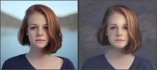
Getting the Final Painterly Look
Mainly adding a texture is a key to getting the more painterly effect needed to sell the look. Sam has a texture in the PSD file he provides and several other brushing suggestions are given to get this look. Also using Color Lookup Adjustment Layers, and possibly Gradient Map Adjustment Layers, using different blend modes and opacities gives some nice painterly effects. And do not be afraid to stack several of the same kind of adjustments using different blend modes and opacities. Just remember that usually a Curves or Levels Adjustment Layer must be added on top to bring back some contrast. So this is what was done on this image to finish up the “look:”
- Liquify was applied to enlarge her eyes just little and give her mouth a bit of an upturn (this filter is so cool!).
- A stamped layer was created and a Sharpen action was run on the image – a black layer mask was applied and just her eyes, her hair strand on the right and a small section of her ear lob were sharpened.
- A Color Lookup Adjustment Layer set to 80% opacity was run using On1-Heat Wave LUT – one that adds warmth into the image – any warm one you will probably get this effect. This really filled her face with a beautiful light effect.
- Another Color Lookup Adjustment Layer was added and set to 12% layer opacity called Teal Orange Plus Contrast preset (not sure where I got this). It darkened down the blues in her shirt.
- Added a Levels Adjustment Layer to flatten down the blacks a little since paintings do not have true blacks in them usually.
- Added French Kiss Tableaux Mirage-2 Texture – used a Hue/Saturation Adjustment Layer clipped to the texture with Saturation set to -100 so only the strokes from her texture show up. The texture was set to Overlay blend mode at 46% layer opacity. (See link to my blog on how to do this below.) These layers were grouped and set to 62% Group opacity – then the Group’s layer style was opened and the Blend If Slider was set to This Layer Black tab split to 0/86 and Underlying Layer White tab split to 121/255 so the strokes showed up just like I wanted them.
- Next on a New Layer below the Group file, a brush was created from the texture and used to cover the whole image to give it more of a painterly look – the layer was set to a reddish brown brush color, Color Burn blend mode and 93% opacity. It adds some nice soft canvas looking lines in the image, especially on the face. (See link to my blog on how to do this below.)
- A Hue/Saturation Adjustment Layer was clipped to the Group above and the Saturation was increased (+44) and Lightness lowered (-38) to darken down and add more color to the image.
- Last step was a final Levels Adjustment Layer – Black tab to 16 and Output Levels black set to 5.
Hopefully you can get an idea what really goes into these digital paintings. And I am still not sure it is really a “Painting” since the original image was used, but it definitely looks more painterly than just a good retouching effect. I still look at it and see places where it could be improved, but it is a learning process. Definitely it took me several hours just to figure out the Mixer blending to get the effects needed. Enjoyed being back and plan on doing this a lot more. ……Digital Lady Syd
Digital Lady Syd’s Related Blogs:
Where to Find a Good Photoshop Painter – David Belliveau tutorial information
How to Create a Texture Brush to Match a Texture
How to Add Texture to an Image without Adding Its Color (You Tube video link in blog)
WORKING ON DIGITAL PAINTING IN PHOTOSHOP

Sorry I have not been blogging as much as I have in the past. I have been watching a lot of videos and trying to figure out how to use the Photoshop brushes to actually give a reasonable painterly brush stroke. There does not seem to be much on how to actually do this – only a few digital artists talk about it. I felt like the above image starts to emulate painterly strokes as it might look in Corel Painter, but not sure about if it emulates real media results. (In my Painting Acrylics Digitally – Can It Be Done? blog, I did get a pretty decent acrylic look.) The original above image is from Unsplash by Luca Bravo in Arles, France and was posted in my Beautiful Blue Door Tidbits Blog 3 years ago that used the Mixer brushes. For this blog I have been experimenting to try and get a consistent painterly stroke and finding settings that might work on other brush tips for a similar look. I have listed throughout this blog several free resources for brushes used in the above so check out the hyperlinks. I am also finding out this is a huge subject to cover so I am just addressing a small portion this week.
Creating the Sketch (black outline)
In the above the black lines were drawn in to create the layout of the original image. Used the PS Megapack Inkbox and Kyle’s Clean as a Whistle brush – lots of Click + SHIFT’s to draw straight lines (and it still is not perfect). When drawing a horizontal or vertical line, just keep holding down the SHIFT key while dragging to see how it is looking. This was handy for this image. If needing a more diagonal line, it will not work. When doing regular sketching, I usually use Grut – I Qwillo brush ($1 for all his individual brushes). Nicolai has an enormous number of fabulous brushes on this site (his Cloud set is the best around) . Every Monday there is a free brush of the week to download and is a great way to try out different media brushes. In this case a little richer stronger line was needed. So I would suggest trying different brushes until you get the line effect you need.
Painting Brushes
I have been trying to stick mostly to Kyle’s brushes here that can downloaded easily to try tout if you are using the later versions of Photoshop. For more info on how to download his PS brushes, see my Kyle T. Webster’s Photoshop Brushes blog. BTW Kyle has just released his Adobe PS Spring 2021 Brush set, so give them a try. The Edvard Munch brush set first appeared in 2017 in a 4-part video series called Get Started with Digital Painting Photoshop – they are not part of the PS2021 brushes, but are a free download here at the Adobe Creative Cloud. He found the Munch Filbert Dry Mixer gives a sort of an impasto look. To get the painterly strokes on each side of the door, I liked Kyle’s Munch Medium Flat brush but I did make some setting adjustments. I am using the brushes below to get some nice painterly strokes. I did switch a bit between them to get the right stroke effect on the walls.
The first brush was named SJ KTW Munch-Medium Flat-painting (150 px) and does not have much color variation but does use both the foreground and background colors with Pen Pressure (this means press light and background color appears and hard for foreground color when using a tablet.) Only the settings listed were changed: Texture section – was changed to one I imported from Painter, but the Rough pattern texture (Invert checked) seems pretty close (it can be found in the Photoshop default Erodible Textures set) and setting Brightness to -22, Contrast 57, Depth 19%, Minimum Depth 82%, Depth Jitter 27%, and Control to Pen Pressure; in Color Dynamics section checked the Apply Per Tip and set the Control to Pen Pressure; and in Transfer section set Opacity Jitter to 38%, Minimum to 55%, Flow Jitter 13% and Minimum 74%.
The second brush was named SJ KTW Munch-Med Flat-Painting Var1-try sim colors (175 px) to remind me how to use the brush. These settings were changed: Texture – changed it to same Rough pattern (Invert checked), Brightness to -13, Contrast to 33, Depth to 14%, Min Depth to 21%, Depth Jitter to 69%, and Control Pen Pressure; Color Dynamics changes were to check Apply Per Tip, Control set to Pen Pressure, and Saturation Jitter to 4%, Brightness 4%, and Purity to -20%; and Transfer set to Minimum Opacity Jitter 84%, Flow Jitter 43%, and Min 28%. Also the Dual Brush section was opened and the same brush,130 (size) Kyle munch flat medium1, was selected – should already show a Size of 130 px, Spacing 17%, Scatter with Both Axes checked, Scatter to 202% and Count 1; and finally Wet Edges section checked.
Try changing the Brush Tip Shape Spacing to adjust how much texture is showing up. Below are examples of how the strokes look all using the same foreground and background colors. If you have a different Texture pattern you want to try, go ahead but do adjust the sliders. Just be sure to save any brush variants you like when finished. See if you can get some nice stroke effects for solid areas especially. I would suggest trying a different brush tip (check out the list provided in the Brush Tip Shape section and just select one you like) using similar settings (or the settings from any brush you like). This is a great way to create your own paint stroke effect. I will talk more on this in a later blog.

Finishing Up
The bottom sidewalk and door pane effect was created using Kyle’s India Brushes Clay brush that I purchased recently for only $1 for his humanitarian cause of Covid 19 in India. (Available until May 10th.) All these brushes are great but I especially like the effect of this one. Kyle also has a free Builder Brush available at his website seems to do a similar result.
The other brushes used in this image were from Jessica Johnson and her fabulous Pattern Stamp brushes – I always seem to be using them! What I love most about Jessica is that she gives out samples of her different types of brushes which is always very helpful. This time it was the pattern at the top that was a give-away called 3 Modern Renaissance which included a brush and a pattern. Check out her You Tube video Free Photoshop Brush & Metallic Color Palette: Inspired by Dior Couture – Modern Renaissance to get her freebies (see 4-13-Free Renaissance Brush zip file) – and be sure to sign up for her E-mail to get notified when she has new brushes and patterns to release. In this case the Modern Renaissance was used as a regular brush and painted on in a darker gray color. Also used her Moody Floral Bold pattern stamp brush with her English Garden pattern (TM12) was used for the colorful flowers on the window sill and by the cat. When you go to her freebies for the Modern Renaissance brush, click on the 3-15-Free Brush Mon zip folder which contains the Moody Floral Brush and an accompanying pattern. I just love the flower stroke with this brush.
One of Chris Spooner’s free Subtle Grain Textures (6) was applied to give the wall a bit of a cement feel and tie it in as a building. It was masked off the cat and windows. He has lots of nice free resources at his site. The name plate with instructions are in my blog called How to Create Personal Overlays for Your Images – one of my most popular blogs.
Contour Trick
The large black cat is part of a set called Egyptian Hieroglyphs by Skybox Creative that cost $12. If you check every Monday several items are available at Free Goods of the Week which is how I got this vector cat. To give him the cool contour (like my gray cat Sophie), a Bevel & Emboss layer style was added using an Inner Bevel, Smooth, Depth 230%, Direction Up, Size 68 and Soften 0. Then in the Gloss Contour, the Gaussian contour was selected – then Highlight Mode Screen, White, at 29% Opacity and Shadow Mode Multiply, Black, at 32% Opacity. The Contour was checked and the Contour was set to one by Jenni and I have no idea where I got it. Just play around a little with – it give some really cool 3D effects. The other cat is from a set called Cat Family by teddybearcholla (found in a very old Photoshop Creative magazine). A Bevel and Emboss layer style was also used on this cat, with a Depth of 532%, Up, Size 7 px and Soften 0 – Highlight Opacity set to Screen and 77% opacity and Shadow Mode set to Multiply and 33% opacity. A Watercolor pattern texture was added and set to a Depth of +26%. The layer styles really gave both cat items a fresh look.

Above is a variation of the same image with just a Color Lookup Adjustment Layer with a Cerulean preset at 25% layer opacity and a Gradient Map set to Overlay at 34% layer opacity that used purple and pink randomized color added. Quite a different look. Eventually I hope to get an E-book or PDF together that can be used as a basic guide to show some of the little tricks the sliders do. For example, did you know that if you put the Shape Dynamics Size Jitter Control (even with no Jitter set) to Pen Pressure, the actual Brush stroke appears smaller. Check the Brush Preview in the Brush Settings panel to see the range between the thick and thin stroke now. There is a lot more to this, but that is just an example showing how the stroke will be different with just one setting change. And the people who do paint digitally use all kinds of different settings to get their brushes to work. In the meantime, I will try to pop in more often! Have some fun trying out some new brushes……Digital Lady Syd
Digital Lady Syd Related Blogs:
ReBlog – How to Use Photoshop’s Brush Texture Section for Painting Clean-up
Looking at the Smudge Tool – Again
Happy Valentines Day

This week I did a quick little Valentines Day card. Most of this card has the standard valentine elements I have used before. But I did create the element in the middle from a video I recently watched on Design Cuts called How to Create a 4-Way Mandala in Photoshop by Leslie Nicole from French Kiss Textures (her textures are some of the best you will find). It was so much fun trying out the Mandala designs that I had to show a couple. The design above also used some really nice valentine elements from Karen Bonaker, the Corel Painter Master. At her site, she gave these away as Painter brushes, but I switched them over to Photoshop ones by following one of my old blogs called How to Bring a Corel Painter Brush into Photoshop – worked like a charm! I painted the background using almost all the brushes she offered – lot of fun here.
Back to the Mandala – I had never seen Leslie’s technique for creating these so it really intrigued me. Below is an example of one created following the basic steps she uses. The video gives a great explanation of how it is done. Leslie mainly uses flower stems or designs to create them. Below my white lily image that is posted here was used as the starting element for the design.

Some painted texture was added behind and Kyle’s Spatter brushes were used also. Topaz (see sidebar at my Tidbits Blog for website link) Simplify was used on the flower in the center to get it to match the image.
This technique is really not as hard as it seems and it gives a beautiful and original result. I plan on trying several more as they are quit fun to do! (Check out this one I just finished a little late: Valentines Mandala) Enjoy the Day!…..Digital Lady Syd
TRYING OUT SOME NEW THINGS

The last few weeks have been pretty busy for us Photoshop groupies what with all kinds of webinars and tutorials being released by both our favorite software companies and photographers. I thought I would just go over a few techniques..
Side Note here: With Black Friday coming up, here are my favorite filters: Viveza – still cannot be beat as an overall filter; Topaz (see my Tidbits Blog sidebar for website links for all plugins) AI Sharpen – use it on every photo and can’t live without it; and a tie between Luminar 4 – just has some cool things in it – not sure yet on their new AI, but I happy with this version for now; and Topaz Studio 3 – this program has so many filters that are so useful like Impression, ReMix, Color Theme, Glow and Edges (and DeNoise Clear). If I just had these filters, I would probably be totally happy. Now I will say Topaz DeNoise AI is excellent when the need arises but I do not use it on every image, and Topaz Gigapixel I use all the time as a stand-alone mainly. And yes Color Efex Pro is always great – I just do not use it much.
The above image of the inside at the Garlic Restaurant in New Smyrna Beach, Florida, is a good example of what can be done with the Pattern Stamp Tool. It can create some pretty impressive results and is major useful for creating textures. Used Jessica Johnson‘s new techniques (video and some freebies) at this link – she has lots of newsletter freebies so sign up at her site. I recently bought her Instapressionist brushes and am having a lot of fun experimenting with them. I am finding I can blend this tool with my regular painting to get some very unique effects. I also use the brush to fill in places in my image that needs some soft detail in the backgrounds.

The above violin image from Pixabay was used to apply Frequency Separation (FS) to the rather wrinkled backdrop behind the instrument – the link will show you the image as downloaded. I wanted to try this technique out on something other than portraits since I am not really a retoucher or portrait photographer. So in October Adobe Max 2020 had an on-line virtual Photoshop Creativity Conference. Their link takes you to gobs of sessions, many on PS only. (I believe I heard these videos will be available to access for a year.) Earth Oliver, a commercial retoucher, did three classes all on Frequency Separation 2.0: Part 1 – Photoshop FS2.0 Retouching, Part 2 – Taking Images to the Next Level, and Part 3 – Problem Solving Techniques. And he also supplies you with an action to use. He speaks pretty slowly, but he makes it really easy to understand FS. He also uses the Mixer Brush in some of his steps which I found really useful. FS videos were also presented by Lisa Carney at the Photoshop Virtual Summit 2 (created by Photoshop Guy Dave Cross) which brought together 20 PS experts for roughly 40 hours of videos, but these summits are always fun to watch and full of great tips in them – the videos had to be purchased at time of viewing. Lisa Carney did a Basic FS Class for Beginners and one using FS on all types of files, including smoothing out wrinkles in clothes or backgrounds. She also has a Creative Live video called Retouching Clothing and Fabric, which is really good. Using the info from two retouchers, the above image was adjusted. A Hue/Saturation Adjustment Layer was used to create the interesting color of the violin (just dragged in the image with the toggle finger). Design Cuts Blooming Corner by Maria Letta Corner1 brush was used as detail behind the violin after selecting the violin. Last step was adding a Curves Adjustment Layer selecting the preset Basic Matte Effect. I can finally say I understand FS and will now use it a lot more.

This image uses two free images: etty fidele in Bologna Italy (Unsplash) and New York City from Deeezy (Image 12). Chris Spooner, a British PS person, recently gave away this really cool Gold Action. In the above case it was run separately on each photo and then combined with a nebula image (from Unsplash) added that was also turned to gold using a Hue/Saturation Adjustment Layer. Just sort of one of those fun things to try and every now and then and whenever something gold is needed. This really works!

Same image as above, but this time I put one of my own Corel Painter textures behind the violin and added some sand on the instrument (this was actually a snow brush from Serge Ramelli with a brown color). The colors were changed by using the old Match Color command which Ben Wilmore explained clearly in his Summit video. On Creative Live Ben has this info in his Photoshop Mastery Retouching and Collage videos – they are older but still very good. I have never used this command so I was surprised how good it turned out. As a Source image, one of the textures I had created with a beige color was selected. Then the Luminosity, Color Intensity and Fade sliders were adjusted to get the overall colors wanted. It was pretty easy and turned out nice. To get the beach feel, the PS Lighting Effects filter in the Render grouping was used with a Point light set to a yellowish color and Intensity of 19, a white Exposure of 26 and Ambience of 29 to get this soft beach feel.
Hope my US friends have a great Thanksgiving – probably a bit low key – I know mine is going to be. But have fun anyway. Hope you get in on some great sales – the plugin companies all have good deals going on. Later…..Digital Lady Syd
GOT SOME FREE TIME! TRY DRAWING!

This week I decided I to try another drawing video and see what results I could get this time. One of my favorite wildlife artists (and Disney cartoonist extraordinaire!) Aaron Blaise had a sale on an older set of videos (he was using Photoshop CS6) called Wildlife Painting Bundle for Photoshop. The above Elephant was drawn and painted following the steps in his 1-1/2 hour long Elephant Painting Tutorial video. He takes you step-by-step on how to create the image in great detail. It took me much longer than 1-1/2 hours to do this – had to walk away a few times and start certain sections over to get it correct. The main challenge was to get used to the Erodible Brush he showed you how to create. Once you have mastered the brush, it was amazing what it could do! One hint here, I had to actually add some Softness to the brush (41%) to keep my lines from getting too sharp when making wider strokes – and the brush size was set to 7 or 8 pixels to get sharp sketchy lines. The only downside was the Elephant video’s resolution was lower than the other three and this made it a little harder to see some of his settings.
Aaron’s Elephant image was darker and used warmer tones rather like a Safari. My image used Topaz (see sidebar of my Tidbits Blog for website link) ReStyle to get more gray tones. The file became very large – almost a gigabyte and that seemed a bit excessive for a drawing. Therefore two different files were saved – a drawing file after finishing up the video, and a duplicate stamped layer from the drawing file to add my other changes. Aaron also teaches you how to create an interesting textured background and how to add special effects to it to enhance the overall drawing when finished. This bundle contained videos for a Leopard (which I am doing right now), a Lion and a Panther.
*****

My wolf drawing above was created a few years ago following Aaron’s YouTube video called How to Paint Fur – Photoshop – Wolf Portrait. It contains very similar steps, but since the wolf has hair instead of skin, it used different brushes. For more details on how this was done, check out my Learning to Draw a Wolf! blog. Aaron’s video for the wolf is also great for learning to draw. He has lots of other YouTube videos, several where he is using natural media as opposed to digital, but all of them are very informative. He is an excellent teacher.
There are several other digital artists that are sharing their Photoshop techniques. I am a big fan of David Belliveau of Paintable for learning to paint people. (See my Where to Find a Good Photoshop Painter blog.) A couple times a year he offers free week long lessons that are terrific, and he has some really great PS brushes for free download. And EDX (University of Newcastle in Australia) offers a free Drawing Course called Drawing Nature, Science and Culture: Natural History Illustration 101 – this is a course I keep meaning to start taking and have not had time to do it. This may be a great time to try! And just for some crazy fun, try doodling! (See my blog How to Enjoy the Doodle!)
*****
Below is a little drawing and painting done several years ago. Just another example of something that can be drawn easily. It followed my blog called Some Flower Power that describes the basic steps used.

Some Photoshop News
Also thought I would just add a couple notes for everyone. Photoshop just posted an upgrade (fixes tablet issues which I was having big-time! Thank you Adobe!), Skylum Luminar 4 update that now allows adding components into your sky and has greatly improved the skin panels (Thank you Skylum!), and Topaz AI Sharpen which now allows selective sharpening using a mask (Thank you Topaz Labs!). See sidebar of my Tidbits Blog for Skylum and Topaz website links. Should be some fun stuff to investigate this coming week. Hope everyone is at home and feeling well! Have a great time with drawing in Photoshop. There are so many things to learn by drawing that can help your photography skills too!…..Digital Lady Syd
HOW PHOTOSHOP’S COLOR DYNAMICS BRUSH SETTINGS WORK

I found some good info in my old notes on the settings for Color Dynamics in the Brush Settings Panel. With so many sliders it is easy to be confused on how to use these settings when you want to just add another color to your brush for painting. In the image above, which was created in Corel Painter, a scatter brush was used on a separate layer in Photoshop using Kyle’s scatter brush below using blue colors. The Color Dynamics section is not available for all PS brushes, but is for the Regular Brushes, Pattern Stamp Brushes and Art History Brushes.
Back in 2014, Melissa Gallo, a Corel Master and great painter, created Painting with Photoshop Workshop with 26 videos. It contained all kinds of brushes, patterns, actions, etc., that covered everything needed to learn to paint in PS. It is still available on her site and worth getting if you are really interested in learning to paint with PS. One of the her videos has a very uncomplicated way of looking at the Color Dynamic sliders. The other major reference for this is from David Belliveau, who mainly draws portraits in Photoshop (he offers a free class a couple times a year which are excellent so look for this) and has some wonderful free PS brushes (scroll down the page to find them). He covered this topic in Brushmakers Blueprint, a video from 2016 which appears to be only available on his member site.
Below is a screen shot of the Color Dynamics Section as shown in PS. Be sure to click on the actual words “Color Dynamics” to open up the settings. If just the left side check mark is clicked, it does not open up.

Kyle’s Spatter Br-Pressure Control brush is in his Scatter Brushes group, one of the free sets that can be downloaded if you use PS. (To find these brushes, go to upper pop-out menu in the Brushes Panel and select Get More Brushes – the Scatter brushes can be downloaded from this page.) Note that this is an Airbrush as shown by the icon checked in the Options Bar – the longer you press on the brush, the more dense it gets. The original brush does not have Color Dynamics checked so all the brush strokes will appear in just one color. To get the colorful effect shown in my top image, the screenshot settings were used. After adding the settings, the brush was resaved (by clicking the “plus sign in a box” icon at the bottom of both the Brush Panel and Brush Setting Panel). In the New Brush dialog, rename the brush (I added my initials to it so I knew it has the new settings) and check “Capture Brush Size in Preset” and “Include Tool Settings.” Below are listed all the color settings and what they do. The word “Jitter” means change in the digital world according to Melissa.
Foreground/Background Jitter: When kept at 0, the colors will mix just fine but will have mostly Foreground color variations. If you move the slider right, more of the Background colors are picked up until the stroke shows more of the Background color variations. (This is when the Hue is set to 0 – move this slider and get a lot more color variations.) This setting is not so important if the Control field is set (see next paragraph). I tend to adjust this slider and not change the Control field when adding color to most of my brushes.
Control: In the above brush settings, Control is set to off as I liked the effect I was getting as is. By switching in the drop-down to Fade with Foreground/Background Jitter set to 0, it takes 25 steps (if that is the number chosen in this field) to go from the foreground color to the background color. If set to Pen Pressure, it lets you paint using foreground to background colors depending on how hard you press (when using a tablet & pen). Many people just use this and not change much else in the panel.
Apply Per Tip: Located at the top of the Brush Setting Panel, when turned on, the colors are all mixed according to the panel slider settings. With the Pen Pressure set in the Control field, press hard to get the foreground color and light to get background colors. If you turn this off, each time you make a stroke, the same color will appear. So all the scatter color might be pink with one stroke and red with another. Different way of laying down the color in the stroke. I find this a little hard to control.
Hue Jitter: This decides how many colors you get between the foreground and background colors. Want more, move slider right; want fewer, move slider left. Note that as you increase the slider, more colors will be added into the stroke with Apply Per Tip on. Set to 100%, all colors will be shown. The Hue Jitter above is set to 25% which means 25% will go from the foreground color to variations of the foreground color, and 25% will go from the background color to variations of the background color. Increase that amount to get more color variations.
Melissa says the next three settings work in tandem, meaning they work together.
Saturation Jitter: How much of a change do you want between Saturation and no saturation? Set to 50% means that 50% of 100% of the colors are saturated and will show some gray randomly placed. When Saturation is set to to 96%, 4% of the colors are saturated and 96% of the colors will be randomly grayed out. When Saturation is set to 0%, no colors are grayed out and are all equally saturated. The scatter brush is set to 40% so 40% of 100% means that 60% have some gray showing up. This seems a little complicated to me. Basically this means when set to 0%, PS is using the original saturation of the foreground and background colors for all color variations created, and when set to 100%, PS is adding in a lot of desaturation to the color variations.
Brightness Jitter: Set to 100% means the colors are very dark – the jitter goes from high to low randomly. The brush above shows a 54% change in brightness – pretty middle of the road between overly dark (100%) and overly bright (0%).
Purity: How pure the color is. I wondered what this meant and David says the slider is acting like Hue and Saturation. When set to -100%, it becomes a black and white stroke and when set to +100%, it is totally saturated. The brush above was set to -12 which causes it to be slightly darker overall. To get a black and white brush, set everything to 0 but Foreground/Background Jitter should have some setting to be able to see the variations, and set Purity to -100.
Here are some ways to set up these sliders:
- With some Hue added, set Brightness Jitter to 80% and Purity to 55% to get very bright strokes.
- Decrease Brightness Jitter to 15% and get a much lighter look.
- Adjust Purity to -45% to get more of a pastel look.
- For a nice pastel look set Brightness Jitter to 23% and Purity to -47%. To put some color in gray and others in pastel, set the Saturation to 100% (changes how many colors are completely grayed out and how many are in full color).
I figure you will not remember all these settings (I know I won’t), but maybe you can use this blog when you need a reference on the settings (that’s why I wrote it). Bottom line is to experiment with your brush and the different settings to get that perfect effect. Hopefully it will help you get the brush results you need. Hope everyone is having a great winter – so far not too bad!…..Digital Lady Syd
Digital Lady Syd Related Blogs:
Where to Find a Good Photoshop Painter
DIGITAL LADY SYD’S BEST PHOTOSHOP TECHNIQUES FROM 2019

Happy New Year! Instead of doing the traditional “My Best Photos for the Year” blog, I decided to list what I think are “My Best Photoshop Technique Blogs for 2019.” It is easy to overlook what is really useful when blogging all year and trying out all kinds of fun and crazy things. (I seem to be trying out a lot of PS actions recently?) So hopefully you will enjoy going back over the tutorials I found most useful and use this blog as a quick link when you need the steps. (And yes, that is one reason I write these blogs – there are so many great things that can be done in Photoshop and I can’t remember them all!)
HOW TO SUBTLY ADJUST AREAS OF AN IMAGE USING TWO METHODS
I am finding I use these tricks a lot when there is an area where the contrast or color just does not fit right with the rest of the image. By blending the edges softly, the adjustment can be gradually blended in.
WHAT ABOUT THOSE COLOR STRIPS IN THE HUE/SATURATION ADJUSTMENT LAYER?
I also use the strips a lot to get my colors set exactly right. I had never used them much, but once I figured out how to do it, it is really handy.
USING A LEVELS ADJUSTMENT LAYER FOR A VIGNETTE
This is the main vignette technique I now use. I like how it can be targeted exactly to where I want it and the shape can be adjusted easily to fit.
WHAT ABOUT THE PATTERN STAMP TOOL? NOT SO BAD!
The Pattern Stamp Tool really helped me create some great backgrounds especially. When an image has too much going on, using a matching pattern (which I usually make with this tool) can help get rid of the confusing background.
WHEN TO USE THE PATCH HEALING TOOL
Use it all the time!
HOW TO ADD A LITTLE INTERIOR GLOW
I would never have thought of doing this without Serge Ramelli’s tutorials. It completely changes the way an interior of a room looks.
HOW TO CREATE AN IMPASTO TEXTURE LAYER STYLE
This is another technique that I use when doing a more painterly looking image. This is actually from a blog I did several years ago and still use it all the time. Looks great with Topaz Impression.
HOW TO GET RID OF THOSE DARN FENCES IN ZOO SHOTS
Still use these tips when I go to any place that has animals behind fences.
HOW TO ADD A DARKER BACKGROUND IMAGE FOR A DIFFERENT EFFECT
This has been very handy to use with animal images.
CAN A BLURRY IMAGE BECOME SHARP? MAYBE
This technique has saved some of my favorite images!
Obviously there are many more tips and tricks scattered throughout my blog this year. And I do like to cover what is new with all the Photoshop plugins – I could have done this same blog on just filters. It has been a great year and I appreciate everyone for following me and watching my occasional YouTubes. Hope the next year brings you great joy and lots of good Photography!…..Digital Lady Syd
HOW TO CREATE A 2020 CALENDAR

This week I decided to do yet another blog on how to create nice calendars in both Photoshop and Lightroom. It just makes logical sense to me that a calendar showing your family or some of the beautiful places you’ve been is a perfect gift (or I find mine often show up on my refrigerator each month). Since the season is winding up, it can be a quick extra addition to your holiday gifts. The tree above was created using one of Corel Painter Master Karen Bonaker’s Painter holiday brushes (if you own Painter, you must check out The Digital Art Academy website – loads of info there). This calendar used only Lightroom’s templates – see Matt Kloskowski’s video with all the steps needed for Lightroom calendars and the templates. It is a pretty basic calendar look, but I kind of like it.
******

My digitally painted lion image from the Smithsonian National Zoo in Washington, DC (scroll down to the Webcams to see the lion above in the Lion Cam) was started in Lightroom, but I did not like the calendar, so the image was opened in Photoshop and a different one was placed over the one used in Lightroom. The template for the year (and individual months also) was downloaded from Microsoft and opened as a Word document. Just highlighted the calendar by clicking the little square with a plus icon in upper top left corner, right click and select copy. In open image in PS, just CTRL+V to paste as a layer. Used a little Free Transform magic to adjust the template. The black text did not look good so a Hue/Saturation Adjustment Layer was clipped (ALT + click between the layers) to the calendar layer to get more golden tones in the lettering. To remove the white background in calendar, also clipped a Warming Filter (85) Photo Filter Adjustment Layer set to Density 30% to remove it. So this image used both Lightroom and Photoshop.
******

This calendar was created completely in Photoshop using the same 11 inch by 8 1/2 inch size at 300 resolution, just like the Lightroom template size (Lightroom will let you make them any size you want – if find this size is very convenient). This time one of my painted textures was added behind the image and the calendar itself was darkened by using the Layer Style’s (to bring up, double click on the layer text area) Blend If-This Layer and setting the black tab to 182/220 – then the layer was set to Subtract blend mode at 80% layer opacity. To bring out the days in the calendar, a Hue/Saturation Adjustment Layer was clipped to it and set to Colorize – Hue 82, Saturation n 37 and Saturation 7. A Stroke layer style was also added to the flower image.
I could create calendars all day long – they are pretty easy to do and can be made so very unique. Do check out my similar blogs listed below for more instruction or ideas (note some of the older links have expired, but there are still some good ideas in the blogs). Wishing everyone a wonderful holiday season! ….. Digital Lady Syd
Digital Lady Syd Related Blogs:
How to Create a 2018 Calendar
How to Create 2017 Calendars in Both Lightroom and Photoshop
Free Calendar Template
Create Calendar Photoshop Templates
QUICK LOOK AT PHOTOSHOP 2020 AND SETTING UP THE TOOLBAR

Me and this rather king-size alligator at the St. Augustine Alligator Farm are taking a bit of a break this week. Still chewing on all the new goodies in the latest Adobe Photoshop 2020 release (no longer CC). I was pleasantly surprised with some of the new items. If you are interested in learning about everything new, I found the best source to be Unmesh Dinda’s video called Top 20 New Features & Updates Explained! Photoshop 2020 – he gives excellent examples too.
The one I have been trying out the most is the new Object Selection Tool. If you cannot find it, like me, it had to be added to the Toolbar by RIGHT clicking (if you just click on the Ellipsis, no dialog box opens and the Tool or Ellipsis disappear) on the very tiny arrow on the lower right corner of the Ellipsis (the three dots) which is located just under the Zoom Tool and above the Color Swatch icons. (This is a fairly new feature to Photoshop.) I had trouble even finding the dots on my Toolbar and keeping the Tool open due to “not” right clicking. Once opened, you will get an Edit Toolbar choice (only one actually) which opens up this big Customize Toolbar dialog. Highlight the new Object Selection Tool and for it to show up as an icon by itself, drag it into a clear area between the other sections, otherwise it goes in with the Quick Selection Tool when dragged over. Quick recap and how my Toolbar is set up is shown in the Screenshot below.

As you can see, I like to keep the Quick Selection Tool, Magic Wand Tool, Rectangular Marquee Tool and Patch Tool set up individually since I use them a lot. With the new Object Selection Tool, the same thing was done as I anticipate this is one I will use a lot. Had not planned on getting into this, but I had to look up my Toolbar notes to see how to do this. Thought it might help a few of you out. Maybe you also have some other favorite Tools you want to have open in the Toolbar. Same process.
I have been impressed with the new Object Selection Tool. It is used basically like the Select Subject option that we have had with the Quick Selection Tool, but now you can just drag around what you want selected (it turns into a Lasso Tool or Rectangular Marquee Tool – select mode in Options Bar), which may be just a little area of your layer, and it creates a selection for you. If you don’t like it, just hold down the ALT key to remove areas or SHIFT key to add to the selection. Below is an ant that I used and you can see it selected all the little tiny places in with with a few extra Lasso lines.
I also like the new options in the Warp Tool – this will be really helpful for compositing especially. And of course the Content Aware Fill command has been updated so you can choose what area it should use to create the fill. It is pretty cool.
There are a couple things I do not like about the new update. One is that when you click the Home (house) key on the far left of the Options Bar to select an image recently opened, the panels all show up on top of the list so you cannot see them all. That is not good. Also they moved the Preset Manager and all it contains as far as I can tell are Tools and Contours, they took the Brushes out. I know they think the Brush Panel (and new Pattern, Style, and Gradient panels) are good enough to replace this, but I still find the little swatches hard to sort in the tiny panels. For those still available, it is now located in Edit -> Presets -> Presets Manager – not convenient at all. It would be nice if there were an option to add the Preset Manager back.
I plan on learning some more about these new Tools and pass along any new tips and tricks as soon as I get them. In the meantime, enjoy the new update. It does have a lot a new features to figure out. Have a great week……Digital Lady Syd
Alligator Image info: Just in case you were wondering, here are a few things done to this photo. Used the Quick Selection Tool – Select Subject, which they say has been greatly improved, and it seems to be. Digital Textures Captured Light Sea texture4 was used as the background. The Flood Filter from Flaming Pear was used to create the reflection. Used Mixers and Gradient Tool to fine tune the texture as it was too busy for my taste in this image. Some rim lighting was done on the top edge of the Alligator following a tutorial by Unmesh Dinda in KelbyOne’s Photoshop User Magazine from Nov/Dec 2018 called Make Your Subjects Pop by Adding a Beautiful Rim Light Effect – if you are a member, it is a really nice tutorial. PhotoFocus’s Africa Color Lookup preset (I believe it was in a Luminar set) was applied at 88% opacity – one of my favorite LUTs. Evened out the final effect with Viveza 2. It was a bit of challenge to get the water to show up at a certain height and still see his leg – I wanted to create a very shallow water look.
HOW TO SUBTLY ADJUST AREAS OF AN IMAGE USING TWO METHODS

During Photoshop Week 2019 on Creative Live, I watched a segment by Randy Van Duinen called Lightroom and Photoshop for Architectural Photographers. I did not think there would be much relevant to me, but it is loaded down with some new ways of looking at photographing and post processing. It is an inexpensive class and frequently on sale – definitely worth the buy. One of Randy’s tips is about de-emphasizing those distracting areas and putting them into shadows (or as in the above, making the foreground lighter). After working with his technique, I figured out a way to get the same results using the Properties Panel on a Layer Mask, so check out the Alternate Workflow for these steps. Not sure which is the easiest to do.
WORKFLOW WITH GAUSSIAN BLUR FILTER
- Select an areas with the Lasso Tool (or whatever selection tool you wish to use).
- Set the Quick Mask options (by double clicking on the 2nd from the bottom icon on the Tool Bar) to show the Masked Area as you want the selected area or area to be changed not covered by the overlay and the Opacity to 100% . Then enter Quick Mask mode.
- Go to Filter -> Blur -> Gaussian Blur and set the Radius to a large amount to make a nice smooth transition between selection and other areas. Should be able to see the transition clearly. Click Enter to close filter.
- Press Q or press the icon again to exit Quick Mask.
- With selection active, open a Curves Adjustment Layer. Can now light or darken the layer mask or change the color of the layer. Remember that the Red, Green and Blue Color Channels can also be used to adjust the results.

The above shows what the original image looked like as it brought in from Lightroom (just used Basic Panel corrections, cropping/straightening, and Lens Correction Panel). Duplicated the Background layer (always do this) and applied Topaz (for website link see sidebar at my Tidbits Blog) Sharpen AI (use this a lot now) set to Focus and Remove Blur 0.65 and Suppress Noise 0.20 – note that a layer mask was added as it definitely was too much sharpening for the soft clouds. I had decided that I wanted the small bush on the left to be brighter and the foreground to look more sandy than it did in the image. On another duplicated layer, the Lasso Tool was used to first select the bush. The the Quick Selection mode was used to select the areas that I DID NOT was to change. See the Screenshots below to see how the edges blend once opened in Quick Selection mode and the Gaussian Blur filter chosen and set to a Radius 52.4 pixels. By changing the radius size, the blending can be set they way you want. If you want to see some of the background, set the Opacity for Quick Mode lower than 100%. The Lasso Tool is really not that exact so if more accuracy is needed, just use the Paint Brush Tool to adjust the mask.
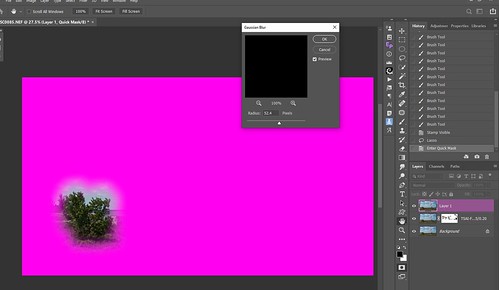
The image below shows how the blending looks with a larger area selected and a larger Radius size is used. Definitely have a much smoother transition. This time the Radius was set to 182.0 pixels, but Randy uses much larger sizes on his images. It definitely depends on the size of what you are blending and how large an image you have.

Once the filter is applied, just click Q or the Quick Selection icon to exit and a selection will be available to apply to any type of Adjustment Layer, but with this workflow it usually involves the Curves Adjustment Layer. Of course a Levels Adjustment Layer could be used or some of the color Adjustment Layers could be used like Hue/Saturation. For the above two different Curves Adjustment Layers were used, one for each area selected. The last step was to add a Levels Adjustment Layer vignette (see my How to Create a Subtle Vignette blog).
*****
Thought I would show you a couple images that also used this same technique. In the leaves image, by darkening the background, it actually created a very 3D effect. This time the large leaves in the foreground were selected with the Lasso Tool since I wanted to darken the background. Inside the Quick Selection Mode a Gaussian Blur Radius of 424.3 pixels was used to create a more subtle transition. Then back in Photoshop a Curves Adjustment Layer was used to darken the area somewhat. The vignette was from Topaz Lens Effects’ preset Soft Olive Green and keeping the opacity low at 32.83.

*****
My last example uses the Watercolor1 Mockup by Digital Florist. Just popped my Day Lily image with a butterfly and put on the drawing pad. The original mockup was very light, so by selecting the sketch pad, the background was darkened using this technique (Gaussian Blur Radius set to 355.2). This now draws the focus to the image and not all the painting supplies. (The crazy background was created using Corel Particle Shop filter’s Expression and Spring Silk Ribbon brushes.)
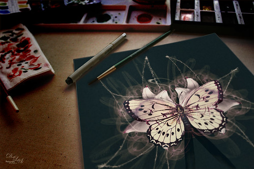
ALTERNATE WORKFLOW
There is another way to do this same technique without using the Quick Mask Mode and I will list the steps below. I like both ways of doing this, so give each one a try.
- Add a black layer mask to your image.
- With a larger soft brush, switch to white and paint over the area you want changed. For the top image it would be the left bush or foreground area. Note, you have do this twice for the different areas if you want to use different setting in the Adjustment Layer for each.
- Add a Curves Adjustment Layer above the image and clip it to the layer (press the first icon at the bottom of the Curves Adjustment Layer Panel or CTRL+click between the Image and Adjustment Layer layers in Layers Panel. Otherwise the selection changes will apply to the whole image. Do your adjustments. Levels Adjustment Layer can be used here – sometimes it gives a little better result.
- Click on the Layer Mask of the image layer to bring up the Properties Panel – set the Feather to get the soft transition you want. To see it as if you were in the Quick Mask Mode, click the (\) key to see the overlay or ALT+click to see just the black and white mask. Also fine tune your Layer Mask with a brush at this point in case areas were missed.

Not sure which way is easier, but it gives similar results. I do believe the Gaussian Blur is a little easier to see the effect, but with the overlay in the Alternate Method, it is still pretty easy to see.
This technique can be used for just a subtle change which is what I like, especially in landscape images. Have a good one until next time!…..Digital Lady Syd
Digital Lady Syd’s Related Blogs:
How to Use a Selection to Draw Focus in an Image
Using Curves Adjustment Layers to Get Rid of Shadows and Highlights
A FEW COMPOSITING TIPS AND TRICKS! – RECYCLED
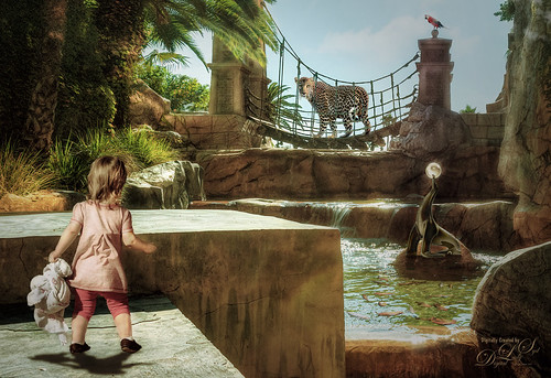
Running behind with blogging this week – this image took a lot longer to complete than I planned. Compositing is a lot of fun to do, but it takes a while to put it all together and get a realistic feel to the image. I love doing this type of image but between coming up with a good idea and finding the components, it takes some time. I had been thinking about what kind of story I could present with this background image which I really liked. I decided I liked the idea of the little girl and the Leopard catching each others eye and sort of a hidden mysterious spot. The image has 5 added components all with different issues that needed to be addressed to get a good final look. The background above was taken at the Mandalay Bay Hotel in Las Vegas (while I was attending a PS World). The Seal Statue and Parrot are from PixelSquid, a great resource for objects but you do have a fee to use them. The little girl and fish were from my own images. The Leopard was from Pixabay. The final image has many many layers – had to use lots of groups to keep it all straight. An older blog from a few years ago is being re-blogged since the info discussed is still very relevant. These really are a lot of fun to do so without further ado, here is the original.
*****
 This week I decided to do some compositing just because its fun to do. There are a lot of reasons to do this besides being fun, like it teaches you to really be aware of your light source and shadows to get a realistic looking the image. Also it gives you a chance to use some of the Photoshop tools and techniques that are not used that often. And finally, by choosing each object a good story can be created in the image.
I have always loved this image of a yellow corvette taken quite a while ago and just had not found a good place to use it. So this is where the compositing process began for me on this image. Since I started with the object first, a suitable background needed to be found to start my story. The image used was of some beautiful trees in Madison, Mississippi. If you are into compositing, it is important to take a few photos to use as background images – places where anything could be added to make an interesting image. The yellow in the car and the greenish yellow image seemed to be a good fit. The colors of the objects is important in composite images to help blend the objects together in a natural way.
After adding all the objects, the light and time of day of the background image needed to be considered to once again, blend in the objects naturally. Everything added to the image must fit with the scene. The blanket, cooler and picnic table were all downloaded from PixelSquid, but I could have used my own images of these objects. The following is a basic workflow on how this image was put together and a couple tricks I have learned along the way.
Preparing Objects for Placement
So this is where the PS tools and techniques come in handy. The car was sitting in a field with a bunch of other cars around it and a fence behind it. Just a little color adjustment was done in Lightroom before opening up the car in PS. It was removed from its background using PS CC2017 and the Select and Mask panel – the Quick Selection Tool was first used to select the car, and then the edges were refined using the Refine brush. Also the windshield was removed in this panel. Any selection tool or filter that removes backgrounds could have been used, I am just finding the new Select and Mask panel pretty nice to use. I also noted that the light was not shining on the car in the t direction – another problem to address later.
Background Image Prep
Now the Tree image was opened up in PS after just some minor adjustments in LR. Several items were removed in the image using the Spot Healing Brush. Next the corvette was placed in the image and positioned – used Free Transform (CTRL+T) to fit it in correctly. I decided the image needed to be expanded on the lower level to make the image look balanced so the car layer was deleted. In CC2017 the Crop Tool was used and Content-Aware was checked to fill in the Options Bar. Note that the Content-Aware option only works with the Crop Tool on a single layer. Therefore, either the image must be merged down at this point or crop the image first before adding your objects. I found I still had to do a little clean up after the additional pixels were added.
Adding Objects into Image
The car was again placed in the image – you can either use the Move Tool and drag to the composite image tab, go down to the image, and release; or use the old fashion way which is to select (CTRL+A) and copy (CTRL+C) in the object image, then paste (CTRL+V) in composite image. I use both. The car was Free Transformed (CTRL+T), and a layer mask was added to the car to remove the incorrect shadows in front of the car. Next the picnic table, cooler and blanket were added from PixelSquid (see my How To Use the PixelSquid Add-on in Photoshop blog – it is no longer in beta testing but is a pay to use program.) The shadows for these objects could be manipulated with the downloaded objects.
To get the objects to look like they really belonged together, some of the foreground areas had to slightly overlap parts of the blanket, tires, and table legs. So layer masks were used to add this effect in on each object. A very small brush was used to get this effect – try using different brushes in the mask to get a more natural result. The area seen through the windshield of the car had to be slightly blurred , so the Blur Tool, which I almost never use, was selected and just painted in a bit of softening to the windshield. It worked great!
Adding Some Special Effects
A stamped layer (CTRL+ALT+SHIFT+E) was placed on top and Topaz (for website see sidebar at my Tidbits Blog) Impression 2 was opened. The Degas I preset was applied at around 40% – that was all that was changed in this preset. The layer was duplicated and Topaz Glow’s Oh Hey preset was applied at 30% – this filter does a great job of applying an overall lightening to an image. On another duplicated layer, Topaz Texture Effects 2 was opened and a downloaded Community preset called Fall Foliage Fall Trees was applied with a little manipulation to the Vignette and Basic Adjustment sections. Each image will use slightly different settings in these sections. The Light Leak had to be flipped horizontally to keep the lighting consistent in the image.
Final Tweaks
To really soften the edges of the objects, individual New Layers were added to paint in some correction color. For example, on the blanket, a little dark paint was added to give it more of a rumpled feeling on the grass – just used a soft round brush and set the layer opacity to 13%. A little lighter color was added to the right side of the cooler using a dab of light yellow and set to 60% layer opacity. To add a little lighter coloration to the front right area of the car, a little light color was added to just highlight it, and the layer opacity was set to 20%. Even the background was tweaked slightly to blend the image and give that vintage feel. This trick was learned from a wonderful class by Karen Alsop on Creative Live called Using Composite Photography to Create a Fantasy World. Check out Karen’s website for some great compositing images! Some darker shadow effect was needed under the car, so this same technique was used there also – the shadow will be darker right under the car and blended out softly the further away it gets. The layer opacity was then adjusted down a little. This can also be used for the atmospherics in the image – where the further away you look towards the horizon line, especially in landscapes, the more muted the colors become.
The overall image appeared to be too yellow to me so a blue (R156/G161/B220) Color Fill Adjustment Layer was set to Color blend mode and 13% layer opacity to offset this. Blue is opposite Yellow on the Color Wheel so this will serve to curb the yellow color somewhat.
Finally, a little more definition was needed in a couple areas of the image. The area around the headlights was burned. The trees were slightly darkened behind the brighter areas of the light trees to separate the branches a little. To do this, a New Layer was opened, set to Overlay blend mode, and with a soft black brush set to 12% layer opacity, just painted over these areas. (See my The Best Dodging and Burning Technique! blog.) The layer was set to 57% layer opacity.
Now the image is complete! I was pleased that it tells a story, has the vintage feel I was after, and the components all fit together well (using tools and techniques I do not always use) – to me that is what a composite should do when done correctly! It does take a little effort to create a good composite, but it is well worth time if it turns out the way you want it. I know there are lots of ways to create composites, this is a pretty complicated one, but they are fun to do! Hope everyone in the US has a great Thanksgiving Holiday!…..Digital Lady Syd
WHEN TO USE THE PATCH HEALING TOOL

The above image is my guinea pig (okay, this is not a guinea pig, it is a female white-faced saki monkey from South America) which had a lot of problems in the image. There was a plastic enclosure in the Mammals Exhibit at the Smithsonian National Zoo in Washington, DC, and the fact that she was moving around a lot – many people were also watching her so it was a bit of a crazy exhibit when I took this image.
This week I decided to write about something that always confuses me – when do I want to use the Patch Tool (or Healing Brush/Spot Healing Brush for that matter) versus the favorite Clone Stamp Tool? I know most people think the Healing Brush Tool is mainly used for retouching, but it can be used on any type of photo since it actually acts very similar to the Clone Stamp Tool. The Patch Tool is the Healing Brush on steroids, and the Spot Healing Brush uses Content/Aware technology, but is still similar to the Patch Tool set to Content-Aware. Therefore I decided to use the Patch Tool as the main example since all three tools are very similar.
There are two ways to use the Patch Tool by either setting in the Options Bar the Patch drop down to Normal or Content-Aware. This makes a huge difference in how this tool works.
Normal Patch:
When set to Normal Patch, a stamped or composite layer must be placed on top (CTRL+ALT+SHIFT+E or also called “the Claw”) since the changes cannot be made on a New Layer above. How do you know this? In the Options Bar there is no Sample All Layers drop-down or check box. These settings are recommended by several PS pros for the Options Bar: Patch Normal, Source highlighted, and Diffusion set to 5.
- The default settings are set up with the Source highlighted which means the Lasso Tool selection is placed over the bad area, then drag it to the good texture area and PS will try to match this selection with the color and lighting just outside the bad area you selected. So basically, just select a bad area by dragging a selection around it and drag to an area you want it to look like. Voila! This Tool can be used to clean up very large areas – much faster than the Healing Tool.
- Change to Destination if you want to select the good area and move it over the bad spot.
- Transparent Box: Use if you want to copy the texture but not its content. This can be cool if you want to copy an area that is a little more sharp (like you can do with the Clone Stamp) – use the Edit -> Fade to blend in the texture properly. Adobe says it works best for solid or gradient backgrounds with clearly distinct textures such as a bird in a blue sky. I tend to turn this on and off when working with some detail areas.
- Diffusion drop-down menu: Adobe says “The Healing Brush, Spot Healing Brush and Patch Tool in Photoshop have a Diffusion slider which controls how quickly the pasted region adapts to the surrounding image.” Set Diffusion to 1 and it smears less – use low slider amounts on images with grain or fine details; and to 7 smears the most – use higher values on smooth images.
- Repair an area using a Pattern: Select the Patch Tool and drag in the image to select the area to be repaired – select a pattern from the Pattern drop-down list and click Use Pattern. This is useful if some texture needs to be added to some skin (use a gray grainy texture) or in over-exposed areas that would benefit with some type of texture added.
Content-Aware Patch:
Since there is a Sample All Layers on the Options Bar, a New Layer can be used to do the changes. This being said, some of the PS pros say do the changes on a duplicate layer as better results are achieved. It synthesizes nearby content for seamless blending with the surrounding content.
- Structure: Set to 1, the patch adheres very loosely to the existing image patterns while a 7 adheres very strongly to the existing image patterns.
- Color is for applying the color-blending to the patch. A Color value of 10 applies the most color blending.
- Select an area to replace on the image.
A Couple Tricks to Do:
- If you do a patch and it is too sharp or bright, before doing anything else, go to Edit -> Fade and lower the opacity to match. it did this all over the fur on this image to match the effect correctly. I actually have set up my F4 key in my Keyboard Shortcuts to use for the Fade key. Very handy to use with any brush and tool effects.
- If the patch did not turn out good, go back in the History Panel to before the Patch Selection was made.
- Can make a selection with any selecting tools prior to choosing the Patch Tool – the selection will remain to use for patching the selected area.
- To use the Normal Patch non-destructively, I learned this nifty trick from a short video by Jwalt Photography called Patch Tool Edit on New Layer – basically what he is doing is duplicating the layer twice, choosing the Patch Tool to select the problem area, dragging to area with better texture, right clicking outside the selection and choosing inverse, and finally pressing delete. Now the corrected area is on its own New Layer and is non-destructive.

Here is the original image for this monkey, after Lightroom! Not too impressive. I loved the eye contact with the monkey so I did not want to get rid of the image. The plastic barrier in front of her had all kinds of marks and distortions. The Patch Tool was used in the Normal mode to add more texture to the right side of the monkey where the plastic was problem and to remove the white out-of-focus branch that ran through her. The image was initially sharpened by using the Luminar Flex filters like Structure, Detail Enhancer and Microstructure. Then the Patch Tool was used on a stamped layer on top. This took several iterations – it is not always an easy process but by not using too large a section, the areas that were not clear could be made more sharp. Sometimes the Transparent box was checked and sometimes not, depending on the area. Totally a trial and error, but it did look better than just using a Clone Stamp since the Patch Tool matches the tones much better. A Color Lookup Adjustment Layer helped darken the background and a vignette was used to emphasize the face. And yes, a little painting was done to fill in places. The large white blob on the upper left was removed using the Content Aware Patch set to Structure 3 and Color 0 and it was pretty fast to match to the tree trunk already there. Definitely experiment with both types of patching – one may look better than the other and remember the settings in the Options Bar will make a difference on the selection.
How Do You Know which One is Best to Use?
Bottom line: Anytime there are edges present in the area to be changed, use the Clone Stamp Tool. You can always clone out the areas where the edges are, then switch to the Patch Tool (or Healing Brush or Spot-Healing Brush) to finish up the rest of the clean up. Just be sure the Clone Stamp Tool is used to remove or move the sharp edges. This is way too simple of an answer since I just cannot come up with an image that does not require a little final tweak with the Spot Healing Brush or Clone Stamp Tool even though the Clone Stamp or Patch Tool did the heavy lifting. I guess that is why PS has given us so many choices! Just do not forget that the Patch Tool can give some really good results – it can quit a life-saver!
Hope you try out the Patch tool – it is really easy to overlook, but can be so useful. Try using it when cleaning up a difficult image. Have a great week!…..Digital Lady Syd
Digital Lady Syd Related Blogs:
Creating a Healing Brush Background Texture
WHERE TO GET SOME COOL MOCKUP FILES?
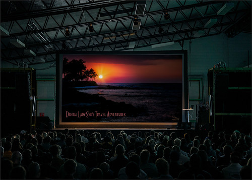
This week’s blog is about how to display your art work in a mockup and where they can be downloaded. There are many places where mockups are offered for free (all but 1 are free in my blog). If you are interested in marketing your images, it is a great way to see if they would look good as different types of products. This has turned out to be a lot of fun since I started going back through some of my older work to place in these these files. This older sunset image was taken on the Big Island at the Hilton Waikoloa Village. The folder for this mockup contained the .psd file with all the layers needed and was called Work Presentation Mockups For Free. Not sure this is a a very useful mockup, but it is pretty cool to see how your image would look to a larger gathering. I might actually use it as a start for a slideshow presentation of my images to a club or community group .
How to Add Your Photo into a Mockup File
- All mockups contain Smart Object layers which need to be opened by double-clicking on the little icon on the lower right corner of the layer.
- Once clicked, a new type of file opens up with a .psb ending.
- Highlight the layer where the image should be placed. Often there is a layer named “Place Artwork Here” or the company’s logo – highlight this layer to add image above it.
- Bring in your image – can go to your Explorer and just drag the file into the PS .psb file. (I like to drag my images in from Adobe Bridge) Usually the image will need to be adjusted to fit the opening correctly. Free Transform handles will be shown that used to fill out the opening. Can right click in the image to get other transform options to adjust the image even more.
- Click enter or the check box in the Options Bar to set the transform settings. The placeholder layer can now be deleted.
- The Smart Object file (or .psb file) must now be saved so it shows up in the original .psd file – CTRL+S to save and close out of the file. If you try to “x” out of file, PS will ask if you want to save – select Yes and to close .psb file. These Smart Object files can always be re-opened to switch out your image or add adjustment layers.
Pretty simple. Many of these mockup files come with lots of extra groups or adjustment layers in the original .psd file that can to be used to add interesting effects to the overall mockup. Others have adjustment layers in the actual Smart Object that can be used to get an interesting effect to just your image. The above mockup contained a guy in the image that I did not like so he was removed by using the Clone Stamp Tool in the original .psd file on a New Layer.
*****

This free mockup is totally different from the one above. It is a good way to see how your images (come of my digital painting creations) would look on the wall. This folder contains three different configurations where images can be inserted and each file has 3 individual Smart Objects to add the photos to the different frame positions. The wall and pillow colors can also be changed easily with a Hue/Saturation Adjustment Layer in the .psd file. The file is called Poster Set Mockups by SparkleStock Lite
*****

Thought this book mockup looked good – if I had written a book it would make a nice notification. The download folder called simplebookcoverfreemockup contains a .psd file where the photo (a Laughing Kookaburra) is added in the Smart Object layer. This is also where the text layers and the line art bird from Winterland Collection by Bilberry Create Gray png 11 was added – just saved the .psb file (CTRL+S) to update the Smart Object in the original file. The background color can be changed in the main .psd file. This mockup is also available for free.
*****

I really like this street scene image – it took me a while to find an image I thought looked good in the signage area. The graphophone taken at the Lightner Museum in St. Augustine, Florida, (one of my favorite St. Augustine places to visit) has a sort of vintage feel which is what the mockup seems to have. That is because the mockup contains a Film group which contains a dust group and a leaks group with several different choices. There is also a regular Leak group and a Glass group. You can even change out the background image with your own! This is a super-nice mockup with so much flexibility – could play all day with these settings. The file is free and named Outdoor Light Ad Mockup.
*****
This is a pretty basic frame mockup but I liked the nice green leaf in the mason jar. The image was one I painted in Corel Painter (thank you Skip Allen) some time ago and it looks nice with this kind of setting. This is a very simple mockup – just a Smart Object and background layer with the design items on it. It is called Frame Mockup and is by Gabriela Dantur and unfortunately is not free but is inexpensive to buy at the link.
*****
The following two mockups are pretty basic but really show off possible products nicely. The first one is a very simple mug on a soft blanket and has a very different appeal than just showing a plain ole coffee mug. I had created this snoozing Sumatran Tiger image to actually put on a mug and I think the mockup is perfect for this type of product.
This mug mockup is free and called Sublimations Mug Mockup Coffee Cup by Leo Flo Mockups. It is another really one with just a background layer of the blanket and mug, and the image is loaded into a Smart Object single layer. Of course you can add some adjustment layers here to make your image look the way you want.
*****
The image below of the duck from last week showed up very nicely as a pillow. Another really simple mockup called Free Brand Square Pillow Mockup from freemockupzone which contains several more layers with a Smart Object single layer. I thought it did a good job of making my image look just like a pillow would really look. The floor was darkened to match the pillow tones in the Smart Object (.psb) in this image.
Hope you got some ideas for showing off or selling some of your objects. I have not looked at this too closely, but I think many of my items would be suitable as mugs or pillows or framed. Also it was fun to see how my photos would look on a large screen presentation. That’s it for this week……Digital Lady Syd
Digital Lady Syd Related Blogs:
Mockupped Sailboats
Red Hibiscus Holiday Cheer!
TAKING A CREATIVE BREAK

Sometimes I like to just take a break from all the techniques I am learning and do something because I feel like doing it. So this week’s blog is not really emphasizing anything, but doing what this blog is all about – “Just Having Fun!” So without further ado, here are some images I have created in the last few weeks just because it was FUN!
Not to bore everyone too much, but I will give you a few insights as to how I got a particular look for these images. This fabulous Ring Tailed Lemur above is one of my favorite recent compositions. The basis for creating this effect was a video by Jesus Ramirez called Pencil Sketch Effect from a Photo in Photoshop. His technique does not work on every image, but sometimes it gives an interesting result and it worked on this image. It gave a great beginning overall sketch of my subject that was different from others I have tried. I actually created an action to do these steps. The ugly background area had to be removed next. On more layers Photoshop’s Fan Flat Blender mixer brush (located in PS’s Converted Legacy Tool Presets -> Default Tool Presets) was selected to paint in the hair and several variations were made in the Brush Settings Panel (like changing the Brush Angle and Size, adding Shape Dynamics, and adjusting Texture settings). It was fun to do this and I like the results the new brushes created – am now using them a lot including on the bottom image.
*****

This image’s final effect turned out to be a surprise. It all started when I read a tutorial by Scott Valentine in the Kelby One Photoshop User Magazine from March 2018 called Hard Mix Tricks. There was a section about creating a Pop Art look. A Curves Adjustment Layer (which is just a placeholder to set the blend mode – any adjustment layer could have been used) was set to Hard Mix blend mode on top of the original image (see Pixabay’s Chiemsee-517997_1920) – the image now was broken down into its basic colors. Between the Curves Adjustment Layer and the original image a Black and White Adjustment Layer was set to Luminosity blend mode. The color sliders were adjusted so more colors were added back in. Now I did my own thing by adding several New Layers on top. Used David Belliveau’s super Mixer Blender Brush to smooth the mountains and water in the image. By pulling this brush up, the grass in front was created. For the details several smaller regular and mixer brushes were used. The bird is from Obsidian Dawn. To get the color palette, a Color Lookup Adjustment Layer was added using the Futuristic Bleak preset. Again this was just some fun that came about by playing with brushes. I think this image would look good in several different color palettes. And other brushes will definitely give some different results – I think I will be trying out this technique on other images.
*****

This sweet duck was overall a pretty nice image and had a teal blue water background. The sketch technique was used here just like on the Lemur image. The duck was selected and placed on a layer above, the feathers were painted back in using the Mixer brushes created in the top image. The texture I made in Corel Painter and was placed behind the duck. Three different fonts were used in this image: Sunda used Blossom, Teal used Breakable, and Anas gibberifrons used Dancing Script. I like all three of these free fonts. Topaz’s (see website at my Tidbits Blog sidebar) ReStyle filter was used with a preset from one of my images to unify the color.
Painting in Photoshop is not so popular, but it is very satisfying if you have a bit of a creative vein in your vision. I hope you enjoyed my images – will probably be returning back to tips and tricks but I thought I would share these. Have a good week and Happy Mother’s Day to all you Moms out there!…..Digital Lady Syd
