
HOW TO CREATE A WATERCOLOR / INK IMAGE IN PHOTOSHOP
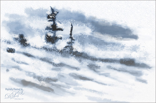 I was not sure what I wanted to blog about this week until I ran into some wonderful Photoshop brushes that really got my attention. This image was created using some new Wet Media Photoshop Brushes by Aaron Blaise, a former Disney animator. I was pleasantly surprised how nice they are. He also teaches you how to make a very similar image as above in his video where he describes how each brush works and how to use them together. By the way, they are very inexpensive and contain 27 different brushes including several direction sensitive splatter brushes. This was so much fun to try. I have not done this type of creative art very often, and I believe I am now hooked. I also discovered Aaron does some very nice artwork himself.
A Pattern Fill Adjustment Layer was placed above the bottom layer and set to a Watercolor type paper. The technique uses the same brushes Aaron used in his video example. A little note here is that when he is switching to white from black paint brush color, he sometimes is using a slightly grayer version of white and a true white as the foreground/background colors – this kept the spatters lighter and gave the brushes a different effect. A Solid Color Adjustment Layer was added above the painting layers and set to a bluish color using Color blend mode at 39% layer opacity. A white to transparent Gradient Fill Adjustment Layer was next to keep the lower part of image whiter. A generic Mixer Blender brush was used on a separate layer on top to clean up some still showing rough spots. The last step placed a Levels Adjustment Layer on top to add a little more contrast to the image. No filters were used!
*******
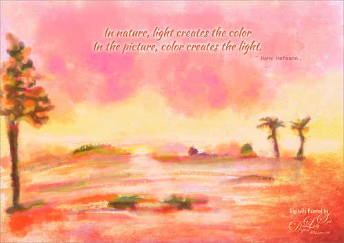 Since I am still learning about these brushes, this was a lot of fun to try them out. By varying the sizes, colors and textures, a very different look can be achieved with Wet Media brushes. This time each different brush used was placed on its own layer so it could be adjusted easier. Topaz (see sidebar at my Tidbits Blog for website link) ReStyle was used to make the color palette a little more to my liking. It started out in yellows and greens. Next two of Jai Johnson’s free textures were used: Cotton Candy Wall set to Darker Color blend mode at 77% layer opacity and Antique Brown Light Canvas set to Hard Light at 74% layer opacity. The Blend If sliders were used to really target the look I wanted. The text is Kaushan Script Regular.
If you like this type of creative artistry, these brushes are a very good value. Since I understand the Photoshop brushes, for me this is a refreshing change to have a set with this variety. Most Photoshop brushes do not have this range and are not created by actual artists to give the best results. Check out his video linked above if you would like to see them action. I will be working on my technique using these brushes – this is definitely a good start towards learning this technique. Have a good week everyone and try some painting!…..Digital Lady Syd
Digital Lady Syd Related Blogs:
How to Easily Create a Photoshop Brush for Painting
Sunny Desert Day
Just Painting!

Syd…Thanks for posting this. I had a picture I thought would look good in a water color. Now I have some tips on how to process it!
03/08/2015 at 7:08 am
Pingback: JUST SOME PHOTOSHOP FUN THIS WEEK! | Digital Lady Syd's Fun Photoshop Blog
Pingback: » Sailing! Digital Lady Syd's Tidbits Blog