
ADDING A CREATIVE PAINT EFFECT
 This week I am presenting a little tutorial on how to add an interesting an painterly or artistic effect to your images. This technique goes hand-in-hand with the use of other creative filters, but is a great way to add a personal touch to those canned filters results. The image above is from Stirling Castle (completion date cc 1542) where the face of the palace is lined with statues. This statue is thought to be King James V of Scotland in yeoman attire as he wandered incognito among his subjects and calling himself the Gudeman of Ballengeich (tenant farmer of Ballengeich, a place near Stirling).
This technique comes from a really nice tutorial by Sebastian Michaels who is a total genius when it comes to using Photoshop. Several years ago he created a video called Custom Brush Technique at Light Stalking where he discussed several different ways of creating brushes. He made a grunge brush that he used to paint in an effect similar to the above. I took a little liberty here and downloaded similar brushes to create some of my effects.
What is shown here is how to add a white layer with a layer mask – by painting with black in the layer mask with unique and textured brushes, a very artistic result can be achieved. The steps are as follows:
- Adjust photo and on a duplicate layer (CTRL+J), add in any special effects such as filters.
- To add even more variety to the image, copy the duplicated layer from Step 1 and add adjustments layers, filters such as Topaz (for website link, see my Tidbits Blog sidebar) Impression or ReStyle, or go to Image ->Adjustment->Hue/Saturation (not an Adjustment Layer) set to colorize to change the overall color of the image. My image was turned into a bluish colorized look on the original filter layer, but could have been done on another duplicated copy.
- Add a New Layer on top and fill it with white (can go into Edit->Fill and Content: White (SHIFT+F5), or just change the color swatches to default Black/White (D) and press CTRL+BACKSPACE to fill with white (FYI: ALT+BACKSPACE fills with black).
- Add a Layer Mask to this layer (2nd icon from left at bottom of Layers Panel).
- Using several different brushes in the layer mask, build up the effect. Set the brushes to 20-30% only and change the rotation of the brush with each tap down. It is easiest to do if the Brush Panel is opened and set to the Brush Tip Shape section. Flip the little circle around to set the stroke so edges appear different when painted in the mask. Also, can right click in the Options Bar the Brush Preset Picker (2nd icon) to change the rotation and size quickly. Start by adding a bit of vignette feel on the edges. If you want the brush to rotate randomly with each stroke, can ago into the Shape Dynamics section and set the Angle Jitter to some amount – I use 19% on many of my brushes. Look at the Preview field to see what the effect will be when changes are made in the Brush Panel.
- If the layer was duplicated and more than one filter or effect was created (as in Step 2), also add a layer mask to all these layers and paint out parts so the original color of the image shows through. This gives a nice split tone look.
To get an interesting effect, try grunge brushes, splatter brushes for the edges, and soft round or smaller sized textured brushes to paint back any important details. Different sizes, rotations and opacities of brushes really vary the effect. And remember the Properties Panel can be used to adjust the layer mask opacity if the final result is too strong. The actual layer blend mode and opacity can be adjusted also. Lots of flexibility can be found here.
The above followed Sebastion’s steps from his video pretty closely including using Photoshop’s Filter Gallery to create a watercolor effect (Watercolor filter – Brush Detail 9, Shadow Intensity 1, Texure 2; and Crosshatch filter – Stroke Length 9, Sharpness 6, Strength 1). This was added to the layer first before the Hue/Saturation Colorize effect was applied. Then the White Layer was placed on top. Three different types of brushes were used on both layer masks: a grunge brush (Shadowhouse Creations’ Grunge Brush Set 2-G4 brush), a grunge brush made using a texture somewhat like Sebastian’s, and Grut FX IL Ratatatsplat brush (from his wonderful Inky Leaks Splatter set) was used for the edge effect. Finished up with Nik Viveza 2 to just pull the eye into the statue area and lightly lighten the face.
*****
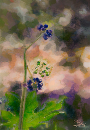 This blueberry image used the same workflow. It does not seem as if adding a white layer on top would make much of a difference here, but it actually did. It lightened the image overall before bringing in the color from the layers below and can add some beautiful texture with the right brushes. For this image, Topaz Impression was opened and one of my presets was applied called SJ WC like effect on bldgs (see end of blog for settings). On a duplicate layer, an Image->Adjustments>Hue/Sat-Colorize was set to Hue 46/Sat 27/Lightness +2 – a gold sepia tone. The color did not look right so a Hue/Sat Adjustment Layer was clipped to the layer (ALT+click between the layers) and changed to a more pink color. This layer was set to 33% layer opacity. Brushes used in white top layer mask and the Impression and Colorized layer masks were: SJ 1 Color-Paint Fur-AD Sketch Splatter (see end of blog on how to create this brush-one of my favorites as it adds just a touch of texture to the stroke at a small size and nice splatter brush at larger size) at 25% br opa and 502 px and rotated around edges; Shadowhouse Grunge GB-4 again at 1200 px and rotated around center; and ABlaise-Canvas Texture Br 46 32-350px (this brush added some nice texture into the image). The brush sizes and rotation were varied in each mask. Topaz ReStyle’s Zambezi Zest preset was used to get the French vineyard colors in the image. (Settings: ReStyle Opacity 62% and Soft Light blend mode; Color Style Primary 0.58; and Lum Primary 0.47; Texture Strength 1.00; Basic Temp 0.22, Tint 0.34, and Sat 0.08; Tone Black Level -0.14, Midtones 0.03, and White Level -0.39; and Detail Structure -1.00 and Sharpness 0.63; and Masking – with Strength set to 0.36, painted out the green leaf at bottom and the berries to give more detail in just those areas.) Finished up with the standard Red Channel Luminosity Curves Adjustment Layer, Black and White Adjustment Layer set to Luminosity blend mode, and Nik Viveza 2 to bring out the focal points.
*****
 Here is another example of how this technique could be used. This is an image of Urquhart Castle in Scotland on a very rainy day. Topaz ReStyle was applied using the exact same preset and settings from the blueberry image. Then a white layer was added on top with a mask. The Castle image was painted back in using the same brushes as above or the newly created Grunge Brush, the SJ 1 Color-Paint fur-AD Sketch Splatter brush (settings below) and once again Aaron Blaise’s Texture brush – his textured brushes really help with this effect when used in a layer mask. The layer was set to 35% layer opacity. On the ReStyle layer, a layer mask was added and parts of the trees and castle were painted out so the original image color showed through. At the top a New Layer was added and filled with a light gold-yellow color. A layer mask was added and once again the image was painted back using the same Grut-FX IL Ratatatsplat for the edges and my SJ 1 Color-Paint Fur brush at a small size for the detail areas. This layer was set to Linear Dodge (Add). To get the final effect, the Layer Style was opened by double clicking on the layer. In the Blend If sliders, the Underlying Layer black tab was split (by holding ALT and pulling the tab apart) and setting it to 10/70. This does not always work, but it definitely worth trying out to see what happens. In this case it brought out the structure more clearly. Nik Viveza 2 was used to pinpoint the focal point which is where the red umbrella is located. Anyway, just note that you are not limited to a white color top layer or using just one color layer. With a little experimenting, a very nice image can be produced. I believe I will use the above image on note cards.
Hope this gives you another little trick to try in your artistic endeavors and maybe it will give your images that extra level of interest it needs. And try out my brush – I am finding it is very useful in lot of different types of images. Have a good week!…..Digital Lady Syd
Topaz Impression’s SJ WC like effect on bldgs Settings: Thought I would share the preset settings as it really does give some interesting results sometimes with a little masking when looking for creative effects. The preset was made in Topaz Impression 1: Started with Watercolor II preset and these were the final settings: Stroke Type 04, Brush Size 0.91, Paint Volume 0.42, Paint Opacity 0.87, Stroke Width 0.33, Stroke Length 0.89, Spill 0.23, Smudge 26, Coverage 1.00, Color Overall Hue 0.15, Saturation -0.20 and Lightness 0.06; Red Sat 0.47 and 0.14; Orange Sat 0.60 and Lightness -0.42; Yellow Sat -0.33 and Lightness 0.13; Green Sat 0.20 and Lightness -0.32; and Blue Sat 0.36; Lighting Brightness -0.04, Contrast 0.39, Vignette 0, and Light Direction X0.33 and Y0.06; and Texture Strength 0.78, Size 0.30, Canvas IV, Background Type solid white, and Background color used #d38967 – all other settings not listed at 0. Adjust your color swatches to get other color tones. These changes were made to the preset in Topaz Impression 2 for the blueberry image: Number of Strokes High; Color Aqua Sat 0.25 and Lightness 0.51; Lighting Highlight 0.40, Shadow -0.39; and Texture Strength 0.
SJ 1 Color-Paint Fur-AD Sketch Splatter brush has become a favorite brush for all kinds of things. With these brush settings, it is great to paint animal skin but it works great wherever a little soft edge with subtle texture is needed. It is my go-to clean up brush when color needs to be added to fill in some rough spots. Here are the settings: First download these free brushes from Alex Dukal – Adobe Sketch Brushes and select AD Sketch Splatter – 143 px brush. This brush had the brush tip I liked but most of the brush settings were changed. Here are the Brush Panel settings as I use the brush: Brush Tip Shape – Size 9 px, Angle 13 degrees, Roundness 100% and spacing 120%; Shape Dynamics – only the Control field was set to Pen Pressure (for tablet use); Scattering – check Both Axes, Scatter 149%, Count 9, and Count Jitter 54%; Transfer – only the Opacity Control field was set to Pen Pressure, and Smoothing checked. Be sure to create a Brush Preset and a Brush Tool Preset (1st icon on the Options Bar – open the drop down and click the Create New Preset icon – this saves the Options Bar settings). Adjust and paint with different sizes. Can add Texture and Color Dynamics for different look. Also Dual Brush can be interesting. I use this brush sometimes as small as 4 px to clean parts of an image by sampling adjacent colors. Try out the original brush provided as it is a really nice splatter brush.

I love the first image. I’m inside the Word Press app on my iPad and can’t see any other images. Don’t you just love Word Press?
04/08/2017 at 10:51 am
Thanks for the comment, Kerry – sorry you cannot see the other two images.
04/08/2017 at 9:37 pm
Pingback: » St. Giles Cathedral Entranceway Digital Lady Syd's Tidbits Blog
Pingback: A LITTLE TOPAZ TEXTURE EFFECTS TIP | Digital Lady Syd's Fun Photoshop Blog