
HOW TO CREATE A QUICK LAYER STYLE BORDER OR FRAME
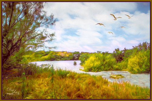 This week I am just going to share a few simple border techniques I have used for years. Many people do not realize how easy it is to create these to finish off an image. Both Topaz and On1 (for websites, see sidebars at my Tidbits Blog) have some great frame filters for doing this, but sometimes you just want to finish off an image with a quick border. Photoshop’s layer styles dialog box is a great place to do this. Both plain color, pattern, and some with a bevel effect can easily be created. The image above was taken at Spanish Cay in the Bahamas. For post processing info, see Image 1 at end of blog.
Basically the process involves opening up some of the Effects in the Layer Style dialog box and just changing the settings to get something you like. I find that the Inner Glow and Inner Shadow work best for my borders, but often the Stroke effect is used also. (Settings for above are: Inner Shadow: Blend Mode Normal, Tan color swatch, Opacity 100, Angle 135 and no Use Global Light, Distance 0, Choke 67, Size 54, regular Contour map, no Anti-aliased, Noise 0; and Inner Glow: Normal, Opacity 100%, Noise 0, Swatch purple, Technique Softer, Source Edge, Choke 99%, Size 57 pixels, Contour Map 5th one to right, Range 100 and Jitter 0). The following slider information is mostly from The Photoshop Wow! book referenced below.
Settings for Both Inner Glow and Inner Settings
Size determines the amount of blur applied to the border. The greater the size, the more the Glow or Shadow is blurred so at a higher setting, it is more diffuse – thinner and spreads out more.
Increasing Choke makes the effect more concentrated – it controls the transition made from dense to transparent as set by the Size (in the Outer effects, the spread slider does the same thing). Set the Choke high, and it gives very sharp edges and set it lower to get a soft blended look.
Contour settings remap the intermediate tones that are created by the blur used to make a Shadow or Glow. Using the default 45 degree straight contour causes the blur to thin out more as it goes from outside to inside. By changing the Contour in the drop-down, different types of effects can be obtained. These can be fun so definitely try them out!
Inner Glow Settings
The only sliders I look at here are the Opacity, Color Swatch, Choke, Size and sometimes the Contour, changing to a drop-down choice. Try changing to the 2nd Contour map and you will see a thin line created inside the edge of your image for a nice single line effect.
A Glow effect is usually light and radiates evenly in all directions. Therefore a Glow has a Gradient choice in the dialog box. I have not used this but it appears that a change in blend mode would be needed to look good.
I set the Technique to Softer – I do not see much difference in my thin borders when it is set to Precise but there is a difference if the frame is larger.
There are no Distance or Angle settings for Glow effects.
Set the Source to Edge (which I always use for a border) to radiate Glow from the edge getting thinner as it moves further away. Set the Source to Center for some artistic looks that radiate color from the center outward, getting thinner as it moves away.
FYI: For use with the Contour drop-down, Range determines which part of the gradient is used for the Glow and Jitter mixes up the pixels in the gradient for less defined transitions.
Inner Shadow Settings
A Shadow effect is dark and can be offset while here Shadows only have a color swatch.
There is an Angle field showing where the light source is. If the Distance is set to 0, this does not matter what the setting is. If there is a Distance amount, then adjust it and try clicking use Global Light to set with the other effects – but make sure you like how it looks.
When using Contour map, Noise helps prevent any banding, but may help when printing. I do not use this setting for frames.
Stroke Settings
A basic large Size set to Position Inside and Fill Type Color gives a nice solid color effect. I have done this several times. This can be combined with the other two effects above for some more different looks.
For a different look set a fairly large Size and set to Inside. Then go to Fill Type and choose Gradient. The same Gradient Styles are in the drop-down and also one that only appears in this dialog – the Shape Burst gradient (it can create a neon effect, an inline-outline effect for text or a multi-color glow outer edge effect). Who knew? I demonstrate this effect in my video.
Also the Stroke effect is really good for adding a pattern effect as a border. If you have a texture you would like to use as a border, first open the texture in Photoshop and go to Edit -> Define Pattern – just name it and it appears at the bottom of your pattern list. Set a fairly large Size (like 200 px) and set to Inside. Go into the Fill Type and change to Pattern. Open drop-down and at bottom is the new pattern from the texture. This can create some really looks. Combine this with the other two effects above for more looks.
Below is a quick video just showing how to do this – it seems to be easier to look at it than read about it. If you do not see the video link in your RSS feed, please open up blog and click through.
******
 In the image above, a very nice basic layer style was applied to get this frame. For post-processing info, see Image 2 below. This image used the same basic Effects in the Layer Styles Panel: First added an Inner Glow (set to Normal blend mode and black color, Technique Softer, Source Edge, Choke 100%, Size pixels); next the Inner Shadow (set to Normal, a peach orange color, Angle 135, Distance 0, Choke 44%, and Size 54 pixels); and finally a Stroke (Size 2 pixels, Position Inside, Blend Mode Normal, Opacity 100%, Fill Type Color, and Color Black). Pretty simple settings and easy to adjust – change the sizes and colors in the Inner Glow and Inner Shadow effects for a different look.
******

The African Antelope image uses one of the Star Burst gradients in the Stroke Effect. This border was created using a Stroke Layer Style and setting the Size t0 49 pixels, Position Inside, Blend Mode Normal, Opacity 100%, Fill Type Gradient using Gold Sepia (in Photoshop Toning Gradient set), Style Sharp Burst with Align with Layer checked, Angle 89, Scale 100%. If you like the result of the style, click New Style and name it. It will appear at the bottom of the canned Layer Styles when you click on the section labeled Styles at the top of the Effects list. I actually changed the color from a blue to a green for the inside color by going into the gradient and changing the 2nd from the right tab to a sampled green color. For info on how this image was post-processed, see Image 3 below.
I have some canned layer styles for download free at my DeviantArt site – then just change the colors of the Inner Shadow by clicking on the color swatch and sampling a color in the image. These work great as a starting point. Last week I added a layer style to my image using the same style as in the top image except instead of a tan color, it was a brownish gray color (see my How to Create Profiles in ACR from LR Presets and Some LUT Files blog).
The best reference for layer styles is from one of my favorite Photoshop Gurus, Jack Davis, and Linnea Dayton who created a little gem of a book called Adobe Photoshop 7 One-Click Wow! book. This book covered everything I needed to know about layer styles. Also Linnea Dayton and Cristen Gillespie co-wrote the older but still fabulous The Photoshop Wow! books which go into great detail on everything to do with layer styles.
I hope you get a chance to try this out – it can really give an image a very finished look. Until next time, have a good one…..Digital Lady Syd
Post Processing Information:
Image 1: This image was taken on a relatively deserted island in the Bahamas called Spanish Cay. There were many little hidden coves and beaches. The birds were added using a low res free stock photo and selecting just the birds with Color Range. Opened up Topaz Studio and followed steps in a Topaz video called Creating Imagery Driven by Imagination with Topaz Studio Creating Imagery Driven by Imagination with Topaz Studio. (Actual settings: Impression Adj: used the settings from Shannon Rose and saved a custom preset called SJ Acryllic Painting by Shannon Rose preset (see Lovely-pg. 18); Add mask to mask just the body of one bird and the heads of the others; AI ReMix Adj: used the Pasture (Row 3/Col 2) and set it to Opacity 0.37 and Color blend mode – applied layer mask to area in water with little island that was already muddy looking – also mask out odd color in the birds, esp the wings; HSL Color Tuning: Overall Hue 0.19 and Lightness 0.19, Orange Sat 0.37, Yellow Sat 0.37, Green Hue -0.32 and Sat -0.36, and Blue Sat -0.57, Details 0.26, Suppress Artifacts 0.08 and Color Sensitivity 0.28 – used same mask as in AI ReMix adj and Opacity 0.72; Color Theme: set to Normal blend mode, used same mask inverted to just affect the muddy water and turned it slightly bluish – changed the 3rd icon to #498727 (Lightness 0.53), 4th icon to #8ba9c7 (Lightness 0.83) and 5th icon to #e8e8e8 (Lightness 0.91); and added Second Color Theme Adj: Changed first icon to #422c16 at Lightness 0.26.) A Dodge and Burn 50% gray layer was added. Also a Color Dodge lighting layer was applied (see Digital Painting Blending Modes: 3 Easy Ways to Color Artwork by David Belliveau). Last step was a stamped layer (CTRL+ALT+SHIFT+E) and applied the above listed Layer Style settings.
Image 2: This image of a Scottish Church had a most beautiful view. On1 Photo Raw 2018’s Effects using Dynamic Contrast and Sharpen filters was used first on the image. A Color Lookup Table using the Candlelight preset was added and set to 76% layer opacity. The Warming Filter (85) was added and set to 51% Density and set to Multiply blend mode and 77% layer opacity. Then some clean up and spotlight effect on the buildings. There was a lot of window reflection in this image, so it took a lot of clean up. A Color Dodge layer was used to light up the sky a bit. A Lighten-Darken 50% gray layer was used to add some contrast. Last step adding the layer style to a stamped layer on top with settings listed above.
Image 3: This image is from a packet I recently bought from Deal Jumbo in a set called Amazing Wild Animals 2 from images taken at South Africa, Namibia and Botswana. This is a group of Red Hartebeest African Antelope. On1 Photo Raw 2018’s Effects using Dynamic Contrast and Sharpen filters was used first on the image. Next, one of my new favorite filters called Topaz AI ReMix was applied (Settings: AI ReMix Adj: Opacity 0.78, Luminosity blend mode, Style Strength High, Row 2/Col 2 swatch, Brightness 0, Contrast 1.00, Sat 0.75, Hue 0, and in mask painted out the animals lightly and more so in some of the white flower foreground; HSL Color Tuning Adj: Opacity 0.58, Orange Hue 0.10, Sat 0.02, and Lightness 0.73; Dehaze Adj: Opacity 0.62, Strength 0.54; Impression Adj: Opacity 0.71, default settings painted out the animals using an 0.58 Mask Transparency). Nik Viveza 2 was used to direct the focus of the image. A Black & White Adjustment Layer set to Luminosity blend mode and a Red Channel Luminosity Curves Adjustment Layer were added. The last step involved create a stamped layer on top and adding the Layer Style as described above.

Pingback: » Having a Snack Digital Lady Syd's Tidbits Blog
I don’t often use borders around my photos, but the techniques you discuss here are also good for setting text on a photo apart from the imagery itself.
04/26/2018 at 5:30 pm
Pingback: SOME CREATIVE EXPRESSION IN PHOTOSHOP | Digital Lady Syd's Fun Photoshop Blog
Pingback: A COUPLE TIPS ON THE MASKING SLIDER IN LR (ACR) AND FILM GRAIN EFFECT IN PS | Digital Lady Syd's Fun Photoshop Blog
Pingback: » King Bludud’s Pig Digital Lady Syd's Tidbits Blog