
SOME EPCOT FUN! (AND MORE IMPRESSION)
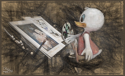 Since I recently went to Epcot and got a few images, I have been having fun trying out Topaz (see sidebar at my Tidbits Blog for website link) Impression on them. I am finding that when an image is maybe not in perfect condition, but you want to use it as a nice remembrance of your experiences, this plug-in does an amazing job of helping control the bad and bringing out the good. The level of realism you want added back into your image can be controlled by just applying a layer mask in Photoshop and erasing out any overdone areas. The artistic element can also be controlled to just the extent that you want by using either two different presets stacked on different layers in Photoshop, or just using one preset and adjusting the layer opacity or blend mode, or adding adjustment layers on top. This really has a similar feel as if you are adding texture to an image. I have to admit this is one of my very favorite images I have taken at Disney World. This was a window display and there was so much glare everywhere. In Lightroom Seim’s (see sidebar at my Tidbits Blog for website link) Super HDR X and RadiSpot presets were applied. A lot of clean up was done right in Lightroom using the Adjustment Brush – 5 areas were selected and adjusted. In Photoshop the background layer was duplicated three times and each of the new layers were taken into Topaz Impression. First my Charcoal I Slight Colors preset was applied (here are my preset settings that started with Topaz’s Charcoal I: Stroke: Brush Type 08, Brush Size 0.58, Paint Volume 0, Paint Opacity 0.38, Stroke Width -0.18, Stroke Length 0.23, Spill 0.24, Smudge 0, Coverage 1.00; Color: Red Overall Saturation -1.00, Red Saturation 0.50, Orange 0.31, Yellow Hue -0.03 and Saturation 0.54, Green Saturation -0.32, and Blue 0.64; Lighting Contrast 0.19, and Light Direction x0.51, y0.51; and Texture Strength 0.24, Size 0, Paper I texture, and white background color) and set to Multiply Mode in Impression; on next layer same preset without changing the mode to Multiply; and on the top layer the Da Vinci Sketch I preset was applied with no changes. By adding layer masks to both of the top two filter layers, the areas with color could be painted back just the way I wanted it to appear. I discovered it does seem to make a difference whether you change the blend mode in the plug-in or on the layer in Photoshop – so try both ways if you do not like the way it looks. Then two clean up layers were created to paint over parts of the image. Another cleanup layer involved using the Sharpen Tool on the face to draw the eye to his face eye. The last step was adding 50 free photo art borders 18. (By going to Select -> Select Color and choosing Highlights, you can select the whites – then add a layer mask and apply it. Now by adding a Color Fill layer clipped to the border, you can change the color from white easily.)
 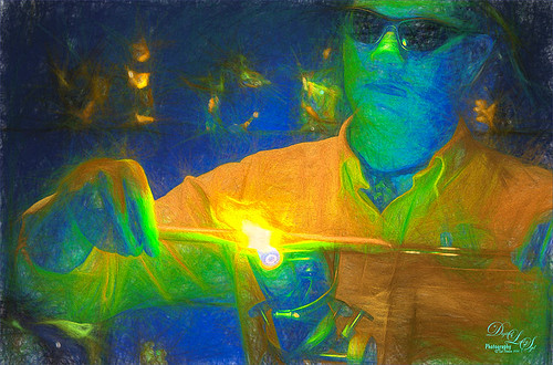 Well this image turned out really different – this is a guy that was doing a glass blowing demo at the Mexican Pavilion at Epcot-Disney World Orlando. This was a very dark image to begin with and after adding Seim’s PW4 Magic Ugly Shade Fixer preset and doing the Shake Reduction filter in Photoshop, it was opened up in Topaz Impression. Used my SJ Colored Pencil preset and got this kind of crazy color thing going, but I really like it. (Started with Colored Pencil II preset and ended up with these settings: Stroke Brush Type 07, Brush Size 0.90, Paint Volume 0.77, Paint Opacity 0.20, Stroke Width -0.82, Stroke Length -0.25, Spill 0.26, Smudge 0.16, and Coverage 1.00; Color Overall Sat 0.37, and Red Hue 0.78, Red Sat 0.32 and Red Lightness 0.28; Lighting Brightness 0.21 and Contrast -0.40, Light Direction X: 1.00 and y: 1.00; and Texture Strength 0.33, Size 0, Paper I texture and white background.) (See my New Impression of Octopus and Seahorse Tidbits Blog for another example of this preset.) It has a poster feel to it. Then the clean up layers were added. One for fixing the blown out yellow flame – added just a touch of color to it. And the second to remove some white dots that appear around the image. There are still a few that are apparent, but they don’t stand out as major artifacts. A Curves Adjustment Layer was added on top and that was it.
  Another image from Epcot of a store display on the World Showcase. I just liked the feel of the Venice exhibit so I thought it was worth a shot. In this case. the image had to be tilted manually using the Vertical Slider in the Lens Correction Panel in Lightroom. Also applied a very nice free preset from Nicolesy called Autumn Fresh and some Radial Filters on the overly bright spots in the image before going into Photoshop. On a duplicate layer, Topaz Detail 3 was opened and a preset I created a long time ago called Text was applied. (These are the settings: Overall Detail – Small Details0.08, Medium Details 0.20, and Large Details 0.08; Tone Exposure -0.60, Contrast 0.25, Highlights 0.10, Shadows 0.05, Whites 0.10, and Blacks 0.05; and Color Temperature 0.10, Tint 0.03, and Saturation 0.10.) I usually just try different presets in this plug-in until I get the sharpness I like. This layer was duplicated and Topaz Impression was applied using my Charcoal I Slight Colors preset (same as in first image) but changed some of the settings. (Here are the settings for this image: Stroke Brush Type 08, Brush Size 0.58, Paint Volume 0.64, Paint Opacity 0.23, Stroke Width -0.18, Stroke Length 0.23, Spill 0.24, Smudge 0, and Coverage 1.00; Color Overall Saturation -1.00, Red Sat 0.50, Orange Sat 0.31, Yellow Hue -0.03 and Sat 0.54, Green Sat -0.32, Blue Sat 0.64, Purple Sat 0.59, and Magenta Sat 0.94; Lighting Brightness 0, Contrast 0.43, Vignette 0, Light Direction X -0.14 and y -0.04; Texture Strength 0.47, Size 0, Loose Weave-3 and Background color an off-white (#ebecee); set to Strength 0.66.) On a duplicate layer used Nik Viveza 2 to pop up the colors back in the center of the image, but the Radial Filter in Photoshop’s Camera Raw Filter would work the same. Control Points were added to the globe light which was too bright and was drawing the eye off the image and the window in the lower left. Another point was placed in the middle to lighten up the center and direct eye towards the tower and boat on left side of exhibit. Did a clean up layer and darkened out the bottom edge and bottom right window light. A Curves Adjustment Layer was added as a last step to add just a little contrast back into the image. I feel that I am starting to figure out what effects I really like in this plug-in. It has been fun doing this since my time has been limited recently. It has been a long time since a new plug-in has been released with some different effects. Will catch ya again in a few…..Digital Lady Syd Digital Lady Syd Related Blogs: Digital Lady Syd Speaks Out on Topaz Impression More Painting with Topaz Impression Painting a Painter

Leave a comment