
PAINTING FUN IN PHOTOSHOP
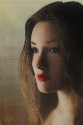 This week still having some summer fun. Have not been painting that much recently, so I decided to share a couple little things I am learning. Since I have been playing around with faces and portraits a little (Lisa Carney reruns have been on Creative Live recently and she is the best retoucher), I thought I would attempt a little painting in Photoshop. The above image was taken from a beautiful photo at Unsplash by Roksolana Zasiadko. First the image has to be cleaned up and the subject put on its own layer using some sort of selection process. I could not get her hair extracted properly in PS, even with a little “channel pulling” (using the channel with the best contrast to make a selection) to make the selection, so I improvised by doing using the Select and Mask command before painting in the missing hair. Then lots of layers of painting and retouching on the face . I cannot tell how important it is to develop a set of brushes for this type of work. So for example, I used the brush that was in my How to Create my Favorite Brush blog using a very small size to paint in the eyelashes. David Belliveau’s mixer brush was used to smooth skin. (A link to his free brushes are with his How to Blend Colors in Photoshop: 4 Essential Technique blog.) To add the hair, one of Aaron Blaise’s Lion Leopard Fur Brush was used at a large size. It worked amazingly well by just sampling lighter and darker colors. Added one of my orange light leaks (one I created using my How to Create Light Leaks to use Over Again blog) to the right side to lighten it up and give a sunny feel. One of my Corel Painter textures was used as a background. On the top a layer used one of 2 Lil’ Owls (for website, see sidebar at my Tidbits Blog) Creative Masks set to Screen blend mode at 31% layer opacity for a little detail effect on the side. Just a lot of experimenting with brushes and effects. If you have a great photo to start with, it is not that hard. Still, it takes a lots of practicing to get the digital look just right – hope to spend some more time on this this summer!
 I discovered that using Topaz Impression2 to help your digital art is just fine, and then take art to the next level with your painting. This shot of a coleus plant was taken in my front yard – they grow almost like weeds once planted, but they are so pretty, and there are lots of pattern varieties. It took quite a bit of clean up to get to a point where the painting could begin. The plants were selected and placed on their own layer – much easier than the portrait with the hair above. Then the selected object was taken into Topaz (see sidebar for website link at my Tidbits Blog) Impression 2 was opened and my SJ Van Gogh Painting Start preset was applied – can be downloaded in the Topaz Community by searching for sj space. (These are the settings if choose to use: Started with Van Gogh II preset and made these changes: Stroke Type 01, Number of Strokes High, Brush Size 0.13, Paint Volume 0.20, Large Brush Volume 0, Paint Opacity 0.81, Stroke Rotation 0, Rotation Variation, Stroke Color Variation 0, Stroke Width 0.68, Stroke Length 0.58, Spill 0, smudge 0, and Coverage 1.00; Color Overall Saturation 0.17; Lighting Brightness 0.09 and Contrast -0.04; and no Texture.) For this image, the Orange, Aqua, and Green Colors were also adjusted. Next Jai Johnson’s Daily Textures Explorations 10 was added underneath and a Hue/Saturation Adjustment Layer was set above to get the background colors.
Several new layers were painted using my SJ 3-Pastel-Van Gogh TI1 brush – this is a brush I created just for painting this type of image. To make your own, follow my How to Create my Favorite Brush blog but with a couple important changes. First a small square was selected using the Marquee Tool showing a part of the plant Impression layer that showed some nice contrast and brush strokes in it. It was turned into a Pattern by going to Edit -> Define Pattern and name it. (I named mine TI Van Gogh). Next the Brush Panel Texture section was opened. Select the Pattern drop-down (little arrow on right side of pattern swatch) and go to the very bottom where the new Pattern is located. The setting for the pattern I created are: Scale 46%, Brightness -46, Contrast 34, check Texture Each Tip, Mode Color Dodge, Depth 38% and Depth Jitter 12%. Try adjusting all these settings to fit your particular pattern. This brush gives a nice stroke effect at both larger and smaller sizes. Then open the Color Dynamics section and check Apply per Tip, set the Hue Jitter to 2%, and Brightness Jitter to 11%. (It was used on the hair in a few places on the top image.) This is the only brush used in the Coleus picture and basically I dabbed around on each leaf to get the look I wanted. And since the image is a composite, the plant edges were painted over slightly using the brush at a little larger size and sampling the background color all around – this blends the edges much better so it does not look like you just popped the plant on the background. To finish off, another texture from Jai called Be My Valentine was added on top – it was set to Overlay blend mode at 80% layer opacity. Another Hue/Saturation Adjustment Layer was clipped to the texture (ALT+click between layers) to set the color correctly. Finally finished off with a Black and White Adjustment Layer set to Luminosity blend mode and a Levels Adjustment Layer to get the final tone and color correction.
Well it may sound like a lot of work, but I am finding using the new brush is very nice for painting, with no change of pattern. I did notice after several attempts to get the correct feel to this image that using a texture that matches the painting style being used is very helpful. And I was surprised how easy it was to get nice hair effects by creating your own hair. Until next week, have a good one – I hope to try a little more experimenting with these techniques……Digital Lady Syd

It’s always fascinating to read how people ‘paint’ since I do it so differently with various textures. Thank you, Syd.
07/15/2017 at 3:46 pm
Pingback: HAPPY VALENTINES DAY (WITH A FEW TIPS)! | Digital Lady Syd's Fun Photoshop Blog
Pingback: ENJOYING SOME SPRING BUTTERFLIES | Digital Lady Syd's Fun Photoshop Blog
Pingback: » Teach and Student Digital Lady Syd's Tidbits Blog