
A FEW PHOTOSHOP AND LIGHTROOM TIPS AND TRICKS
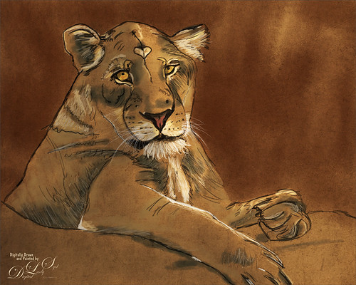
This week I thought I would present a few handy tips and tricks that you may not know or had forgotten – some are from a few years ago. These are ones I found while experimenting on my latest images. Maybe they will be helpful for you while working on yours. The image above was drawn and painted from an photo I took at the Jacksonville Zoo a while back. I love her expression. So here we go…..
- CHECK VALUES QUICKLY (PS): Sam Peterson from Adobe Creative Live, has this excellent way to turn your photo to black and white to see how the image values are looking. First need to set up the panel. In PS go to View -> Proof Setup -> Custom and in Customize Proof Condition Dialog, set Proof Conditions – Device to Simulate to Dot Gain 20%, Rendering Intent to Relative Colorimetric, and check Black Point Compensation. Now these settings will always remain. Simply press CTRL+Y and instantly you will see the whole image in B&W. Just press CTRL+Y again and it removes the effect. Also, the Color Picker still works when image is in B&W so you can see what color is causing a problem if you do not like the results. Really cool! I am using this all the time now for a quick view of what is happening with the tones in the image.
- SHADOW AND HIGHLIGHT LAYERS (PS): Another Sam Peterson trick – this guy does have some really interesting techniques! For images with really neutral lighting, he creates a New Layer and sets it to Multiply blend mode and selects a grayish-blue tone (try #8e969e). Clip this layer to object layer for keeping shadows confined to the object only. Otherwise can use on the whole image. Use any brush, soft Airbrush or hard edged, to paint in the shadows. (Can create a gobo lighting effect doing this with an interesting stamp brush – see my Photoshop Gobo Lightng Effect blog.) He does the same technique for Highlights using a Color Dodge blend mode and a darkish mid-gray color (try #42403d). These two layers work well together and give some beautiful results. By using these colors and adjusting the brush opacity and flow, a subtle result can be achieved.
- BRUSH SMOOTHING FOR TRACING (PS): This tip is from Paul Trani also from Adobe Creative Live. When tracing over an image and are having problems controlling the brush strokes, set the brush Smoothing up to 50 and the lines stroke much easier. It does slow the brush down a little, but it really helps to create nice smooth curves lines. I am finding this very helpful anytime I am using a very small sized thin line brush – used it to add some tree branches on a trunk recently.
- SELECT AND MASK REFINE EDGE BRUSH (PS): I have always struggled with getting good results in this panel. Well Sam Peterson once again gave me some insight for this tool. With the layer mask highlighted, go into the Select and Mask Panel and choose the Refine Edge brush icon, 2nd down on left side. In Tool Options Bar at top, open the drop-down next to the brush size field and set the brush Hardness to 0, Spacing to 25%, Angle to 0, Roundness to 100% and Size to Off. Also note that the Radius is set to 0, Smart Radius is not checked, and Object Aware selected. Once I did this, I found it was much easier to get good results on the edges, particularly when selecting hair or fur. He also cautions that dragging the brush too much inside selection will allow the edges to creep in. Drag on the very edges outside of object for best results. Use the ALT key and paint back any area that leaks in or use the Brush Tool (3rd icon on left) to clean up.
- CAPS LOCK TO FIND AND PAINT WITH BRUSH (PS): Kim Klassen of texture fame put me onto this one. When painting with a very tiny brush or very large brush where it is hard to see, just press the Caps Lock to get a small cross so you can see where the center of the brush is. It works with painting with a very tiny sized brush. I use this trick all the time when using cleaning up areas with small brushes like cleaning up halos, etc.
- SMUDGE BRUSH AND MIXER BRUSH LAG ISSUES (PS): These tips comes from Kyle T. Webster, the Adobe Brush Evangelist. If your Smudge or Mixer brush are acting very sluggish, you may need to turn off Sample All Layers due to several layers in image. Can also go into the Brush Settings Panel -> Brush Tip Shape section and – for Smudge Tool, uncheck Spacing and for Mixers set the Spacing to 5%. Try reducing the brush size also. It helps to close other documents open in PS and any open web browsers to speed things up too.
- DEHAZE SLIDER TIPS (LR): Two major Lightroom and Photoshop gurus offer these tips. Moose Peterson, of wildlife reknown, says that whenever he uses Dehaze, he always lowers the Blue Saturation in the HSL/Grayscale tab since the slider tends to crank up the blues. John Paul Caponigro, possibly my favorite PS guru, says that Neutral areas may turn magenta, and Shadow areas pick up strong blue or green casts. Can reduce Saturation after using, but what he likes to do it create a Virtual Copy. On one copy use no Dehaze and on another use it. Highlight both images in filmstrip, right click on an image, and select Edit In -> Open as Layers in PS. Put layer with no Dehaze on top and change to Color blend mode. Something to try IMO.
- ADJUSTING PRESENCE SLIDERS IN LANDSCAPE IMAGES (LR): This info comes from Randy Van Duinon, a very good architectural and landscape photographer, who uses an interesting LR workflow. He starts by first adjusting the Texture slider which works in the fine detail adding contrast in these areas; next the Clarity slider which adds contrast in the midtone areas (he keeps this amount around 35 and more on cloudy days); and finally Dehaze which adds contrast to the larger areas. Then he continues with the Basic settings. This has worked out well for me at times.
- USING PROFILES IN LIGHTROOM (LR): Daniel Gregory, a professional fine art photographer, came up with what I consider is a rather common sense tip. Since the image can change rather dramatically just by changing a profile, he believes that it should be applied first as he would be making different setting decisions depending upon which profile he uses. The Adobe profiles do not have an amount slider, but usually creative profiles that are downloaded have this slider. Consider the Amount slider the same as an Opacity slider on a layer in PS. I will add that many people do not add the profile until the end (Matt Kloskowsky for example) so this is definitely something to try.
- PARAMETRIC AND LINEAR CURVES (LR): This tip is from Tobi Shinobi, a bright young newcomer on the PS scene. In the Tone Curves section, first adjust the Linear Curve (2nd white round circle) and add your points. Press ALT to reset the curve and ALT+click over the curve to set a point to adjust. Right click to delete point. The go to Parametric Curve and adjust – they work independently of each other. Use this order to add some finesse to your images.
I hope there were some new ideas presented in these tips. Some really great PS and LR gurus have some great ideas! It was fun putting this together. See ya soon again…..Digital Lady Syd

Very interesting tips here…especially the shadow and highlight layers and the caps lock to get the centre of the brush…something to try in future! 🙂
07/25/2021 at 7:43 am
Thanks Ann! I am finding there are some really good tips from people I have never followed often. There is always so much to learn about these two programs!
07/26/2021 at 7:37 am
Good for the brain, LOL!
07/26/2021 at 10:03 am
Pingback: » Red Hot Music! Digital Lady Syd's Tidbits Blog
Pingback: WOW! THE NEW IMPROVED PHOTOSHOP NEURAL FILTER COLORIZE | Digital Lady Syd's Fun Photoshop Blog
Pingback: » B-24E (Liberator) Bombers – 1943 Digital Lady Syd's Tidbits Blog
Pingback: » The Pirate Digital Lady Syd's Tidbits Blog
Pingback: » Turtle and Child Sculpture Digital Lady Syd's Tidbits Blog
Pingback: » St. Andrews Golf Shops & Hotels Digital Lady Syd's Tidbits Blog
Pingback: DR. RUSSELL BROWN’S PAINTING AI ACTION SET | Digital Lady Syd's Fun Photoshop Blog
Pingback: A DAY TO NIGHT QUICK CHANGE | Digital Lady Syd's Fun Photoshop Blog
Pingback: HOW TO CREATE A GUSTAV KLIMT LOOK | Digital Lady Syd's Fun Photoshop Blog