
HOW TO CREATE A FUN CARTOON

If you are like me, you probably spend a lot of time just doodling in Photoshop. I like to try out new brushes and end up creating some pretty weird but fun cartoon characters. Then I end up tweaking it until it is something, well, as seen here in this blog. What I like best about doing this type of digital art is that it does not have to be perfect. I thought I would share with you some of my favorite brushes that work really good when cartooning or doodling. Also some nice brushes for adding color to the cartoon along with a couple little tricks to try out. This blog is a bit huge, but it is a lot of info to cover.
The cartoon lady above was the first one developed for this blog. Below are the basic steps I usually follow to create my cartoon images:
- The first step is to draw a “Rough” drawing layer using a nice drawing brush. Usually a pencil or ink brush is selected to start – this image used Kyle Webster’s Tilty Pencil Brush from his Winter 2022 set (I changed mine from a Mixer to a Regular brush – see Appendix at end of blog on how to do this – it makes a great sketch brush, but both the Mixer and Regular brushes are great!) Begin by just doodling a few items to start your character, and black is my preferred sketch color. Usually I begin with the nose or eyes – then I throw an oval shape around the figure to create areas to build on. Then the body is drawn, if needed. Remember at this stage, it does not have to be proportioned perfect.
- This step is optional if you are happy with the Rough drawing layer. Next create a “Refined” drawing layer by starting with a New Layer and setting the “Rough” drawing layer to a lower opacity. Then either use the same brush or a different one to draw over the original in a darker ink to fine-tune the lines. This totally depends on the look you want. For the above image, a New Layer was used to fine-tune the face separate from the body – the layers were merged together when the refining was done. Sometimes a rougher ink brush looks better at this stage for the character being put together.
- Put a New Layer underneath the Rough Draft layer (turn it off now if there is a Refined drawing) and start painting in the different areas of your character. This image used a few of Kyle’s Real Watercolor Brushes – the Skirt used Wet Pull and her skin used Natural Edge Painter 2. The hair was called Sampled Brush 2 3 by Daarken in his Full Daarken Brushes Full Set (some really cool brushes in this large free set). It just created this great mass of hair! For the Blouse the Natural Edge Painter 2 was used again and Kyle’s Real Watercolor Spider Spread Blend smudge brush was used to spread out the paint and smooth the fabric effect. I love this smudge brush!
- TIP 1: This next step is really important so the texture placed underneath your character does not show through the person, especially when using watercolor or if the layer opacity of one of the objects is less. To do this, duplicate your Refined drawing layer and paint solid white over just the character. Once done, move it down under all the color layers. If white shows through a little after moving, just erase what looks bad on the white layer. This will make your image look so much better!
- Create shadow and lighten layers. TIP 2: For the lady above, a technique by Pratik Naik was used where a large round 100-pixel soft brush. In the Options bar set the Flow to 9% and leave Smoothing at 0% and turn on the Airbrush icon. Created a Layer set to Overlay blend mode and painted with white to lighten and another Overlay layer using black to darken the image. This brush is my go-to brush for this and often a different color is used to get a different look. Very handy to use!
- To finish up, just above the original background layer a texture can be added. The one above was created in Corel Painter. A Color Look-up table was used to give a little more contrast. Could also add on top Curves, Levels, or Hue/Saturation Adjustment Layers with different blend modes and opacities.
This is the basic process.

The Unhappy Man image above was created using a different free brush called Scratchy Scratchy by David Belliveau at Paintable from his Sketch Set (I have learned a lot from David and followed several of his classes – see my Where to Find a Good Photoshop Painter blog for an example and more info on him.) Another really nice brush – there are so many choices in PS for this kind of art. His lips were created using my SJ KTW Tilty brush (I have trouble with lips so to learn to do this, Etherington Brothers visual lip tutorials were very helpful – search on their Twitter Feed for How to Think When You Draw – Lips – Part A and Part B from May 21, 2021. It shows you how to draw spheres in the lips to get them balanced.)
The T-shirt pattern is from the Old Design Shop – Keating Bicycle Ad and the Free Transform-Warp tool was used to get it crooked (this layer was set to Multiply to remove the white – this messed up everything when a stamped layer was created on top at the end of the process. MAJOR TIP 3: If creating a stamped layer (CTRL+ALT+SHIFT+E) and a weird color shift happens or a layer style does not work correctly, select the layer(s) with the blend mode(s) or styles and convert them into a Smart Object(s) – now create a new Stamped Layer on top. This took me forever to figure out but I find color shifts comes up a lot!
Grut’s NM Knowit was used for the light whiskers on the Refine drawing. A solid color brush was used on a layer underneath the Refine drawing layer and different colors added to the character. Sam Peterson’s Pencil Stumpy 6 was used to paint in the solid colors. Then Sam Peterson’s Airbrush for Shadows at 25% opacity to finish up. Both of these brushes can be downloaded for free by going to his in his Character Design in Photoshop YouTube video and in the chat relay sidebar there is a link – he does discuss how to use his brushes in this video. Sam always has some good PS techniques in his Creative Challenges. Next the white figure was painted on a layer underneath the colored parts of the person as explained in Step 4 of the process. Last step involved adding the texture background below the white layer. The background texture was one created from an elephant tutorial by Aaron Blaise (see my Got Some Free Time! Try Drawing blog for info on getting his fabulous tutorials) – he often starts his tutorials by creating really nice basic textures so check him out to learn about this and all sorts of drawing. This image is similar to the top image but used different brushes.
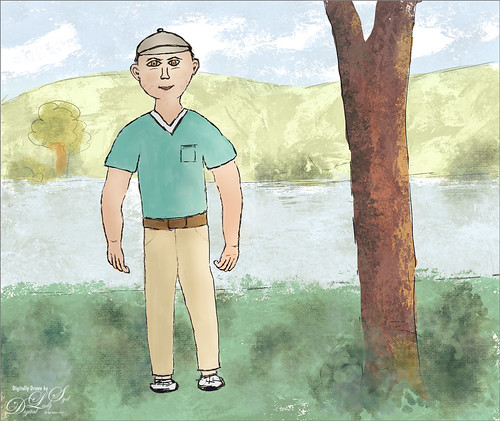
This above Outdoorsman image followed the same basic steps, but once again used some different brushes. This time the Rough drawing layer was used with no Refine drawing layer. TIP 4: Where I differ from most drawers is that I do erase out lines and remake them on-the-fly or use the Lasso Tool to change the size or line up my lines. My Wacom pen is set to toggle between the ALT key for sampling and E for erasing – very handy. My new favorite drawing brush for cartoons is Kyle’s Clean Comic brush from his Magapack set – created a brush by changing these settings in the Options Bar: Size of 10 pixels, Flow 36% and Smoothing 12% – then the saving brush. It makes for a very clean line. The painting color brush is one I named SJ Smooth Painting and it uses the tip of Aaron Blaise’s Local Color Brush (from the Brush Tip section) with my settings. (His brush used a lot of settings, but I only used Transfer (Opacity Jitter 0% and Control Pen Pressure) and Smoothing. The Options Bar is set to Size 35 pixels, Opacity 100%, Pressure for Opacity on, Flow 83%, and Smoothing 10%.) It makes a really nice paint stroke for applying color. TIP 5: It is fun to try different brush tips from with other brushes to create new ones. Sometimes really great brushes are created as this one is for me.
The background was created by adding a layer underneath the white painted layer and just lightly drawing in some background features with the Clean Comic brush. I followed some tips from a recent video by Kyle T. Webster called Tips for Creating Space and Distance in Your Art – very informative. On a layer underneath the background sketch, Kyle’s Smitty brush from his Spring 2022 set was used for the landscape and the tree. The sketch was left just slightly showing by lowering the Sketch background layer to 64% opacity – wanted a bit of the cartoon look to still show to tie it into the character drawing. The slight floral effect was created by using a Pattern Stamp by Jessica Johnson using her English Garden Set (brush 30 and pattern 37) – my favorite set of hers! She is the Pattern Stamp expert! Used my Pratik Naik from above for the slight shadow effect.
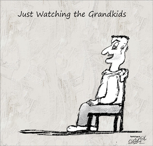
This image is a lot more basic than the others. Just a Rough layer was created using a new ink brush called Tick Fission by GrutBrushes – it is his free brush of the week this week but all his brushes are only $1 if you find one you want. This site is fabulous if you have not checked it out before. I am really enjoying this brush as it gives some nice variety of lines for drawing. Underneath, a brush created from a texture brush using French Kiss was used to add some texture to his pants. (See my How to Create a Texture Brust to Match a Texture blog to learn how to do this – it is nice to have a texture brush from one of your favorite textures to use in images.) Under that is the painted white figure. TIP 6: A Pattern Fill Adjustment Layer was used to add the background – the above uses Kyle’s Gesso Canvas Knife pattern from one of his brushes. I can’t find the brush where this pattern is from, but several of his brushes have similar effects – Kyle’s Megapack Inkbox Brush Pen Queen uses one called kyle nupastel 2017 that also looked nice in this image. To download the pattern (texture) from the brush, just click the + icon to the left of the pattern line – it will automatically go into your pattern file. Use a Selective Color Adjustment Layer using the Colors Black, Neutral, and White colors and the black slider to adjust pattern contrast – try both Relative and Absolute. This is a great way to get a really nice painterly texture. By using the Pattern Fill Adjustment Layer, they can be swapped out really easily. Even if the pattern is too light or dark, just change the blend mode or layer opacity of the adjustment layer and it may look really good. To learn about the textures in brushes, check out Brush Hour with Kyle T. Webster: Let’s Create Some Pattern Brushes video for great info on this. The font used was Segoe Print and is free for personal use.
Thank you so much for hanging in there with me on this huge blog. It has been a while since I did one – this is something I have been wanting to write about for a while. Hope you found something useful in it, even if it just finding some new brushes to try out. Have a great one!…..Digital Lady Syd
APPENDIX:
TIP 7: As promised here are the instructions on how to convert brushes between Mixers and Regular type brushes and other types too. The bottom line for converting a regular brush into a mixer: Select the Mixer brush that has the settings you like, then press down the CTRL+ALT keys while clicking on the Regular brush you want to convert to a Mixer with the original Mixer settings. They will appear in the Options Bar. Below is how I actually created the SJ Tilty Pencil brush.
How to turn Kyle’s Tilty Pencil Variant Brush from his Winter 2022 set from a Mixer into a Regular Brush. Not exactly how I figured this out, but it works great for me as a Sketcher. It gives very delicate lines, like the ladies face above, but much darker lines for more emphasis. To convert the Tilty Pencil Variant into a Regular brush is just the opposite from turning the above info on changing a a Regular Brush into a Mixer. In this case either create a basic Regular Brush with the Option Bar set to Opacity 100%, Flow 100% and Smoothing 20% or find a brush that is set up the way you like. Select this brush and press down the CTRL +ALT keys, keeping them held down until you get to the Tilty Pencil Variant, and click on it – it now turns into a regular brush with all the Mixer’s Brush Settings but the Options Bar will use the regular brush settings. Immediately go down and save the brush by pressing the + icon and naming it. Otherwise once you use a different brush, it goes back to a Mixer. Now you can change the size and the settings to match what you want. For my brush (a small round brush tip), it is no longer an Erodible brush (since the regular brush tip used was not Erodible brush type – need to create an Erodible brush like the Mixer settings on the new one if you want it to be an erodible Regular brush) – but is set to Size 7 pixels and Spacing 10%; Shape Dynamics – Size Jitter 11%, Control Pen Tile, Minimum Diameter 36%, Tilt Scale 104%, Angle Jitter 39%, Control Pen Tilt, Roundness 0% and Control Off; Scattering Both Axes at 30%, Count 5, and Count Jitter 62%; Texture – Pattern is Kyles WC Seamless 1 (saved down from one of his Watercolor brushes – see TIP 6 above), Scale 100%, Brightness -122, Contrast 5, Check Texture Each Tip, Mode Height, Depth 22%, Minimum Depth 0, Depth Jitter 0% and Control Pen Tilt; Transfer – Opacity Jitter 0%, Control Pen Pressure, Minimum 26%, Flow Jitter 0%, and Control Off; and Smoothing checked. In the Options Bar, Opacity is 100%, Flow 31% and Smoothing 20%. There you have it! This same technique can be used on most brushes in PS except the Clone Stamp Tool. Try it out – it works really good.
DIGITAL LADY SYD’S RELATED BLOGS:

Pingback: » AI Painted Image of Natural Bridge Digital Lady Syd's Tidbits Blog
Pingback: DRAWING CARTOON DOGS FOR FUN | Digital Lady Syd's Fun Photoshop Blog