
SOME COMPOSITING TIPS AND RESOURCES
This week I decided to try out a few of the tips I learned by mostly watching the Photoshop Creativity Virtual Summit a few weeks ago. There were many great instructors and videos with a lot of emphasis on compositing. (If you have never watched these summits before, it definitely is worth the time – Dave Cross, one of the original Photoshop Guys, has been organizing the Lightroom and PS summits for several years doing two a year. Wonderful info!) I also watched a few other videos which I will reference below for you to check out.
Making Brushes from Resources
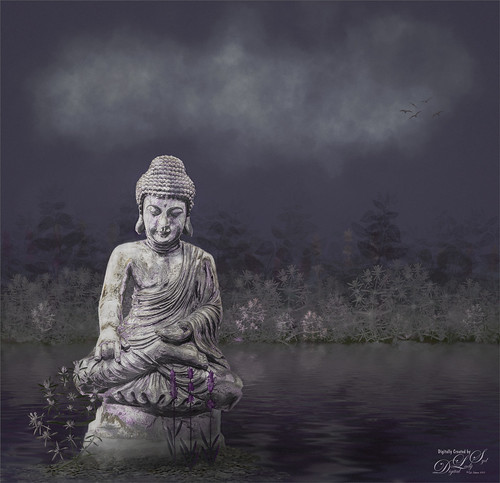
To begin with, Creative Market had a really nice free give-away (every week they have 4 free downloadable items) a few weeks ago called Herbs of Provence by Yevheniia (not sure if still free). The set contained a folder on Herbs and with 10 PNG herb elements in each sub-folders (Hand-sketched elements, Outlines, Silhouettes, and Silhouettes with Outlines) – very unusual to see this variety of elements! The black silhouettes could immediately be turned into brushes which is what was used to paint in all the plants in this image and got me started creating this image. (And yes, several items in the brush section were checked to make them interesting like Shape Dynamics, Texture, Transfer, and Color Dynamics in some cases – play around with these settings.) A horizon line was created with these plant brushes along with a blue sky and green foreground. To make these kind of brushes which is just a stamp brush, there are many sites that give free downloads with PNG element files, besides just backgrounds and patterns. Also check out Design Cuts (linked to freebies section) and Deal Jumbo (also linked to freebies) that have many similar items as above – any plant PNG can be converted into a brush after filling them with black. Also Scrapbook sites have lots of these types of items, but beware that in most cases they are for personal use only and cannot be used on the internet even! Just be sure to check out the usage requirements. The bird brush 04 that is barely visible in the upper right corner is from Wavernwater at DeviantArt although there are lots of similar free bird brushes everywhere. They are even easy to just draw in on a layer.
Speaking of brushes, Aaron Blaise, the Disney Drawing Guru, gave away a Cloud Brush during the summit (and is still available at the link) that was used to create the clouds in this image. He provides a short video to show you just how to get the right effect in your clouds.
Once you have created your brushes, try painting just painting them on a duplicate layer by setting the Lock Transparency Pixels icon (first icon after the word Lock in Layers Panel or just press / to toggle lock) so the brush strokes are protected. Can go into the Layer Style of the plant layer and add Patterns, Gradients, Embossing, etc. Lots can be done at this stage! I have found using a small pattern in Layer Styles give an interest look to small flying bird layers so they do not look too flat. And don’t be limited to just brushes, those PNG files can be brought into your work individually and then painted using the same technique or by adding Layer Styles. When using a lot of plants, it is best to create a brush. But when just needing one or two, using the PNG files is easier and they can be manipulated using Free Transform or the Liquify Filter to get a good result. The flower on the left of the statue was a painted PNG file.
Filters That Still Work (for me anyway)
Lisa Carney (the Movie Poster Queen) suggested using the Flaming Pear Flood Filter in her video. I got this filter back in 2009 – it was applied to a stamped layer of the sky and plant and grass layers (CTRL+ALT+SHIFT+E) and it still worked in PS2023! The newer version is not much different and is inexpensive. The Flood Filter creates a water layer – an added layer mask can be used to remove parts not needed. On the above, everything but the water was painted over so the cloud and plant layers could be readjusted if needed. Can make some subtle water layers that look very realistic. It is probably still the best water filter around. In the image above, the water line was brought right up to the horizon line. It took a little practice to get the somewhat smooth effect that still looked like water but not large waves.
In the image below, an old Filter from (Google) Nik called Analog Efex Pro 2 was used to create a 4-image triptych effect. For some reason it just looks good show-casing all the elements that were selected in the final image even though this was a much earlier iteration of the final. You can see the plant brushes were different and the statue is sort of just sitting in the water at this point. The tonality was was changed and that was partially done in the filter. The latest DXO Analog Efex Pro 3 has a lot more choices but the original still is not bad. Point is, many times these older filters still work just fine when looking for a certain effect.
Adding in Specific Elements
Now it was time to add in whatever element would look good in this image. This was tricky as I did not start out thinking about the main composition, I was just making brushes and adding in some flood – I believe that is called having some fun just playing! But it was starting to look like something that could make a nice composition. The Buddha element was selected out of an image taken at the St. Augustine Alligator Farm a while back. A sharper shinier version was available from PixelSquid (see next paragraph) but it did not fit the scene correctly. The statue above had a lot more character with a more vintage look. (And it is amazing how many different gestures a Buddha statue can have which was another consideration.) And don’t forget stock photos have some very nice elements that can be selected in PS and moved into your composite (be sure to look at the resolution of the object (Image -> Image Size) and match it to your document before moving to get a good result.) I use Unsplash and Pixabay a lot but Adobe Stock has been adding a nice selection of free photos too. Also try looking at your own images and select an element like I did with the statue.
The Buddha looked funny just sitting in the water, so a rocky base was created to ground it using the Gravel Set from PixelSquid. I have had the PixelSquid plugin since it first began and it is great for adding elements to an image – it can be pricey but watch for their sales for a good discount and well worth the money if you do compositing. Lisa Carney uses it a lot on her movie compositions. Shaun Ryken is a compositer that works with PixelSquid – he has two YouTube videos that cover compositing in general and PixelSquid – check out Recreating Spongebob’s House with PixelSquid Plugin Part 1 and Part 2. I learned a lot from these videos even though they are a bit chatty. The objects come into PS as 3D spinnable objects in the object field – just drag around to see from above and below and all sides – really cool! Once you find a position you like, it will be updated the created layer in PS. Not seeing anything happen? Go into Preferences -> General and check “Always Create Smart Objects when Placing” – otherwise it will not update the object view. Use the Move Tool when working with the PixelSquid layers – by holding the CTRL key, the Free Transform guides appear and the size can be adjusted quickly. And don’t get discouraged if you do not have PixelSquid, it is not necessary.
Once applied, need to watch how the lighting is catching everything! Lots of item layers may need to be rearranged to look correct. By adding a layer mask to the gravel and painting out some of the rocks at a low brush opacity, it looks like they are partially underwater. Adding a few more of the flower plants using the same brushes ties the background in with the foreground. One of Shaun’s tips is “With compositing it is almost 0% of the time do you use black at 100% – 98% is as far as you should go.” Therefore try not to make your shadows totally black.
Some Basic Techniques that Are Easy to Do
To soften the effects of the rocks and the foreground flowers a New Layer was added and the Blur Brush was used to slightly blur them – much easier than using the Gaussian Blur filter and the layer opacity can be reduced or a layer mask added if it does not look quite right! My layer was set to 90% opacity. Also there is a Strength slider to lesson the amount and the Edit -> Fade command can be used if a stroke looks too strong.
For dodging and burning details, use two New Layers set to Overlay blend mode, paint in with a tiny hard-edged brush to paint in the details in black or white where needed. Once again reduce the layers if too sharp or reduce the Brush Opacity or Flow to suit the item. Aaron Blaise also just offered an Ink Brush for free download – it would work great here as it is just 4 pixels with a 24% Size Jitter set to Pen Pressure for tablet use.
One of my favorite new tricks comes from my favorite PS Guru, Corey Barker. To add a little more light or dark, instead of using a soft brush and painting, use the Gradient Tool. Set your Layer to Overlay blend mode as above. Set the Swatches to default black and white colors (D). Now in the Options Bar, set the Gradient to Radial and the Opacity to 50% to start. Use black color and drag out just a very short line in an area you want to add a shadow effect and vice-versa for the highlights. Increase the Opacity if needed. This was done all over this image and it pin-pointed the effect just right. Really nice look!
The Camera Raw Filter was used 3 times in this image: first to mask out the brushed in plants to add some colors; to add a Color Profile for more purple tones in the image; and as a final step to add a vignette and a little grain to further blend the objects together so they do not look like individual items.
Another way to really brighten up a larger portion of the image, as was shown on the right side of the statue, is to add a New Layer set to Overlay blend mode and with white, paint with a large brush (take a 100 px soft round brush with the Enable Air Brush style Build Effect icon clicked on in the Options Bar) set to 100% opacity and 9% Flow. Just paint over where you want to add the light in and then reduce the layer once finished. Mine was set to 64% opacity. Different colors of paint can used to fill areas with the brush also – Pratik Naik, a well-known retoucher, taught me this trick a long time ago. Can also be used to create shadows as shown on the water by the statue. If you want the light or shadow to only be on part of an object and not the whole area around the object, can clip an Overlay blend mode layer to the object layer (ALT+Click between the New layer and the object layer) and it will only paint on the object.
The image below used a texture which really gave it a nice gritty effect so no additional grain was needed at the end. This Flypaper Texture is called Apple Blush and came with the old Adobe Paper Texture Pro by Russell Brown, Adobe PS Guru, who wrote the script for the panel which is linked. (I cannot vouch it will work on your computer but Version 3.1 still works for me in PS2023.) I use it all time just to try out a couple textures to see if a one might work with my image. Definitely a time saver.

Finalizing the Image
As mentioned above, one of my last steps was to add some grain to the image and in this case, Camera Raw’s Effects Panel was set to 24 with defaults for the other sliders. Also the Vignette was created using a Midpoint of 49 and Roundness of +9. Some people like to create a Noise layer that works very much like the Grain slider – I find the Grain slider works really good. This does help blend the image together.
The other thing that can be done is the objects can be selected and a layer mask added – then using a Blur Brush set to 90 pixels at 100% Strength, paint over the edges in the mask – it does not matter if you paint over the object as only the edges are affected by the blur – major cool way to slightly soften the sharp edges to blend the elements into the composition. In the Mask’s properties, the Density can be reduced if the blur is too much.
There are other techniques that I will cover at a later time – still learning a lot of them. Many creatives use textures at various blend modes and opacities to lighten or darken an image overall – adding layer masks if needed also. Many times Layer Style Blend Ifs can be used to pull some texture up through a layer. Many are using Gradient Maps, Black and White, and Color Lookup Adjustment Layers to get some interesting looks. I will try to create a different image or two to show how to use these techniques soon.
The last steps were basically the same one used to finish up any of my images. A final Curves Adjustment Layer was added and some clean up layers were used, but overall that was it. It took me 10 iterations to get the look I liked. Still dealing with the learning curve! If you have any questions on the techniques presented, try doing a search on my website – I have been doing PS blogs since 2010 and have covered a lot of these in more detail. Hope you got a few tips that will help you create some new composite or add a little to your existing images. And check out the linked resources for some new ideas – I think the ones listed all have great design items! …..Digital Lady Syd

Leave a comment