
HOW TO USE A PHOTO FRAME MASK
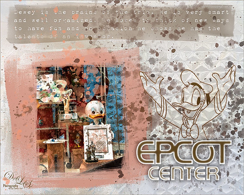 This week I decided to play around with some photo masks – some very nice ones that I purchased from French Kiss (see sidebar at my Tidbits Blog for website link) called Brayered Blocks Clipping Masks and others that are free to download or I created. The masks make some interesting framing effects, especially when stacked. They are actually a lot of fun to use, but it does take some understanding as to how the masks work to get a nice result. This short tutorial that Nicole created on how to use her masks called Using and Embellishing Photo Masks was very helpful and she has several other related blogs to view. The image of Dewey above took a lot of clean up as this image was taken of a display with lots of glass reflection. Check out Image 1 below for all the gory details on how I did this crazy image and how to add in this type of mask! This one took a while to do!
 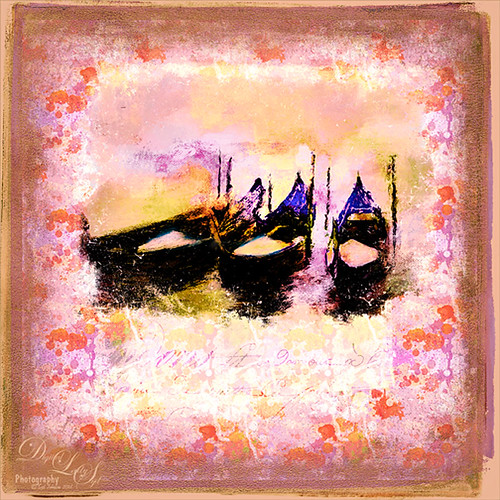 This generic image of some gondolas used photo masks created using brushes. A new image was created with the photo added on top. This time Shadowhouse Creations Grunge Frames brushes, which are a free download, were used twice to get this effect along with a free photo mask from French Kiss Collections Facebook page. Now the trick is to get this all connected together correctly. Check out Image 2 information below to get the steps on how this was done. Some quick points on using these photo masks. Try using the Free Transform on the different layers to line up your masks to your image or get rid of any edges from the image you see. Usually it is not the photo mask you think that is causing the problem – check out the others. Also, if you just cannot seem to get rid of the line from edge, try just painting in your original image with the background color to remove it. Photo masks can be made fairly easily by using some of the available brushes, like those from Shadowhouse Creations, or by using your own watercolor brushes on a layer. Just start by adding in some texture effects to your brush – can use a lower opacity and get a layered edge. Try using two different brushes together. I even made a couple by just using brushes in Corel Painter and opening the file in Photoshop – just needed to do a Select -> Color Range and in drop down choose Highlights so the whites are selected – then check the invert box. Add a layer mask to the brush layer, right click to apply the layer mask, and there is your photo mask. Now create a brush by using the Rectangular Marquee and placing around the strokes, and go to Edit -> Define Brush Preset. Actually not as hard as it sounds.
 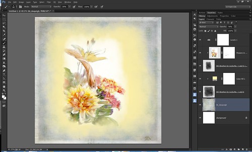 The screen shot shows how this pretty basic image set up. (Click on image to see larger view in Flickr.) I created the photo mask using free Watercolour Brushes by Leyla – no. 1 and 6 at 30% brush opacity and using black as a color. Just left the edges lighter and painted more in the center area. The layer was duplicated and reduced in size to fit the image. When edges showed up on this image, the actual image was changed in size to adjust for them but also I had to sample the background to get rid of parts of it. The layer mask was used to make some of the lower flowers slightly pop out into the photo mask. You can always go back into the mask you created and paint in more color or erase some to fit the look you want. The interesting background texture is from Kim Klassen called deepsigh. Hope you get a chance to try this type of effect and maybe experiment with making your masks. This is really a lot of fun to do and I have to thank Nicole at French Kiss Collections for bringing this concept to my attention!…..Digital Lady Syd
Digital Lady Syd Related Blogs:
Just a Frame Flower
Image Information:
Image 1: How did I get rid of the reflections? In Photoshop I used my Chalk Brush (regular Chalk Brush 60 with the Angle Jitter set to 19% in the Shape Dynamics – can’t tell you how much I use this brush in place of a regular round brush!). At a lower brush opacity of roughly 30%, the colors were sampled from the image as I painted over the reflections. Next the image was opened in Topaz (see sidebar at my Tidbits Blog for website link) Impression and the Edward Hopper II preset was applied. A flattened version was created and opened in a new document. On a layer underneath the image, French Kiss Brayered Blocks 01 was added and a light pink Solid Color Adjustment Layer was clipped to it (ALT+Click between the layers to clip). Under that a mask another mask was added, Brayered Blocks 05, where a brownish color was used in another clipped Solid Color Adjustment Layer. On the original image a layer mask was added and with my Chalk Brush, the edges were brushed around the inside edges to get a rough looking inside frame edge. At this point a Group called Dewey Frame was created and collapsed to keep everything straight. (Highlight your layers and press CTRL+G to place in a group – then rename.) Upper text was added using 1942 report with an outer glow added. The text layer was duplicated and rasterized (right click and choose Rasterize) and the original text layer was turned off. Under the rasterized text layer, another mask, Brayered Blocks 12 was added and warped to fit underneath the text. French Kiss Chalkboard 2 texture was clipped to the actual brayered block mask layer, and a Solid Color Adjustment Layer was also clipped to this layer using a brown color. Another group was created called Upper Text Group. Just above the Background Layer French Kiss’s Tableaux Northern2Z texture was moved into the file. An image of the Epcot Ball was moved into the image above this texture and adjusted off-center. It had been previously turned into a black and white image and this layer was set to a 71% opacity. Clipped to this image only was a Curves Adjustment Layer and a blue to white Gradient Adjustment Layer at 52% layer opacity – this gave nice sharp edges to ball pattern. Now the layers involving the Epcot Ball selected and grouped together. The last steps involved adding the text for Epcot Center – this is the Prototype Community 25 little letter a. A layer style was added to the font – Inner Glow for the white edging (Choke 24% and Size 29 px), Color Overlay to get the matching center brSo here are the image details – there are lots of them here so skip down if this puts you to sleep. How did I get rid of the reflection? In Photoshop I used my Chalk Brush (regular Chalk Brush 60 with the Angle Jitter set to 19% in the Shape Dynamics – can’t tell you how much I use this brush in place of a regular round brush!). At a lower brush opacity of roughly 30%, the colors were sampled from the image as I painted over the reflections. Next the image was opened in Topaz (see sidebar at my Tidbits Blog for website link) Impression and the Edward Hopper II preset was applied. A flattened version was opened in a new document. On a layer underneath the image, French Kiss (see sidebar at my Tidbits Blog for website link) Brayered Blocks 01 was added and a light pink Solid Color Adjustment Layer was clipped to it (ALT+Click between the layers to clip). Under that a mask another mask was added, Brayered Blocks 05, where a brownish color was used in another clipped Solid Color Adjustment Layer. On the original image a layer mask was added and with my Chalk Brush, the edges were brushed around the inside edges to get a rough looking inside frame edge. At this point a Group called Dewey Frame was created and collapsed to keep everything straight. (Highlight your layers and press CTRL+G to place in a group – then rename.) Upper text was added using 1942 report with an outer glow added. The text layer was duplicated and rasterized (right click and choose Rasterize) and the original text layer was turned off. Under the rasterized text layer, another mask, Brayered Blocks 12 was added and warped to fit underneath the text. French Kiss Chalkboard 2 texture was clipped to the actual Brayered Block mask layer, and a Solid Color Adjustment Layer was also clipped to this layer using a brown color. Another group was created called Upper Text Group. Just above the Background Layer French Kiss’s Tableaux Northern2Z texture was moved into the file. An image of the Epcot Ball was moved into the image above this texture and adjusted off-center. It had been previously turned into a black and white image and this layer was set to a 71% opacity. Clipped to this image only was a Curves Adjustment Layer and a blue to white Gradient Adjustment Layer at 52% layer opacity – this gave nice sharp edges to ball pattern. Now the layers involving the Epcot Ball selected and grouped together. The last steps involved adding the text for Epcot Center – this is the Prototype Community 25 little letter a. A layer style was added to the font – own tone, and Drop Shadow (Opacity 34%, Spread 35% and Size 57 px). On a New Layer the I Love Donald Brushset for CS3 by xxxNightwingxxx-Donald brush 28 was used and an Outer Glow layer style was added using the pink color set to Structure Opacity of 62%, Spread 48%, Size of 6, Range of 83% and a Contour in a set called 50 Contours that I am having trouble finding the download link. The two text layers and were Grouped in a Donald and Text group. Last step involved created a stamped version (CTRL+ALT+SHIFT+E). Nik Viveza 2 was used to emphasize the Disney sketch in this image. A New Layer was added and with a round soft brush set to 250 px at 12% brush opacity, a couple large sweeps were painted over the upper text block as it appeared over-powering. A New Layer was created on top and French Kiss Spatter4-01 brush was selected – the Color Dynamics section of selected in the Brush Panel where the Foreground/Background Jitter was set to 49 and Brightness Jitter set to 54% and in the Shape Dynamics section the Angle Jitter was set to 40%. This gave the randomness of the spatters with color sampled from the image. This layer was set to 76% opacity and a layer mask was added where the spatters were removed from Donald and the Epcot Center text mainly. I could do this kind of image all day! Got to love Disney! Image 2: A new document was created – 7 inches x 7 inches at 300 ppi. The gondola is one first painted in Corel Painter and you can see the final image at my Hanging With the Gondolas! Tidbits Blog along with the specifics used in Painter. Next in Photoshop the image was opened in Smart Photo Editor (the settings used were: Applied Photo-art at a click o50 by andrewb2012 – Effect Controls: Master Fade all the way right; Multi-color Match 0.81, Exp -0.029, Highlight Clipping 0.254, High Clip Detail 0.044, Vibrance 0.673, Hue -1.000, Sat -0.312, Bright 1.156, Gamma -0.223, Contrast -0.085, High Clipl 0.421, High Clipl Detail 0.54, Vibrance 0.85, Hue 0.146, and Sat 0.265). Check out last week’s Digital Lady Syd Reviews Smart Photo Editor Photoshop Plug-In blog. This is the image that was later added to my file above. Above the background layer which had a golden tone added to it, French Kiss Dusky Rose texture was added and set to Overlay at 100%. A New Layer was created and with one click using a black Shadowhouse Creations Frame 1 brush which size was adjusted to fit the image, a block mask was created. Next a Pattern Fill Adjustment Layer was clipped to the block mask layer, and from 10 Free Seamless Colored Splatter Textures from Idealhut, Pattern o2 was applied. This pattern can be moved in the image to adjust it the way you it to look – I have used these patterns a lot over the years. Next French Kiss free Photo Mask was added, set to Screen blend mode, and a light creamy orange color Solid Color Adjustment Layer was clipped to the French Kiss’s photo mask. Shadowhouse Creations Grunge Brush 10 was added next and then the gondola image was brought in. Both layers were adjusted using the Free Transform (CTRL+T) – do the image first, then clip it to the Grunge Mask, and then adjust that to fit the image. A Hue Saturation Adjustment Layer was used to get the color just he way I liked them.

Love these frames! Amazing works, thank you for sharing! And thank you for the links too 🙂
11/08/2014 at 4:34 pm
Pingback: » Just a Frame Flower Digital Lady Syd's Tidbits Blog
Pingback: HOW TO CREATE A CAPTURED DAB BRUSH IN COREL PAINTER | Digital Lady Syd's Fun Photoshop Blog
Pingback: HOW TO ADD AN ABSTRACT SHAPE FOR A FRAMING EFFECT | Digital Lady Syd's Fun Photoshop Blog
Pingback: HOW TO CREATE A QUICK MONTAGE | Digital Lady Syd's Fun Photoshop Blog