
HOW TO RANDOMIZE SOME COLOR WITH THE GRADIENT MAP ADJUSTMENT LAYER
This week I am getting back to just having some plain ole’ Photoshop fun! Recently I ran across an easy and quick technique to turn an image that looks ho-hum into something great! There are times when an image does not look quite right no matter what is tried. That is when I usually open one of Topaz’s (see the sidebar at my Tidbits Blog for website link) creative filters to see if something connects with me – that is usually the fabulous Topaz ReStyle plugin. (See blog links at bottom of post for more info.) But if you do not own ReStyle, this a pretty nifty way to get a somewhat similar result using a Gradient Map Adjustment Layer. The last two examples do not have extreme color changes, but by adjusting the layer opacity, which seems to be critical in getting certain looks, or trying different blend modes, very interesting results can be obtained.
What does a Gradient Map do? Photoshop maps the shadows in an image to the foreground color and the highlights to the background color. It also allows you to add as many colors as you want by using the Gradient Editor while still maintaining some of the photo’s original tonality. For more on using a Gradient Map Adjustment Layer for black and white images, see my blog links at end of post.
Workflow on How to Randomize a Gradient Map
Recently Kelby One placed a link to a short video by Victor Feyes called How to Get Easy Color Grades in a Simple Way that used this technique. Here are the steps used for getting some pretty fantastic quick results:
- Open Gradient Map Adjustment Layer and set the Blend Mode to Color and the Layer Opacity to roughly 50%. Don’t worry about the actual colors in the color swatch.
- Click on the gradient strip to open the Gradient Editor dialog.
- Set the Gradient Type to Noise.
- Set the Roughness somewhere under 15%, usually nearer to 10%.
- Set the Color Mode to HSB or LAB.
- Check Restrict Colors box.
- Click Randomize as many times as you need to get an effect that looks good.
- If the colors are too intense but look good, go out of the dialog and change the layer opacity – less than 50% is best.
That’s it! It is so simple I am not sure why I didn’t try this a long time ago. These settings above are general and there is no reason why the Color Mode cannot be left at RGB, the Roughness setting increased, or Add Transparency checkbox turned on. And all the Color Mode sliders can be adjusted to give a little different result on the image. (See the last image’s screenshot.) Watch the gradient while clicking the Randomize button to see how the different colors are affecting different parts of the image. Once the gradient is applied, in the Gradient Map properties, there is a Reverse button that can give an interesting effect. To save the gradient for reusing, in the Dialog Box click in field to name if you want and click the New button – it appears at the end of the shown gradients. (Note: if the Save… button is clicked, it opens a dialog to save all the presets in one file and not just the new one.)
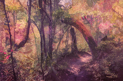
The image at top was taken at Ravine Gardens State Park in Palatka, Florida (with this rather steep trail that tried to kill me!) and was pretty much a basic shadowy shot. The images I took here have been hard to post-process due to the bright sun and blotchy effect on the bushes and flowers which were in bloom. Therefore this image seemed like a logical choice to try out this Gradient Map technique. Below is a Screenshot showing the original image with only LR settings applied and the Gradient Map and settings used to create the new color look in the top image. The Adjustment Layer was set to Color blend mode and 36% Layer Opacity. (Click on screenshot to see larger in Flicker.)

What the Gradient Map Dialog Box and Sliders Do
The Photoshop Wow Book (from years ago but still one of the best PS books around) is the only good source I could find on how the Gradient Map Dialog Box actually works so the following info is from this book. By checking the Add Transparency box, random transparency is provided – by checking this box “….will probably introduce more variability than you want to cope with” so instead use a layer mask after the Noise gradient is applied. The Noise Gradient ranges are set by moving the sliders on the Color Model bars which will determine the Outside limits of the colors that can appear in your gradient but the gradient will often include a much narrower range of colors. The Wow Book also provides the following definitions: Roughness: a higher amount makes more and sharper color bands and a lower amount has fewer bands and smoother transitions. Restrict Colors is checked so that the gradient will not include any colors too saturated to be printed with CMYK inks. To create a gradient of just gray colors, set the Color Model to HSB and set the Saturation all the way to the left – now only the Brightness tabs will have any effect on the image. I could not get a very good result doing this. The pretty Azalea below was also taken at Ravine Gardens in Palatka, Florida and is another example of this workflow.

Below are the settings used in the photo above – click on image to see larger in Flickr. The blend mode was still set to Color and the Layer Opacity was set to 55% – any higher opacity and the image becomes very yellow.

A different gradient was tried below. A screenshot shows more of a blue toned gradient applied. Used Color blend mode and 42% Layer Opacity. The image is not finished, but it does give a very different pretty result.

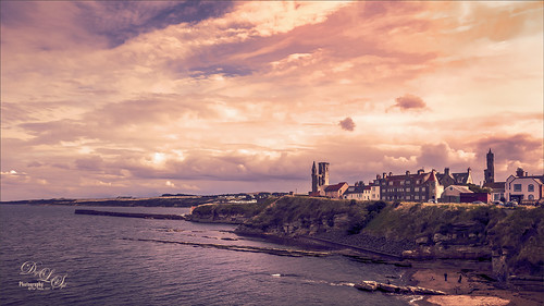
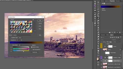
This last image of Old St. Andrews in Scotland is an example of combining the two types of Gradient Maps – the first was a Noise Gradient Map (see screenshot for how image looked before applying the Gradient Map Adjustment Layer – click on it to see settings more clearly in Flickr). On top a regular Solid Gradient Type instead of Noise was selected and Blake Rudis’s action and his gray gradient 19 set to Soft Light blend mode at 41% Layer Opacity was added. Blake has a really good video called Advanced Color Toning Made Easy and he gives away the action and 20 gradients so check it out. It’s a very handy action and I use it all the time! This combination seems to bring some very good results in the images. It is not a huge change but definitely an improvement.
Hope you will try this technique. It gives some really nice unusual looks and can really pull the colors of an image together for some needed pizzazz! I am having a lot of fun with it. Have a great week – Spring is almost here!…..Digital Lady Syd
Digital Lady Syd Related Blogs:
Digital Lady Syd Reviews Topaz ReStyle – from a while ago, but it is still relevant
Four Picture Triptych with Topaz ReStyle
How to Use a Topaz ReStyle Trick for Improving Your Image
How to Do a Black & White Gradient Map Conversion

Oooh! I love this – must try it out! (I have it bookmarked for reference.) Thanks for the great explanation. 🙂
03/17/2019 at 7:22 am
Pingback: » How Did This Happen? Digital Lady Syd's Tidbits Blog
I like the idea of using the gradient map to create randomized colours. Something I have never thought about.
03/22/2019 at 10:33 pm
Love Gradient map and use it when needed. Thank you for sharing, Syd!
03/25/2019 at 9:48 am