
ADDING TEXTURES TO WILDLIFE PHOTOS
 This has been a busy summer for me so my posts are a little sporadic. I have not used textures a lot recently but I did get a chance to look at Jai Johnson, a wonderful wildlife photographer, and her Artistry Beyond texture videos. (Of course all her textures are to die for, especially if you do any wildlife shooting.) This got me interested in trying it out again so I followed several of her tips to create both images in this blog. She does use an older Topaz interface – photoFXlab plugin (I agree with Jai – I still love this little program) – but her steps can easily be adapted to Photoshop and Topaz’s new program, Studio (for website link, check out the sidebar on my Tidbits Blog). I just finished watching her Episode 4 on Working with Harsh Light and found her tips very helpful since I photograph a lot in bright light. This beautiful little Rainbow Lorikeet (a type of Parakeet) lives at the Jacksonville Zoo in Florida. Since you are inside the actual bird exhibit, images can be taken quite easily although these birds do not stay still for long.
This image followed Jai’s Farmhouse Art concept (see her Episode 7 for more on this) which basically is a desaturated, simple, subdued and fresh appearance. I have not seen this look very often although I think it is very popular for home decorating. Usually the background is white-washed looking with neutral tones so that is what was done in this image. This image used 9 different textures (only 2 were from Jai) at different blend modes and opacities. It was surprising how nice the effect built up but it did take a lot of trial and error to get the effect. The created texture can be saved down using the combined textures as a jpg to use again on other images. Many of these textures had lots of color in them so they were desaturated using a clipped (ALT+click between layers) Hue/Saturation Adjustment Layer. Some textures were blurred to soften a little and layer masks were used on some to apply just in certain parts of the image. Also the bird had to be lightly desaturated by selecting it and using the Photoshop Camera Raw filter to soften it down. Using different blend modes at low opacities can really change how a texture applies itself. And do not forget those Blend If sliders in the Layer Style. Used all these tricks on the images. Also Nik Viveza 2 was used to help direct focus – still the best Photoshop plug-in out there!
I really like the font Blossom that was used in the word Rainbow and the Lorikeet font is Marcelle Script. A Dodge Brush set to Highlights at 30% Strength was used on a rasterized Rainbow text layer to add a tarnished effect to it. Still learning how to do this effectively, but it was fun to try.
*****
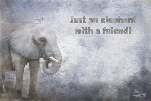 This elephant image was also taken at the Jacksonville Zoo. Similar steps as above were taken to get this effect. This time 5 different textures (these were all different kinds of textures, several I created using Painted and Photoshop) were used. One thing I learned from Jai is that if an area needs a certain color, light or texture, just load a texture that might work and hide the texture with an black layer mask. Then paint back the areas that will add the effect you want using a very low brush opacity. This was done several times on this image to get the darker and softer effect in the corners. The little bird is from a beautiful free set of watercolor birds by Anna Faun – he really looked good with the elephant. The font is called Candy Texture and I added a little smoke effect over it to soften the text.
If you are interested in learning more about how to get some great texture effects, I would recommend Jai’s videos. She has some really good techniques I have not seen anywhere else. I will probably be another week or so before updating again……Digital Lady Syd
Digital Lady Syd Related Blogs:
Digital Lady Syd’s Review of Topaz photoFXlab v1.1
Taking Off From the Rookery Runway
InstaTone in photoFXlabs – Great Fun and Great Results!
INTRODUCING THE FREE TOPAZ STUDIO
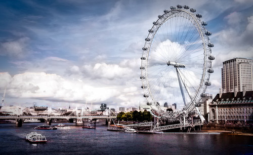 As you all know, I am a huge Topaz Labs fan so I have been busily figuring out what can be done with the new Topaz Studio. To link to the download, go to my Tidbits Blog sidebar which goes directly to the free download and other info on the different adjustments. I will keep this link going since Studio has it owns Topaz site. I am not ready to do a full review so I will just go over what I have learned and pass on a few thoughts. It appears to be a wonderful upgrade to their original Topaz photoFXlab from several years ago (and which I have always thought was one of their best releases). Studio acts as a hub for all the programs from Topaz you already own. It can be accessed as both a stand-alone program or as a plug-in for Photoshop and Lightroom. Studio is a basic RAW editor that contains several features similar to Lightroom or PS Camera Raw. JPG, TIFF, and PNG files may also be opened in the program. The heart of the editing lies in the various “adjustments” that are applied individually to create an overall original image effect. The London Eye image is an example of combining several of their adjustments to get the final image effect. (The Adjustments applied and saved in a preset are: Basic Adjustment, Precision Contrast, Radiance, Dehaze, Bloom and Posterize, then Reduce Noise and Vignette were applied on a separate layer.) There are also a myriad of presets on the left side that can be selected that contain several adjustments to apply in one click. This is very similar to the original photoFXlab. But now if a feature is not one you like, it can be deleted from the preset.
For starters, the program offers free adjustments to apply to your images. These 10 effects are: Basic Adjustments (similar to photoFXlab Adjustments section), Blurs, Brightness/Contrast, Color Overlay, Dual Tone, Film Grain, Image Layer, Posterize, Tone Curves, and Vignette. Sounds a bit like Lightroom or Camera Raw doesn’t it? If you do not own Photoshop or Lightroom or know someone who does not, this is a great way to process RAW files and it is free download. The program adjustments work from the top down as opposed to bottom up like Photoshop layers. The adjustments actually look like layers, but you are unable to apply them as a group of layers as in PS, but you can create your own presets to use the same settings over again.
 The Adjustment Pro Pack contains another 14 adjustments to apply more unique effects to the image. Each adjustment can be downloaded individually and tried out for 30 days before buying. Definitely take advantage of this trial period to see how you like what Topaz is doing with this program. The Pro Pack has some really handy effects such as: Abstraction, Black and White, Bloom, Color Theme, Dehaze, Edge Exposure, Focal Blue, HSL Color Tuning, Precision Control, Radiance, Reduce Noise, Sharpen, Smudge, and Texture. I like the Precision Control Adjustment which is a contrast adder and is a lot like Clarity with the miracle Micro slider and also a pretty nifty Color slider. It is too bad it is not in the original set as it is a really nice effect. Reduce Noise takes some really good info from the Topaz DeNoise program that is so fabulous. And in Sharpen, the Lens Deblurring section is very similar to their Infocus plug-in and works wonderfully. Each of these adjustments can be duplicated and applied more than once. I believe Topaz tried to take some of the best from each of their plug-ins to make editing an image must faster. The image above is of the Hillsboro Lighthouse in Broward County, Florida, and used the Recital 001 preset in Topaz Studio. The image below was used in the stand-alone version of Studio – used Topaz ReStyle plugin’s Rusted Gray and Light Blue preset and then the Basic Adjustment. Quite a different feel to this image that was taken on a very overcast day.
 One of the best parts of the program is their Masking features. If you own Topaz Texture Effects 2 or Topaz Impression, the brushes and masking is very similar – but with a difference. Now the mask can have more than one way to localize the effect. Therefore the Gradient and Spot masks can both be used on the same mask or also add in the Brush or Luminance Mask – very nice! This way the adjustment can be localized to just one small area of the image. And they are using their Edge Aware technology that I have loved for years. I am missing the Burning/Dodging, Saturation/Desaturation/ and Smoothing/Detail brushes from the photoFXlab and a few of their other plug-ins like Black and White effects, but hopefully they will be added soon.
If you want to just jump right in and start using the program, check out a short video called Topaz Studio Welcome and Walkthrough by Heath Robinson of Topaz. He goes over the program interface very thoroughly. But to learn a little more about how to use the actual adjustments, check the video Intro to Topaz Studio by Greg Rastami – he gives some great ideas on how to actually use the adjustments on all types of images – very helpful! I know Topaz Labs will be coming out with many more videos as they are pros at getting their fans up to speed on their products. There are also short videos on each adjustment in case you need more info on how to use it.
As stated above, you can still get into your regular Topaz plugins by going to the Menu Bar and selecting Plug-ins to further enhance the image. If you do apply a plug-in, it will duplicate the image in the Workspace at the bottom and now you have to finish adding effects onto the new one – there is not way to know what plug-in was applied by looking at the list in the left panel. I have had a few problems with this if I get too fancy and apply too many plug-ins. Just be aware of this. I know the Topaz group well enough to know that they are definitely working on this issue. The program is automatically updated when new versions are ready so no more downloading and executing new versions – that alone is a great new feature! Another drawback at the moment is that they do not have any tools for removing distractions like a Healing Brush Tool or Clone Stamp Tool – apparently this is going to be included in one of the next updates so watch for this. Below is a succulent plant that uses one of my presets called SJ Colorful Plant Effect that was uploaded to the community and can be found from the preset search section of the program.
 Considering that this is a free program and it is hugely complicated, Topaz has really done a fantastic job! It is lots of fun to fiddle around with all the different adjustments and try out other presets – I can see that they will be fine-tuning this program as it continues to grow and will be a real contender in the RAW field down the road. Lots to check out and some incredible effects can be created! I will be using the plug-in more in the future and try to keep everyone updated on all the new software additions. In the meantime I would suggest you download it and enjoy! ….Digital Lady Syd
Turning the Old into the New
 Recently I have read about several people who have gone back and revisited some of their images they took many years ago before all the new technology, especially the Camera Raw technology, was created. So in this blog I decided to give it a try. The image above was originally photographed in June of 2003 with my 2 mg Casio QV-2900 UX Digital Camera – my first digital camera. I love the new look of these timeless Tamora Roses, possibly my favorite flower ever – it was always so nice to see them growing in my yard in Virginia after a long day at work and they smell fabulous! For all the blog original images and info on how they were processed, see the bottom of the post.
…..
 I have been doing digital photography since 1998 when the Engineering Office I was working for decided to purchase a 1.3 mg Sony Digital Camera that saved images down onto a 3-inch disk. And this camera was expensive – I think it was over $600 when we bought it. That is when I learned to use Adobe Photo Deluxe, a precursor to Elements. I brought the camera home for a few family pix and I was hooked. The original image above was from my first batch of personal photos and was 40.7 KB in size! Not my favorite picture, but it was pretty cool to see what can be done with it now and a nice reminder of my salt water aquarium I used to maintain.
…..
 This is just a simple snow image of a small bridge on Royal Lake near my old home in Fairfax, Virginia, and taken using my Casio camera again in the winter of 2003 – I actually like the original as well but it was fun to see what the new plug-ins can do on an image. Glad I do not have to deal with the snow anymore! This little 2 mg camera took some great images and I really put it through it’s paces back then.
…..
 Just having fun with this beautiful yellow rose that also grew in my yard in Virginia. All the new textures that are available make it hard to choose a look! This was also taken with my old Casio.
…..
 This is what my backyard looked like in April with all these aged Azaleas in bloom – definitely looked like a fairy garden! I really miss Virginia in the Spring! Actually you can see below what the real color of these flowers are – still beautiful – like both images.
Here is a tych I created from last week’s blog (see Using a Tych Panel to Show Off Your Images of my original images. Quite a difference!

If you have some older images that you really loved but just did not have the total feel you wanted, try reopening them up in Photoshop and applying some of the new techniques, textures and filters. This turned out to be a lot of fun for this rather boring time of year. Enjoy!…..Digital Lady Syd
Processing steps for each image:
Image 1: These flowers are actually a tangerine color – yellow inside and pink tinge on the outside. In Lightroom the image was cropped, and Basic panel sliders were adjusted, then with an Adjustment Brush the center of the big flower was sharpened and clarity added just a little. Once in Photoshop the background was duplicated and Topaz (for website link see sidebar at my Tidbits Blog) Simplify 4’s Watercolor II preset was applied set to 90% layer opacity. A composite layer was created (CTRL+SHIFT+ALT+E) and a Selective Color Adjustment Layer was applied to make the flower more pink (Yellows: Yellow -52%; Greens: Cyan -19, Magenta +56, Yellow -2, and Black +7; and Neutrals: Cyan and Magenta 0, Yellow -16, and Black -10). Next Melissa Gallo Painted Textures Winter Wheat was added and set to Hard Light blend mode at 100% opacity. I discovered that 2 Lil’ Owls Bonus Texture 4 created a great painterly looking frame – I created a PNG file of just the frame by following the steps in my blog How To Make Frames or Borders – scroll down to the section called “To save the frame you created as an overlay to use again.” A very light pink Color Fill Adjustment Layer was clipped (ALT+ click between the layers). A Levels Adjustment Layer was added and the Output Levels changed to 33/255 to give a light hazy look to the image. In the layer mask, the main flower center was lightly painted in black to remove the haze. A Hue/Saturation Adjustment Layer was added to remove a bluish cast in the bottom of the image (Saturation -56 and Lightness +57).
Image 2: After applying a few Basic Panel changes in Lightroom and doing an OnOne (for website link see sidebar at my Tidbits Blog) Perfect Resize to change the image size to 6 inches X 4.5 inches from 2 inches X 1.5 inches, I could work on the image. To get the above result, Topaz DeNoise 3 was applied using their strongest JPEG preset and then adjusting the Overall slider to 0.27 and no Recover Detail. Topaz Detail 3 was applied using the Highlights Detail IV preset. Then I went into Topaz Simplify 4 and added the Painting Tone IV preset changing the Size to 0.18, Saturation to 1.83, Saturation Boost to 1.42 and Dynamics (my favorite slider in Topaz is in Simplify also) to .31. I was able to get a bit of a texture in the image by applying Kim Klassen Cafe‘s free Sunkissed texture (sign up for her newsletter to get lots of beautiful textures) with a Bevel and Emboss layer style added where Texture was checked – used my free SJ Smudge Texture as a texture (which is really a pattern) to the image at 100%, and in the Bevel & Emboss dialog, I unchecked the Global Light box, changed the Size to 0, Highlight Mode Opacity to 85% and the Shadow Mode Opacity to 69%. (To create a pattern from a texture, just open the texture up in Photoshop and go to Edit -> Define Pattern and it will appear at the bottom of your patterns list.) A light gray Color Fill Adjustment Layer was clipped (ALT+click between the layers to clip the color to layer) to the texture layer. To add the painterly frame, my free SJ Painter Oil Frame (that I created this week in Painter) was added and the same Layer Style was added (hold down ALT+drag the one on the texture to copy to the frame layer). A Curves Adjustment Layer was added and that was it. I think it really has a painterly feel.
Image 3: This image was cropped in Lightroom and in the Basic Panel the Clarity, Vibrance, Contrast, Shadows, Highlights, and Exposure sliders were adjusted along with the Sharpening slider. In Photoshop Topaz photoFXlabs was opened and Topaz Adjust’s French Countryside was applied. Back in photoFXlab the Adjustments tab, my favorite Dynamics slider was set to 48. My free SJ Snow 2 Overlay-slight blur was applied at 73% opacity. Next my free SJ Painter Oil Frame (see download link Image 2 info) was applied at 69% opacity. On top of that French Kiss Artiste Collections grayish Northern Skies texture was added and set to Vivid Light at 41% opacity. By putting the texture over the frame also, it gives the canvas feel to the white frame. A slight S-shaped curve was added using a Curves Adjustment Layer.
Image 4: Basically this image was sharpened using Topaz Detail 3 Feature Enhancement II preset; Nik Color Efex Pro 4‘s stacking Film Efex Vintage using filters Film Type 16 and the Opacity slider set to 0 – that is because a Control Point had been placed just on the yellow flower, Darken/Lighten Center, and White Neutralize with a green Color selected; and adding 2 Lil’s Owls (see my Tidbits Blog sidebar for website link) Workbook Bonus Texture 13 (this is a soft smooth pink texture) set to 76% opacity. A Hue/Saturation Adjustment Layer was clipped to the texture get the bluish tone for the background.
Image 5: To get this beautiful look, Nik Color Efex Pro 4’s Midnight filter set to Color Set Blue and White Neutralizer filter selecting a dark green color. Kim Klassen Cafe’s (see link in Image 2’s info) free unleashed texture was used, and once again I created a PNG following my Overlays blog steps (follow the steps in my blog How To Make Frames or Borders – scroll down to the section called “To save the frame you created as an overlay to use again”) and then clipped (ALT+click between the layers) a light gray Color Fill Adjustment Layer to it. That was it – really easy to do.
Image Tych: The background for the Tych was one from Kim Klassen free Texture Partings – I love the very soft subtle textures she creates!
Digital Lady Syd Related Blogs:
Digital Photography Has Come A Long Way
Take the Time to Experiment!
 Just had some fun experimenting this week and came up with these images. For the above I love the way the texture and color and abstract form compliment each other. I started out with a very over-exposed image of two pink grocery tulips – I was actually experimenting with my shutter settings on my camera when I shot this image. (See top image in photo below.) I do not know why I decided to use this image but it just looked so different – a few adjustments were made to the RAW file in Lightroom following my blog workflow in How to Use Adobe Camera Raw (ACR) or Lightroom 4 Quickly before opening it in Photoshop. (See bottom image in the photo below.) I wanted to try out some of my new watercolor brushes (here is a download link) I made in my How to Turn a Brush into a Watercolor Brush blog. Following this blog’s basic workflow the layer was duplicated and, instead of selecting the flowers, this top layer’s blend mode was set to Darken so the white disappears. On a New Layer set between the Background layer and duplicated layer, I selected SJ Watercolor Erodible 2 brush set to 250 pixels and a blue color where the watercolor background was painted in. A Solid Color Fill Adjustment Layer was clipped (ALT+click between the layers to clip) to the blue watercolor layer to change it to the purplish color. Since I only want to change the flowers, the top layer was highlighted and Topaz (see sidebar for website link at my Tidbits Blog) Simplify 4 plug-in was opened. The Oil Painted Tone I preset was applied as is. Back in Photoshop a Curves Adjustment Layer was added for a little more contrast to make the background stand out more. The center image below is where I was at in the workflow at this stage.
 I decided to try just one more thing so a composite layer was created (CTRL+ALT+SHIFT+E) of all layers. I opened up Topaz photoFXLab (this is the new Topaz interface to access the different plug-ins quickly) since I was not sure where I was going with the image. First I went into Topaz Adjust 5 and applied the Spicify preset – it looked great! I created a Stamped (same as a composite) layer in the plug-in and opened Topaz Lens Effects to see what a Fisheye effect would do – it did not look good so I started trying out the other lens effects. I ended up in the Lens-Split Prism section. After clicking on all the presets, I liked the Seven Way Split Prism with changes. (I changed the Mixing Level to .50, Radius to .42, Rotation to 83.76 and left at Type I.) Back in photoFXLab I created another stamped layer and in the Adjustments tab, the Saturation slider was set to -37 and my favorite Dynamics slider to +27. Another stamped layer and Topaz Simplify4 was opened where one of my old presets I call Factory HDR Look was applied. (The settings are Simplify section: YCbCr Colorspace, Simplify Size .52, Feature Boost 3, Details Strength 1.51, Details Boost 1.27, Details Size .62, Remove Small 0, and Remove Weak 0.16; Adjust section – Brightness .01, Contrast 1.07, Saturation 1.93, Saturation Boost .97, Dynamics 0, Structure 1.0, Structure Boost 1.00; Edges section – Edge Type MonoEdge – Fine, Edge Strength 4.47, Simplify Edge .39, Reduce Weak 7.78, Reduce Small 0.07, and Fatten Edge 4.11. In Finishing Touches section the Transparency was set to .53 – it made the flowers pop!) I decided this was enough photo manipulation. Back in Photoshop I wanted the tulips a different color than the actual reddish pink they were. A Hue/Saturation Adjustment Layer was used to turn them into the purple colors. (The settings were for Reds Hue to -97, Saturation to -38 and Lightness to +14; the Yellows Saturation was changed to -21; and the Greens Hue to -124 and Saturation to -29.) Totally changed the image. I used 2 Lil Owls (see my Tidbits Blog sidebar for website link) Texture 4 from their Texture Workshop E-Book bundle set to Darken blend mode to remove the white center to create a border, and then turned the frame color to white by clipping a white Color Fill Adjustment Layer to the texture (ALT+click between the layers to clip). A final Curves Adjustment Layer was added just to even out contrast.
…..
 This is another image that I had to really fiddle around with to get something interesting. I liked the different plants in the image – it was taken while in my car at a stop light outside a shopping center. The original image is seen below.
 I got the idea for the initial steps to this image from a very creative book I just purchased by Theresa Airey called Digital Photo Art New Directions. In it she uses a program called Akvis Sketch to create some effects on her images. With the new Topaz Simplify 4 Sketch section, it seemed reasonable to me that it could be used in the same way. It worked! This image started off using Topaz Adjust Mild Detail preset on a duplicate background layer. This layer was duplicated and Topaz Simplify 4 was opened to the Sketch section Hard Pencil II preset and adjustments were made to the preset. (All sections but Edges were turned off (here area the slider settings: MonoEdge Fine, Edge Strength 5.00, Simplify Edge .40, Reduce Weak .54, Reduce Small .52, and Flatten Edge 0). In Photoshop a composite layer of just the Topaz Adjust layer and the background (turn off the Simplify 4 layer by clicking on the eyeball in the Layers Panel) and highlight the two remaining layers – CTRL+ALT+SHIFT+E. On this layer Topaz Simplify 4 was applied again but this time the Pastel preset was used. (These settings were changed: Simplify Section – YCbCr, Simplify Size 0.27, Details Boost 1.00, Details Size .20, Remove Small 0.10, and Remove Weak 0.31; Adjust Section – Brightness 0.10, Contrast 1.48, Saturation 1.70, Saturation Boost 1.24 , Dynamics 0.36, Structure 3.33, and Structure Boost 0.67; Finishing Touches, turned on the Tone section – Tone Strength 0.46; and Local Adjustments – painted back the yellow flowers and a little of the pink and whitish leaves using a .37 opacity brush). This layer was placed below the sketched layer and set to 73% opacity.) The Sketch Layer should be placed above the Simplify Pastel preset layer, turned on, set to Multiply blend mode to get rid of the white area, and set to 73% opacity. A new Composite layer was created using all the layers. A clean up layer was added to get rid of distracting areas. I decided I needed to fill the lower center area so I copied the purple pansies in the center, warped them and changed flowers to pink. Next I used a program that I have always loved but do not use a lot – The Plugin Galaxy – which has this marvelous Mirror Effect plugin. It was set to Vertical Right – then you can drag in the interface by right clicking and dragging to get very different results. I dragged all the way left for my final image above, but below is a screen shot dragging almost all the way right.
 Since I wanted the pink hyacinth back in the image, I added a layer mask to the mirrored layer and used a black brush to paint back the pink flower and the side. A PNG filter similar to my SJ PNG Borders was added and a Gradient Overlay using the Pastel Grunge gradient (free from Graphix1 A White Shade of Pale Gradients set) at 130% scale at -112 degrees was added to create the pink to green frame effect. It took a while to do but the results are very nice and interesting.
Digital Lady Syd’s Rule No. 1: Take the time to Experiment! – Definitely paid off in this instance. Hope the workflow did not put you to sleep but I wanted to show how you can create some very interesting effects by just experimenting a little. In both cases Topaz Simplify 4 was applied twice using different presets for each image. Really liked the final results and they are something unique and truly mine!…..Digital Lady Syd
Digital Lady Syd Related Blogs:
Digital Lady Syd’s Review of Topaz photoFXlab v1.1
Instant Mirror and Quick Mirror for Photoshop
Digital Lady Syd Reviews Topaz Simplify 4
 As everybody probably knows by now, I am a big fan of Topaz plug-ins (see my Tidbits Blog sidebar for website link). If you like to create “photo art” (which I do), then many of their products are outstanding for this and Simplify leads the group. This is not the go-to plug-in to get that major realistic look or HDR feel to an image – stick to Topaz Adjust for that, although the lighthouse image below has a pretty realistic look to it. This beautiful Monarch butterfly image really expresses what Topaz Simplify 4 can do. You do not have to be an artist to give a beautiful artistic feel to an image. This latest version has opened up a whole bunch of new options and I am totally excited about trying them all out. Simplify 3 was a great product and I used it a lot. Simplify 4 adds more of the little extras that Topaz’s newer plug-in updates offer. But the real strength is in the addition of all the new presets – Topaz can make a basic photo look fabulous with just a few clicks. The image above used the Sketch Effect category Pastel II preset. Since I have photoFXlab (the new Topaz interface) that contains a great Adjust Tab – the Temperature slider was set to -100 and all of the sudden instead of a green and yellow image, which was really nice, it became a much bluer image. (This could easily be changed later in just Photoshop using ACR or a Color Balance Adjustment Layer.) Using the photoFXlab Mask Tab, the orange color was painted back in the butterfly – I really like the blue-orange color palette. In Photoshop the canvas looking border was applied using ShadowHouse Creations Assorted Mask Overlay Mask04 on top and set to Linear Dodge at 100% opacity. A little clean up was done to emphasize the eyes and blend some over bright colors. Very beautiful result and very easily created.
….. What I really love about Simplify is that it can save a “soft” image – that one shot you really want to save but the image is just not that good. The image above is an example of just that kind of problem. This shot was taken from a moving train using an ISO of 2000 – pretty high for my camera and it created a pretty soft look. How did I get this sharp look? First I used DeNoise set to RAW Moderate (be sure you have sharpening turned off in ACR or Lightroom – I did not on the first pass and it really messed up the noise removal). Next Topaz photoFXlab was opened and the layer duplicated – then from the Plugins Tab, Simplify 4 was opened. Lots of choices here – hard to make a decision which effect looks best. The Painting Effect category’s Impressions Color preset was selected – all detail is lost but the color is great! Back in photoFXlab, the layer was set to Color blend mode and the colors just popped as you see above. If you do not like the result, just delete your layer, duplicate again and go back into Simplify. A +From Stack stamped layer was created and the Adjust Tab’s sliders were set to: Temp 15, Saturation 14, Exposure 15, Contrast -12 and Dynamics 92. The Desaturation Brush was set to Strength -0.21 to brush out the bluish pavement and turn it back to a gray tone. The Detail brush was set to Strength 0.79 and used to paint over the buildings and the Burn brush Strength set to -0.33 and used to make the center building less bright. In Photoshop ShadowHouse Creations Blurred Smoke texture was added (a layer mask was added and the center painted out with black brush to reveal the image) and my B&W Border Frame layer style was added. I loved the results!
So what is new? Over 100 new presets that are organized into 7 Effect Categories: BuzSim, Detail Removal and Enhancement, Line and Ink, Painting, Sketch, Simplify 3 Preset List and My Collection which is where I save most of the presets I create (I put my old ones from Simplify 3 here also). I have not completely explored all the categories but I am loving the Painting Effects.

Here is a snapshot of a the new Simplify 4 interface. The Preset Thumbnail View is closed at upper left to show all the new Painting Effects presets. The image in the plug-in is shown at 1:1 (this is the recommended view by Topaz so you can actually see what the effect is doing) and has the Oil Painting preset applied with some slider changes in the Adjust Panel. It now contains not only my favorite Topaz slider, Dynamics for localized contrast similar to Topaz Adjust effects, but also Structure and Structure Boost sliders to get more detail like Topaz Detail uses. The Saturation and Saturation Boost sliders made this image a little more colorful than the original preset results (this is a common result with the Oil Painting preset) – these sliders were already in Simplify 3. You could play all day with the effects and sliders! The Simplify Panel and Edges Panel have not been changed with this revision but a new Curves Tool has been added to the Global Adjustments Panel with several choices in the drop-down Curves field or by just dragging with your cursor inside the grid. I usually do this step at the end of my workflow in Photoshop, but it might come in handy on a difficult image.
What I Like!
- All the new presets and new painterly effects!
- New Dynamics and Structure sliders. Fabulous addition!
- Localized brushes where the effect can be brushed out in places where it is too much – contains Dodge, Burn, Brush Out and Smooth brushes with the fantastic Edge Aware technology.
- Ability to add a Vignette from within Simplify.
- Ability to Apply an effect and then apply another one before exiting plug-in. This has the potential to give some interesting results.
- The addition of the Quad Tones to change the colors inside the program – learning curve here but could be quite useful!
- Detail Removal and Enhancement Effect category may have some good uses with some experimentation.
What I Don’t Like!
- Still have a little webbing problem when using the BuzSim presets. Usually on a separate layer in Photoshop the webbing color issue can be corrected. First try the various Simplify panel sliders to fix, especially the Simplify Size slider – just do not overdo adjusting this slider or you lose the painterly look.
- No Detail Enhancer brush in the Local Adjustments section – would be nice to have the ability to bring back detail, not just brush it out, on certain parts of the image like eyes and floral centers.
- Ability to save Quad Tones colors down as separate presets although I guess if you get a favorite color combination, it could be saved as a preset with no change to any of the other sections – then applied separately after applying the original preset. It seems a little cumbersome this way.
- Would love to have a color change tab like the HSL tab in Camera Raw. It would be nice to isolate just one color to change.
I have to admit, the things I do not like are not that big a deal – this is a great program for making an artistic statement and is totally fun to use! The upgrade has made this a very versatile plug-in for Photoshop users. And for us Topaz fans who already owned Simplify 3, it was a free upgrade! Can’t beat that!
….. Okay – here is my problem. Now that Topaz has this new photoFXlab interface, it is hard to keep what you are doing in the individual plug-ins separate from other things you can do to an image in the interface. That is a good thing! The Palamedes Swallowtail butterfly image above used the new Line and Ink Effect category with the Cartoon by D. Pacheco preset. The image does not look like it did in Simplify 4 because it was taken into InstaTone and the tones from Yellow Flower by Richard Susanto at 500 px were applied. This changed the whole color scheme to a better one.
…..
 The British scene above used one of the new BuzSim category presets – BuzSim Toned II. I did add an Overall Transparency of .34 to the image to bring back some of the natural colors in the image. In photoFXlab, the Dynamics slider was set to 76 and Contrast to -9 to pop the detail just a little. This image was taken back into Photoshop where a layer was added on top to clone in the correct color in the Coca-Cola lettering – just a slight webbing problem that was easy to fix in this case. The red awning was made brighter by using a Color Balance Adjustment Layer and setting only the Highlights to Red at +27 – the mask was filled with black and the awning was painted back in. The color was too bright so I set it to 57% opacity.
….. 
The beautiful purple orchids that were growing in Hawaii also uses Topaz Simplify 4 and the Painting category’s Watercolor preset. In this case I decided I wanted to actually paint the flowers and needed a really strong color background to base my Mixer Brush blending on. The Temperature slider was adjusted to reduce the blue tones just a little and the saturation was increased only a little to get finish the colors in Topaz photoFXlab. Many experts believe the Saturation sliders in Topaz plug-ins are superior to the ones in ACR and Photoshop. Back in Photoshop I used Fay Sirkis‘ Signature Watercolor Smooth Blender brush (you must be a member of NAPP to get these brushes – check out her videos there) to paint the flowers – the layers were set to around 73% so some of the Simplify detail is preserved. Fay’s Texture Regular brush was used to smooth out the background area and basic blender brush was used to smooth the transition edges of the flower. A final Curves Adjustment Layer added back a little contrast the Mixer brushes tend to delete and my Double Edged Frame layer style were added.
…..
Another interesting preset category, Detail Removal and Enhancement, is included to help with actual dust removal in an image. On the image in the interface, there were little water drops on the long skinny leaves. When Spot Removal IV was applied, you can hardly see them in the original image. Rather amazing! It can be used on faces with blemishes. Using a layer mask in Photoshop or photoFXlab, move the corrected layer underneath the original with the blemishes – then just dab at the blemishes and they disappear. I need to experiment with this section but it looks like it has great promise. BuzSim has always been one of my favorite presets ever since Amphisoft came out with the the original Buzz Simplifier filter (see my blog Simplifier and Simplify Filters). Topaz did a great job in picking up this rudimentary filter and making it into a great filter. Now you have many choices to get this wonderful look.
Bottom Line:
If you want to add some beautiful effects to your images, get Simplify 4. It is easy to use and can be changed by using all the different adjustments layers and blend modes in Photoshop and Topaz photoFXlab. Even beginners will be able to feel great about their results. For more information on using this new version, see Topaz Labs video Introduction to the New Topaz Simplify 4 that explains everything about the plug-in. You may not use it on every image but when you do use it, it will create an effect that is very hard to duplicate with any other plug-ins on the market. At least download a trial and see what you think. Good job Topaz!…..Digital Lady Syd
Digital Lady Syd Related Blogs:
Digital Lady Syd’s Review of Topaz photoFXlab v1.1
Using Topaz Simplify for That Artistic Feel!
Using photoFXlab v1.1
InstaTone in photoFXlabs – Great Fun and Great Results!
Topaz Simplify and Topaz Detail Together
Topaz Simplify and Lens Effects Saves an Image!
Adobe Photoshop CS5′s Mixer Brushes
My Version of Photoshop Tennis!
I really love taking photos but I am slowly realizing that once in Photoshop, I end up with something entirely different than what I had in mind! There is an older book, Photoshop Secrets of the Pros by Mark Clarkson, where players “pass images back and forth making changes as they go” for a set number of rounds, ie., Photoshop Tennis. This book first got me thinking about doing radically different effects to images. Last week I did a blog on Digital Lady Syd’s Photo Art Workflow where I basically showed what I do to give a different feel to an image. This week I am continuing with that theme showing other options to get more of that photo art look. The images are also examples of what happens when I start playing around with different combinations of effects in Photoshop – I am never quite sure what I will end up with. I also downloaded and tried Photomatix Pro’s new program Merge to 32-bit HDR this week so that was part of the first two images’ workflow.  This image of the Ormond Heritage Condominiums (located where the old Hotel Ormond used to reside in Ormond Beach, Florida) was first processed as a five-image HDR shot using Merge to 32-bit HDR. The really neat thing is that if you already own Photomatix HDR Pro 4.2 and Lightroom 4.2, you can download it for free from the link above. All you do is select all the HDR images in Lightroom, go to File -> Export and select Merge to 32-bit HDR (or just right click and go down to Export and select the program). A dialog opens where I chose the following: Preprocessing and Merging (Align Images, Crop aligned result,by matching features, and include perspective correction) and Remove ghosts; and Name Merged File: Combined file names and check Stack with first selected photo and Scale pixel values to fixed range. The images are processed very quickly and a TIFF file is placed back with the original images, just as if you had done this in Photoshop’s Merge to HDR, except Photomatix never opens up a program – it all happens inside Lightroom. What a cool little program from Photomatix! The above image was mainly processed in Topaz photoFXlab (see sidebar for website at my Tidbits Blog) plug-in using Topaz Adjust presets. See Image 1 settings below for more info.
 When adjusting the crop on the top image in Lightroom, I got a quick look at what a small crop would look like. Basically I just liked the way it looked – the frosted light of the lamp post and the comfortable porch balconies make you want to sit outside and enjoy the view and weather. The only thing done on this image in Photoshop was using Nik Color Efex Pro 4 and stacking a bunch of filters: High Key, Sunlight, Detail Extractor, Dark Contrasts, Bi-Color Filters and Image Borders. It just works!
……
 This image was also processed in Lightroom using PhotoMatix Pro’s Merge to 32-bit HDR. I then did my adjustments on the resulting TIFF file in Lightroom. In Photoshop I decided right away to use the new Topaz photoFXlab program where Topaz Simplify and Topaz Lens Effects were used from the Plugins tab. See settings for Image 3 for the exact info on how this was applied.
 Here is the same image with exactly the same settings as in the image above except for the framing, but the twist is that a Hue/Saturation Adjustment Layer was clipped to the Vivid Light texture and set to a Difference blend mode at 71% opacity. I loved the way it looks like as if it is being drenched in some bright light – almost a spooky feeling. I am glad I did not stop with just the image created above as I think I like this one better – there may be more of a story in this image.
……
The next two images show an example of starting with a night photo taken with my point-and-shoot camera at the Gold Lion Cafe in Flagler Beach, Florida, and turning it into a really interesting almost wintery looking sketch. I did not exactly plan this result. The night image is definitely what it looked like that night as I sat topside and listened to the ocean waves rolling in. But I really like the final image with the artistic pop added.

Here is the image with a more photo art feel.

Both images took a lot of manipulation but the second one used the Layer Styles dialog to get the beautiful color out of it. See Image 6 settings below to see how this was done.
As you can see, if you stick to the basic workflow, which all these images did, but add in that new tool or different feature (like the Layer Style Blend If sliders or the new Lookup Adjustment Layer or a unique crop or blend mode combinations), you can get some very different and interesting images and end up in a totally different spot. As always, every time I work on images, it is always completely consuming and lots of fun – otherwise, why do it? Tennis anyone?…..Digital Lady Syd
Settings:
Settings for Image 1: Once the Tiff image is taken into Photoshop after making Lightroom adjustments, the background layer was duplicated Topaz photoFXlab plug-in was opened. After duplicating the layer, the Mask tab was selected and the plain sky was deleted. A new cloud image was load using +From File and placed under the top layer. A stamped layer was created using +From Stack and Topaz Adjust was opened up and Photo Pop preset was applied. In the Brushes tab, detail was increased throughout the image. PhotoFXlab was exited. The background was duplicated again and put on top in Photoshop. This layer was taken into Topaz photoFXlab again and Topaz Adjust’s preset Painting Venice was applied. Back in Photoshop a black layer mask was added and the bright areas of the image were painted in to add depth to the trees in the image. ShadowHouse Creations You’d Be Surprised texture was applied using Overlay blend mode at 34% opacity. Finally a Curves Adjustment layer was added. My frame layer style (see DLS Free Layer Style Frames) was added sampling colors from the image.
Settings for Image 3: Duplicated layer in plug-in. In Adjustments tab used these settings: Temp -4, Tint 23, Sat -12, Exp 1.80, Contrast -8, Dynamics 49, Sharpness 51, and Shadows 22. In InstaTone tab image from 500 px of an orange leaf from Aliona Shewtsova and set the layer to Saturation blend mode at 74%, which really brought out the colors. Next a +From Stack stamped layer was created. In Plugins tab Topaz Simplify was opened and the BuzzSim preset was applied as is. In the Adjustments Tab these settings were used: Temp -17, Contrast -5, Dynamics 87, and Sharpness 3. Layer opacity was set to 83%. Stamped using +From Stack. Plugins Tab used Lens Effects and applied Vignette Selective section-Soft Olive Green preset with these settings: Center on right side of slide, Vignette Strength 0.21, and Opacity 50%. Exit plug in. Exit Topaz photoFXlab. Flypaper Apple Blush taster texture was applied using Vivid Light blend mode at 100% opacity. A Curves Adjustment Layer was applied with the individual channels being adjusted to bring out the colors I wanted. My thin double edges layer style was applied (see DLS Free Layer Style Frames).
Settings for Image 5: After basic color adjustment in Lightroom (just a single shot), this image was opened in Photoshop CS6 and Nik Color Efex Pro 4 plug-in was opened. These filters were stacked: Midnight using Neutral Color Set set to 65% Overall Transparency; Bi-Color Filters using the #1 Color Set; and Photo Stylizer using Cool Silver, Style 1, Strength 38% and Overall Opacity 61%. Back in Photoshop Sarah Gardner’s Blush Ginger texture was added and set to Overlay blend mode. The new Lighting Effects Filter in CS6 was used to add some soft light to the center lantern lights – the Spotlight effect was used at an Intensity of 7 and Ambience of 60. A Color Lookup Adjustment Layer set to Abstract and Gold-Blue and the layer was set to a Screen blend mode at 64%. OnOne PhotoFrame (see sidebar for website at my Tidbits Blog) Emulsion 02 was added sampling a dark color from the image for the color.
Settings for Image 6: After applying the same Color Efex Pro filters as Image 5, the image was opened up into Topaz Simplify and a Sketch preset I had previously created was applied so that the lines looked pretty much like a black and white sketch. (To create, use Mode Edges; Colorspace RGB and all sliders in Simplify section – set all to 0.00 except Details Boost 1.00, Remove Size 0.08, and Remove Weak 0.10; Adjust section – Brightness 0.00, Contrast 0.73, Saturation 1.40, and Saturation Boost 1.92; and Edges – MonoEdge Normal, Edge Strength 5.00, Simplify Edge 0.22, Reduce Weak 0, Reduce Small 0, and Flatten Edge 2.28. To adjust the sketch detail and darkness, adjust the Simplify Edge slider.) Now here is the tricky part – a Layer Style was added by double clicking on the layer and in the Blending Options dialog, the Blend If section is used. On This Layer, the black tab was split by ALT + clicking on the tab the split tabs set to 0 and 164 – the white tab was left at 255. On Underlying Layer, the White Tab was split and set to 0 and 72 and the Black Tab left at 0. It looks really weird but it gave me the color effect I liked. This layer was set to Lighten at 100% opacity. A composite layer was created (CTRL+SHIFT+ALT+E) and using Select -> Color Range, the white was selected. CTRL+Backspace to delete the white from the image. Two layers were created underneath the top layer and using Best Mcbad Watercolor Brushes 22 and 30, a watercolor sky was created using blue and light pink. A Hue/Saturation Adjustment Layer was added to increase the saturation in the Yellows. A Curves Adjustment Layer was added to increase contrast. This image used different settings for the Lighting Filter – Intensity 5 and Ambience 93 – only wanted a slight glow since it is daylight. Some clean up was done. My Layer Style (see DLS Free Layer Style Frames) was added to frame the image and that was it! Whew!
Digital Lady Syd’s Photo Art Workflow

I am constantly amazed at how some of my images turn out – not at all what I had expected. This week I am going to go through my photo art workflow step-by-step so you can see what a difference a little tweaking will do. One of my favorite image types to play with in Photoshop are shots of art works. It is a nice break from cleaning up photos of family and large travel landscapes and gives me the opportunity to be creative. This image is of a type of art I had never heard of before that is on display at my favorite local museum – the Lightner Museum in St. Augustine, Florida. These are examples of Victorian era cigar band art. The Photoshop-processed image above is my final photo art result and the one I liked the best, but there were several other choices I considered.
NOTE: If you want to see the settings used for any of the steps, just click on the image and the larger Flickr image will appear.
- Here is the initial image as a RAW NEF file. The dishes were enclosed in a glass case and the camera settings were a 44-mm lens at F/4.8, 1/8 sec, and ISO 1250. There is a lot of light glare on the pieces. This image is not one I would normally choose to process, but I just loved the composition of the items and the colors in the cigar bands.

- My next step was to create a Virtual Copy in Lightroom (this does not have to be done if using Adobe Camera Raw in Photoshop) to try to clean up the tone a little before going into Photoshop. Since only a few changes were done here, it does not look much different. First I go to the Lens Correction section and select the Profile tab where I set my lens info, and then the Color tab where I check Remove Chromatic Aberration (this can save a lot of time later). The next step would be to adjust the Crop of the image if it needs it – in this case it did not. Now adjust the Basic sliders. Also check out the noise in the image and try to correct if needed. Next I right click on the image in Lightroom and select “Edit In -> Edit in Adobe Photoshop CS6” which now opens up Photoshop, if it is not already open, with your image.

- I am a big fan of combining my plug-ins until I get just the effect I like. If I do not like what results, I just delete that layer and try again. I always duplicate the background first so I know what the image looked like to start. On a really difficult image, which I considered this one to be, I usually will first open up Nik Color Efex Pro 4 – they have so many filters, you can sometimes get a great look right away. Shown below are stacked filters Tonal Contrast, which I believe is one of the best filters in this plug-in; Pro Contrast, which is one of my personal favorites, and works wonders on many of the images I have processed; and Brilliance/Warmth, one of the most popular Color Efex filters – just adds a really soft warmth to an image. Usually I like the Detail Extractor, but it really looked bad on this image due to all the glare on the items. Note that before entering the plug-in, I created a Smart Object (right click on your duplicated layer in Layer Panel and select Convert to Smart Object in menu) as Nik plug-ins work very well with Smart Objects. It allows you to go back into the plug-in and all settings and control points will still be in place so they can be readjusted easily.


- Since there is so much glare in this image, there is only one plug-in I know of that does a good job controlling it and that is my most used plug-in, Nik Viveza 2. It will almost always improve if not remove problem areas on an image. You can see I have added 10 control points on the glare areas (click on image to see the little round circles more clearly in Flickr) to try to even out the tone. By comparing to the above, it is not perfect, but what a difference it makes! The detail and saturation of the image is also much improved. (See my blog Nik’s Viveza 2 Plug-In – A Hidden Gem!)

- Still have issues where the glare is – it needs to be cleaned up and the pink removed since it draws your eye into the left corner and it is distorted by the glare. The Color Replacement Tool was used to turn the pink color turquoise (see settings used in Options Bar in photo and turquoise foreground color in swatch) and some cloning was done on the dish to even out the pattern where the glare blows out the detail. A Hue/Saturation Adjustment Layer was used to get rid of another pink hot spot. I usually try to work completely non-destructively (meaning the original image was not changed by any of the adjustments made on the layers above), but the Color Replacement Tool is destructive and changes are made on the image itself – the Hue/Saturation Adjustment Layer may have been a better choice for this problem area.

- I always add or at least try to add a Curves Adjustment Layer to adjust the contrast towards the end of my workflow. Since I thought I was almost done, it seemed appropriate to add it now. Below is what my curve looked like for this image. I usually just drag the Hand Tool (located in the upper lefthand corner of the panel) in the image to get this correct. It usually is just a subtle change but very significant. In this case I only wanted to brighten up the plate and mug where the color was located, not enhance where the glare was. The Curves Adjustment layer mask was turned black by clicking on the mask and CTRL+I to invert the color from white to black. Then a soft 30% opacity brush was set to white and used to gently paint back the areas where the I wanted additional contrast and color. This was a good point to create a composite layer that combines all the layers below into one on top by clicking (CTRL+ALT+SHIFT+E) – this helps when the number of layers gets large as some techniques need a single layer to work correctly – this can especially be a problem with the Clone Tool.

- At this point I thought I was getting the image to a final look. I decided I wanted sort of a vintage type edge on the image, so I used one of my very favorite textures, ShadowHouse Creations Old Photo 6. After trying several blend modes, I selected the Exclusion blend mode (which I do not use that much but worked in this case) set to 53% opacity. Still not sure it was quite what I wanted so I decided to add one of his new Assorted Mask Overlay (08) and set it to Soft Light blend mode at 100% opacity. Basically just the beautiful edges were used on both layers, and the image center was mainly painted out using black in the layer masks to keep the basic image intact. I often use the free Russell Brown Paper Texture Panel to try out and stack the various textures (the green square at the top of the icons to the left of the panels opens it up).


- I must be done???? But then I thought, I wonder what happens if I take this image into the new Topaz photoFXlab (see sidebar for website in my Tidibits Blog). Well that proved to be a problem because I started finding all kinds of new effects I liked on this cleaned up image. The settings below were applied as a first step to the bottom layer for all the different Topaz effects tried on this image.

- I duplicated the bottom layer in the plug-in and applied from the Effects tab a preset called Lithography by H. Hurst (Topaz used the preset from Topaz Detail) and set the layer to 65% opacity. In the Adjustment tab, the Saturation slider was set to 20. The Dodge Brush was used from the Brush tab to whiten around the pupil of the eyes of the girl on the plate using a brush strength of .10. Next the lips were slightly reddened using the Saturation brush. It was saved in the new Topaz extension .pfxl so the settings could be readjusted at a later date if needed. Clicked OK and applied to it to the image in Photoshop. At this point I did create a note to remind myself exactly what I did in the plug-in since I am still learning about the new extension. The image that resulted is shown below.

- To be honest, I just didn’t love the final result so I decided to delete the layer where I applied the photoFXlab plug-in and start over in this plug-in. This time I decided to try out the results using the Plug-in tab and selected Topaz Adjust 5. Here I tried out one of my favorite presets I created from the French Countryside preset in the Vibrant Collection. It looked nice and more like what I wanted. I use this preset a lot when I want a nice artistic feel.

- I decided to try one more preset just to see if I liked it and sure enough, it is the one I selected. It is in the Stylized Collection and is called Painting-Venice. I added several settings in the Finishing Touches section: Transparency – Overall Transparency slider to .7, Color – Warmth 0.03, and Tone – Quad Settings as shown on the image – the correct colors should be set already. Once out of the Adjust plug-in, in the Adjustment tab Exposure was set to 0.38, Contrast to -3 and Dynamics 24.

Well this is a good example of my workflow for a photo art image. I could have used OnOne Software’s wonderful Perfect Effects (see sidebar for website at my Tidbits Blog), or any of the other plug-ins offered by Topaz, but it just depends on what I think will work. Overall the main components are 1) process as discussed above in Lightroom, 2) take into Photoshop and do any clean up, 3) add plug-in effects, 4) add any textures if you want, 5) I always go to Viveza 2 now, 6) do any extra sharpening or noise reduction that might be required, 7) add a Curves Adjustment layer for final tone and contrast, and 8) add any framing. I hope you can see that even though a change is very small, it can be very significant to the photo, and that you can always change your mind. An image can take on such a different feel with different plug-ins and textures applied. I thought originally I wanted a very sharp almost HDR look for this image, but I ended up with a very bright painterly result. I am happy with it but it is not exactly what I had in mind when I started! …..Digital Lady Syd
Using Topaz photoFXlab to Replace Skies
Now that the latest version of photoFXlab (see my Tidbits Blog sidebar for website link) has been released for several weeks, I have had a little time to come to grips with how to use the program and integrate it into my workflow. I have been surprised by how often I am using the Masking Brush to add new skies to my landscape images.

The above depicts a really cool private bar on the beach on one of the more remote roads in Marsh Harbour in the Bahamas. I had the fortune of sailing there a couple years ago and am revisiting some of the images I did not process. It is so clear for starters because I converted it to a 32-bit HDR image in Photoshop CS6’s Merge to HDR and then processed the resulting TIFF file in Lightroom. (See my blog New Lightroom and Photoshop 32-bit Processing Capability for info on how to do this). So many of my images from Marsh Harbour had no clouds in them – so I added a few in the background for effect. Now that I am getting familiar with the Edge Aware Masking Brush in photoFXlab, it is turning out to be one of my favorite selection tools.
These are the basic steps to replace a sky and it is very simple:
1. Once inside the plug-in, duplicate the bottom layer (always do this when using photoFXlab – it can save you from a lot of problems in the long run.)
2. Go to +From File button and select a cloud image you like – watch out for the way the sun is lighting up the clouds. If you took the original image in the middle of the day, use a cloud image from a similar time of day. Also be sure it is a jpeg or a psd file (it will flatten the layers when it comes in) – photoFXlab does not open up camera raw files. I took a NEF file I liked and saved it down as a jpg in Photoshop – pretty easy.
3. Use the Tools tab in photoFXlab to Scale, Move or Rotate (or flip) the cloud layer to fit the area you want to fill – line up the part of the image you like, even if the edges go outside the original image size.
4. Move this layer underneath the duplicated image layer.
5. Now the magic starts! Select the Masks tab and create a fairly small size brush setting the Strength to 0 (creates a black line on the mask so you see through to layer underneath), Hardness around .20 (shows a fairly large feather size – set to 1 it has no feather), Flow 1.00 (if you make this .5, you only get a gray or 50% black color and it is hard to keep the tone the same), and Edge Aware 1.00 (set to 0 it will detect no edges). Start painting on the mask – make sure the crosshairs or inner circle of the brush do not enter into any part of the image you want to keep. Let the feather area of the brush slip over other areas so edges between image layers will be sharp. Zoom in if you need to get the details. Paint around the horizon edges first, and then fill in the background with a larger brush size and Edge Aware set to 0. Voila – there is your new sky.
What is really neat is that even if your little edges disappear – like the coat hangars and chain in the above image, the details can sometimes be brought back by lowering the opacity of your cloud image just a little – in this case I set it to 54% since I did not want the clouds being the major center of attention. Just be careful around the horizon lines – set the Strength to 255 (white) to clean up areas that you painted over – it actually acts like an eraser.
The +From Stack button was clicked to create a Stamped or Composite layer on top. In the Adjustments tab the Saturation was set to 23, Contrast to -23, Dynamics to 51, Highlights to -21, and Shadows to -4. The image was brought back into Photoshop where a Curves Adjustment Layer was added for additional contrast and that was it.
This is so much faster than using the Photoshop selection tools or any of the masking plug-ins, but it really works best on skies. I believe other programs should be used when you have a more complicated selection. Still, this is one of the major things I need it for and it works great!
…..
I listened to Topaz Webinar A Closer Look at Edge-Aware Brushes with Nicole Paschal, who does a great job creating interesting and useful webinars that highlight all the Topaz products and how they work together. You can type in questions in an interactive way with both the staff and Nicole as she is presenting the webinar – very informative. Several webinar tips are listed below along with a few of mine:
- If you find that you are not getting a good distinct line between the items you are trying to select, change the brush size down to a smaller size – it will give you a better result as large brushes do not recognize edges as well. The Edge-Aware technology is based upon the color under the crosshair so this gives a smaller and more accurate sample.
- Can either brush or click to fill area. Usually the first pass of brushing will leave little areas not covered completely or with a little haloing, but if you brush back over it , they disappear. Nichole finds that it is easier for her to just click several times as she moves through the area of the image instead of actually brushing.
- Make sure your inner circle is not touching any color you do not want selected.
- Set the Brush Strength to 255 to paint back in areas that you accidentally covered up when painting on the mask. If you set the Strength to 125, the area allows 50% of the layer below to show through, as done in the last image below.
- Probably best to create another +From Stack layer if you want to add some of the Brushes effects to an image. Nicole says she likes to do just one major brush effect to each layer at a time. There is then more flexibility in adjusting opacity and changing blend mode for each change done.

If you look closely, you can tell this Marsh Harbour image used the same cloud image, this time at full strength. The same workflow was used to get the clouds in the image. Normally at this point the Adjustments tab and the Dynamics slider would have been used, but it just did not give me the look I wanted. Therefore Nik Color Efex Pro 4 was selected with these filters stacked: Detail Extractor with control points removing it from the sky, Darken/Lighten Center which gives the slight vignette effect, and Pro Contrast using the Dynamic Contrast slider which I do not always like. Nik Viveza 2 was also used to add detail into the water and sharpen the stones a little. Sometimes you have use more than one plug-in to get the right effect, but the sky still looks great using the Masks tab.
…..

This beautiful Lion’s Face is atop a tower on Flagler College (the old Ponce de Leon Hotel) in St. Augustine, Florida. They are all over the campus and city. These slightly different steps were followed: The Adjustments tab settings were: Saturation set to 2, Contrast -37 and Dynamics +96. From the +From File, Shadowhouse Creations Marshmellow Skies was opened, then scaled and rotated in the Tools tab so it was on a diagonal to fill out the sky area. A Stamp layer was created by clicking the +From Stack button, and in the Effects tab the Black and White Effect preset called Opalotype-Hand Tinted Cream preset was applied. This layer was set to Lighten Blend Mode at 100% Opacity. In the Masks tab again, the middle of image was painted out using a large brush set to a Brush Value of 145 (middle gray) so it just clears the effect from the lion’s face a little. Back in Photoshop my layer style frame was used (see DLS Free Layer Style Frames blog).
Pretty easy and fast to replace a sky in this new program from Topaz. If you have some of their products already, download the photoFXlab trial and see what you think – I personally like the feel of the new interface and am using it a lot!…..Digital Lady Syd
Digital Lady Syd Related Blogs:
Digital Lady Syd’s Review of Topaz photoFXlab v1.1
Using photoFXlabs v1.1
Digital Lady Syd’s Review of Topaz photoFXlab v1.1

Wow! What to say! What to say! This is a totally new direction for Topaz – technically this is a stand-alone interface that can also hook into Photoshop as a plug-in. It combines all their individual plug-ins into one spot to be accessed together, instead of individually (which you can still do if you want). For those looking for a quick answer, I am recommending photoFXlab for two very good reasons – InstaTone and the Dynamics slider. These are rather unique features and I commend Topaz for coming up with them. Also the Mask and Brush tabs with the already familiar Edge Aware technology is top-notch. For a full review, see below. Definitely worth downloading the trial and trying it out, especially if you have some of the other Topaz plug-ins. (To access the Topaz Website, see sidebar of my Tidbits Blog.)
Topaz had a difficult time getting Version 1.0 to work smoothly so Version 1.1 was released and now it is a much more solid program. This lovely bovine image from the Big Island in Hawaii is my first attempt at using photoFXlab and overall it went pretty smoothly. To create it, the original image layer was duplicated by clicking Duplicate at bottom right of the interface or CTRL+J can be used just like in Photoshop (the plug-in now has layer capability). Next the Plugins tab on the top left was accessed, Topaz Adjust 5 was opened, and the Sun-Dynamic preset was applied with Adaptive Exposure set to .25, Regions 5, and Tone Setting Strength set to 0.74. I did not use one of the canned effects in the Effects tab, to me that is not where the strength of this program lies. The sky’s reds and yellows were too harsh, so the next step was to go to the Masks tab at the top right and create a sky mask using the Mask Brush set to 125 (set to 0, it will be a totally black brush) to soften the color by 50%, and the Edge Aware slider was set to 100 to follow the skyline closely. The sky was selected very easily and inverted so only the sky was revealed. (Remember – White reveals and black conceals.) At this point you could go the Adjustments tab which is very similar to the Basic tab in Camera Raw and correct the sky, or just adjust the opacity of the layer or change the blend mode for a different look. In this case the layer was changed to Linear Light at 82% opacity, just as if you were in Photoshop’s Layers Panel. That is all that was done on this really basic attempt to try out the new product.
What I Like!!!
- The Dynamics Slider – might be worth buying this plug-in just because this is a great slider to have in your bag of tricks, and they have got the halo issue under control. It could be a plug-in all by itself. As Topaz says “It gives it the dynamic local contrast without the dirty grungy look.” I love it! Also all the sliders use IntelliColor technology which gives a more natural effect – for example, the Contrast slider does not increase Saturation like it does in Photoshop or Lightroom.
- Being able to use InstaTone – just click on a number of internet sources or use your own file of photos – it instantly will apply the tones to your image. (This is totally addictive!) By clicking the Remember button, up to six different tonal images can be revisited before you decide which one to apply. Of course, you may need to go to the Adjustments tab for some tweaking to make it look good on your current image. Still great idea and very easy to do! See the image below.
- The Masks tab with Edge Aware brush capability has made using the masking function very easy. Much easier and faster than actually going into ReMask 3 for detailed selections like the sky behind tree branches. Apparently it is best to use ReMask 3 when selections are fairly simple.
- The addition of layer capability such that the image can be duplicated and the Opacity and Blend Modes set – looks very similar to Photoshop’s layer palette. Great addition! Also, can just scroll over the different Blend Modes to see what effect they have on the image without actually applying it – very quick to see if you like it.
- The Brush tab – great functionality here – and all the brushes from Topaz Adjust 5 and Black and White Effects are included, just have to adjust the top slider to get the effect you want. The Edge Aware technology for general selecting is much better than anything Photoshop has IMO. Great time-saver here.
- Even though I do not love the Effects in the Effects tab, they do make it very easy for you to see what the effect will look like on your image by just clicking the Preview With My Photo checkbox. This has a similar feel to using presets in Lightroom.
- The Tools tab may actually help with compositing a couple of images together to get an interesting effect or to add a texture to an image. Still has some limitations here but does have some possibilities. See orange daisy image below.
- The addition of a History tab – have not had to use it yet, but I can see where it could be very useful in certain circumstances.
What I do not like!!!
- The thing I dislike the most is that you cannot get back into the Topaz layers once you have applied the settings. You would never know that you had applied a Linear Light Blend Mode at 82% Opacity to a layer if you did not write it down. It would be great if the final application would come back into Photoshop as a Group containing the Topaz layers that could then be adjusted for opacity, blend mode changes, sharpening, additional masking, etc. as a group or individually. It would be so much more functional that way. UPDATE: Topaz has added a unique file extension to their program. Now you can open the image up in photoFXlab and restore your settings as applied. Not a total solution, but much better than before!
- In a related issue, the Smart Object functionality does not work when entering from Photoshop – I have always had trouble with all Topaz plug-ins when using Smart Objects – they do not retain the settings applied, but the ability to save your own presets has kept this from being a major issue. I understand that they cannot add the individual image changes made from brush strokes, but it would be nice to have the settings available that were made in the Adaptive Exposure or Details sections of the individual plug-ins or the Adjustments tab in photoFXlab. The image is flattened upon exiting and that is it, even if converted to a Smart Object before opening the plug-in. This requires me to write down everything I did and then create a note in Photoshop for the image if I want to refer to the settings at a later date. Big problem!
- The Effects are not that great – so I still end up going into the individual plug-ins using the Plugin tab. This is the only way I can reach the presets I created with each individual plug-in, which tend to be the ones I use the most. You cannot save them in the Effects panel at this time.
- It will not read RAW files, although in Topaz’s defense, if you bring your image into the plug-in through Photoshop (which converts NEF files to PSD immediately and Lightroom creates a TIF) or some other program, it will read PSD, JPG and TIF files. I have not had a problem with this. It would be a problem if you used the stand-alone program and wanted to bring in a RAW file.
- When zoomed in to apply brush effect in tighter areas, it is hard to get around the image – no window to move where you are painting. Need to know that ALT + click in layer will switch brush to Hand Tool to move around and it is very jerky.
- The Tools tab has a Scale section but it only scales 1 to 1, does not transform or stretch so it is hard to get a texture with interesting borders lined up – they get cut off.
- This program does not come with their bundled package at this point – if you do not own all the different plug-ins, you get a much shorter list of examples in the Effects tab.
- As touched on before, no way to create presets, especially in the Effects tab, like you can in the individual plug-ins so that you can use the same settings again.
- When you use the bracket keys in the brush tabs be careful as it associates with the last slider you changed, so when you think you are changing the size of the brush, you might be changing the strength or some other slider. Also, the size jumps in large amounts – not a smooth change adjustment. Small nags here.
- In InstaTone Photo Library, there is no way of remembering which tonal image you used – have to count over rows and down to locate it again. This is another small nag. The work around is to use your own finished image next time you want that look applied.
- In InstaTone internet locations or when using your own folder of images, when a black and white image is clicked, the effect applied to your image is still in color – it will darken the image a lot, but the color is still visible. (Work-around for this is to switch your image layer to black and white first – easiest way to do this is to set Saturation slider to -100 in the Adjustments tab, then click on black and white image in InstaTone.)

This image of the Lagoon Towers at the Hilton Waikoloa Village on the Big Island in Hawaii uses the InstaTone tab. The 500px.com button was selected and by clicking on different images that pop up, the tone is transferred to your image. This is ingenious! The image above uses an image called Chiesa die Croce Rossa by Sven Fennema. Next the Adjustments tab was selected and the wonderful Dynamics slider that simulates the Topaz Adjust HDR look was set to +75. The Brushes tab was used last and the Burn Brush Tool selected and set to a Strength of -.10 to darken the shadow of the palm trees just a little. Be sure the Edge Aware slider is set to 1.00 for sharp selection. I have to admit this turned out really nice with just a little effort. To see what my original image looked like, see below.

…..
As usual, Topaz has good documentation for the plug-in with the User Guide (which needs to be slightly updated with the new version release) and forums. They also have a good video on U-Tube, Quick Intro into photoFXlab v1.1, which shows you all the bells-and-whistles in detail, and I found it very helpful as the program can be a bit confusing until you look at it.

This image is actually two images composited in photoFXlab using the Tools tab. Using the +From File and adding another of my orange daisy images as a new Topaz Layer, the Tools tab was selected and the image was scaled, rotated and moved to adjust over the original layer correctly. On the new image layer mask, the Brush Value moved between a Strength of black (0) and white (255) to create an effective mask – this was a little tricky until you get the hang of it. Clicking on the +From Stack, a composite of the two layers was created on top, preserving the layers underneath. Next the Adjustments tab was used and several of the sliders were tweaked including the Dynamics slider set to 94. On the top layer, another +From File was clicked and Shadowhouse Creations Scratchbox4 texture (and one of my favorites) was added and set to Linear Light blend mode. The centers and a little bit of the petals were painted out using a Brush Strength of roughly 125 or middle gray. The OnOne PhotoFrame (see sidebar for website link at my Tidbits Blog) was added back in Photoshop to finish up the image. I believe with a little more time, I can probably do more creative things using the composite feature, but it might still be easier to do this in Photoshop where a Free Transform command can be used to adjust textures and images.
…..
All in all this plug-in is a wonderful addition to the Topaz line up of plug-ins – just needs some smoothing out. What I love about Topaz is that once you buy it, you always get the upgrades for free and I do believe this product will get much better. It has lots of useful things going for it. If you have a mental block on what to do with a picture, the InstaTone tab is fabulous for that. I would never have thought to try out the tones in the Hawaiian image without using it. Also the Dynamics slider is a terrific addition. I am hopeful that Topaz will make it so you can at least retain their layers in Photoshop once the plug-in is applied. It would be wonderful to have that flexibility. I will definitely be trying out more effects and hope to bring you some new ways to use this plug-in in coming posts. In the meantime, try out the program, especially if you already have some other Topaz plug-ins on your computer. They have a great discount going until the end of the month. …..Digital Lady Syd
Digital Lady Syd Related Blogs:
Using photoFXlabs v1.1
Using Topaz photoFXlab to Replace Skies
