
HOW TO CONVERT BLACK AND WHITE IMAGES TO COLORFUL PAINTINGS WITH TOPAZ STUDIO 2

As most of you know, I have been working on learning to paint in both Photoshop and Corel for a long time – it is a very challenging process and sometimes I do resort to using my favorite Topaz (for website link see my Tidbits Blog sidebar) filters to use with my paintings. While playing with Topaz Studio 2 recently, I discovered several filters that could be combined to create very colorful and painterly looking images out of black and white ones. I have blogged several times on how to colorize black and whites (see end of blog for lots of links), but with a few of the Topaz Studio filters, very nice painting effects can be achieved fairly quickly.
All the blog images used a Studio “Look” to get the colored effect. Looks can contain many different filters so different results can be achieved. The really cool thing is that each filter in the Look can be manipulated individually and additional filters can be added to get an effect. And these Looks are saved just like a Filter preset is saved so it can be used over several times. That is what I did with a Look I call my SJ BW to Painted Color. I would post it to their community, but I do not believe they are doing this at the moment. Therefore, I will share the settings below so if you want to create the Topaz Studio basic Look and save it, you are welcome to use it.
The top image is called “Cowhands Singing after Day’s Work” – Quarter Circle U Ranch roundup in June 1939 – thank you Shorpy for finding this gorgeous image! (If you love historical images, you have got to check out Shorpy.) Click the link to see the original black and white image. See Image 1 (Cowboys Image) for all the details on how this image totally post-processed.
IMPORTANT: With old images, the size and resolution needs to be reviewed first – most have resolutions like 3200 pixels/inch since they were probably scanned. Go to Image -> Image Size and set Resolution to 300 ppi – the size can go really crazy like 0.5 X 0.7 inches so uncheck Resample, next look at the sizes and change if needed, then recheck Resample before exiting – the image will downsize and upsize just fine in PS. And always do your Topaz Studio changes on a duplicate layer since it does not support Smart Objects.
Topaz Studio Basic Looks Settings for these Images
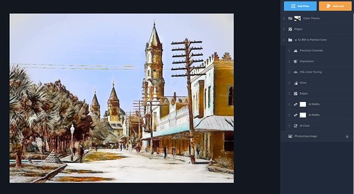
The screenshot shows a different image I am working on (a B&W Shorpy image called Cathedral Place at Charlotte Street, Plaza de la Constitucion, St. Augustine from 1906) where a screenshot of the settings was taken as they appear in Studio. See how there are 8 filters included and two additional filters added on top (Color Theme and Edges again). For the Cowboy image,
This could get long but here we go – wish the Community was available for downloading it. My Look is saved in a Look Category called My Looks and contains only ones I created since Topaz Studio 2 was introduced. I go in and automatically Apply the Look. Right away the image I am working on looks pretty good. At this stage, the Opacity could be adjusted and just use it as it is. I would normally start off adjusting the top AI ReMix filter and then go into Impression before changing the other filters. If the colors or effect still does not look right, another AI ReMix is added (turned on my Look’s since one is toggled on and other one is off in the Look). But since I am giving you my settings, lets start with the bottom filter and build it up.
Filter 1: All Clear – set to Opacity 0.10, Normal blend mode, Remove Noise Auto, Enhance Sharpness High, Recover Details 0.10, Exposure 0.31 and Clarity 0.85. Now if the image needs less sharpness or it looks crunchy, you can always adjust these settings or turn it off if not needed. Note that I set the Opacity very low as I felt it most images don’t need much with all the manipulation being done, but it is very easy to change this.
Filter 2: AI ReMix – this is the turned off one. Mine is set to Opacity 0.71, Normal blend mode, Neon Rose Style, Style Strength High, Brightness -0.31, Contrast 1.26, Sat 0.75, Hue -0.10, Smooth Edge 0.20, Sharpness 0.64, Suppress Artifacts 0. These are probably the settings I was using on a different image a while ago and never reset the filter. But at least it is a starting point for adding some different effects. As you can see, ReMix is where the color is picked up by the image. For my image I will turn it off again as it was not too good on it.
Filter 3: AI ReMix – this is the ReMix filter I use most of the time but change the style. My default is set to Opacity 0.25, Overlay blend mode, Beige Sketch Style, Style Strength High, Brightness -0.61, Contrast 1.65, Saturation 1.69, Hue 0, Smooth Edge 0.20, Sharpness 0.82, and Suppress Artifacts 0. All these settings are changed depending on the image. The Ballerina image used the Cotton Candy Style and it gave a totally different color and overall effect.
Filter 4: Edges – this filter may or may not be useful – need to turn it on and off to see if it helps or if Dark edges are better than the Light ones. Here are the settings: Opacity 1.00, Screen blend mode, Edge Type Color Edge, Edge Tone Light, Edge Strength 0.51, Simplify Edge 0, Suppress Weak Edges 0.09, Suppress Small Edges 0.02, Edge Thickness 0.16, and Edge Resolution 1.00.
Filter 5: Glow – this filter can make a huge difference in your image so be sure to turn it on and off to see what it is doing. Currently set to Opacity 0.85, Overlay blend mode, Glow Primary, Primary Glow Type Dark, Primary Glow Strength 0.62, Primary Effect Sharpness 0.87, Primary Electrify 0.45, Primary Simplify Details 0.66, Primary Edge Color 0, Primary Detail Strength -1.00, Primary Detail Size 0.05, Primary Brightness 0, Primary Contrast 0, Primary Saturation 0.72, Primary Line Rotation 0, Primary Glow Spread 0.80; Finishing Touches – Effect Coverage 0, Coverage Transition, 0.50, Sharpness 0, and Sharp Radius 0.10.
Filter 6: HSL Color Tuning – Opacity 1.00, Normal blend mode, Color – Red Hue 0.29, Saturation -0.54, and Lightness 0.29; Orange Saturation 0.51, Yellow Sat -0.3, and Blue Hue -0.32; Details 0, Suppress Artifacts 0, and Color Sensitivity 0. These all need to be adjusted depending on how the image is getting colorized.
Filter 7: Impression – I believe this is Topaz default settings except I like Stroke Type 03; I will give the settings anyway as these are the ones I like. Opacity 1.00, Normal blend mode, Brush Type 03, Number of Strokes High, Brush Size 0.50, Paint Volume 0, Paint Opacity 0.50, Stroke Rotation 0, Rotation Variation 0, Stroke Color Variation 0, Stroke Width 0, Stroke Length 0, Spill 0, Smudge 0, Coverage 1.00, and Painting Progress 1.00; Color – no changes; Lighting – no changes; and Texture – no changes except Background Type set to Original.
Filter 8: Precision Contrast – I do not always use this one and often I will add Detail filter on top instead. Opacity 0.51; Normal blend mode; Contrast – Micro 0.30, Low 0.54, Medium 0.78, and High -0.54; Lighting – Shadow 0, Midtone 0, Highlight 0, and Equalization 0; and Color – Saturation -0.52, Vibrance 0, and Color Contrast 0.
Now you can add any individual Filters and maybe another Look on top of these settings if you want. You can also add new filters into the Look and save another Look. This is a very flexible process and has so many possibilities.
*****
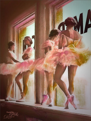
The above original black and white image was called “Ballerinas on Window Sill in Rehearsal Room at George Balanchine’s School of American Ballet” from 1936 – it was taken by Alfred Eisenstaedt for Life Magazine and appears to be a Getty image now. The original image used was very small so it was taken into Topaz Gigapixel to make it larger – 4 X was used (I mention this program as it is fabulous for this type of issue). Then the file was opened in Photoshop. Since it was still a very small image, the resolution was set to 300 and the size increased to roughly 6″ by 8″ (need to uncheck Resample to change the size, then recheck. Then Topaz Studio was opened on a duplicate layer and the “Look” applied. I have gone through all the individual steps in Image 2 below if you are interested. This one took a little more effort than the others – some just are easier to do.
*****
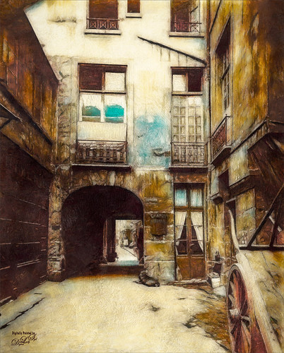
This image taken by Jean Eugene Auguste Atget of the “Passage des Singes, seen towards rue Vieille-du-Temple, 4th arrondissement, Paris” in 1911 and was provided by the City of Paris Museum. This is the original image used to create my Looks settings above – it was taken from a Topaz Studio 1 preset and migrated over to Topaz Studio 2. For more info, check Image 3 (Paris image) below. Basically wanted to show what a nice landscape type image can be obtained using these same basic settings.
I hope you will try this – it really amazed me how realistic the painting results were. I do think I get better results in Corel Painter, but it does have a very large learning curve and takes a while to get the brushes down. I am not sure PS has these effects down, although they are making great strides toward getting it. And the interesting thing is that Topaz packed all these creative filters together for you – you cannot get these type results without combining Topaz ReMix, Impression, Glow and mixing in a few others. And don’t forget the to try the Topaz ReStyle filter. I will be working on a few more images to show you but for now, if you own Topaz Studio 2, give it a try. (And actually you might be able to do it with Topaz Studio 1). This is really so much fun to do! Have a great week……Digital Lady Syd
Image 1 (Cowboy Image): After duplicating the background layer in Photoshop, the image was opened in Topaz Studio 2 where my Look was applied. The following changes were done to my Look: AI ReMix: Changed Style to Market Street at 0.23 filter Opacity and Overlay blend mode; Glow: Opacity 0.85, Primary Glow Strength 0.42, and Primary Electrify 0.11; Edges: turned off; Impression: 50% Opacity; and the Additional Filters – Color Theme filter: changed the second color swatch to more of a red color (37400c); and Detail: Overall – Overall Small Detail 0.61. Note that the second AI ReMix was not used as it is turned off but present in my Look since sometimes I need two of them. Back in PS the biggest problem facing the image was the color of the grass in the front – it was blown out. Color was added by setting a layer to Color blend mode and painting with a soft round brush a sampled tan color over all the grass – tried not to go into the face areas. Next one of my favorite Color Lookup Adjustment Layer presets called Foggy Night (a PS preset) was set to 43% layer opacity. This really softened down the overall effect. Then a Levels Adjustment Layer was added to add some contrast in the midtones (0.78) and clip a little of the black (Output Levels 0/229). Next a Hue Saturation Adjustment Layer (Master: Sat +62 and Lightness +3) was used to add just a bit of color into the skin areas of the cowboys – the layer mask was inverted to black and just areas needed were painted back. Last step was a Color Balance Adjustment Layer (Midtones +17/-12/-55, Highlights 0/-12/-55, and no change to Shadows) for the grass – black layer mask and grass painted back.
Image 2 (Ballerina Image): Going to go into detail here so you can what can be done to get a really nice painterly effect. After resizing the black and white image, Topaz DeNoise AI was applied on a New Layer. On another New Layer changes were made in Studio to my Look preset: AI ReMix: 0.30 Opacity, Overly blend mode, Cotton Candy Style, Style Strength High, Brightness -0.61, Contrast 1.65, Saturation 1.69, Hue 0.04, Smooth Edge 0.20, and Sharpness 1.00; Edge: Set Opacity to 0.76; Impression: In layer mask, painted back the 2nd ballerina’s face and part of the closest ballerina’s back – used a brush in layer mask set to 0.69 transparency; Precision Contrast: Opacity 0.10; and added Filter: Texture: Opacity 0.24; Selected Rainbow Leak 4; Brightness 0.06, and Contrast -0.02. Back in PS, Topaz ReStyle was used to adjust the color tone a little. Created a preset called Ballerinas using the colors now in image and placed it in my Colors from Images collection: ReStyle Opacity 68% and Color blend mode, Color Style Sat Primary 0.06, Secondary 0.08, Fourth -0.09, and Fifth 0.22; and Lum Secondary -0.02, Third 0.63, Fourth 0.33 and Fifth 0.31; and Texture 1.00; Basic Color Temp 0.23 and Sat -0.16; Tone Black Level 0.09, Midtones 0.33 and White Level -0.06; and Detail Structure 0.36 and Sharpness 0.30. A Color Lookup Adjustment Layer was added using Joel Grimes Soft and Desaturated preset set to 30% opacity. Some clean up layers were used to even out some of the face distortions caused by Studio Impression. A Red Channel Curves Adjustment Layer was used and set to 57% layer opacity. A Selective Color Adjustment Color was opened and the Whites and Neutrals were used to add a little cyan to the sky outside the window. Viveza 2 was used to sharpen up the paint strokes in the ballet skirts. a Hue/Saturation Adjustment Layer at 12% layer opacity was added on top to adjust the color – had trouble getting the effect just the way I wanted it. Then a Black and White Adjustment Layer set to Luminosity blend mode and 47% layer opacity was added. A Levels Adjustment Layer was the last step and a Gradient Tool was applied to the layer mask going from black to transparency so only the front two ballerinas were affected by these changes – it also emphasized the stroke more on the front ballerinas.
Image 3 (Paris Image): Well this image took a while to complete since I was experimenting and trying to get a nice “Look” together that would be somewhat useful to all types of black and white images. I started with a Look using a Cartoon Look I had created in Topaz Studio 1 that contained the HSL Color Tuning, Glow, Edges, AI ReMix twice and AI Clear filters. (See my Best Friends Tidbits blog for where I used it first.) The settings are slightly different from the above Looks settings so I will list them. HSL Color Tuning: Red – Hue 0.29, Sat -0.54, and Lightness 0.29; Orange – Sat 0.50; Yellow – Sat -32; and Blue – Hue -0.32. Glow: Set to Overlay at 0.85 Opacity; Primary – Glow Type: Dark; Primary Glow Strength 0.62; Primary Effect Sharpness 0.87; Primary Electrify 0.45; Primary Simplify Details 0.66; Primary Detail Strength -1.00; Primary Detail Size 0.05; Primary Contrast 0.29; Primary Saturation 0.72; and Primary Glow Spread 0.80. Edges: Set to Screen blend mode; Edge Type – Color Edge; Edge Tone Light; Edge Strength 0.51; Simplify Edge 0; Suppress Weak Edges 0; Suppress Small Edge 0.02; Edge Thickness 0.02; and Edge Resolution 1.00. First AI ReMix: Set to 0.25 Opacity and Overlay blend mode; used Beige Sketch preset; Style Strength – High; Brightness -0.61; Contrast 1.65; Sat 1.69; Smooth Edge 0.20; and Sharpness 0.82; Second AI ReMix: turned off; AI Clear: Opacity 0.19, Remove Noise Auto, Enhance Sharpness High; Recover Details 0.10; Exposure 0.31, and Clarity 0.85; and on top of the Look, added Impression filter with my SJ Basic Favorite preset (Stroke: type 03; Number of Strokes – High, Brush Size 0.50; Paint Opacity 0.50; Coverage 1.00 using Original Background Type in Texture section). Next Filter: Precision Contrast – Opacity 0.50; Contrast – Micro 0.30, Low 0.54, Medium 0.78 and High -0.55; and Color Sat -0.50. Back in PS French Kiss Spring Impasto texture was added and set to Linear Light at 45% opacity. A Hue/Saturation Adjustment Layer was clipped (ALT+click between the layers to clip) to the texture and Master-Saturation was set to 100. A Levels Adjustment Layer was clipped on top of it to contrast back to the image (Midpoint set to 0.92 and white tab Output Levels set to 174). (See my How to Add Texture to an Image without Adding Its Color blog and short video.) Then a Light Gesso layer style I had purchased from Kyle Webster before he became famous at PS was used to add some extra painterly strokes into the image. A Curves Adjustment Layer was added last.(See my How to Create an Impasto Texture Layer Style blog and video.)
Digital Lady Syd Related Blogs:
How to Colorize an Old Photo
Giving a Vintage Young Lady a New Appearance
How to Hand Tint a Vintage Image and Create a Brush to Do This
Colorizing NASA Photos and Using Topaz Studio (And Check out Updated Detail)
Get the Boy Something He Wants
Abandoned Texaco Station
A Cowboy in Montana
Contemplating Life
Topaz ReMix – Update and Better Than Ever!

I really like the results you got here, particularly the ballerinas and that last one of Paris. They remind me of a hand-coloured photograph of my mother when she was young. (The Paris image also reminds me of photos of Edinburgh’s old town.)
02/02/2020 at 7:13 pm
Hi Anne – I really like some of the old black and white images from years past and find it fun to give them an artistic twist. I think I will use this preset a lot as it does not take too long to get a really nice artistic feel.
02/06/2020 at 11:02 pm
It’s a great way to give old images a new life!
02/07/2020 at 10:09 pm
Yes, I agree with Ann, these are lovely coloured images. Thanks for letting us in on the technique you have used.
02/05/2020 at 9:23 pm
Thanks for the comment Otto. I love to figure out ways to make it easier to do things with your images in PS. It keeps it interesting!
02/06/2020 at 11:01 pm
Pingback: » The Red Cedar Stump Digital Lady Syd's Tidbits Blog
Pingback: » A Vintage Gas Station Digital Lady Syd's Tidbits Blog
Pingback: » Fishing in 1904 Digital Lady Syd's Tidbits Blog
Pingback: HOW TO COLORIZE USING IMAGE COLORIZER | Digital Lady Syd's Fun Photoshop Blog
Pingback: » Enjoying the Day Digital Lady Syd's Tidbits Blog
Pingback: » Practice Makes Perfect Digital Lady Syd's Tidbits Blog
Pingback: » Palm Court Cafe cc 1903 Digital Lady Syd's Tidbits Blog
Pingback: » Before Walmart Digital Lady Syd's Tidbits Blog
Pingback: » Watching the Sea Digital Lady Syd's Tidbits Blog