
HOW TO USE A RED CHANNEL TO CREATE A NICE BLENDED IMAGE EFFECT
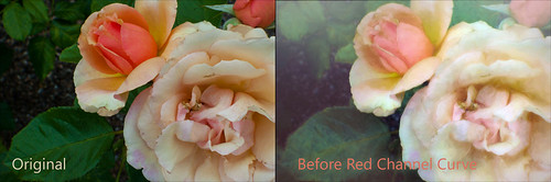
 This week I am presenting just a rather simple technique about how to make your objects blend gently into the image at the end of your workflow. I am not sure I have ever heard of anyone using a Luminosity Channel this way, but it works quite well. The roses above were taken at the Harry P. Leu Gardens in Orlando, Florida recently.
So here is a quick rundown of what was done to this image before the Channel Effect technique. Topaz (see sidebar at my Tidbits Blog for website link) Impression plug-in was used to get the painterly effect. Normally I would hand paint this, but when playing around in the plug-in, the Watercolor I preset was used with adjustments to the color settings. Then some sketch lines were added using a free brush, Kyle’s Drawing Box-Animator Pencil New – it is the best sketch brush I have found for drawing in small lines to differentiate areas in a painting. Used white and light tan to emphasize some of the indistinguishable edges. On a stamped image (CTRL+ALT+SHIFT+E) above Topaz Texture Effects Crisp Morning preset was applied (one of my favorite presets in this plug-in) with the Texture Opacity set way back to 0.17. On another stamped layer the newly free Nik Viveza 2 was used to emphasize the three focal points in the image: the main focal point which is the center of the large flower, the second is the bud and the third is a small area in the large lower left leaf. Next on another stamped layer a slight vignette effect was added using Topaz Lens Effects’s Add Selective Add Vignette filter using the Soft Pearl preset. Below is an example of the Original image as brought into Photoshop and the image before the Red Channel Curves Adjustment Layer was applied.
Now for the Luminosity Channel effect. I learned this trick from a wonderful presentation by Karen Alsop on Creative Live called Using Composite Photography to Create a Fantasy World. There were lots of little tips throughout her presentation, but this one really came across as a real interesting way to get a nice finished look to an image.
- Go to the Channels Panel and highlight only the Red Channel. Click on the first icon at the bottom of the panel called Load Channel as a Selection. Now dancing ants are showing the Highlights as selected for only the Red Channel.
- Switch to the Layers Panel and click on the half black and half white circle (forth icon over at the bottom of the panel) and select the Curves Adjustment Layer or just open the Adjustments Panel and select the Curves Adjustment Layer (the graph looking icon). Voila, the selection goes into the Layer Mask of the Curves Adjustment Layer.
- Now just adjust the curve to make the image appear a little more softer in the highlights – I find that I am slightly pulling down in the middle of the graph to get a more pleasing effect to most images.
This definitely does give a much softer feel to the overall image as you should be able to see in the Tych Panel image on right above and the final top image. I did this as the last step in the workflow. You are not limited to just the Red Channel, try all the different channels – one might be better for different photos. What you are seeing with the mask is that the white areas in the mask will be affected by the curve, but the black areas will not be affected. This means your bright highlights will be slightly darkened and the darker colors and shadows will not be affected by the graph curve. On the above, just the whitest of the whites were affected the most, then less as the colors became darker in value. And remember this is a value effect – meaning lightness and darkness. A Red can be a light color or a dark color depending on the hue that is being used. Just because you have a very bright yellow does not mean it is darker – it is still a light value.
***********************
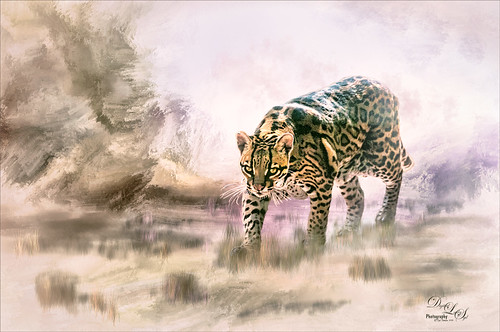 This ocelot was pacing around in his cage at the West Palm Beach Zoo recently. They are nocturnal animals but all the little kids were making lots of noise at the zoo that seemed to be making him nervous I think. He finally found a dark cool tube and was sound asleep before too long. This workflow was very long – just say that it involved lots of filters and hand-painting in Photoshop, and creating a hand-painting a Corel Painter background. Also the beautiful clouds were created from Grut’s wonderful FX Cloud Brushes – the best around! The last step was adding the Red Channel Curves Adjustment Layer and dragging down the curve just a little. It really made the Ocelot look like he was actually part of the added background.
This is a pretty simple trick to use. If you have an object you are trying to blend into the image or just do not like the overall contrast in the image, try this. It seems to be improving a lot of my recent images! Have a good weekend!…..Digital Lady Syd

Thank you for the tip, will give it a try – love the effect 🙂
06/11/2016 at 3:46 pm
Pingback: WHAT’S NEW IN TOPAZ IMPRESSION 2? | Digital Lady Syd's Fun Photoshop Blog
Pingback: » The Dressing Table Digital Lady Syd's Tidbits Blog
Pingback: » The Perfect Plant Digital Lady Syd's Tidbits Blog
Pingback: GET RID OF THAT COLOR! | Digital Lady Syd's Fun Photoshop Blog
Pingback: » Vintage Pottery and Glassware Digital Lady Syd's Tidbits Blog
Pingback: HOW TO ADD SOME LOCALIZED GLOW TO YOUR HOLIDAY IMAGES | Digital Lady Syd's Fun Photoshop Blog
Pingback: MERRY CHRISTMAS FROM DIGITAL LADY SYD! | Digital Lady Syd's Fun Photoshop Blog
Pingback: » Sunny Winter Trees Digital Lady Syd's Tidbits Blog
Pingback: » The Waters Edge in Florida Digital Lady Syd's Tidbits Blog
Pingback: SOME FLOWER POWER | Digital Lady Syd's Fun Photoshop Blog
Pingback: COLORIZING NASA PHOTOS USING TOPAZ STUDIO (AND CHECK OUT UPDATED DETAIL) | Digital Lady Syd's Fun Photoshop Blog
Pingback: COMPARING RAW PHOTO PROGRAMS | Digital Lady Syd's Fun Photoshop Blog
Pingback: USING A SIMPLE LUMINOSITY TECHNIQUE FOR CREATIVE RESULTS | Digital Lady Syd's Fun Photoshop Blog
Pingback: » Stately Portrait Digital Lady Syd's Tidbits Blog
Pingback: » Pink Carnation Digital Lady Syd's Tidbits Blog
Pingback: » Sparkling in the Sun Digital Lady Syd's Tidbits Blog
Pingback: CAN A BLURRY IMAGE BECOME SHARP? MAYBE | Digital Lady Syd's Fun Photoshop Blog
Pingback: » Pretending I’m Driving My Dream Car Digital Lady Syd's Tidbits Blog